Communication Design
Batch 1988-1990
(8 items)
Communication DesignBatch 1988-1990
(8 items)
(8 items)

Documentation of Slide Talks in Print Media
by Arlene Rajabooshanam
by Arlene Rajabooshanam
Seminar slide talks and presentations are effectively communicated through dramatic narration and dynamic visuals. But when these presentations have to be documented in print for various other purposes, the essence is lost, and the documentation fails to recreate the same ambience as in the original presentation. Though it is almost impossible to recreate the same experience in print, an experiment has been conducted in this project.
Details >>
Ecology- Powai Lake
by Mary Swapna Mankekar
Details >>
by Mary Swapna Mankekar
When environmental awareness first started, it was predicted that the world was headed towards doom. It was predicted that things could and would go drastically wrong if environmental abuse continued. What went wrong? Or rather, what went right?
But the important thing today is that we are 'aware' of where we stand. We are aware of what the future holds for us if we continue at our current rate of environmental abuse.
In India, the trouble lies between our vast population and growing industrialization. The environment and ecology suffer as a result of the two.For centuries, mankind has used the water available to him in rivers, lakes, and streams. It has provided both food and drink, been used for recreation, energy, cooling, waste-disposal, etc., Man-made lakes and reservoirs have been created, rivers dammed, watercourses altered, and canals and aqueducts constructed. Inevitably, the quantities of water available have affected what has been done with it. And, equally inevitably, human activities have had their effects on the waters.
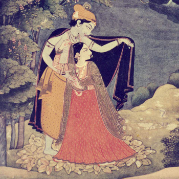
Colour & Composition in Indian Miniature Art
by Pratima Rawat
Details >>
by Pratima Rawat
The treasure of ageless beauty manifested on a few square centimetres, telling of love, the joy of living, the splendour of creation in its cosmic manifestation, and encapsulating thousands of years of thoughts, meditation, and creativity.
Their rich colors—cobalt blues, shell powder whites, vermilion, and tropical greens—were often accented with gold and silver leaf with which they were painted. Sometimes the strokes were so fine that only a squirrel's hair brush was used.
Its admiration was for nature's beauty and the illustration of its deepest desires. Its highest goals were poetry and music.
It had an imprinted love of life and beauty, recognition of humanity's relationship to the universe, love worship, and love of man and woman as a prelude to absolute love in divine plenitude and union as its eternal source. The treasure of ageless beauty manifested on a few square centimetres, telling of love, the joy of living, the splendour of creation in its cosmic manifestation, and encapsulating thousands of years of thoughts, meditation, and creativity.
Their rich colors—cobalt blues, shell powder whites, vermilion, and tropical greens—were often accented with gold and silver leaf with which they were painted. Sometimes with strokes so fine that a single squirrel's hair brush was used.Its admiration was for its natural beauty and the illustration of its most secret dreams. Its highest goals were poetry and music.Its eternal source was an imprinted love of life and beauty, recognition of humanity's relationship to the universe, love worship, and the love of man and woman as a prelude to absolute love in divine plenitude and union.

Order and Chaos in Thinking
by Punyashloke Mishra
Details >>
by Punyashloke Mishra
The ancient Greeks used it to describe the state of the universe before creation. A sort of hazy, disordered gaseous state. Out of this chaos emerged the cosmos (a beautiful word), which implied the lovely ordered world we see around us, existing according to definite laws and rules. It was the entire universe, with its beauty, grandeur, and interconnectedness. The cosmos was orderly and sensible. Chaos was disorder and nonsense.
Chaos was about as bad as a word could go, and hence there was no way but up. Now chaos is the name of the new science that has revolutionised the way we look at nature. Chaos is a science of everyday things—of art and economics, of biological rhythms and traffic jams—giving new insights into the workings of nature. Not bad for a word with such lowly beginnings. On the other hand, Cosmos had nowhere to go but down. It slowly took on restrictive meanings of beauty and, worse, superficial beauty, and now remains with us in the form of the word "cosmetic". So we see that what was nonsense becomes a science, and what was order and grandeur becomes superficial and silly. An apt description of today's absurd situation.

An Investigation Into The Semantics of Communication
by Raja Mohanty
Details >>
by Raja Mohanty
This project was intended to be an investigation into the semantics of visual and verbal communication. It was intended to be a study of various forms of communication, such as prose, poetry, cartooning, and illustrations, to see what gave each one its distinct flavour.
I first heard the term "semantics" about a year and a half ago and have always felt uneasy in its presence. Over the months, I have tended to view it with a certain amount of suspicion. I hold nothing against it. But, when approached directly, "meanings" have a habit of deluding you. If done in the 'true' spirit of a project, this report would have included voluminous chapters on 'data collection,' 'analysis,' and a set of solutions based on the understanding gained from such an analysis.Unfortunately my cowardice fails me. However, I hope that the word "investigation" in the project's title allows me to express why I want to avoid such an analysis.
Because man is inherently lazy, he chooses to live his life through symbols. The 'nice' guy The 'sad' song The 'lived happily ever after' tale He has an extremely efficient memory, which he uses to record past experiences, allowing him to respond most effectively to a new stimulus. He is constantly making observations and, on the basis of these, certain generalisations. Perhaps this stems from the instinct for survival. This wisdom does ensure that you duck in time to avoid the hard dust that the teacher hurls at you, but it also tells you that you ought not write sentences that are too long, for that would be bad English. Everything is fine until this smart assh.... comes along and does exactly the opposite of what he should have done and does it well, and where are you?
If you go by the book, it's unlikely that you will get your fingers burned twice, but it is also unlikely that you will experience the same thrill that you did when, during a freak thunderstorm, you found hailstones lashing your face for the first time.
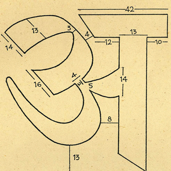
Documentation of Proportion and Structure In “Nirnaya Sagar” Typefaces
by Rajeev Prakash
Details >>
by Rajeev Prakash
"Universality and permanence are the two aspects of the master piece."
The definition applies fully to the type faces produced by Nirnaya Sagar Press and Javji Dadaji Type Foundry, established in the early 20th century in Bombay under the inspiring guidance of Javji Dadaji. This tradition set up by him has been ably followed by dedicated type designers and punch cutters like Ranoji Aru, who have produced excellent designs with an artistic beauty that is still unmatched today.
Even after the arrival of phototypesetting, computerization, and other modern techniques, it is worth mentioning that the typefaces done by Javji Dadaji are still excellent in both beauty and function. Javji Dadaji learned from his mistakes and errors, and this working experience helped him produce master pieces that cannot be compared or equaled today, even with so much technological advancement in type design.
Thus it is still relevant to study and analyse Nirnaya Sagar types with greater detail so that whatever we do for the present Indian script follows not only scientific rules of letter design in terms of legibility but also maintains traditional harmony.

Documentation of Text and Images From Rare Books
by S K Mohanty
Details >>
by S K Mohanty
Books are the most important medium for communication because they can be preserved for centuries. Thus, one book can be preserved for centuries. serves many thousands of people. But, to a designer, books have much more than just the content; just as we have our own anatomy and personality, books have their own anatomy, identity, and personality. Some old and rare books have an interesting appearance because of their size, shape, layouts, typography, and illustrations. This study has been quite exotic and fascinating. done at the Library of the Asiatic Society of Bombay, which is one of the oldest libraries in our country with a fine collection of many old and rare books.
The Asiatic Society of Bombay was born as the Literary Society of Bombay in 1804, at a meeting in the government house of the day (currently the Haffkine Institute). Its first president was James Macintosh. On November 26, 1830, the society moved into its current location, the Town Hall Rooms, an imposing landmark in Bombay. The first Indian to be admitted was Manekji Cursetji in 1830.
The library has about 7,50,000 books as it has been receiving copies of books printed in Maharashtra since 1867 and is also the depositary of Indian books since 1954 in all 14 Indian languages from publishers all over India. This library has a fine collection of rare, beautiful, and contemporary books, documents, and manuscripts in many foreign and Indian languages.
Over the years, the technology and design approach have changed. Though printing on paper and reproduction quality have improved over the years, the old books inspire a designer to be flexible in his approach because some were quite ornamental and some were fully handwritten, giving a spontaneous layout. Others have elegant and high-quality illustrations with interesting margins and layouts. In some books, the first letter of a chapter is very large and highly ornamental, which is making a comeback, and some have interesting dimensions.

Literacy
by Smita Sawai
Details >>
by Smita Sawai
This project deals with collecting information on literacy (in India and abroad) and documenting the same in the form of a booklet.
I chose this project because I felt that illiteracy was one of the most important problems facing humans today. I felt it would be in the interest of society to convey these facts to the common man. Being a visual communicator, I felt I could utilise my design skills to make the information more accessible and interesting. My aim was to explore illustrations by using various techniques available through a modern tool, the computer. Integrating text with visuals was another idea I wanted to implement, to make the booklet visually interesting.