Design Gallery
Logos of India 1
by
India is a rich land of social and cultural beliefs, ideologies and narratives. This richness is unique due to a variety of indigenous themes. These themes inflect the core visual and conceptual identities generally applied by logo designers in India. The present archive of logos celebrates the iconographic images, motifs and images of local arts and crafts that elucidate the indigenous dimensions of India’s identity. These representative aspects contribute to richness and vibrancy of our Diverse and Incredible India!
For more details:
http://dsource.in/resource/logos-india
Aadhaar Designer: Mr. Atul S. Pande (Pune, India) The brand name for Unique Identification Number (UID) is Adhaar. UID launched an all India competition in 2010. The selected logo depicts a glorious sun image in red and yellow colours, with the sun’s nucleus depicted as a fingerprint in red. It symbolically depicts a dawn of new identity of every individual, endowed with a unique number for each individual.
Adivasi week festival Designer: Roby D’Silva, Desilva Associates Popularly known as Adivasi Mela (Orissa State Level Annual Adivasi Exhibition), the event is an annual celebration of Tribal Art and Culture in Orissa. Started in ‘80s, the event went on for one week in a year. The symbol for one such annual week festival depicts Orissa’s Tribal mask. The depiction of big eyes with an evil smile along with the intricately patterned Crown of the mask is a direct signifier of Indian Tribal Art.
Festival of India Committee Designer: Nidhi Parekh, NID Festival of India Committee is a national body that aims to organize annual festive events in different cities of India. It also organizes the annual ‘Festival of India’. The form of our national bird, the peacock forms the central image of the logo. The graphic effect of fine, fluid lines for its wings depicts the vibrant, flourishing image of Festival of India Committee. Utilizing the symbol of India’s national animal, the core Indianness has been impersonified in the logo.
Film and Television Institute of India Designer: S.M. Shah, NID Established in 1960, FTII is the premier institute of film and television institute. The logo for the institute presents the simple letterform in Devanagri. The angular stroke to the turn and the vertical stem of the letter connotes the impression of a rolled film strip. The angular stroke is repeated on the top right end of the Shiro-Rekha to provide visual balance to the composed letterform.
IIT, Guwahati Designer: Yeshwant Chaudhary, Communica Designed in 1994, the logo of IIT Guwahati is based on the concept of sound connection between the mind, body and soul. The concept underlines the deep philosophy of cosmic beliefs in the field of Yoga (a philosophy practice in India since the vedic times). The triad connected with sound training and education creates a unified assimilation of true Indian values of education.
Indian Telephone Industry (ITI) Designer: S.M. Shah, NID Though established in 1948, the logo for ITI was designed in 1971, with the first ever Indian Telephone Industries plant established in Naini (Uttar Pradesh) as a manufacturer of transmission equipments like telephonic instruments, related fibres etc. The use of Devanagri letterform in a graphic treatment that creates the form of a telephone along with equally bold letters ITI with deliberate angular endings signify the cutting edge technology in making fibre and telephonic products as part of transmission equipments.
Mahavir Hospital Designer: Sudarshan Dheer, Graphic Communication concepts A public charitable trust now developed as an extension of the hospital, now called Shree Mahavir Health and Medical Relief Society was established in South Gujarat (1979). The metaphor of ‘fire’ has been inserted into the medical symbol of plus sign. The red + sign is symbolic to medical profession. The flaming growth is shown emerging from the + sign in order to communicate developing quality, healthcare services and facilities for the patients.

Maurya Hotels – ITC Designer: R.K. Joshi, Ulka Advertising With ITC group of Hotels diversifying through its several chains in 1970s, on such chain namely Maurya group of ITC, Delhi got a strong visual identity. The logo designed by Late R.K. Joshi depicts the arched form signifying a warm, homely welcome and hospitality for the visitors. The colour ‘green’, a convincing choice of an earthly hue marks the logo with vitality, comfort, peace and closeness that we experience at our homes. The depiction of a circular suspended form in the center part of the logo reminds of the welcome symbols used at the doors of Indian homes.
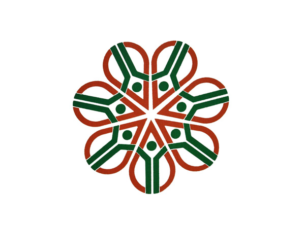
National Integration Council (NIC) Designer: Benoy Sarkar, NID The objectives of National Integration Council (since 1961) – a body under Ministry of Home aims to find path breaking ways to tackle social issues and biases like regionalism, casteism etc. The logo is iconic, depicting people joining hands to integrate and assimilate ideas. The efforts aim to to propagate a secular, equal and strong socio-economic and political fraternity in India. These values are added more visual essence in the symbolic use of the national tri-colour palatte of India’s flag.

Yoga Tirtha Academy Designer: Sudarshan Dheer, Graphic Communication Concepts Yoga Trith Academy is the oldest Yoga centre of India, established in early ‘70s. The logo depicts the philosophy of collective concentration (dhyan in hindi) that unites mind, body and soul. Based on deep Indian philosophy and science of yoga, the logo stands for Indianness – its identity and values.
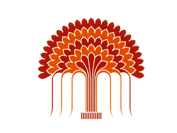
Young Presidents’ Organization Designer: Viru Hiremath, Vartul Communications Young Presidents’ Organization is a premier network of new leaders in the global scene of business and entrepreneurship. This logo was created on the occasion of a world conference organized by the network in Goa in 1994. The logo signifies the concept as elaborated in the punchl line “Doors of perception” written below the logo. It depicts a Banyan tree which has the roots going down and firmly associating with the ground. The expression connotes affirmation, reliability, values like a sustained consistency in the quality and growth.

