Design Gallery
Typo Module
by
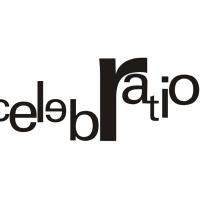
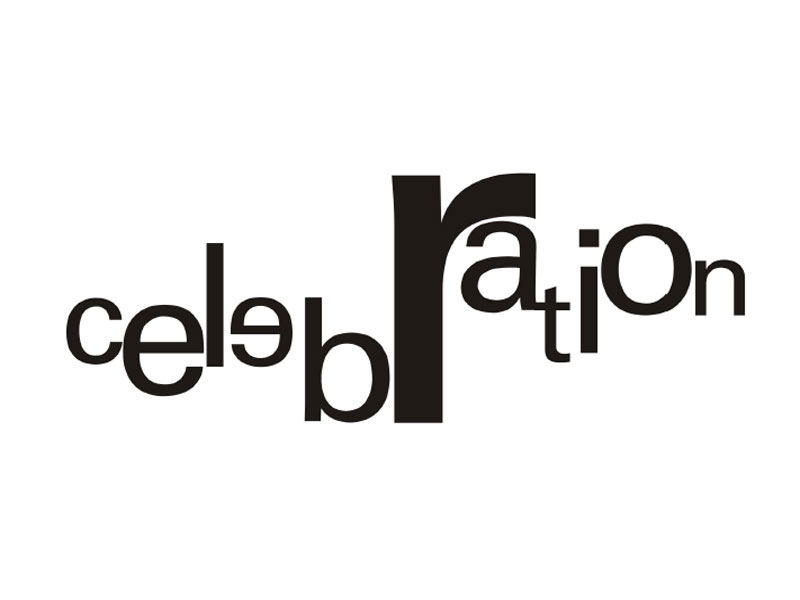
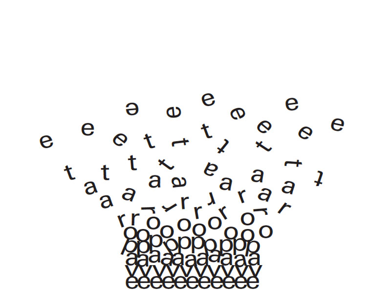
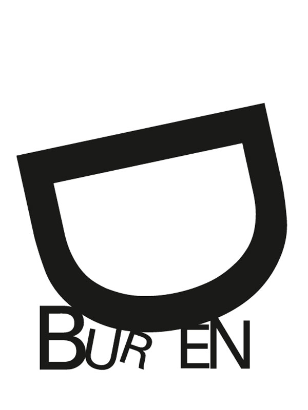
In this exercise, students were given a word and asked to compose the word in an A4 size sheet. There were no constraints on the font size or type. The purpose of the exercise is to understand how the meaning of a word can be enhanced by the right choice of fonts, font size, orientation, letter spacing, weight variation and composition in a visual field.
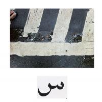
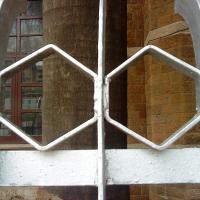
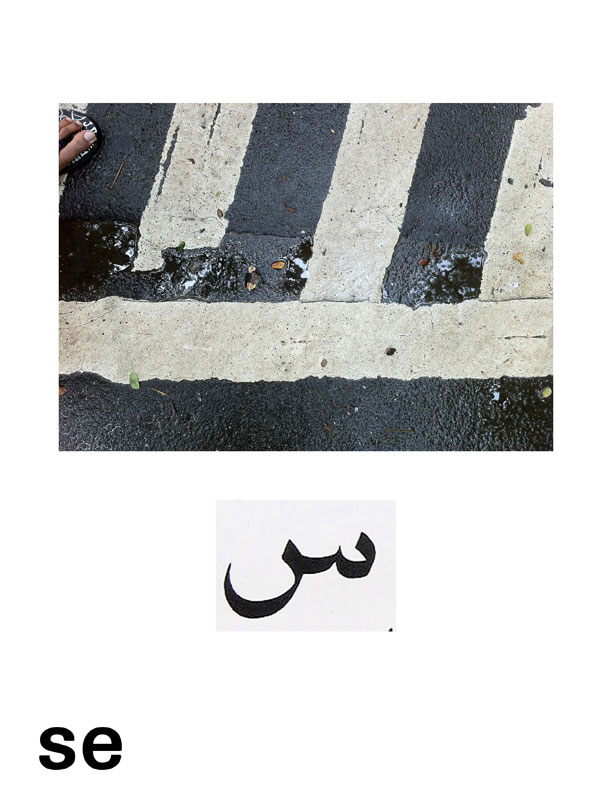
The students were asked to go around and click pictures of letterforms that they observe in their surroundings. This helps them to get more sensitive to type.
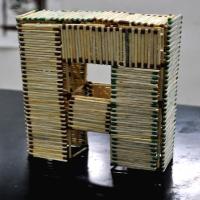
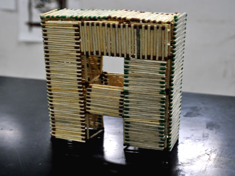
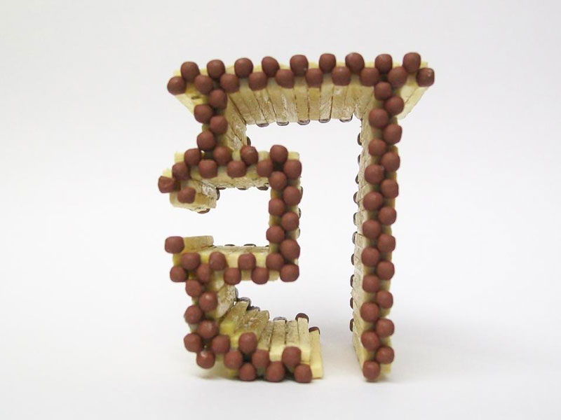
During this exercise, students were asked to make 3D letterforms with matchsticks. The script was not a constraint, so students explored Roman, Persian and Devnagari. The purpose was to understand the three-dimensionality of letterforms. Here's what they came up with.
