Design Gallery
Typographic Logos
Logo Design
by
Logo Design involves use of Typography in addition to forms and shapes. Sometimes the word meaning achieves a meaningful uplift by use of expressive letterforms, use of a certain typestyle (inherent with a tone of voice), the balance of letterforms with respect to colours, use of white space etc. Robert Bringhurst observed that, “Typography is language made visible”. Similarly, for a graphic designer the word’s visual identity becomes visible in the form of logos. Different fonts, customized letter styles and other formal graphic treatments have been applied to create distinct visual identities of Type in these logos.
CEAT
Design: Ray+Keshavan
A Bengaluru based Graphic Design studio With the change in the market image of CEAT from just being a maquee of strength and endurance in CEAT tyres to additional benefits of radials and tyres, the logo acquired a fresh look. The new logo represents the new concept of ‘Take it on’. Visually, the use of parallel lines to depict ‘E’ in CEAT connotes the tangible qualities of performance, sturdiness and durability of the new range of CEAT tyres and radials. The objective of using funky orange in E along with blue and white was to connect with the youth. The new look imbibes modernity and a dynamic freshness in the form.
Chimanlals Pvt. Ltd.
Designer: R.K. Joshi
Chimanlal’s is one of the major company bringing forth designed handmade papers for people since last fifty years. Calligraphy, as considered by R.K. Joshi primarily an art that also becomes design has been used most expressively to define ‘paper’ in Indian context. The elongated stems of letters “h” and “l” in the calligraphic identity present the continued practice of producing quality paper with great variety and aesthetics that beautifully becomes part of everyday activities of using paper for decorations as ephemera.
Debonair
Designer: Kamal Jain
Debonair magazine was started in India based on the design and concept of ‘The PlayBoy’ in US. This magazine for Indian men was given an image shift in 2005, when it was targeted more towards a younger audience. The customized type style used to depict the name ‘Debonair’ signifies a courteous, gracious gentleman with a sophisticated charm. The vertical stress given to the letters in the typography of Debonair exude sophisticated/elegant charm and poise. The four dots used above the letter ‘I’ looks chic and classy.

Godrej
Design: Founder Ardeshir Godrej’s signature
Estableshed in 1897 by Ardeshir Godrej, the logo has been there since last 116 yearsthe Godrej— then considered a major engineering and consumer products brand—used its name as a logo in a regular signature style. Initially, the colour for the logo was ‘blue’ that changed to ‘red’. And recently, in 2008, a three-colour pattern was used to fill the Godrej signature. The objective behind the colour use was to create a funky image in order to connect with youth of India. However, looking from design point of view, the calligraphic identity of Godrej reminds one of the trustworthy locks and cupboards of Godrej (the first product range of Godrej that helped establish the brand.
Incredible India
Concept Team: V.K. Duggal (Director General, Tourism) Rathi Vinay Jha (Secretary of Tourism) Amitabh Kant (Joint Secretary, Dept. of Tourism, 2001-07)
In 2004, the Ministry of Tourism in India initiated the glorious “Incredible India” campaign with the main theme of “Atithi Devo Bhava” (Guest is God); with an aim to create a sensitivity towards tourists visiting India and the stakeholders facilitating the development of tourism in India. The exclamation mark forms the ‘I” of India. The exclamation used creatively across several visuals compliments the concept behind the word “Incredible”.

Infosys
Designer: Ray+Keshavan
A Bengaluru based Graphic Design studio The slogan “Driven by Values, powered by intellect” being Infosys vision and identity. The logotype for Infosys uses colour blue (Pantone 285 C). The characters of the customized identity indicate a visual alteration of Lucid Sans typeface. Moreover, the joined letters provide the logo with a smooth, unified bonding of values that the company abides to stand for (values of trust, quality, consistency in performance and longevity, that summarize their promise of “Building Tomorrow’s Enterprise”).
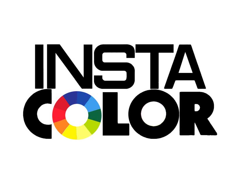
Insta Colour
Designer: Sharmila Sinha, Contract Advertising
Insta Colour logo was designed in mid-90s. The philosophy of Insta Colour involved the use of technology to customize painting solutions. The paints of Insta Colour played the role of persuading people to experience an individualistic pleasure of colour choice provided by a sound technical solution to adorn their houses and offices. This freedom to choose from the colour palatte is symbolically signified in the colour wheel used to depict ‘O’ in the name INSTA COLOUR. The basic Vibgyor colour wheel marks the possibility of numerous color mixing choices available for the customer. Equally, to signify the technical soundness and base of paint products of the company comes across in the choice of Eurostile typeface for the name.
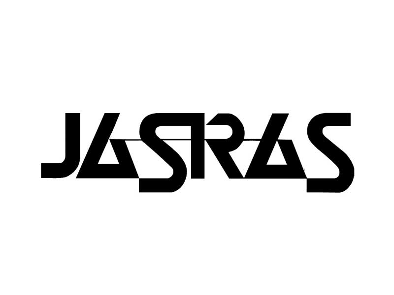
JASRAS
Designer: Sudarshan Dheer, Graphic Communications Concepts
The logo for India’s leading full digital service, pre-media and printing firms named JASRAS was designed around 1974 with the launch of the company. The logo explores the geometric characteristics of letters in their simplicity, strong structural form and rhythm. The dynamic rhythm is achieved by use of using stylized triangles to depict letter A two times in the logo. The shape of A is a triangle based on the Gestalt’s Law of Closure (the visual impetus given to the eyesight to complete forms by using open forms created in a way that persuades visual closure in the mind’s eye).
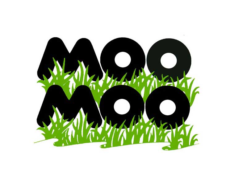
MOO MOO MILK PRODUCTS LIMITED
Designer: Sudarshan Dheer, Graphic Communications Concepts
The use of a bold uppercase letters for the name Moo Moo subtly hints to the cows with hefty built and big, bold and black spots on their back. The characters in black carry the same conspicuity of a cow with black spots. The backdrop of lush green is the perfect base for the image of a cow in its natural surroundings. The connotations that perhaps emerge are that Moo Moo milk products have the purity of natural qualities, making them premium products under Moo Moo milk brand.
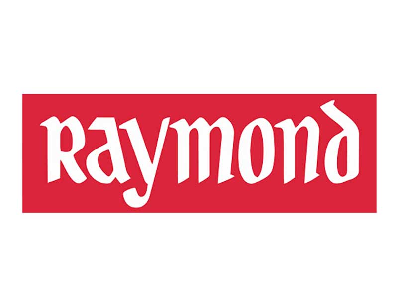
Raymond
Raymond India Limited stand for the trust, quality and excellence in their products (apparel, furnishings, engineering of fabrics and other personal care products). Established in 1925, till present the quality of Raymond elucidates different faces of \'The Complete Man\'- that could be expressively seen in the calligraphic yet stable visual forms of the letters. A Pseudo-blackletter appeal, the Raymond hand signature expresses the essence of “The Complete Man” beautifully.

CIRCLE
Design Concept: PALASA
The ‘Complete Technology’ CIRCLE logo is a recent design by PALASA design team in 2009. CIRCLE, an IT and Computer peripheral brand, provides worldwide with latest techno-savvy products. The simple expressive orange circles in the two C’s of the word CIRCLE completes the meaningful identity of circle i.e. providing complete solutions as an IT brand. The simple and modern font Futura in all Caps gives a clean, crisp and modern appeal.
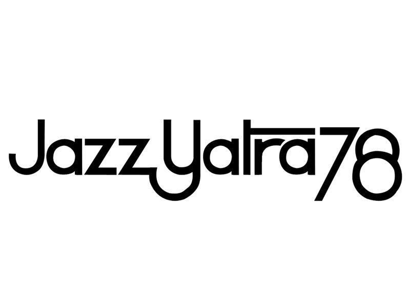
Jazz Yatra
Designer: S P Lokhande
The Americans discovered Jazz less than a century ago. The Jazz Yatra has been an event organized annually since early 70s to celebrate the spirit and new identity of Jazz in India. Jazz in India meant an interesting improvisation on existing identity of Jazz. Not only was the aim to revive interest in Jazz, but to unify people to develop the identity of Jazz in India. Therefore, the logotype using a simple typestyle with joined letters very convincingly signifies the act of harmonious intervention for the celebration and preservation of the spirit of Jazz music in India.

