Signages
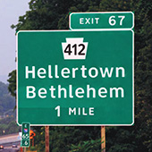
Whenever we step outside or travel, we rely upon on-road signages to recognize the place we are in or the direction we have to take to the destination we want to reach. Even with the arrival of digital navigational technology, we still desire physical confirmation to make sure we have not lost our way. Similarly, hazard signs and other essential signages help maintain a smooth flow of traffic. Anyone who has travelled inside a vehicle would know how little time one gets to glance at such important safety/navigational symbols on the road. And not to mention the readability issues caused by different weather and lighting conditions that are out of the reader's control. One factor which contributes significantly to the successful viewing of signage is the typeface used to showcase them. Specific characteristics of such typefaces can determine the distance from which the content is visible. These characteristics are critical in reducing road accidents as the viewing distance can influence split-second decisions. The design decisions taken while crafting such typefaces should favor increasing the viewing distance. Therefore, building and checking for more excellent readability of typefaces used in these conditions is essential.
Indic Script
The diversity of our country is something that we proudly present to the rest of the world. One of the main aspects of this diversity is the diversity of language. This diversity opens up many new areas of learning and problem solving that are in rarity anywhere else. Nowadays, when information consumption is more significant than ever before, it becomes necessary to display the information to the reader as it should be. Most people in India prefer information written in their local language. Therefore, well-designed Indic typefaces are a necessity in themselves. However, scripts like Bengali, Devanagari, Gurmukhi, Kannada, Malayalam, Oriya, Tamil, etc., tend to be much more complex than the Latin script. With the emergence of new technology, more people have the means to design and manipulate type digitally. As designers, we tend to pick out minute details/problems due to improper/typography and letterforms wherever we see them. It is up to us to ensure the proper use of Indic scripts in print and web.
Objective of the Project
This project aims at designing a variable font family in Roman and Malayalam scripts for signage use cases, while learning the foundations of typeface design and developing a keen eye for balance and a natural rhythm among letters. The outcome will be a variable font file that varies in the width axis. This variability in width allows the signage designer to choose the width he/she sees fit for signage boards with a specified size. The typeface will be crafted, allowing easiness in long-distance readability. This font will be available in two scripts, namely Latin and Malayalam. The open-type technology will allow the type designer to enable arrows and other functional symbols in the glyph-set using font features like glyph alternates or ligatures.
Case Study Download:
• A Multi-script Font for Signages......


