Devanagari Type Design
- Introduction
- Case Study - Slide Show
- Links
- Contact Details
Design of a Devanagari Typeface in Multiple Weights
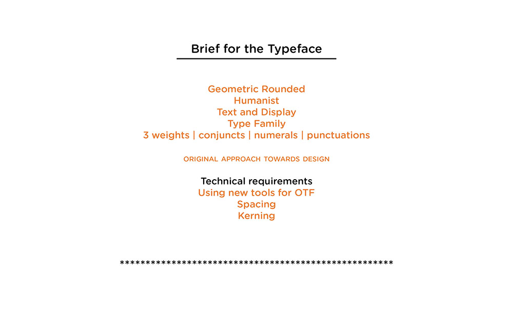
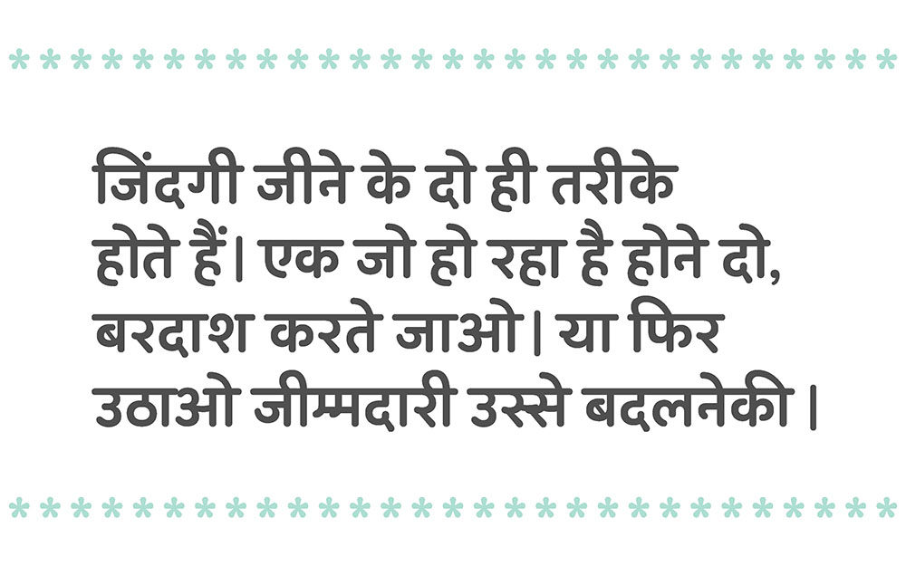
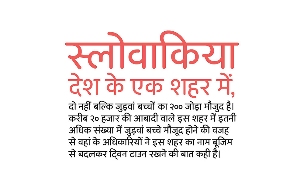
Needs of graphic design changes over a period of time, Typefaces are designers tool to create strong visuals for flawless communication. There is a growing need for fonts in multiple weights, which will cater to the requirements of different platforms. Typefaces are generally classified according to the wide usage of text and display. One of the objectives of this project is to bridge the gap between text and display typefaces. So that the requirement can be met with only one font family.
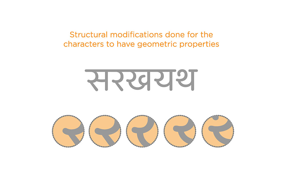
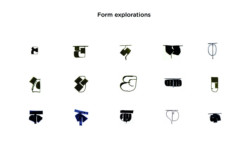
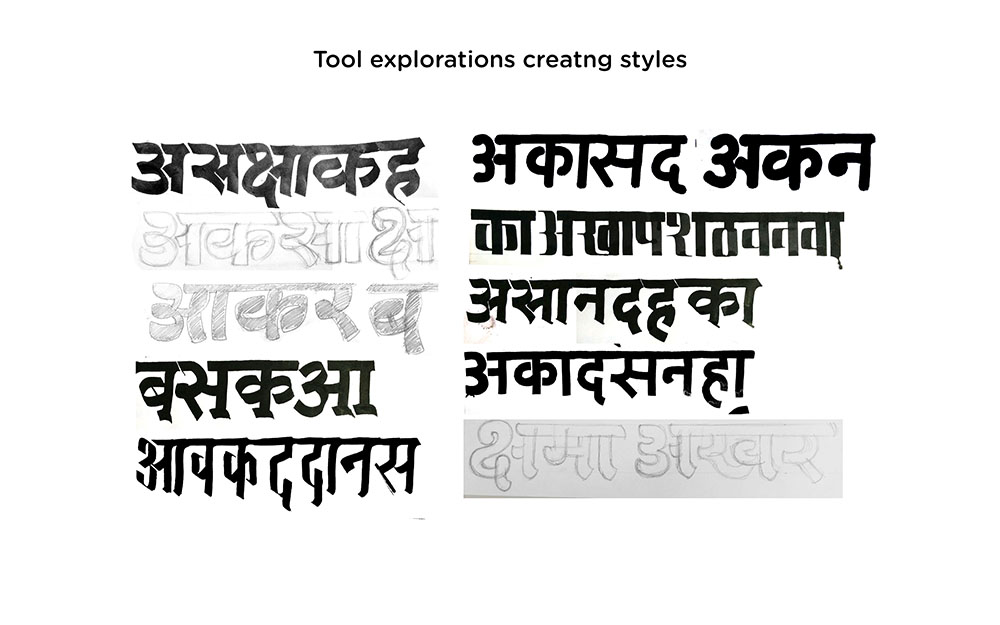
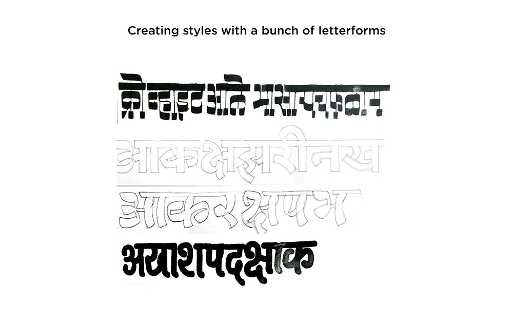
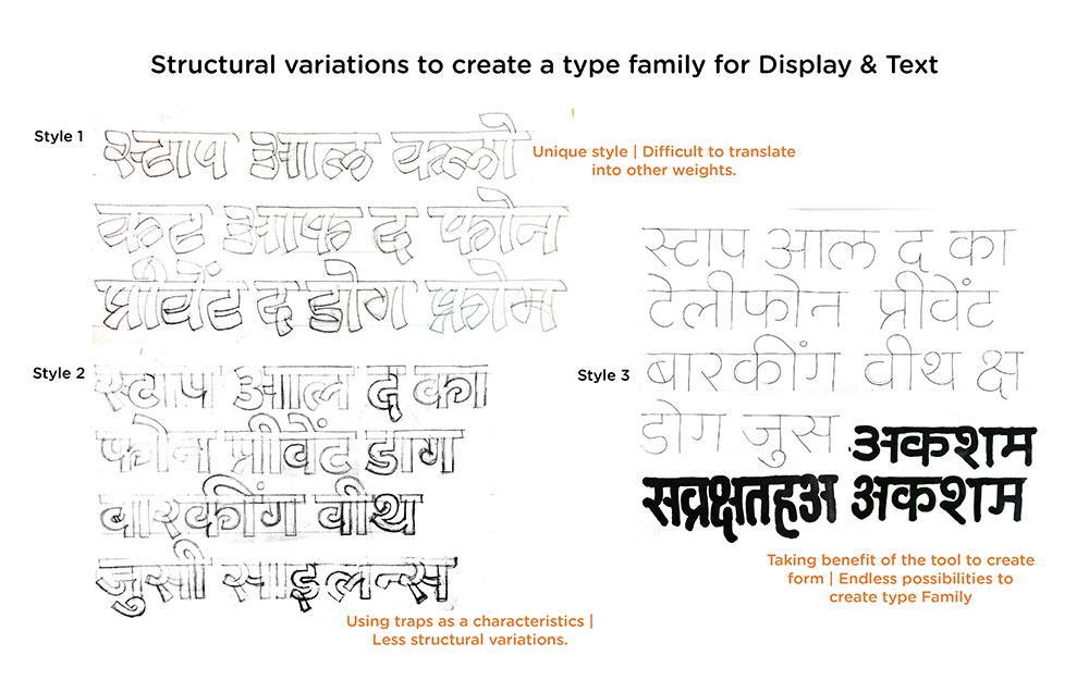
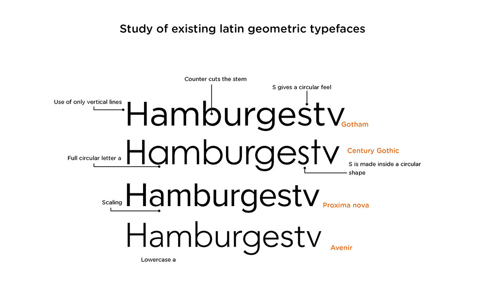
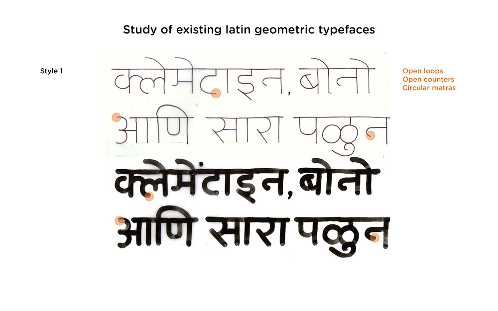
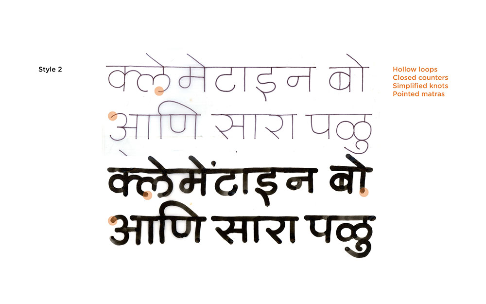
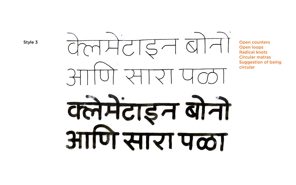
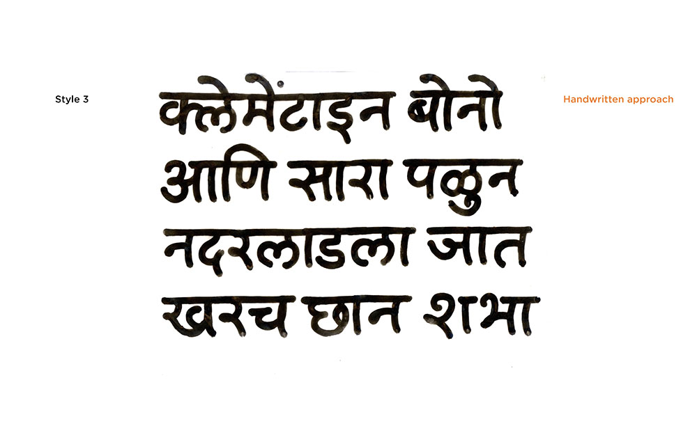
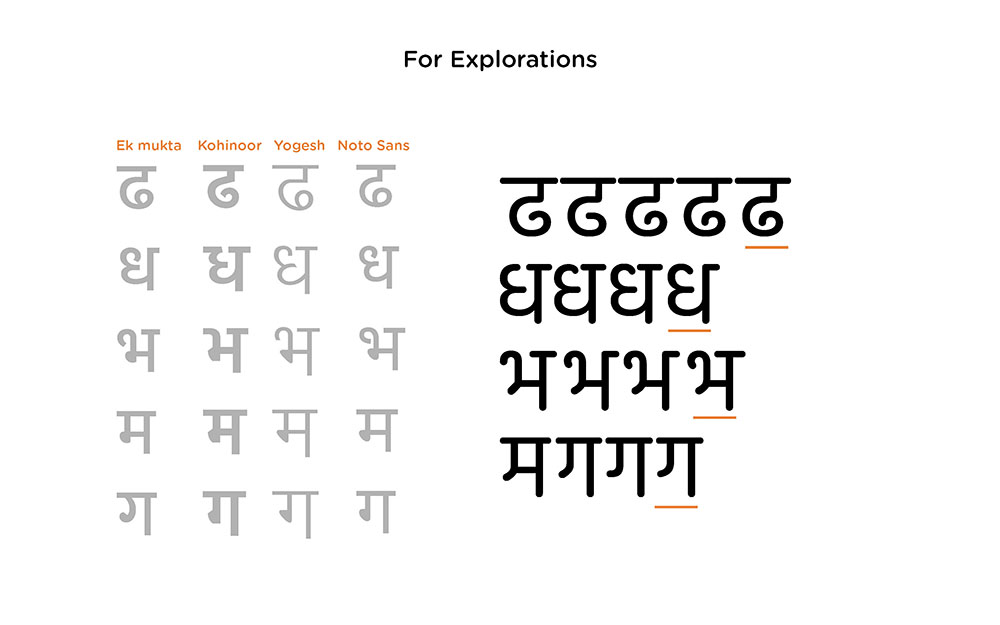
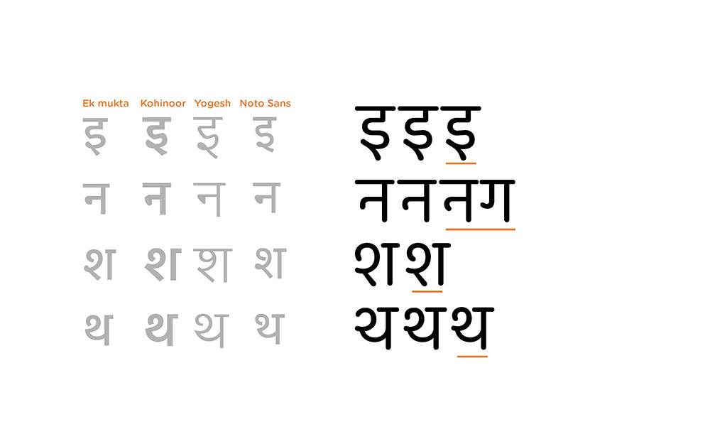
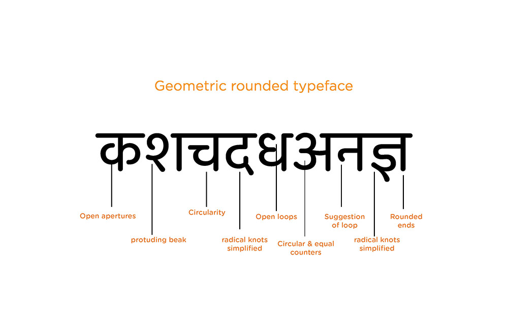
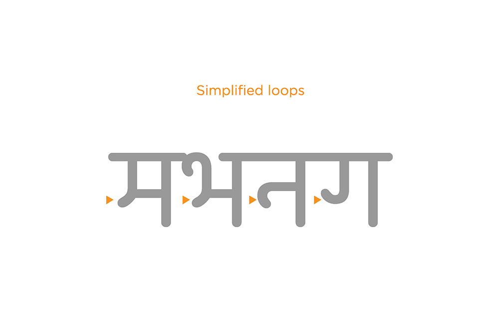
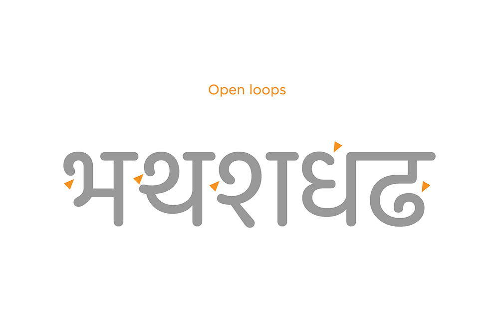
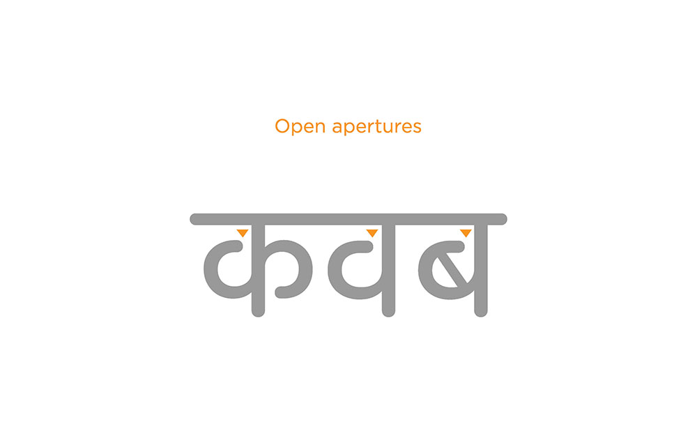
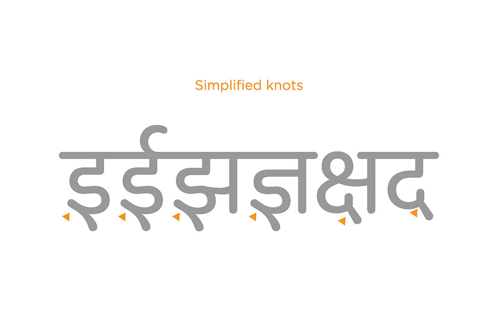
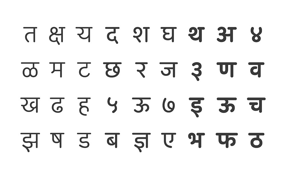
A brief study of devanagari letter structure helped in form exploration. Various calligraphic tools gave direction in creating potential designs. A set of styles of the letterforms were selected to set a guideline of the characteristics., which will suit the need of the project. One of such exploration was of geometric rounded letterforms.
It proved to be a distinct and an interesting approach which could possibly meet the purpose of the project.
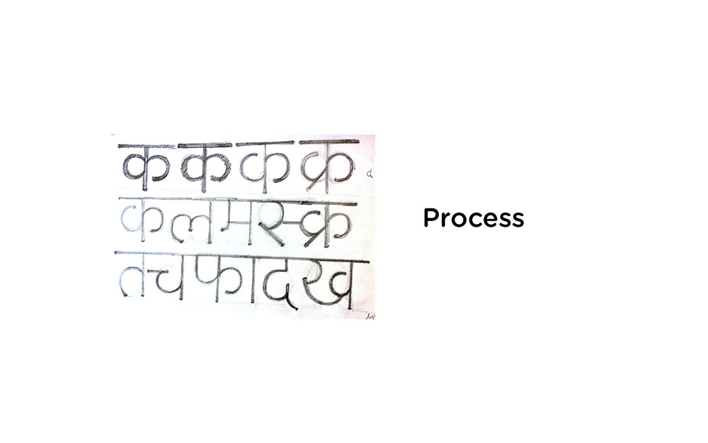
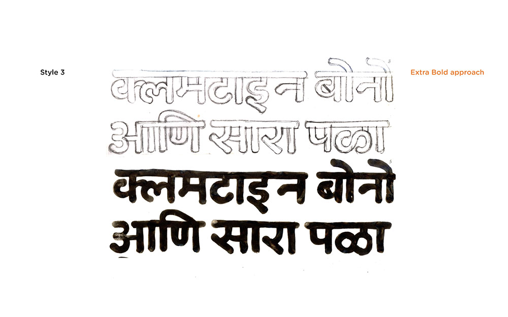
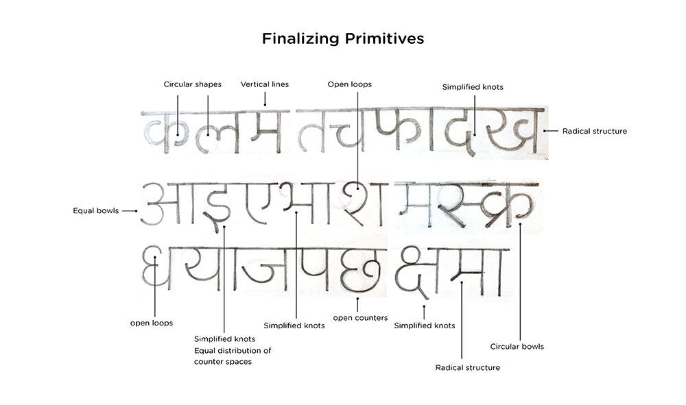
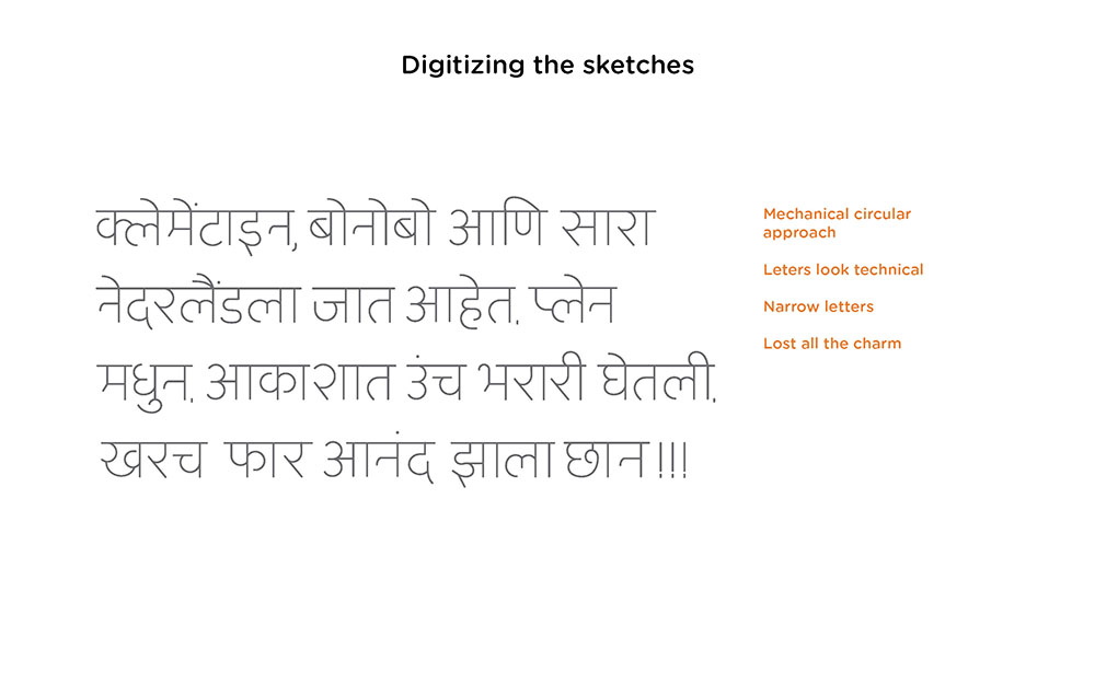
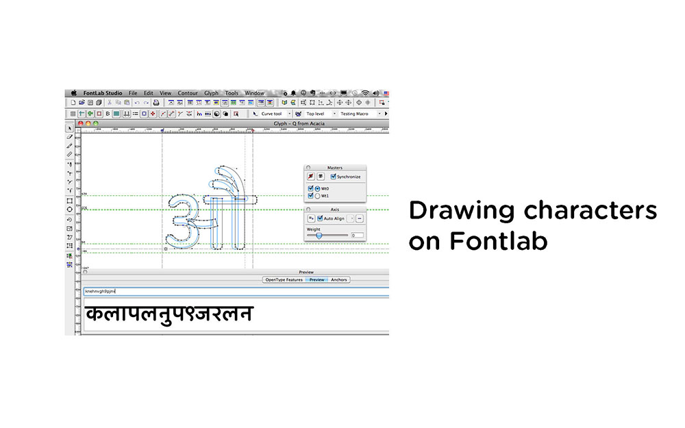
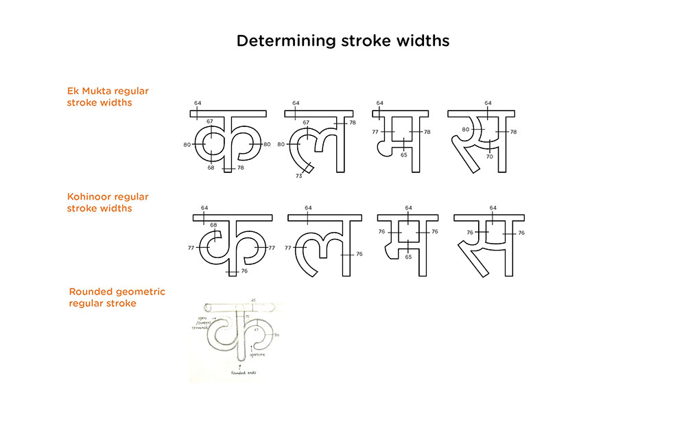
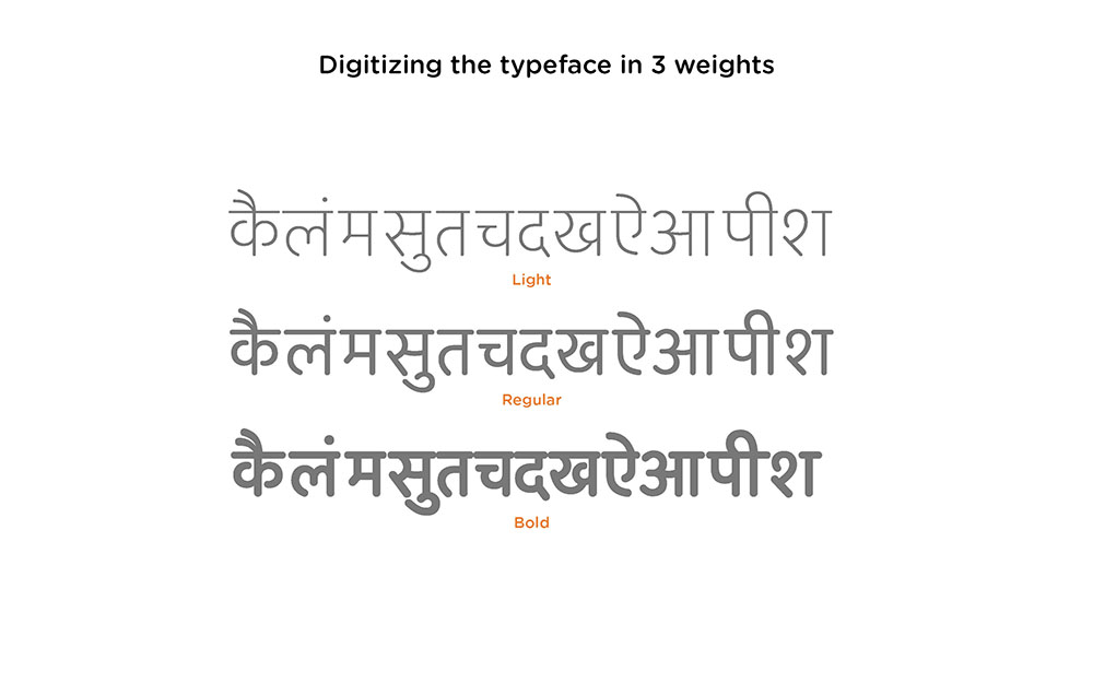
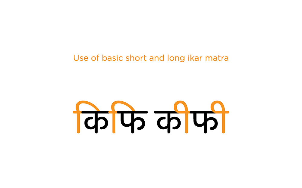
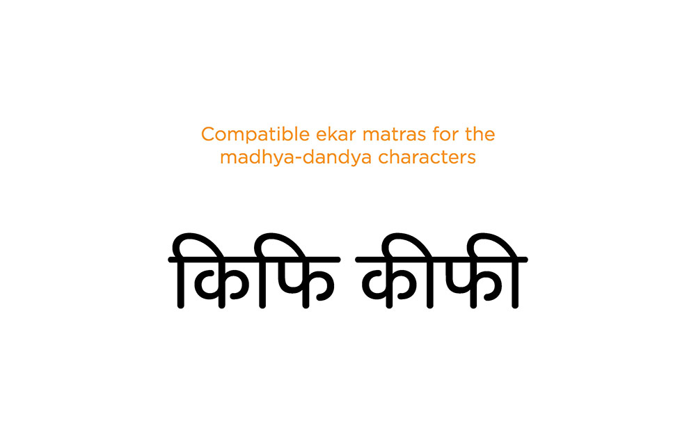
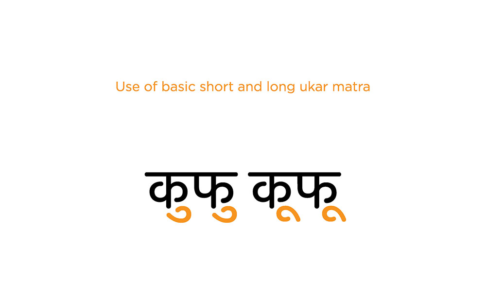
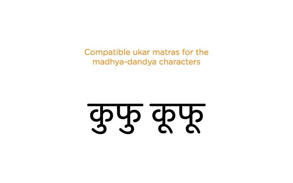
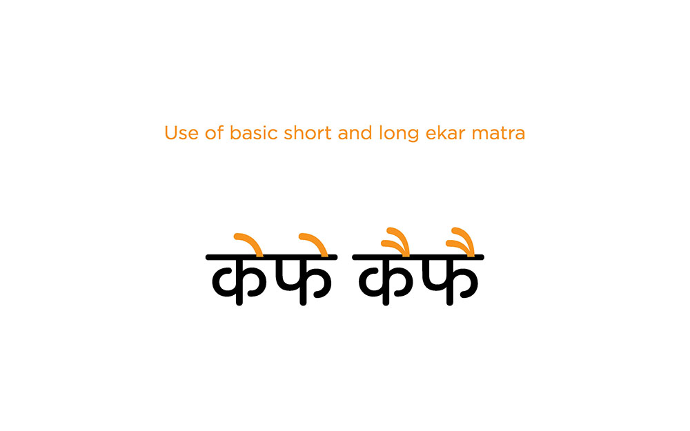
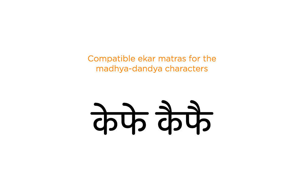
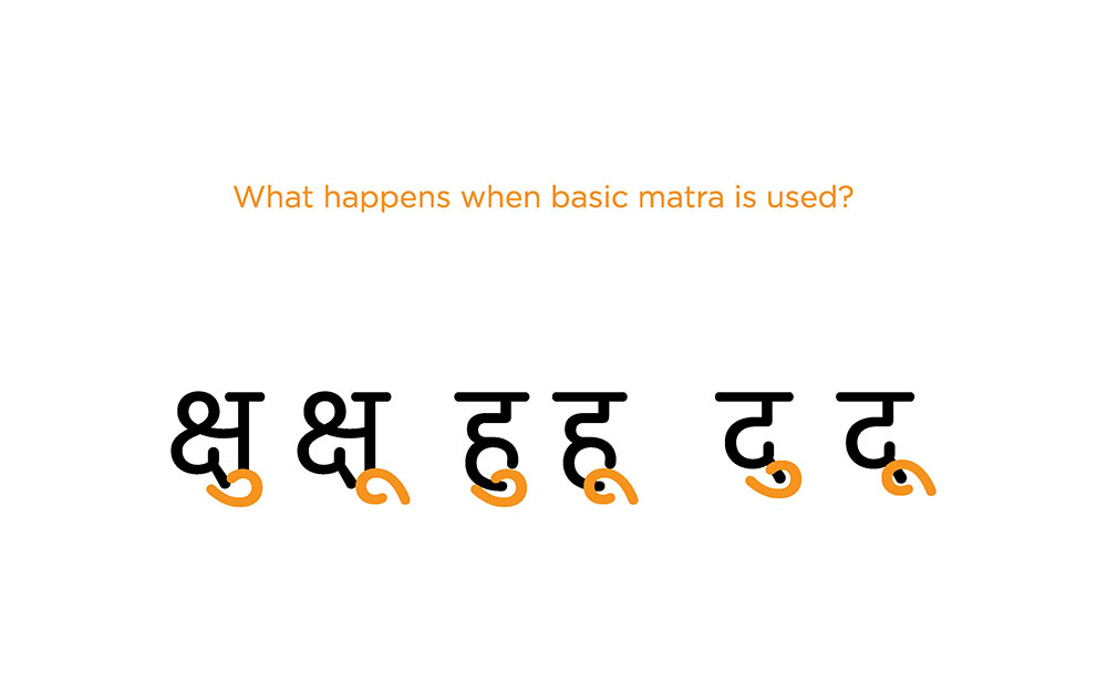
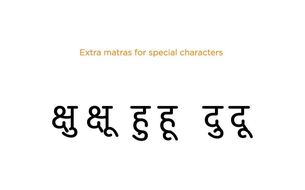
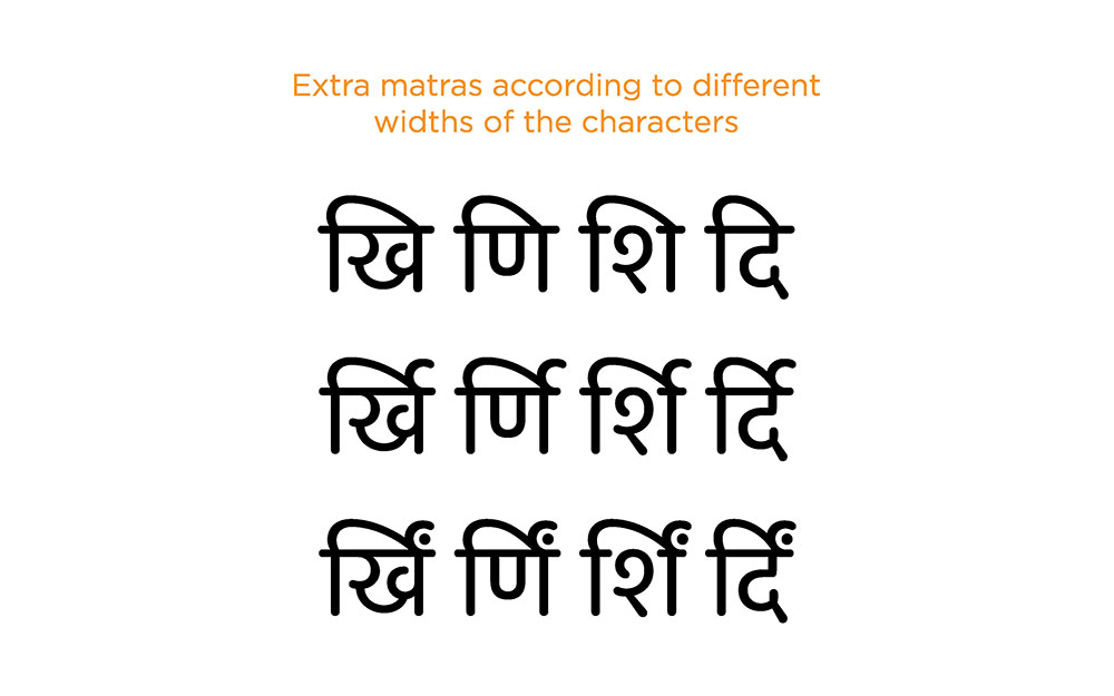
Taking the geometric approach forward, sketches were made of the letters in various weights. Samples of stroke widths for various weights were developed. Digital versions of three weights of the font were created simultaneously. This helped in testing the letter proportions and widths across weights. Matras and letter combinations were coded by using OpenType.
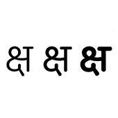
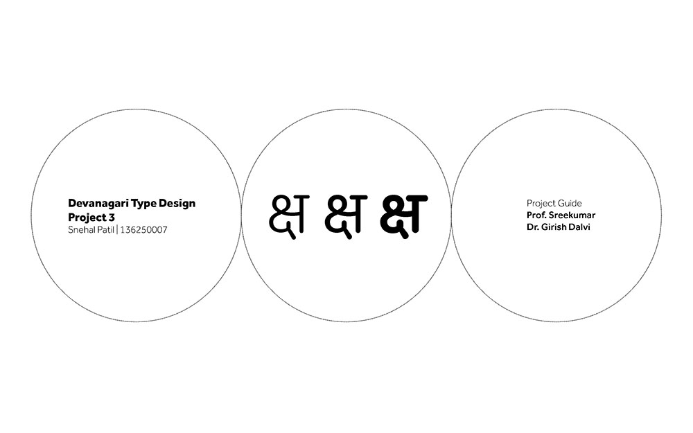
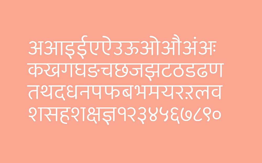
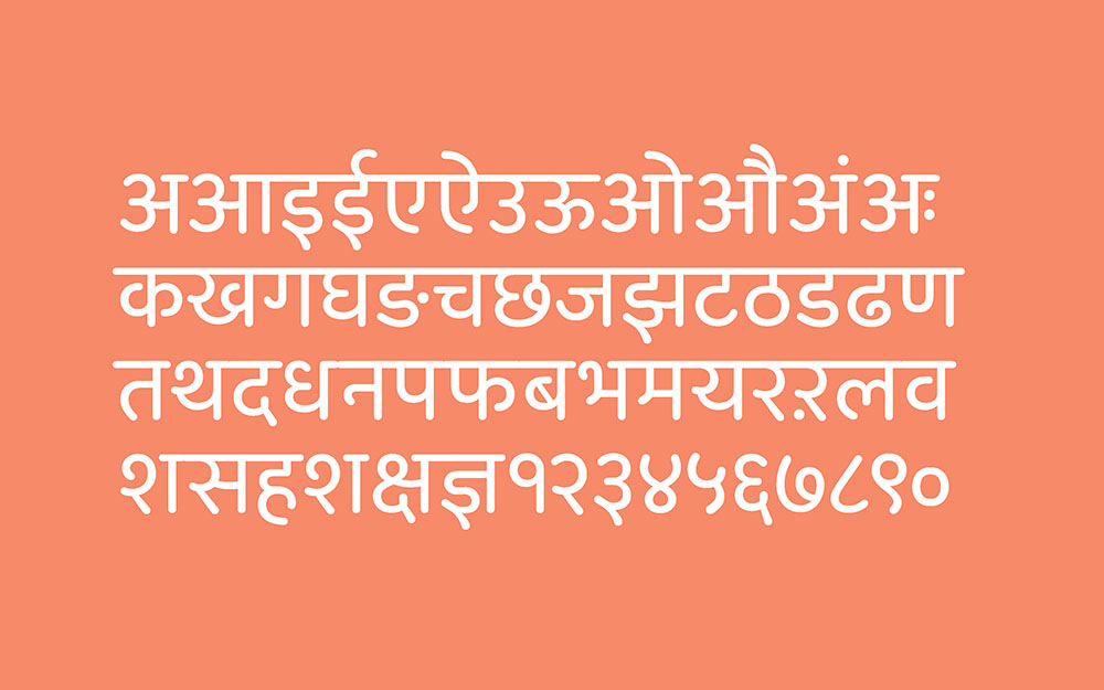
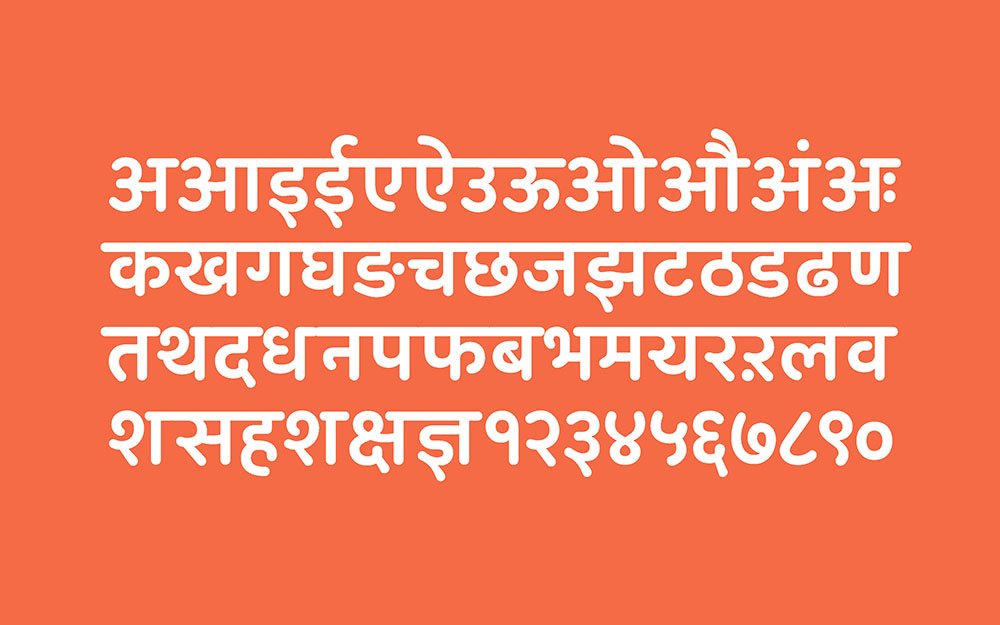
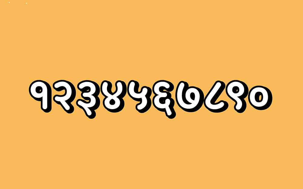
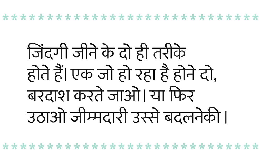
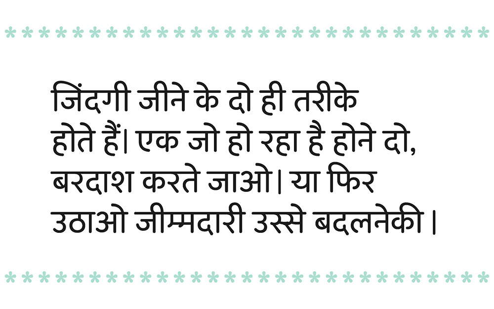
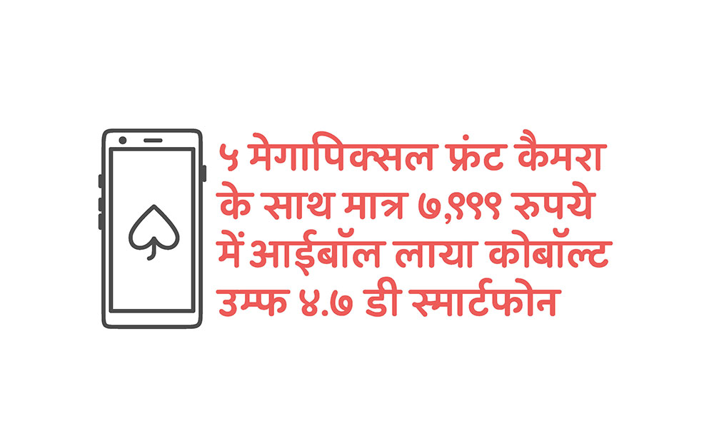
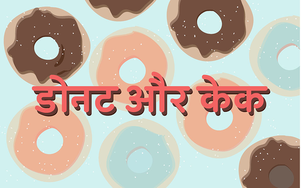
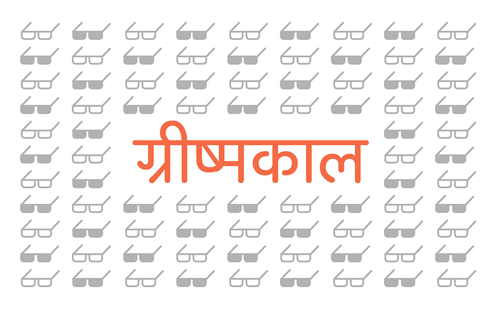
A working typeface in three weights i.e. light, medium and bold was created. This typeface is legible in text, in small point sizes and is attractive in display sizes. The name of this geometric devanagari typeface is ‘Acacia’.
Design process that was followed in this project:
• Introduction
• Pre Research
- Manuscript
- Letterpress
- Hand Painted
- Lettering
- Movie poster
- Newspaper
• Approach
• Process and Methodology
- Exploration
• Project Direction
• Devanagari Typefaces
• Brief
- Study of Devanagari & Latin geometric typefaces
• Digitizing sketches
- Determining UPM
- Determining stroke widths
• Grey value test
• Formalising Characters
• Width Chart
• Form Exploration
• Final Fon
- Light
- Regular
- Bold
• Sample
- Waterfall
- Vowels
- Consonants
- Numerals
- Punctuations
• Conclusion
• References

References:
- http://therumpus.net/2010/02/women-snakes-andstalkers-south-asian-book-covers/
- http://www.youshouldliketypetoo.com/blog/nicesigns/dadar-textile-shop-signs/
- https://poojasaxena.wordpress.com/
- http://www.handpaintedtype.com/
- http://www.aksharaya.org/
- http://www.aksharaya.org/aksharsanvad10.php
- ‘Conceptual Model of Devanagari Typefaces’
by Dr. Girish Dalvi. 2010 - ‘Elements of Typographic Style’ by Robert Bringhurst
- ‘The Stroke’ by Gerrit Noordzij
- Adobe Open Type Features, MM Design.
- Latin Typeface Used in this book is Gotham designed by Hoefler & Co. and Devanagari is Acacia designed by Snehal Patil, 2015.

This project was done by Snehal Patil, M. Des. student of IDC, IIT Bombay during the third semester as a design project.
You could write to the following address regarding suggestions and clarifications:
Helpdesk Details:
Co-ordinator
Project e-kalpa
Industrial Design Centre
IIT Bombay
Powai
Mumbai 4000 076
India
Phone: 091-22-2576 7820/ 7801/ 7802
Fax: 091-22-25767803
Email: contact[at]dsource.in
Participants:
M. Des. Student in Visual Communication Design: Snehal Patil
IDC, IIT Bombay
Faculty Mentor: Professor G. V. Sreekumar and Prof. Girish Dalvi
IDC, IIT Bombay
Website Design:Professor Ravi Poovaiah
Website Layout: Sachin B. Sonawane
Web Content Editing: Sanmati HosureWebsite
Programming: Roopa N. Sahoo, Mandar Joshi, Vaibhav Shah,Yogesh Masaye
