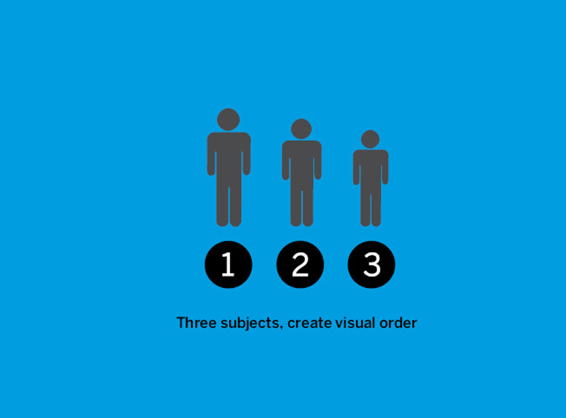
• Create Visual Order for subjects 1, 2 and 3.

Subjects:
Rahul, Kshitij and Navendu (left to right). Shoot pictures of these three subjects such that the required Visual Order is created.

Good solution!
The subject in the center holding the other two creates a visual flow. Subject on the left slightly looks up to become no. 2 and the third subject almost hiding its face to step down at No. 3.

The task illustrates visual flow in graphic design. It tells us how it can lead a viewer through a pre-defined/ pre-designed visual order. The typographic variable ‘scale’ and the subjects holding each other combine together to create an arrangement, which creates a visual flow.

• Same task to be performed with the second group.

Solution does not work. Attention of the viewer is pulled in varying directions. Viewer has a choice to choose either of the subjects and impose his own order. The visual priority in the task is ignored. Solution does not meet the required criteria.

Solution with higher order. Highly functional and orderly. For example, a telephone directory with an alphabetical listing. Solution meets the given criteria but more options could be explored.

Empty space plays an important role in deciding the visual order. This white or empty space interacts with the content. A graphic designer should be extremely sensitive about space. He should train his eyes to see this space (to be able to see the void). On the right is an example to study the addition of white space. It helps to bring more attention to our subject on the left.

Addition of white space from the right changes the visual order. The subject on the right becomes no.1 in visual order due to the white space as well as he is shifted to the center, in spite of him being smaller in size.

Earlier solutions were obvious, therefore students repeat the task. This solution however fails to achieve the desired visual order. If the second subject (on the extreme left) had been facing towards the camera then the desired Visual Order could have been achieved.

One more solution, but the attention is captured by the central part of the gesture as a whole, creating a group of the first two subjects (from the right). Students will have to revise the solution to make it better. Let’s turn over to see the next attempt by the students.

Now the solution works, it suffices the predefined criteria of the visual order and also has a story involved into it. The subject (from the right) looks at us (into the camera) to attract our attention first, The hand holding the head guides our visual path further towards the second subject and finally descending down to the third.

A plain monotonous, flat, typographic solution fulfils the required criteria, but, we need something more than the obvious.

This solution is interesting, creative but a little ambiguous, also readability seems a problem here.

A little tweaking solves the problem, now the solution is functional as well as interesting.

All the three solutions are presented together here. When we compare all three typographic solutions we can conclude that the first one is not wrong, but the third one is correct as well as interesting. We attempt to seek more solutions in graphic design rather than a single perfect answer.
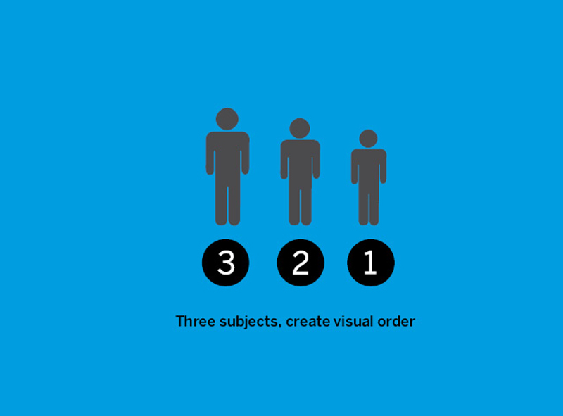
Three subjects, reverse order.

Pictures of the three subjects. The weaker subject (from the right) should be perceived as No.1 in visual order. A tough task!

Excellent gesture, but the subject (from the left) who was supposed to be perceived as No. 3 has turned out to be No.1. Solution fails to meet the required perception of the Visual Order.

A gesture, orientation or posture of the more attractive subject can be compared to an unusual or a dominant element in a typographic layout. A bold font face and increase in font size attracts and captures more attention in comparison to other elements.

Same task with the second group. The weaker subject (on the right) should be perceived as No.1 in visual order.

A successful attempt. It fulfills the criteria and creates the required order, plus has a story built into it which explains the effective use of persuasion to create interest and presents the result; an inviting communication.

Tight cropping of the photograph enhances the solution. It deletes the unnecessary, prioritizes by focusing on the required.
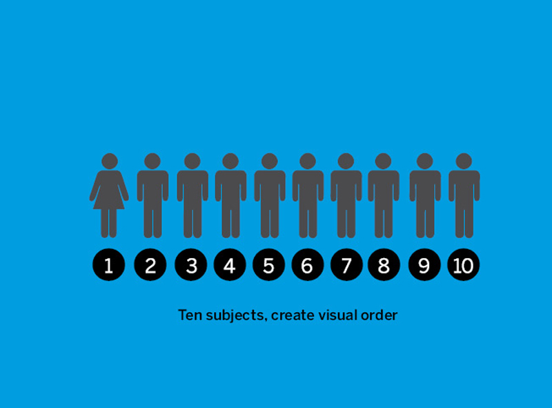
Visual order with ten subjects.

The number of subjects is increased to ten. Amongst the ten a female subject is introduced. Prior to the execution of Task 07 the predefined order in which the subjects should be shot is decided. (See the picture on the right). This picture will serve as a proof to whether the required Visual Order is achieved.

Students comprehend the trouble of defining a visual order with too many elements in a limited space. Solution fails.

Notice the typographic resemblance to the analogy of increasing subjects within a limited space on a billboard (in the city of Guwahati; State of Assam, India). This example helps the students internalize, the concept of lack of Visual Order in visual design solutions. The struggle to handle too many elements in a given space and the disturbance in perceiving a clear visual order creates clutter/chaos.
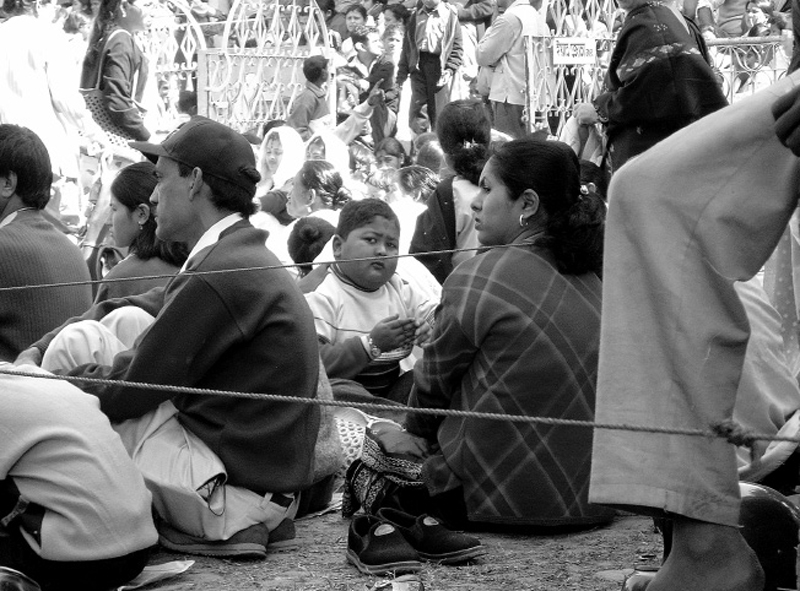
A few picture based analogies to reinforce the concept of Visual Order. Within a given set of information we can impose upon the viewer the decision of where to look first.
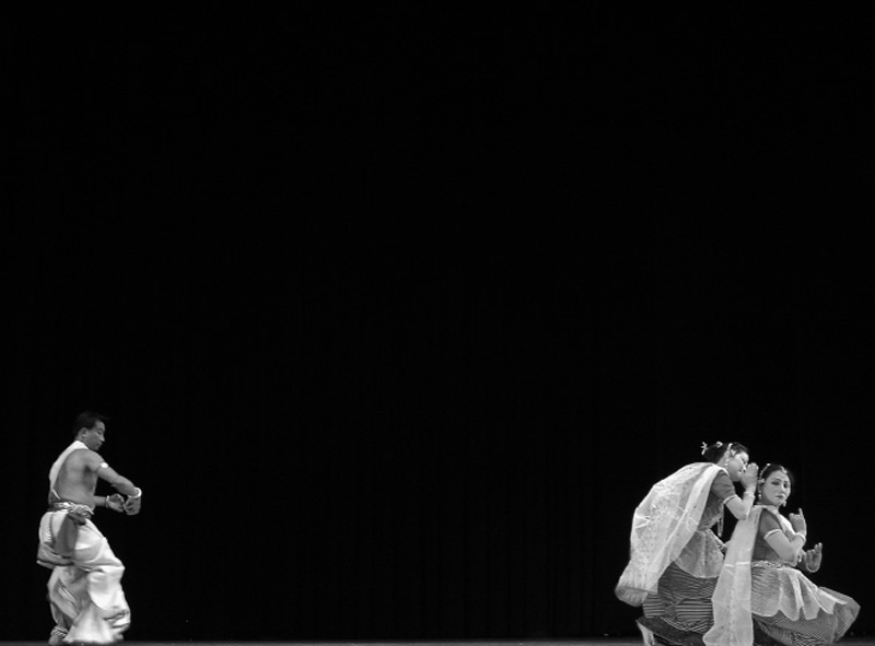
Therefore, design of information, a layout, a brochure or an advertisement is a story-telling exercise. It should be told in an interesting and an intriguing manner. It should involve the reader, carry him through a sequence and take him through the events on the page. The information should not overwhelm the viewer, creating in him a fear of being lost.
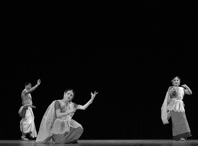
Information can be static as well as interactive. Interactive information can be compared to a stage performance where the visual order of the subjects keeps on changing. When one subject is moving forward to be a performer (be No.1), others rearrange themselves to become 2, 3 or 4; We can term it as dynamic visual order; governed by conscious planning of the dance sequence; well executed by the dancers; under the direction of a skilled director.
Similarly, a graphic designer is the director of the elements in a given space (page).
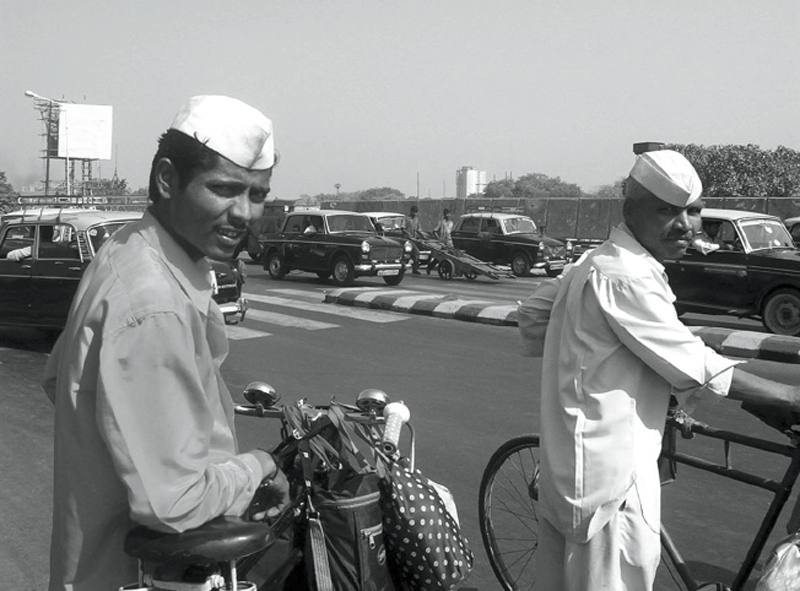
Till now we were only dealing with black & white pictures. In this picture the person in white shirt attracts our attention. Let’s see on the next page what happens if we introduce colour.
Can colour impose a Visual Order?

Colour is a very powerful variable of design. If used properly it can attract as well as distract the attention of a viewer. Excessive use of colour can create multiple hierarchies. Colour is a variable to be used responsibly.
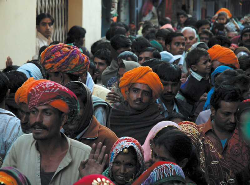
In these assignments with subjects as elements, face of the person becomes an identity to attract attention or dictate a visual order.
Similarly in an advertisement or a layout the written text, its meaning and photographs are the identities of that presented information. The viewer browses through these elements to comprehend the communicable message. A planned arrangement of these elements dictates the pattern of browsing.
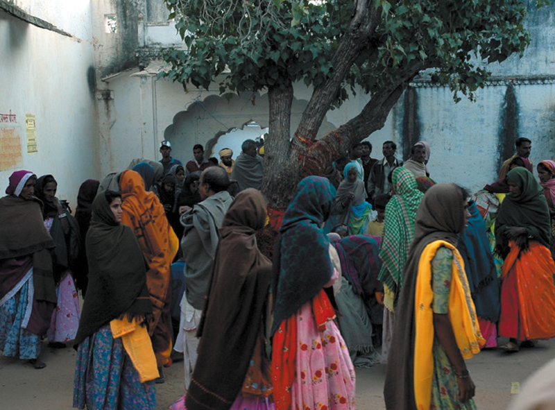
If you don’t see a face we can term that the information is flat. There is no importance given (not highlighted) to any element. All the information is at the same level with absence of hierarchy.
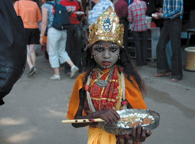
In real life, we find examples of visual order. The boy in the picture decorates himself artificially to attract attention in the crowd of people. Similarly, a graphic designer highlights a single element (to grab attention first) in a composition; before the viewer’s attention goes to other elements in the same composition (crowd).
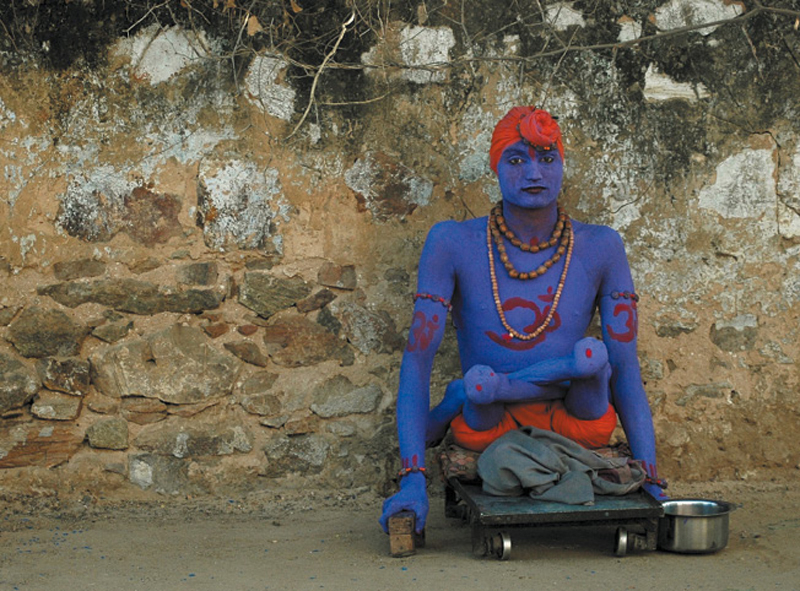
At times people decorate themselves to the extent that you are forced to look at them. If the person in the adjacent picture does not decorate himself in such a manner it would be difficult for him to make a living. With such high visual order (decoration for a single element) he makes sure that gets his alms by standing out in the crowd. It is less likely that people would overlook him.
The struggle is to grab attention of the inattentive.
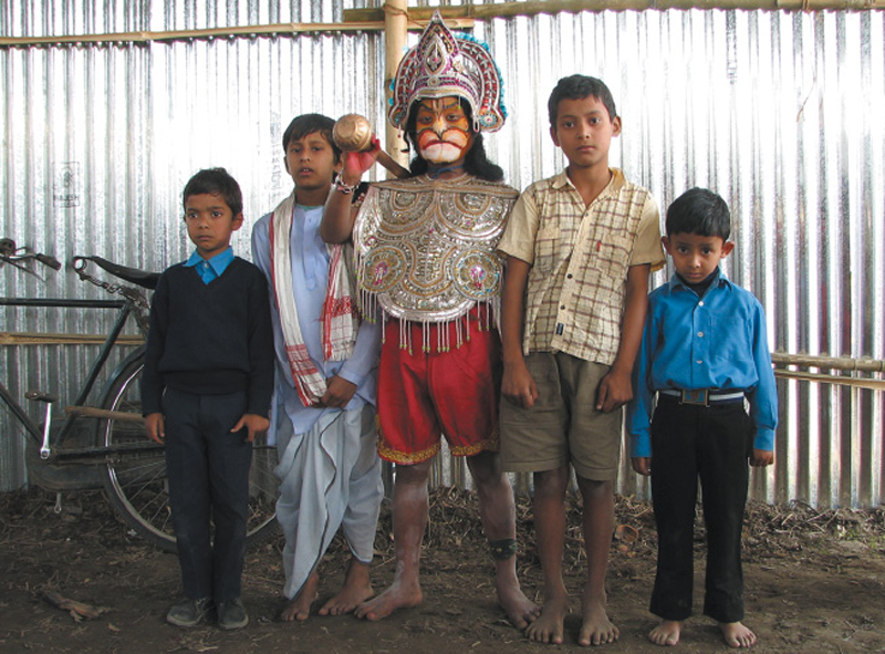
When the number of elements increase Visual Order becomes much more critical. The element which is most prominent, that is first in visual order should interact with other elements rather than isolating itself by domination, taking away attention from others.
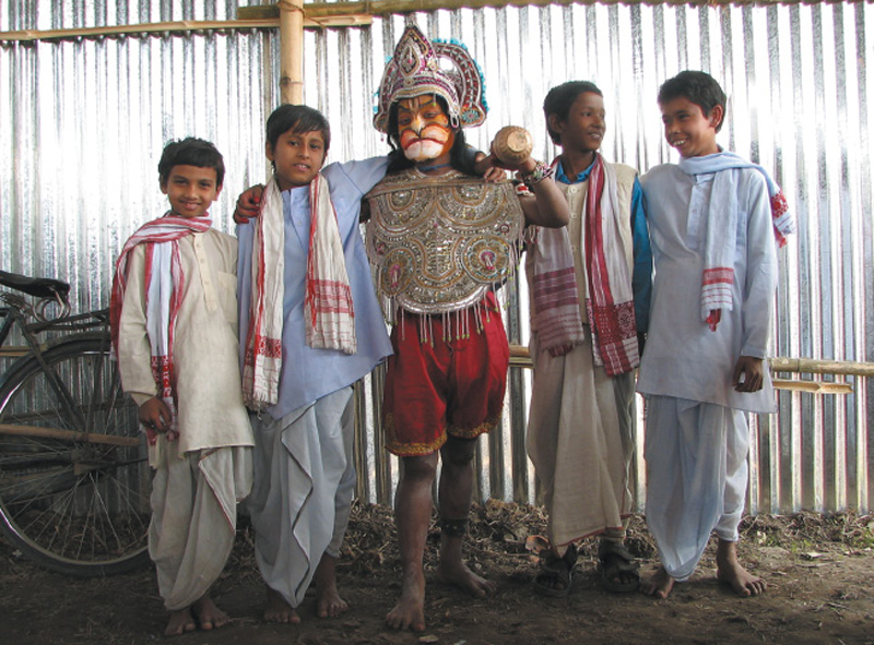
Therefore, the element which is first in visual order should make friends (build relationships between elements) with others to create a visual flow and lead the viewer through the information.
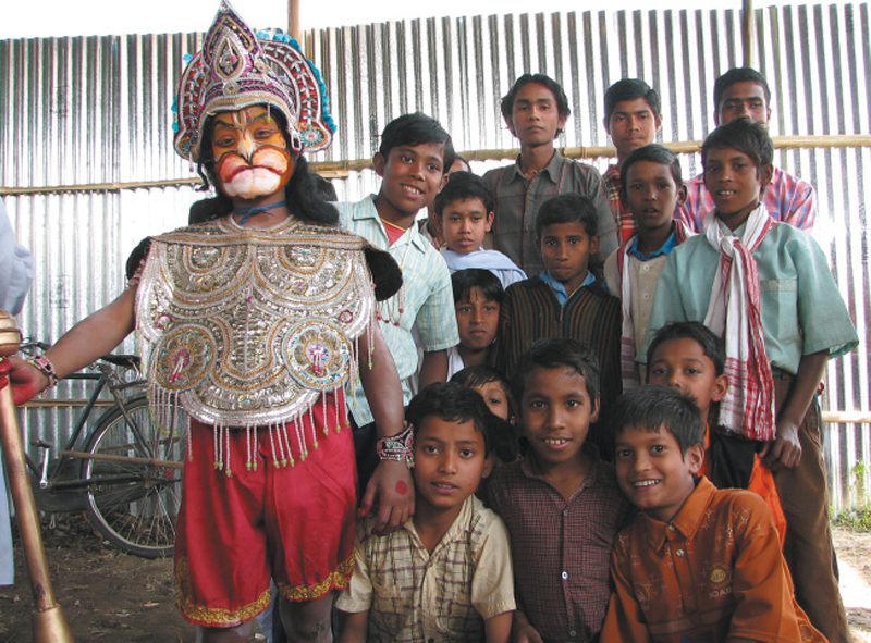
When the number of elements increase visual order/ hierarchy becomes much more critical, otherwise everyone asks/ shouts for attention. Clutter is a result of inability of the designer to handle increasing number of elements in a limited space.
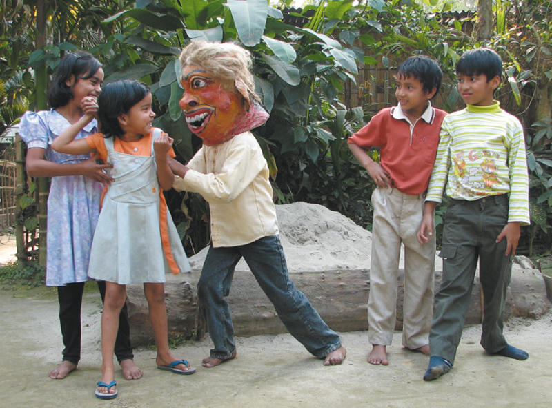
So, we need to design solutions which are holistic. It should persuade the viewer so he is attracted/ interested (remember it is also content dependent) to read through the content; designer should create the required visual order.
What is a good arrangement? Understanding the content and mapping the required visual order to the targeted viewer through careful planning and conscious arrangement.
Good arrangements result from the act of designing in such a manner that all elements interact with each other to complete the story (the communication message) without the need of being told (self-communicative). That is a good arrangement is self-evident and self explanatory by nature.
What is visual communication?
“Visual communication of any kind, whether persuasive or informative, from billboards to birth announcements, should be seen as the embodiment of form and function: the integration of the beautiful and the useful. Copy, art and typography should be seen as living entity; each element integrally related, in harmony with the whole and the essential to the execution of an idea.
Like a juggler, the designer demonstrates his skills by manipulating these ingredients in a given space. Whether this space takes the form of advertisements, periodicals, books, printed forms, packages, industrial products, signs or television billboards, the criteria are the same” - Paul Rand
What is Typography?
“Typography is devoted to a clear purpose, which is to convey meaning through the use of type. It cannot be exempted from this obligation by any kind of argument or any other consideration. The printed product that cannot be read has no meaning whatsoever.
Emil Ruder, 1967
To design is to create an order, either from bottom to top or top to bottom, within a given constraint.
