Design Case study
Newspaper Re-design: The Free Press Journal
Publication Design
by
Introduction
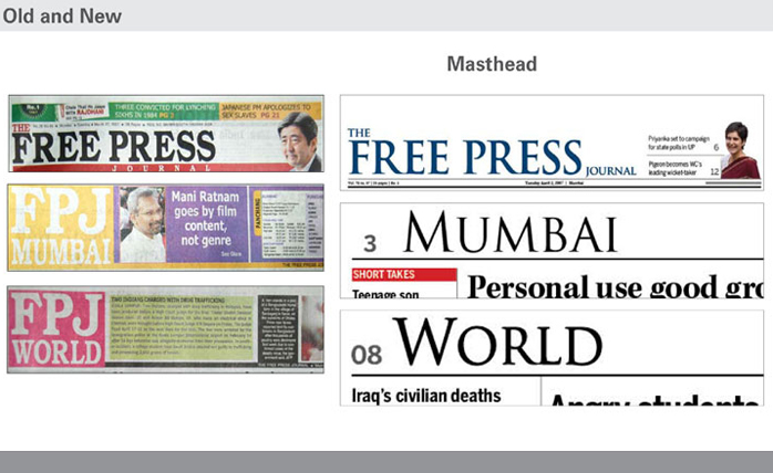
'The Free Press Journal' - Publication Re-design:
This 80 year old English daily printed in Mumbai required fundamental re-structuring in hierarchy and design. The paper was redesigned in accordance with its readership and positioning in the market. Finer details like typography and typeface selection for body copy and headers were looked at in terms of high speed reproduction and low quality newsprint.

Templates of information graphics and statistical data representation were provided for a consistent visual style along with a swanky new colour palette. The 24 pages have been designed with a standard grid, fresh new colour palette, legible type for headers and a readable typeface for the body text which accommodates more words per line, hence increasing the overall word per story.
Publication Re-design Features:
• Standard grid system for placement of text and images.
• Work out a system for placement of advertisement space and news space.
• Typographic fonts:
- Legible type for the headers and sub-header, readable body type.
- An Efficient indexing or ‘navigation’ system to help with clear hierarchy of stories.
• A new and sophisticated colour palette/ attractive mix of hues on coloured pages.
Publication Re-design Downloads:
• Case Study - The Free Press Journal - pdf