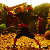
The look and feel of the film is decided beforehand, even prior to the storyboarding. The art director of the film determines the treatment and colors that will suit the film.
Basic Set:
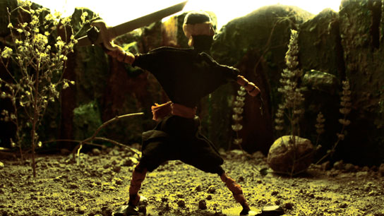
The entire sequence was shot in a studio where a small set was created. The set was lit in a way that made it look so real, real enough to make you think you are in that part of the world.
Lighting:
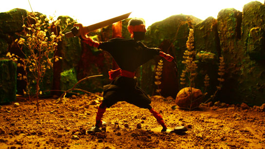
A very dramatic lighting was created intentionally, so that the character and its actions can be seen in a silhouette form but, at the same time you see the finer details of the character.
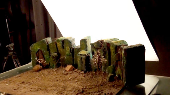
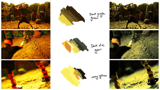
These were the shots that were captured under basic lighting that was setup in the studio. But to impart the right mood and to enhance the advancing darkness, we need a color script.
Color Script:
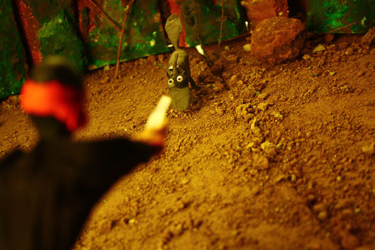
Selecting colors that were closer to the murkier shades of green, screaming yellow's and deep reds, like a sap green, canary yellow and dark maroon were preferred; to recreate the abandoned terrains, soaked under the relentless sun, with leaves that were burnt red and fallen.
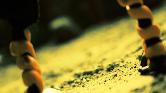
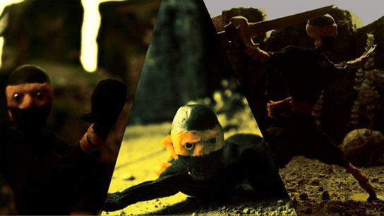
The results of the color scheme after preparing and executing it can be seen in the images below. You must be familiar with Tim Burton’s movies following a similar color palette.
