To begin with I have picked my favorite scarf to create some alphabets roughly. The fabric is easy to bend, stays in place, take up whatever form I want it to. Watch what happens to each letter, their thickness and proportions.
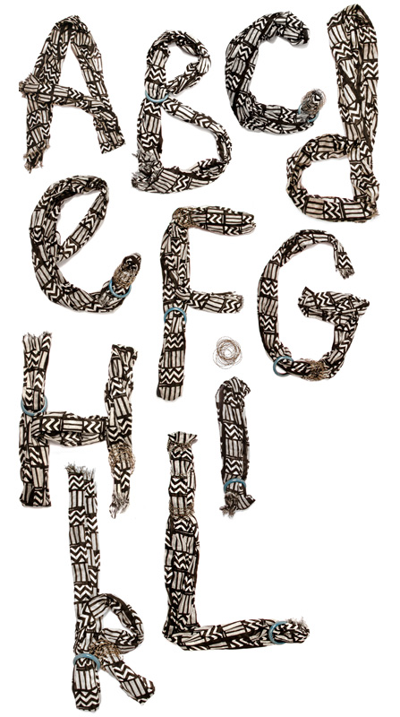
This is the first attempt to arrange the fabric to create letters, in order to realize its possibilities.
In the art of the creating the letterform, designers have to closely analyze and craft every detail of each character carefully – emphasis is placed even on the negative space, often known as counter space. The counter space is often ignored and overlooked because it is not the portion that we normally read. However, just like the positive space, the counter offers the opportunity to create a visually rich typeface.
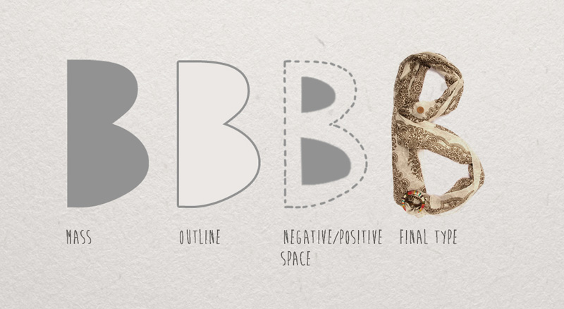
Understanding the form of the letter - visually; as a mass, an outline and a balance between negative and positive space was essential while creating it finally with the material at hand.
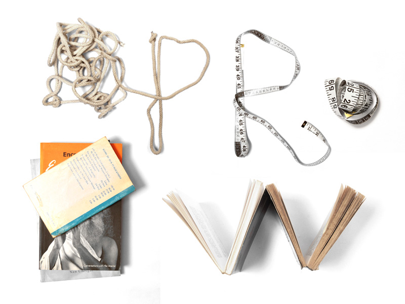
Understanding the nature of the material.
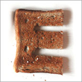
A cursive font would have demanded longer fabric, owing to its linearity or it could be created with some wire or rope. A thick heavy font could be created by stacking books or arranging pebbles, an eatable font would have to be fashioned from food. Different styles and proportions of letterforms along with the message demand a different medium accompanied with a flair for understanding it.
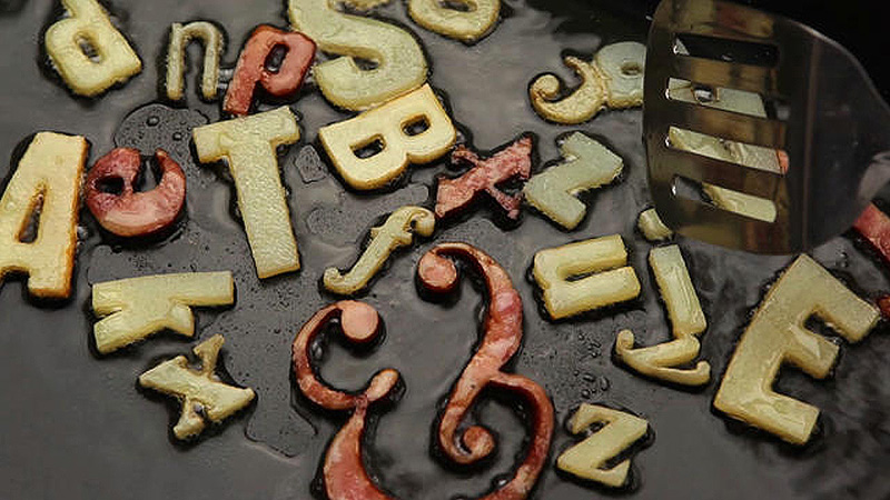
This image is a great example of an eatable font, made with vegetables cutout in the shape of typefaces which are being fried on a pan. It was created for the Typophile Film Festival 5 Opening Titles - by Brent Barson.
The Final Type:
Finally 3 pajama's, 1 belt, 3 scarves, 3 tunics, 1 skirt, 1 button, 6 bangles, 1 comb, 2 clips, some rubber bands and a lot of creativity is what went into creating this font - that has been made primarily from fabric. Each letter has its own identity, but finally forms a family that they belong to. Proportions have to be considered carefully, the negative space and positive space has to be balanced well to create a visually rich font. Owing to the more spread out, flowing nature of fabric I have created a bold but irregular font that is apt for utilizing the qualities of the various textiles.
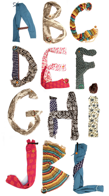
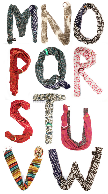
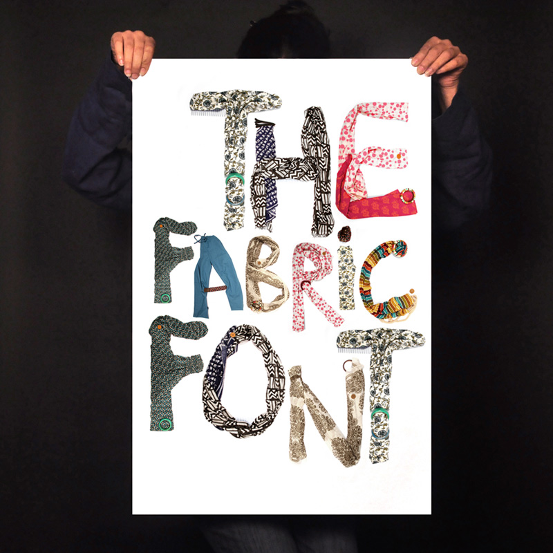
A - Z created with clothes and textiles.
