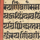
We have discussed the mediums, tools and inks that are employed during the manuscript writing process. These manuscripts were made in the Indian subcontinent a very long time ago. However, there still are many institutions which continue the process of manuscript writing. The manuscript styles have evolved over time. Each period has its unique impact on a particular style. Apart from the painting style of these manuscripts, what is interesting is their exquisite calligraphy style. Before we get into the detailed study of their style of calligraphy, it is vital to understand their layout, how their page elements are placed on it, the proportions of the pages, and so on. Through this study, we will be able to learn how the tools influence not only the layout but also the calligraphic style. In this section we have demonstrated page proportions and page elements through illustrations and graphics and therefore students are recommended to look at those graphics carefully in order to learn more about the manuscript layout.
To analyse the layout style of a Jain manuscript we have taken a sample (online resource) of the Kalpa-Sutra manuscript. The title of the manuscript piece is ‘Kalpa-Sutra section on Mahavira’. The author of this manuscript is not known. According to the sources, this piece of work was created in 1404 CE around the region of Western India. This manuscript has around 97 folios (Pages), numbered 16 to 112, while 1 to 15 are missing. The text is written in Prakrit/Sanskrit language and is written in neat Devanagari script. We will do a detailed study of the calligraphic style in Section B of this module.


Image - 01: Kalpa-Sutra Manuscript Pages.
Image Link: Kalpa-Sutra—Section on Mahavira, Recto and Verso Page.
Image Source: Jainpedia (2014).
Image Copyright: The Jain universe online at www.jainpedia.org Creative Commons Public Domain.
In this manuscript sample, the width of the paper is 32.5cm and the height is 9.4cm. Therefore the proportion of the width to the height is roughly 4:1 (Image 02). We can see here, that the text is generally arranged in two columns, and this remains consistent across all the pages. The horizontal page format influences the width of the columns and they appear rectangular in shape. Proportions of a page are also helpful while shaping the text block. Here the text block and the page proportions are the same, that is 4:1 (Image 03). Furthermore, we can notice that the column to the left is smaller in width than the column in the right (Image 02). Through this analysis of page proportions, we can infer that the paper folios were inspired by palm-leaves manuscript in many aspects, such as the folio-size ratio, the division of the folio into main two columns, margin style etc.
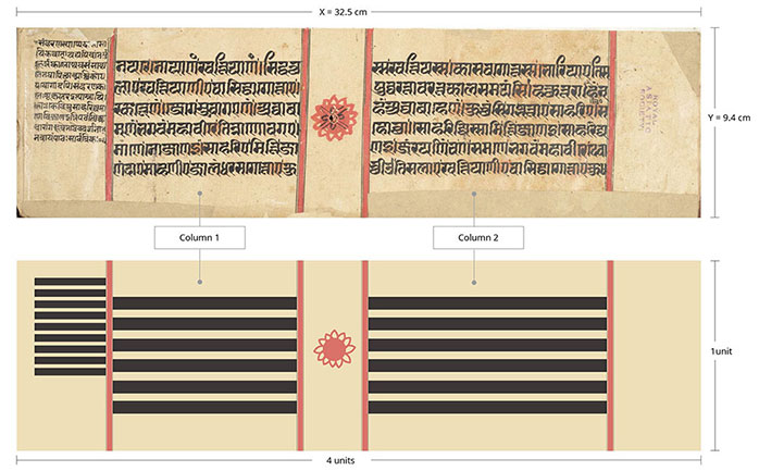
Image - 02: Manuscript Size.
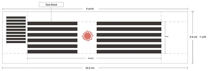
Image - 03: A Text Block.
The borders define the columns within the page layout. Thin black coloured double lines are filled with red colour, drawn to specify the columns on folios. In the layout, the proportions of the margins are 2:1:2:1 from the right fore-edge to the upper edge—to the left fore-edge to the foot edge (Image 03). The margin on the left and the right is respectively 43mm to 42mm. The left column is 82mm wide and the right is 123mm, both columns have a 5mm border.

Image - 04: Margins and Proportions.
We can see that the folio numbers are written within the margin space, that is laid out in the centre of the margin area on the right side. There is usually a folio number inscribed over a red coloured circle. On the left-side margin, you can find the page number written in words.
In this particular example of a paper manuscript, the practice of making a string hole was derived from the palm-leaves manuscript. It can be noticed here that a hole is made in the center of the page. Usually the hole is made to pass the string through all the loose folios to hold them together. It seems that in order to avoid the paper getting damaged from the thread being continuously inserted, the gutter space in the column layout has been kept as wide as the top margin. This hole is decorated with a red circle or is occasionally decorated with auspicious decorative symbols (Image 05).
Intricately painted illustrations are present in some folios of the manuscript. They divided the two columns into three columns. They are in the shape of a squarish panel that occupies the top and the bottom margin of a manuscript. This full height of the image-area of the illustration is what makes the folio more interesting as a whole page (Image 05).
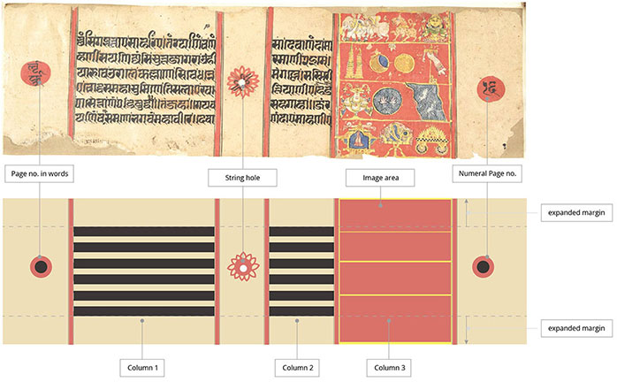
Image - 05: A Layout.
In this particular manuscript, one can see six lines per column. Here, marginal text can sometimes be seen in the wide margin area of a page layout. These notes are written in a smaller size than the main text (Image 06). The calligraphic style of the side notes is slightly different from the main text style. This is probably to differentiate the main content of the text from the notes. The line height of the main text is around 6–7mm; the leading space is 4mm (Image 06). The leading between two lines is relatively small. Overall the manuscript text has a dark grey texture; this dense texture is balanced well with wide margins. The composition of the text, images and calligraphy is simple and balanced to look at.
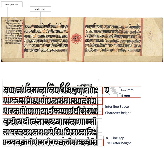
Image - 06: A Letter Proportions.
