-
Title:
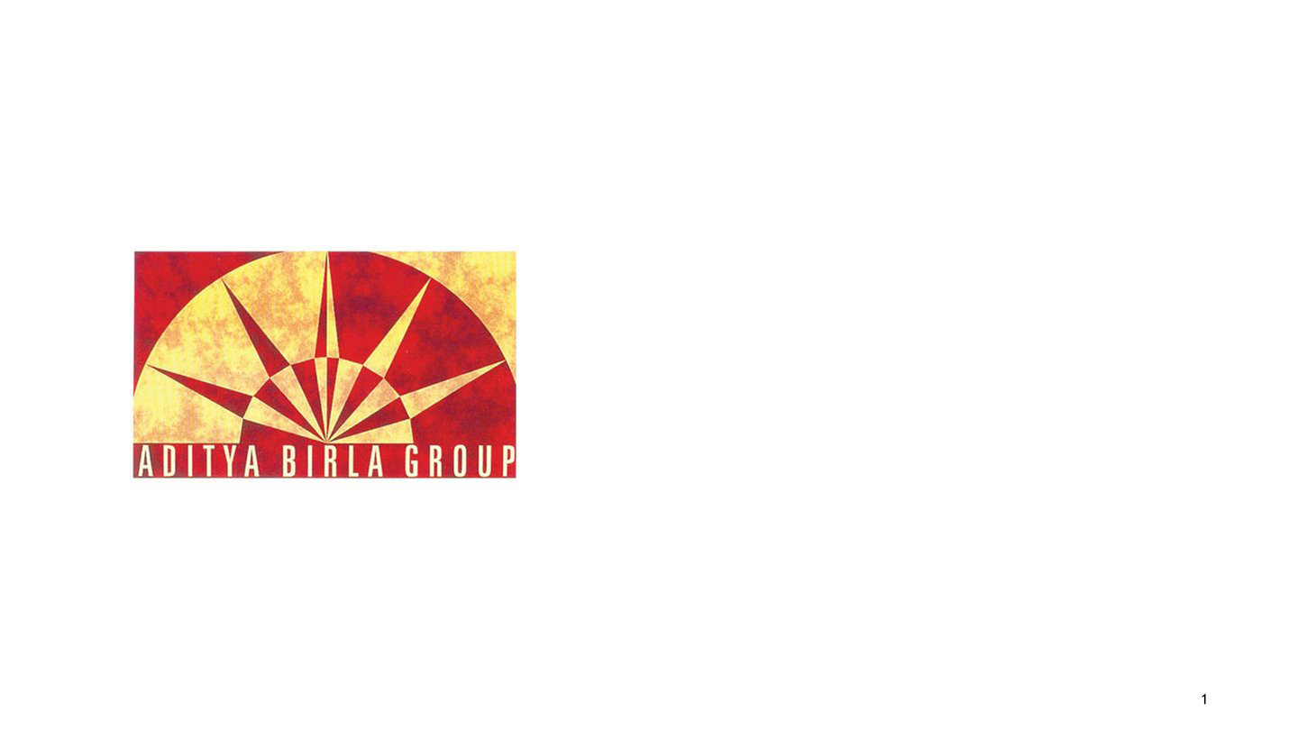
Aditya Birla Group
Description:
The idea behind the form of the logo is the 'Rising Sun' signifying rising business, vision and Aditya Birla Groups architecture as a strong brand against other competitors. The combination of deep Indian Red with the golden yellow flamed up tone in the facets of the sun rays seals the concept and Aditya Birla's shining repertoire with vibrance, richness and over-powering visual. The new logo is the same form and colour unit, but with an enhanced warmth. The modern, bold typography in the group name signature of the logo compliments the increasing strength of the group in present times.
-
Title:
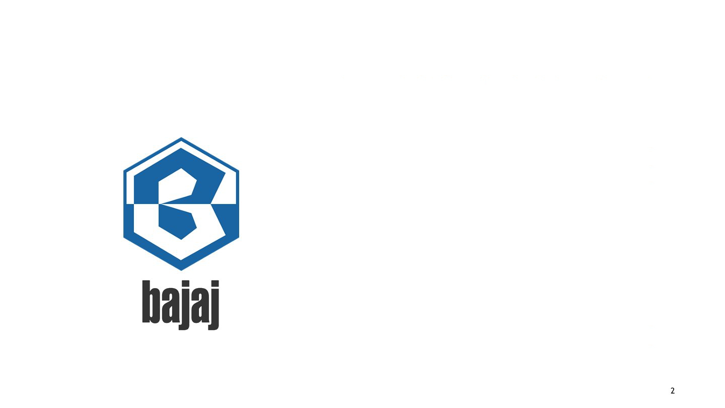
Bajaj Auto
Description:
Bajaj Auto (BAL): Launched as M/s Bachraj Trading Corporation Private Limited in 1945, it received the government's licence much later, in 1960, to manufacture two- and three-wheelers for the Indian Auto market. Henceforth, it became Bajaj Auto Limited (BAL). The ubiquitous hexagonal Bajaj logo elucidated the two-wheeler and three-wheeler product ranges of the company. The hexagonal form of the logo makes it a compact, harmonious unit that confirms the underlying USP of the Bajaj brand: "Buland Bharat ki Buland Tasveer. Hamara Bajaj". In English, it meant 'Strengthened (cultural context) India's Strong Image... Our Bajaj'. Hence, the hexagon beautifully captures the multi-dimensional spirit of India's culture and ideology.
-

Title:
Crompton Greaves Consumer Electricals Limited
Description:
Crompton and Greaves: The old logo was designed in the late 1960s when the government sealed the name 'Crompton Greaves Limited' (as a conglomeration of Greaves Cotton and Crompton Parkinson Limited). The old logo presenting the initials C and G interlocked inside a box appears like a trademark standing for the company's finished electrical products, systems, and maintenance of industrial productivity and sustenance through quality. The interlocking of the two letters signifies the strong bond of trust and reliability that Crompton Greaves has fulfilled since 1937.
-
Title:
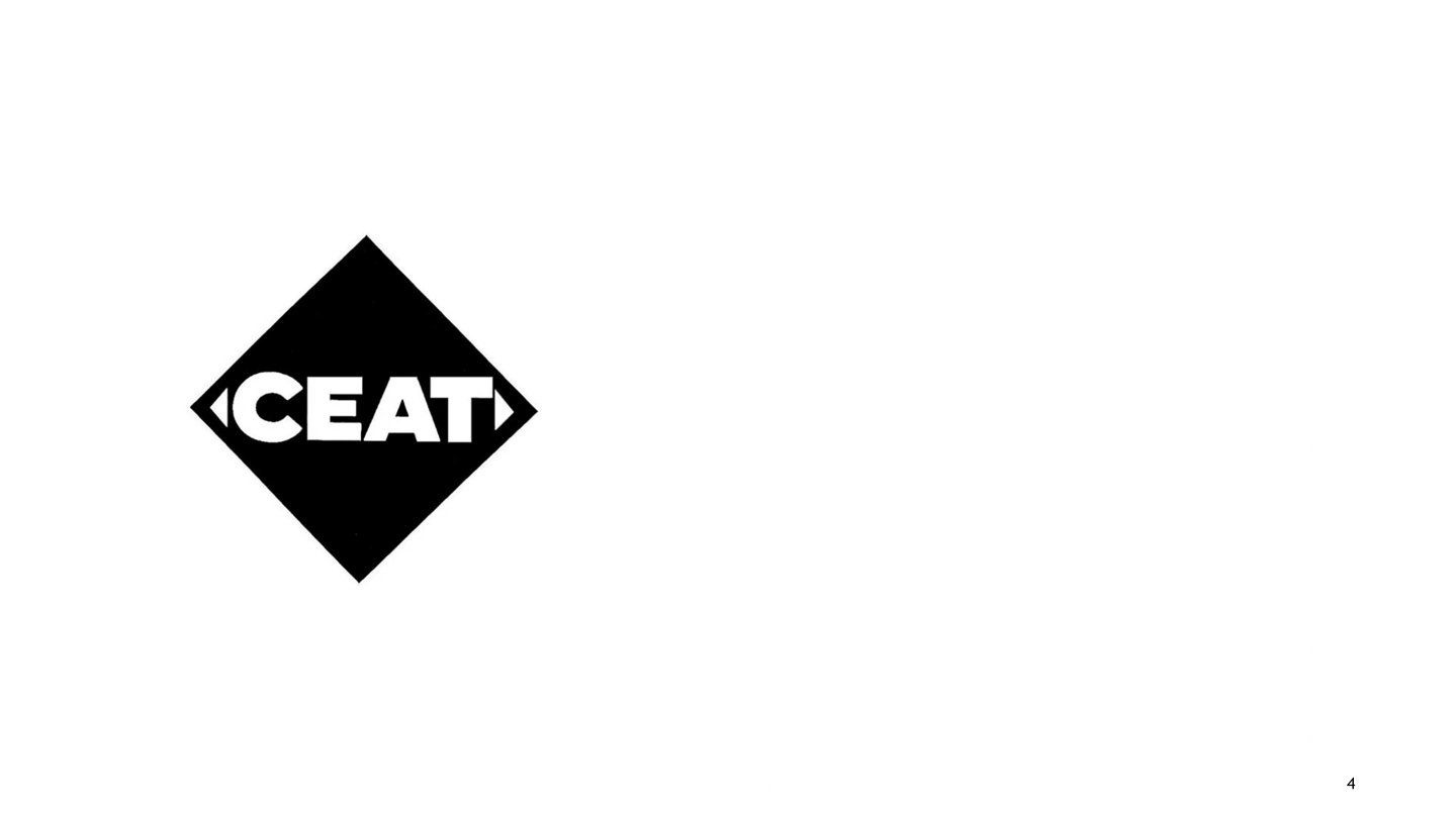
CEAT (company)
Description:
The simple rhombic shape showcasing CEAT was designed in 1983 by the late Prof. RK Joshi. The former form signified the performance, style, strength, and durability of CEAT tyres. The tagline Born Tough extended the significance of the logo further. The two triangles bracketing the word CEAT mark its exclusivity among tyre brands in the early 1980s, when CEAT emerged as one of its first kinds. The simple, bold letters of CEAT establish a premium position for the products on the market. CEAT now has a new logo with bold, more geometric characters and simplified lines, showing the changing perception of speed and mobility of tyres in the present era.
-
Title:
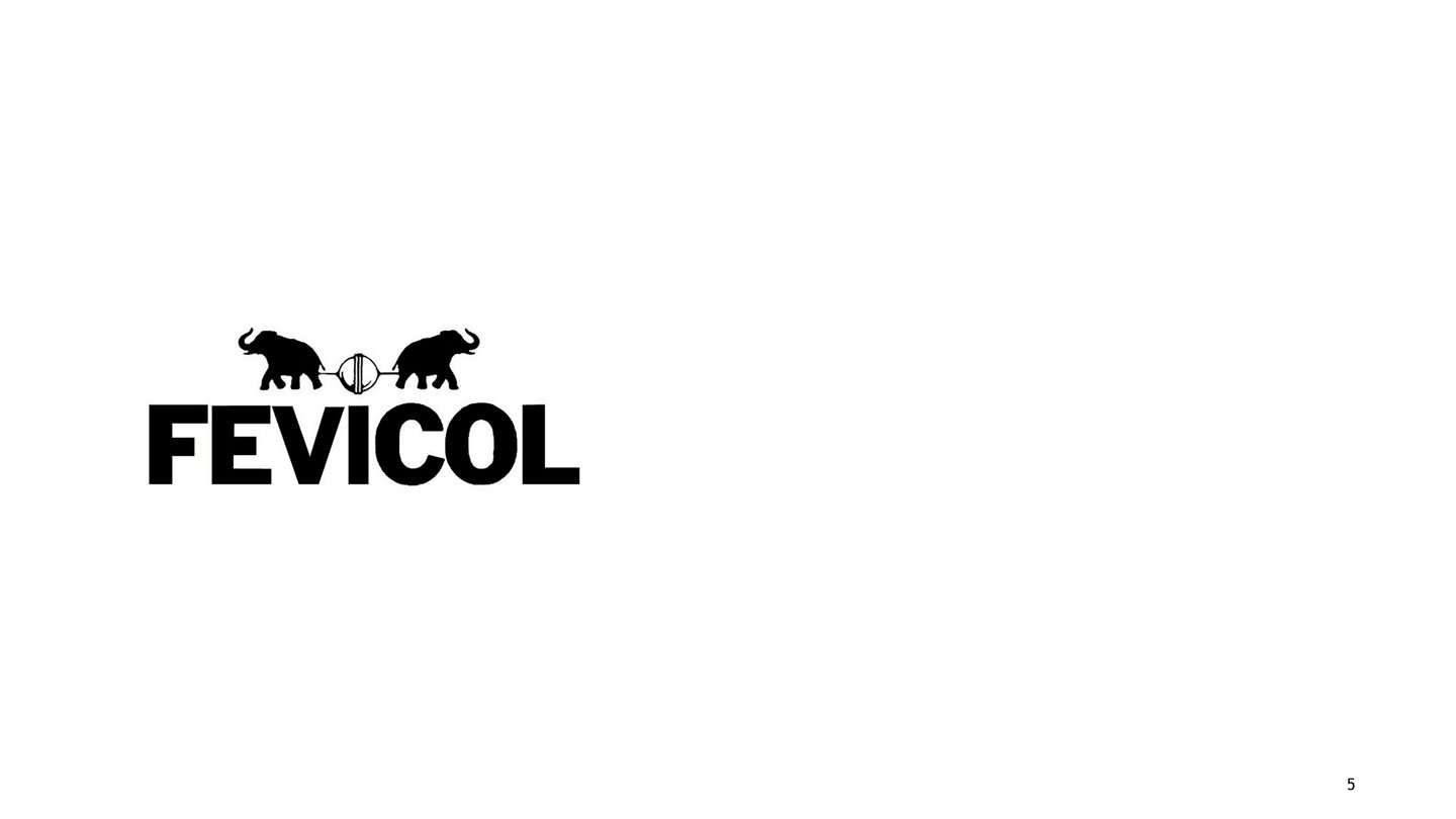
Fevicol
Description:
Since 1959, Fevicol has been producing consistent-quality adhesives. The breakthrough came in the 1970s with the launch of a 30 gm. collapsible tube for use by school students and other professionals. The brand concept of using elephants to try to break the fevicol bond (a tagline in the ever-creative ad commercials by O&M) retains the Indian way of creating humour and establishing the strength of product features. The concept of eternal bonding has created such strong equity for the brand that now people ask for Fevicol and not other adhesives. Similarly, the typography of the word Fevicol seamlessly bonds the letters together.
-

Title:
Hindustan Unilever
Description:
Hindustan Lever came into existence in 1956, launching the logo in the same year itself. The erstwhile logo signified stability and a robust image for the company. The use of bold typography in the letter 'H, having a foundation of the steady effect of an angular, growing leaf, has a strong recall with the added clue of the "Hindustan" word. The dark green colour of the logo leads to an evergreen appeal in the visual that has high recall value even in current times. With the new merger, the company became Hindustan Unilever Limited in June 2007. The new logo acquires a new visual treatment by using 25 icons inside the letter U. The idea of a single-letter identity has been reused, but with a new graphic treatment celebrating the concepts of 'versatility' and 'vitality' as the company's new brand image in the current times.
-

Title:
ICICI Bank, Bombay Branch
Description:
Founded in 1994, ICICI Bank and its services have been beautifully presented by he forms on the logo. The circular spiral represents the revolutionary effortsto create great investment banking, insurance, venture capital, and investment management schemes. The glory of the revolution has been depicted as an emerging flame of lines, moving upwards with the confidence of growing with the course of time, depicting the increasing reach of bank services not only in India but overseas.
-
Title:
India Post
Description:
The corporate logo of India Post was first launched on India Post Day, October 9, 1993. It represented speedy action and dynamism. The logo also shows skill and a good sense of aesthetics in the form of an appealing asymmetric balance in the form. The form is an envelope; the straight parallel lines with sharp angular ends represent the speed with which the postal India service transfers posts across the length and breadth of India. The colour Red signifies the depth of its reach in India. Red adds extra prominence to the speed concept of postal services, which the logo stands for.
-
Title:
Indian Airlines
Description:
Flying in the Air has been man's greatest wish and an obsession since theadvent of the aeroplane. The connection could also be seen in images ofwinged Gods, goddesses, and other mythological figures. In 1932, JRD Tatastarted the Indian Airlines, the national flag carrier airline of India. With 147 aircraft serving 95 destinations, Tata Airlines was rapidly developing its business. But initially, the Tata Tag itself served as a corporate symbol for the aircraft. The logo was developed after 1946 (World War II). The Typographic beauty with a simple sliding crossbar of the letter 'A'.
-

Title:
Airtel
Description:
The former logo symbolically shows a mobile phone. The screen depicts the word 'Air' connected to the red body presenting 'Tel' (the network that suits your 'Tel' – phone). To seal the unity of red with white, the red dot of the i' creates a perfect balance. The communication is direct and convincing. The alternating red and white bars led to it being popularly known as a flag logo in the advertising circuit. From a typographic point of view, a clean, upright, and confident character style adds to the simplicity and elegance of the logo.
-
Title:
Kissan Products
Description:
The logo effectively captures the ethos of the company and its products, applied harmoniously across the complete product range of Kissan. The quality of Kissan products has created a strong image for the brand. The logotype ‘Kissan’ exudes the same quality of superior product features that all its products provide. The letter ‘K’ represents the tongue and the palette (the two sensory organs giving us the ability to taste food). The action of applying Jam on toast has been the inspiration to churn out an iconic form of the curve, placed beneath the logotype to give it a formal balance.
-
Title:
Maruti Udyog Limited (now known as Maruti Suzuki Private Limited)
Description:
The logo was designed when Maruti Udyog Limited was launched in 1981. In 1983, the entry of MUL (Maruti Udyog Limited) revolutionised the car market scene in India. The Typographic symbol of the letter ‘M’ having the texture of tyres inside the form signifies Maruti’s traditional theme of providing good-quality cars with the latest technical aspects and durability. Briefly, the symbol communicated a ‘value for money’ feature of Maruti cars. Recently, Maruti has been trying to transform its old image of a small, compact car into one with a more aggressive appeal.
-

Title:
MindTree
Description:
Mindtree is an Indian multinational information technology company headquartered in Bangalore. It was founded on August 18, 1999. A youngster from Karnataka who has physical disabilities created the company's first logo. The bright colours red, yellow, and blue used in the MindTree logo make it particularly attention-grabbing. The graphic identity of MindTree embodies the DNA of the company: inspiration, activity, and joy. The blue upward sweep represents boundless invention. Action is represented.
-
Title:
Aakar: The Quest for Perfect form
Description:
This logo was designed for Aakar: The Quest for Perfect Form by Sudarshan Dheer.
-
Title:
AKSHAR ANKAN - Art Exhibition held in Sophia College of Art & Design
Description:
This logo was designed by Santosh B. Kshirsagar for the 'AKSHAR ANKAN: Art Exhibition’ logo held at the Sophia College of Art & Design, Mumbai.
-
Title:
Akanth Magazine identity (Publication)
Description:
This logo was designed by Achyut Palav for the Akanth Magazine identity (publication).
-
Title:
Assa Publications
Description:
This logo was designed by Santosh B. Kshirsagar for Assa Publications, Mumbai.
-
Title:
Bharat Woolen House (Textiles)
Description:
This logo was designed by Aay’s Advertising for Bharat Woolen House (Textiles).
-
Title:
Dharakul Magazine
Description:
This logo was designed by Ravimukul for Identity for Dharakul Magazine, "Bharat Vishesh Prakaashan", Mumbai.
-
Title:
Indira Gandhi National Centre for Arts, New Delhi
Description:
This logo was designed by R.K. Joshi for the event ‘Akshra’ at Indira Gandhi National Centre for Arts, New Delhi.
-

Title:
Nehru Centre Art Gallery, Mumbai
Description:
This logo was designed by Santosh B. Kshirsagar for the Nehru Centre Art Gallery, Mumbai.
-

Title:
Resha Graphic Designers
Description:
This logo was designed by Shishupal Panke for Resha Graphic Designers.
-
Title:
Saarth Prakaashan (Publishing)
Description:
This logo was designed by Ravimukul for Saarth Prakaashan (Publishing).
-
Title:
Shabdvel Prakaashan (Publishing)
Description:
This logo was designed by Ravimukul for Shabdvel Prakaashan (Publishing).
-
Title:
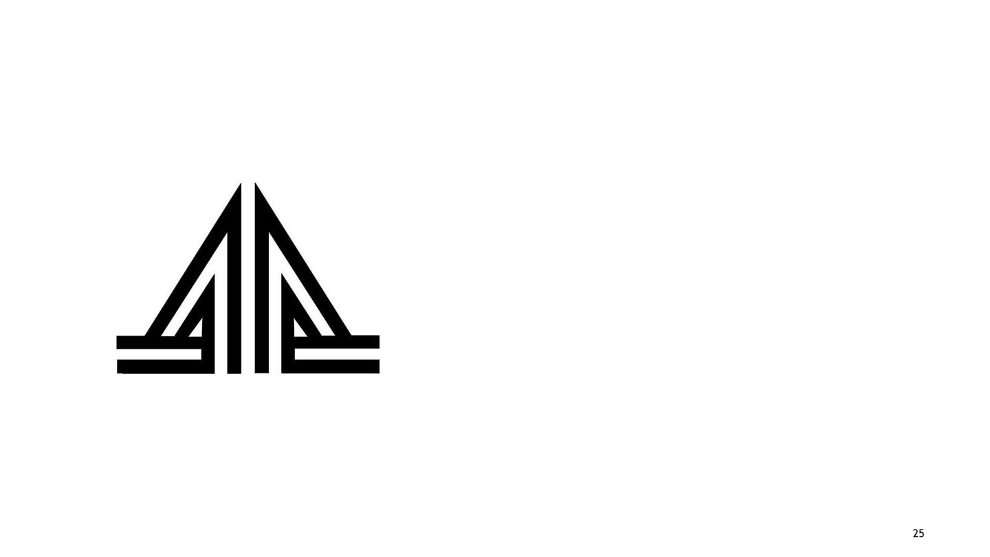
Airport Authority of India
Description:
Designed in early 1990s, the logo for Airport Authority of India has a symbolic graphic depiction. The use of triangular form and the wings of an airplane together as a form instantly makes connections with airports. The upward accent of the triangle depicts the vision of AAI. The vision being to upgrade, develop, maintain, manage civil aviation in India.
-
Title:
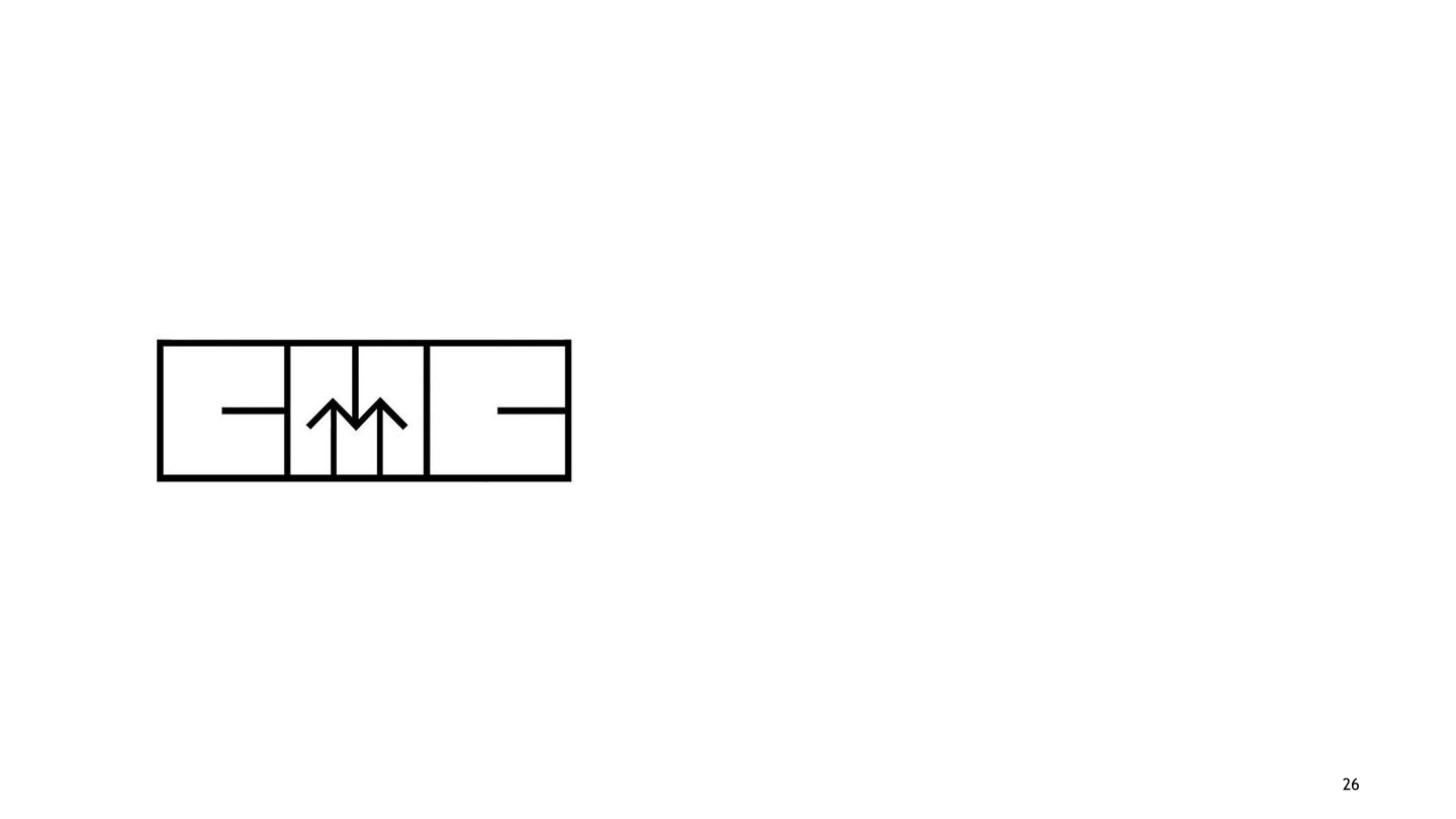
Computer Maintenance Corporation (CMC)
Description:
The logo for the information technology, services and software company (now known as CMC Limited) was designed in 1975. The logo depicts the concept of integrated systems engineering as a unit. The geometric shapes forming letters C, M and C express the image of information technology, integrated services and modern engineering in a simple and effective way. The upward arrows creating the visibility of letter ‘M’ compliments the word ‘maintenance’. The geometric square used to create joined letterforms makes the logo a balanced, harmonious unit concept. The form is minimalistic, but at the same time follows the principle of ‘less is more’.
-
Title:
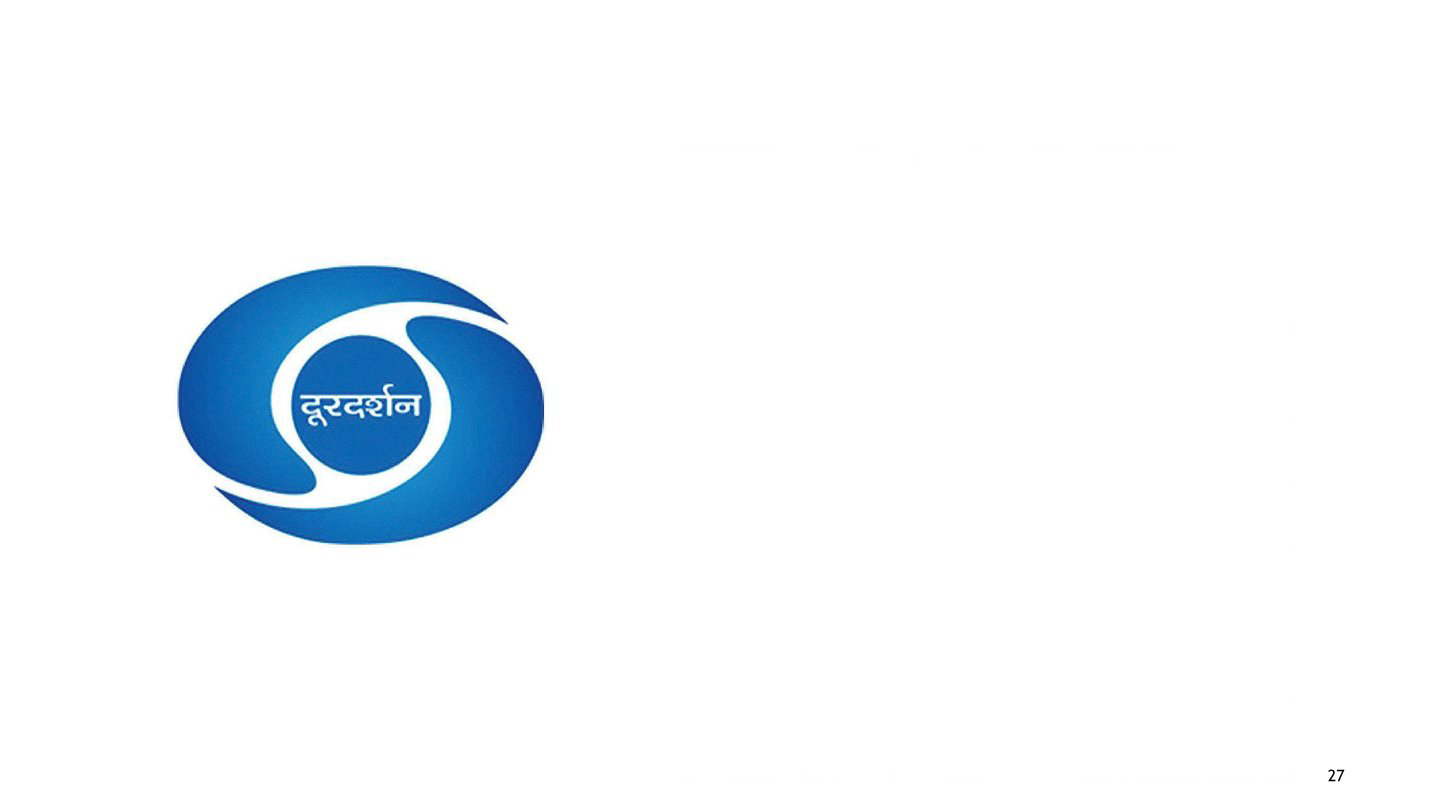
Doordarshan
Description:
Born on September 15, 1959, the logo celebrated the first launch of program broadcasting in India. It is believed that around 180 TV sets were sold in 1959 (the year when television came to India). The design emerged from the hands of a visual communication student at NID, as part of a classroom exercise to create logos. Doordarshan was considered one of the largest broadcasting organizations in the world in terms of studios and transmission development. The classic form elucidates the identity that stands firmly till date.
-
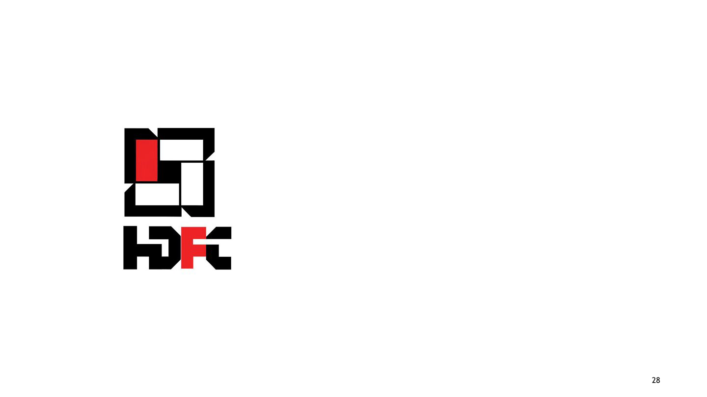
Title:
HDFC
Description:
The characteristic logo for Housing Development Finance Corporation Limited came into being in 1977, with the company’s aim being to provide long-term financial loans for home ownership. The geometric design of the logo in simple colours of black, white, and red makes it strong as a symbol. The letters H.D.F.C., also following the same geometric style and placed below the logo, unify the concept of housing loans. Security, preservation, and trust are the words that come to mind while viewing the logo. It also captures the objective of HDFC as a professional service that provides support to the people of India with integrity.
-
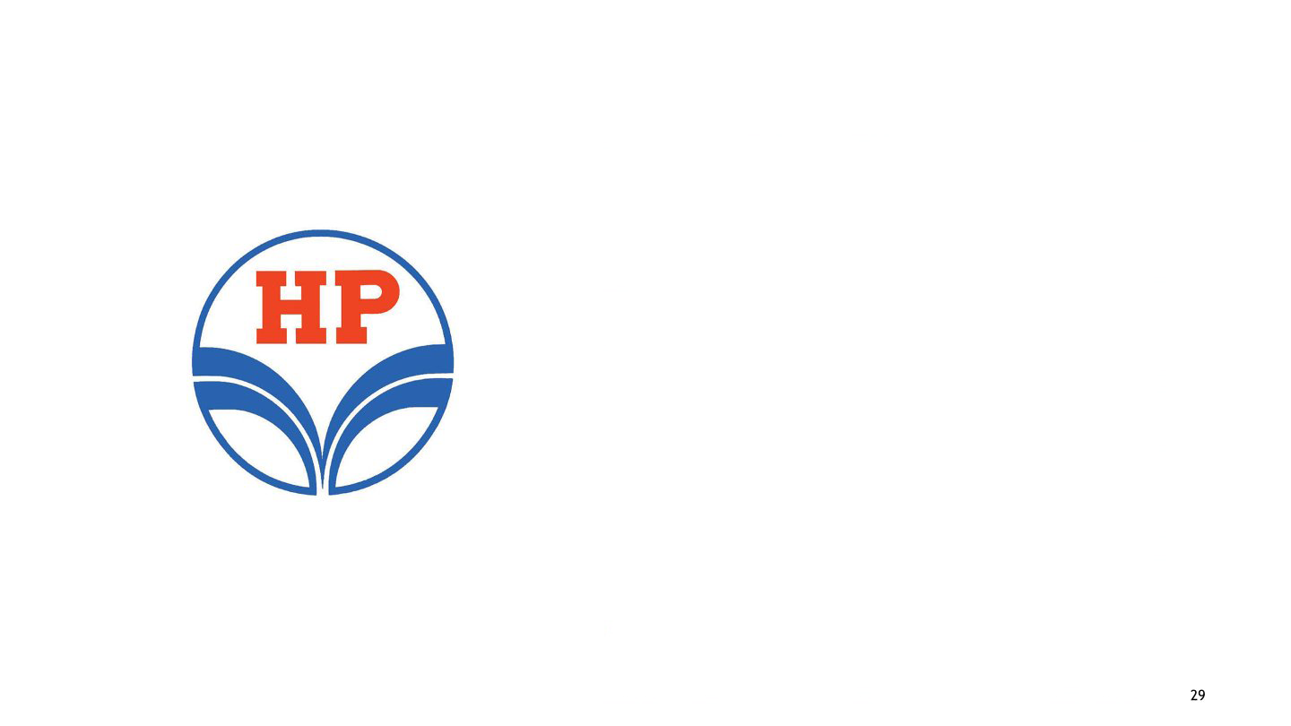
Title:
Hindustan Petroleum
Description:
Designed in 1974, the logo for Hindustan Petroleum Corporation Limited (HPCL) celebrates the "Club HP" concept, i.e., High-quality personalised "Vehicle and Consumer Care". The slogan Future full of energy complements the design of curved lines joining together like a stream of energy fuel being poured into the vehicle. The visual forms connect with the concept instantly. Additionally, the use of Red for the bold initials HP with blue circles and lines provides a clear combination and reasonable contrast between letters and shape, giving the logo a marked elegance. The symmetry makes the form balanced and simple.
-
Title:
Welcome Group, ITC Hotels
Description:
The design was a mark of the extension of ITC to hotels in the 1970s. Surrounding the theme of ‘truly Indian’, ITC gave the name Welcome Group to its chain of hotels. The letter W beautifully envisages the ethos of Namaste (the Indian traditional gesture of expressing welcome). Conceptually, the form elucidates a universal form to accommodate India that unifies different cultures and religions as one whole.
-
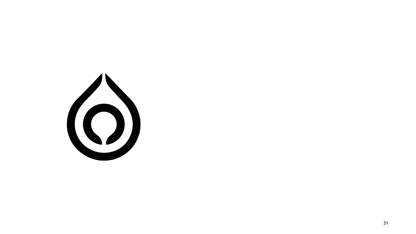
Title:
Operation Flood Symbol for National Dairy Development Board (NDDB)
Description:
The drop logo symbolises the Operation Flood movement started by Verghese Kurien for the National Dairy Development Board (NDDB). The White Revolution changed the face of dairy functioning in India, giving livelihoods to thousands of milkmen in Anand. The timeless simplicity of the drop signifies the value of milk and its sustenance by and for the people of India, making India the largest producer of milk in the world.
-
Title:
Punjab National Bank (PNB)
Description:
Designed in 1984, the design with the letter captures the ethos of the letter in Gurmukhi to conceptually complement Punjab National Bank (PNB). The orange colour also complements the Indian ethos and traditional image. The Gurmukhi letterform enclosing a circle complements the identity of PNB as a nationalised bank (a system of the bank under the control of the government).
-
Title:
SBI
Description:
The logo for the State Bank of India, India’s largest commercial bank, was designed on October 1, 1971. As an initial response to the circle form with an open hole, it looks like a keyhole. But the real concept behind the design is that the circle encloses a common man at its centre. The common man represents the centre of the bank’s business. The circle signifies the service of trust, security, and perfection for the common man. Moreover, the slogans With you all the way and The banker to every Indian support the idea of serving the common man as the epicentre of its activities. This logo is a unique example of how to create the quality of a concept with the most basic geometric form of design, i.e., the circle.
-
Title:
Steel Authority of India Limited (SAIL)
Description:
The logo for the largest integrated Steel and Iron producer, SAIL, was designed in 1973. SAIL has laid a sound infrastructure for the industrial development of the country with its integrated steel plants. The symbol using the triangular form with an upward direction indicates the growth and development of the steel industry. The solid rhombus enclosed within the triangle seems to agree with the fact that SAIL stands to infuse high-level technical and managerial expertise.
-
Title:
TITAN
Description:
The logo was designed in 1987 as a joint venture between Tata Group and Tamil Nadu Industrial Development Corporation (TIDCO) to form TITAN Industries. Titan exports watches, accessories, and jewellery in both modern and traditional styles. The most attractive aspect of the logo is the play with the letter ‘T,' creating a circular halo around it. The form reminds the watch dial and the internal parts of its machinery. Simple and elegant in form, the logo beautifully elucidates the traditional ethos and modern identity of Titan products.
-
Title:
Trade Fair Authority of India
Description:
Trade Fair Authority of India (now called ITPO – India Trade Promotion Organisation), Designer: Benoy Sarkar, NID: The logo was designed in 1974, when the government of India initiated work in the area of external trade. The logo has an interesting depiction of the letters T and F. Thetone is a fusion of the preservation of traditions of Trade and investments with the modern identity of ITPO. The logo has a universal form. It signifies the authority of India in exercising trade through fairs and exhibitions in India and abroad.
-
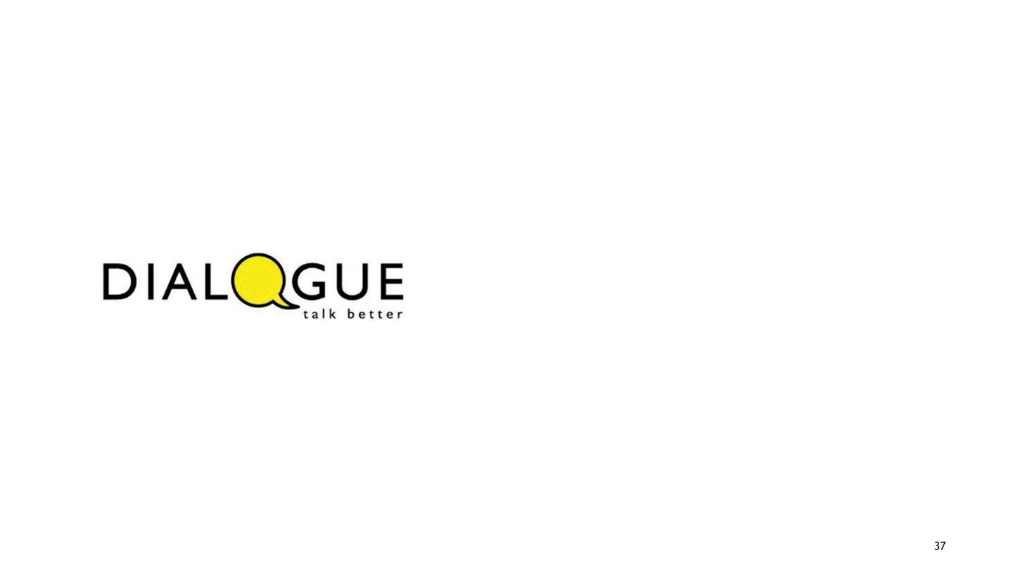
Title:
Dialogue
Description:
A Communication and Personality Development Outfit, ‘Dialogue’ as the name suggests ‘Talk Better’ (that is also the main tagline of the logotype). The speech blurb (‘O’ in the name identity) opens up a conversation channel for effective and easy interaction. The yellow of the speech blurb brings in a kind of ‘youthful freshness’ as well as an urgency to establish dialogue between the service providers and the clients.
-
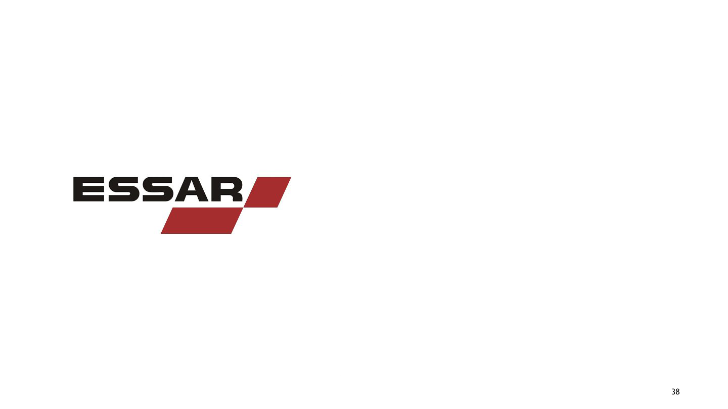
Title:
ESSAR Group of Companies
Description:
Way back in the 1960s, the Essar Group’s logo type and mark firmly established the group’s philosophy of growing with an innovative approach in the areas of service businesses, annuities, and commodity investments. The Uppercase used to depict the ESSAR logotype gives strength and impact to its image as a global entrepreneur – a diversified business corporation with a balanced portfolio of assets in the manufacturing and services sectors of Steel, Oil and Gas, Power, Communications, Shipping ports and logistics, and Construction. The Gripu is active in seizing opportunities to expand their reach. Hence, the joined horizontal bars in intense red elaborate the reach and efficiency factor of the group.
-
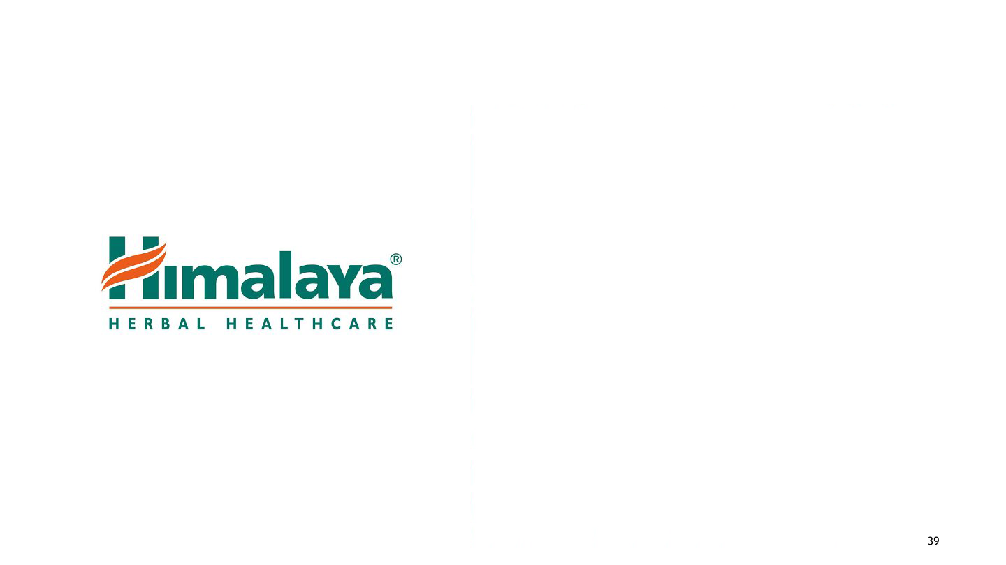
Title:
Himalaya
Description:
Established in 1934, the Himalaya Drug Company is well known for its wide range of herbal therapeutic and personal care products. The makeover logo design revolved around the three-tier concept of tying all brand touchpoints together, from packaging to marketing, collateral, retail, and web presence. The orange cross-bar leaf form of the capital ‘H’ of the name identity presents the trustworthy, pure, and Indian inception of the herbal and personal products. The orange and green bring fervour and healing power from natural resources, along with various brand touch-points. The simple and clean typeface unifies with the said inception and produces a very legible, convincing, and positive logotype (with an almost universal appeal visually).
-
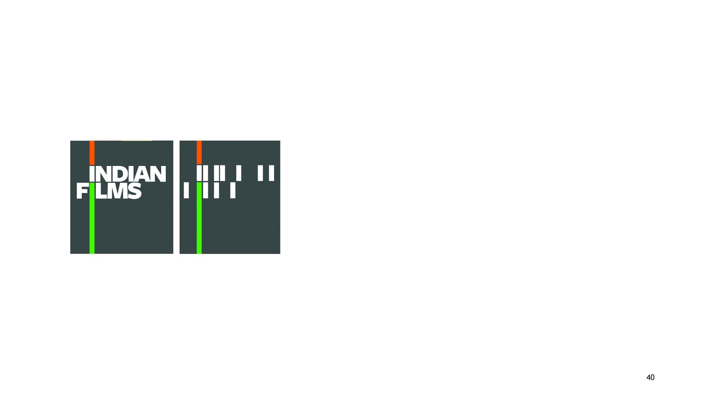
Title:
Indian Films
Description:
Indian Films is the first publicly traded film company, with the main objective of investing in Indian films made primarily for the Indian audience. The expression given to ‘I’ in the name symbolically represents the tricolour mark of India (its heritage and philosophy). The vertical ascending and descending extensions in the saffron and green hues of the tricolour, with the white sitting comfortably between the two bands, create a subtle feel of a 'moving reel’. There’s a moving symphony, movement, dynamism, and framed stories that define the Indian Cinemascope. The other letterforms in white alone are lending themselves to the movement of the Cinemascope (though they are visually individual entities in being away from the tricolour string). The fluid identity is almost a tailor-made solution to signify Indian films.
-
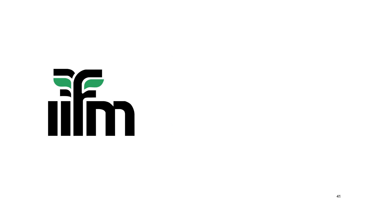
Title:
Indian Institute of Forest Management
Description:
The institute is a sectoral management institute that endeavours to evolve knowledge useful for managers in the areas of Forest, environment, natural resource management, and allied sectors. Symbolically, the green leaves emerging from the letterform ‘f’ of the name identity present natural resources, their preservation, environment-related activities, etc. The logotype is simple, balanced, and harmonious in terms of almost uniform letter spaces. This project portrays a strong management system that is highly integrated and has flourishing aims to facilitate effective forest and natural resource management.
-
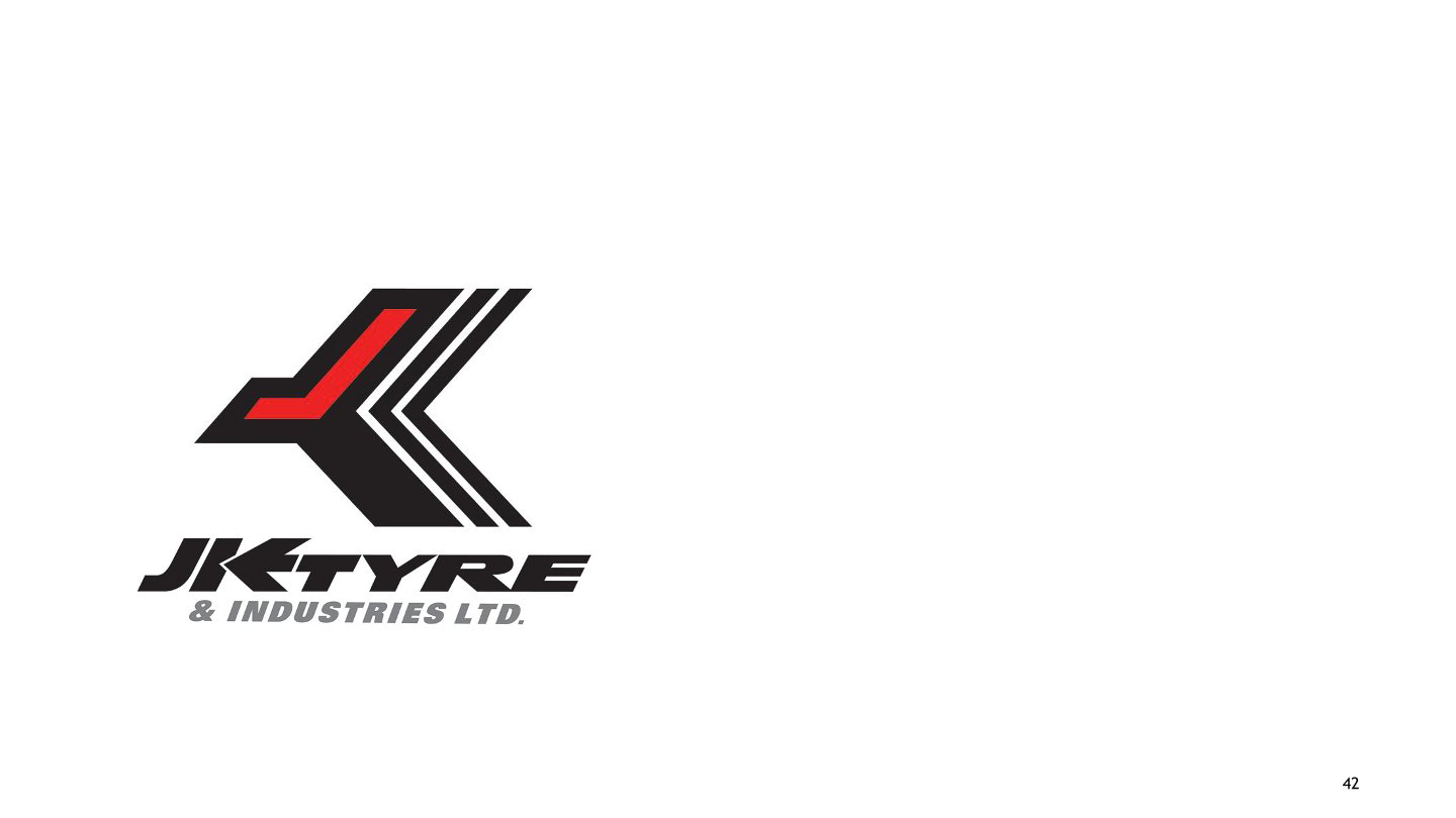
Title:
J.K. Tyres
Description:
A pioneer in radials for cars in India, JK Tyres logo was designed way back in the early 1970s. It is now an established No. 1 tyre brand in India. It provides radials of supreme quality for Trucks and Buses, LCVs, cars, and farms. This function is depicted in the symbolic shape of a small unit of the tyre texture (generally seen as cut zig-zag divisions inside a tyre) representing the part-whole image of ‘Radials’. The speedy, swift, and smoothly flowing uppercase letterforms in an extra black weight further reaffirm the durability, longevity, quality performance, and loyalty of the radials for their buyers, users/customers.The use of black and red provides the connotations of "ruggedness" and "masculine power" that are very much associated with automobile parts, especially tyres.
-
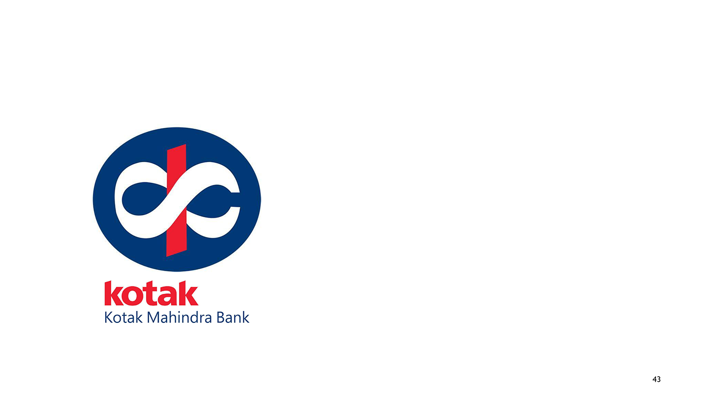
Title:
Kotak Mahindra Finance Limited
Description:
Kotak Mahindra Finance Limited, established in 1984, is India’s most renowned financial bank. Their state-of-the-art service includes individual and group deals, mutual funds, investments, Life insurance, etc. In its revamp around 2010, Kotak concentrated on making itself among the emerging breed of global Indians. The affluence yet the traditional values and trust that the new logo monogram envisages for the urban audience projects made the brand strong, comprehensive, and widely acceptable. The Devanagari ‘Ka’ – has the knot of ‘ka’ around the strong red stem. This unit within the strong dark blue circle projects superiority, victory, a strong foundation, and stability.
-

Title:
Photoquip India Limited
Description:
Photoquip established itself in 1976 as a premier photography studio that manually processed and printed photographs. The logo uses an extra-light, uppercase style, giving the brand image the required contemporary and universal look. The suggestive use of the red-coloured tail of Q—making a white (reversed) shape inside the solid circular body – connotes the sound of shutter clicking, the sight of photo prints sliding out of the printing machine, other equipment and their applications, etc. The illusion within the letterform is symbolic of cutting-edge products and photographic solutions for the respective fraternity.
-
Title:
Tata Group of Industries
Description:
Founded by Jamsetji Tata in 1868, Tata’s early years were inspired by the spirit of nationalism. It has shined in several industries of national significance in India, from steel to power to hospitality and airlines. Launched in 1999, the Tata Group logo monogram and the logotype together represent the new expanding face of Tata Group of Industries, a fountain of knowledge, or may be a tree of utmost trust, subsumed in the reversed out capital ‘T’ against the modern and energetic blue colour of the ellipse. From a service-quality point of view, the logo image has advanced further in the 21st century, and the Tata marque has become a symbol of quality, reliability, and real value, not just in India but in other parts of the world too.
-
Title:
Tanishq
Description:
Launched in 1994, Tanishq is now a leading jewellery brand in India. It has India’s first and largest jewellery store, with 138 exclusive boutiques in 80 cities. The 'Tanishq’ word is a combination of Tata (Tamil Nadu) and Nishq (meaning a necklace of gold coins). Also, from ‘tan’ meaning ‘body’ and ‘Ishq’ which means ‘love, The mark of ‘T’ and the ravishing, luxurious, high-class, silky smooth, and shiny curvaceous letterforms depict a meaningful association with wealth (embedded in ‘nishq,' meaning gold coins).
-
Title:
Technova Associates
Description:
Since 1971, Technova has been a leader in the provision of total imaging solutions for the graphic communications industry. The use of the digitised letterforms and the pointed geometric structure and form of the main mark ‘T’ is symbolic of the provision of integrated solutions of high quality and efficiency. These integrated solutions are for the print, packaging, textile, engineering, signage, and photo industries. All incorporated in a bold letterform in red and a futuristic identity, urgency, and technically sound characters, the logotype presents the effective use of typeface, letter expressions, balance with variation in weights, proportion, and contrasting letter widths (separate for the mark and the letterforms in the logotype).
-
Title:
Vadilal
Description:
Designed in the 1970s, the logotype presents one of the most popular and top ice cream brands. The expression given to the letterform ‘D’ in the name identity – that of an ice-cream bar directly represents the brand’s identity. The slab serifs are expressive of the rounded, solid, and delicate wooden spoons that are generally given with ice cream cups. The visual language of the tilted bar connotes not only the product features and tastes of various brands; but what most comes to mind is the fragrant ambience in which one relishes a Vadilal’s ice cream to the best for invigorating taste buds with delicious ice creams of milk in different flavours.
-
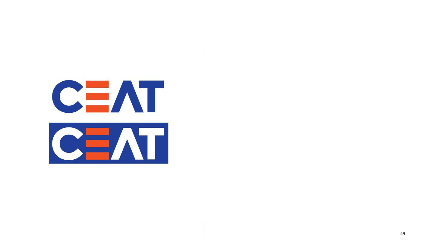
Title:
CEAT
Description:
A Bengaluru based Graphic Design studio With the change in the market image of CEAT from just being a marquee of strength and endurance in CEAT tyres to additional benefits of radials and tyres, the logo acquired a fresh look. The new logo represents the new concept of ‘Take it on’. Visually, the use of parallel lines to depict ‘E’ in CEAT connotes the tangible qualities of performance, sturdiness and durability of the new range of CEAT tyres and radials. The objective of using funky orange in E along with blue and white was to connect with the youth. The new look imbibes modernity and a dynamic freshness in the form.
-
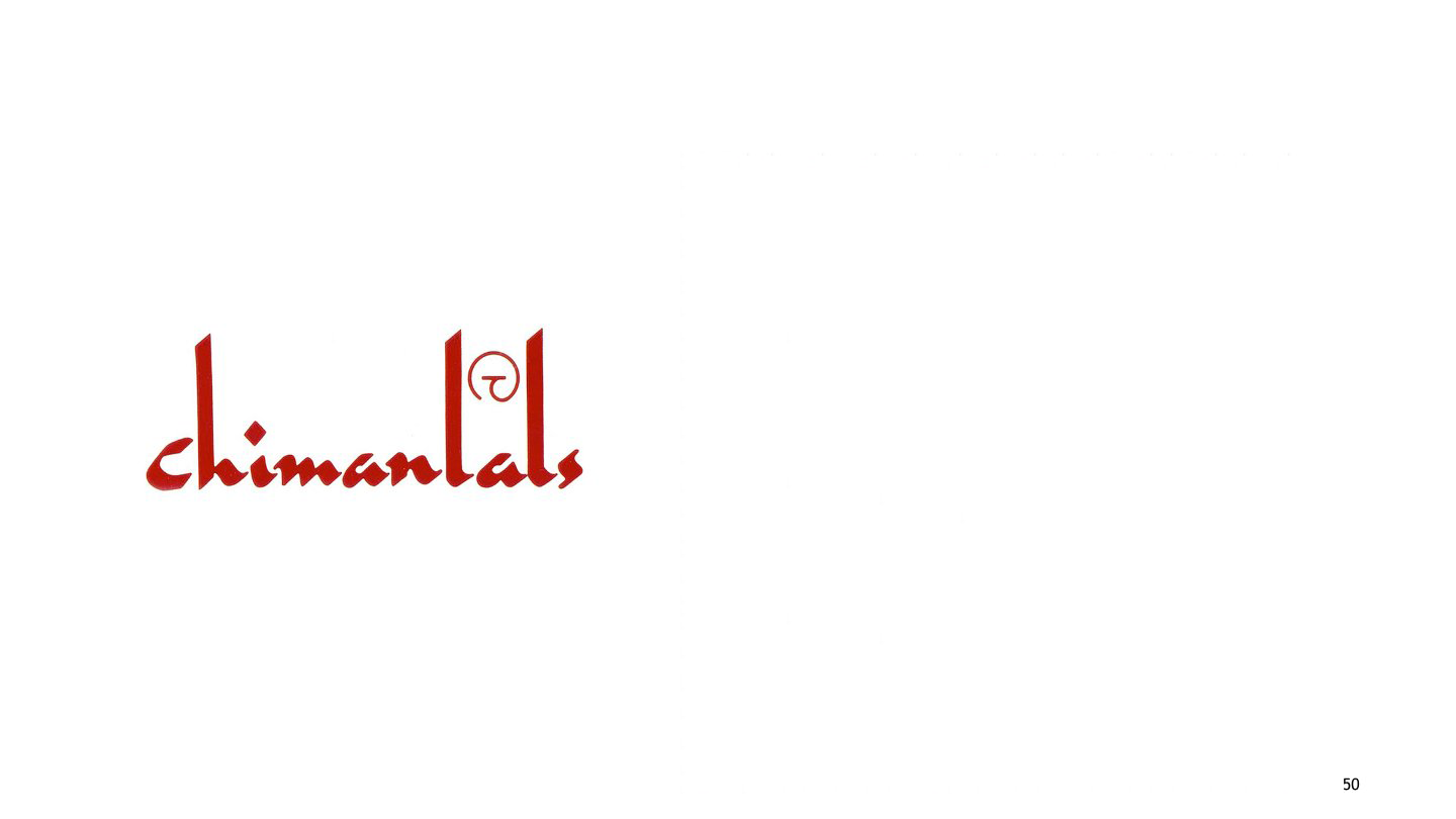
Title:
Chimanlals Pvt. Ltd.
Description:
Chimanlal’s has been one of the major companies bringing forth designed handmade papers for people for the last fifty years. Calligraphy, as considered by R.K. Joshi to be primarily an art that also becomes design, has been used most expressively to define ‘paper’ in an Indian context. The elongated stems of the letters "h" and "l" in the calligraphic identity present the continued practise of producing quality paper with great variety and aesthetics that beautifully becomes part of the everyday activities of using paper for decorations as ephemera.
-
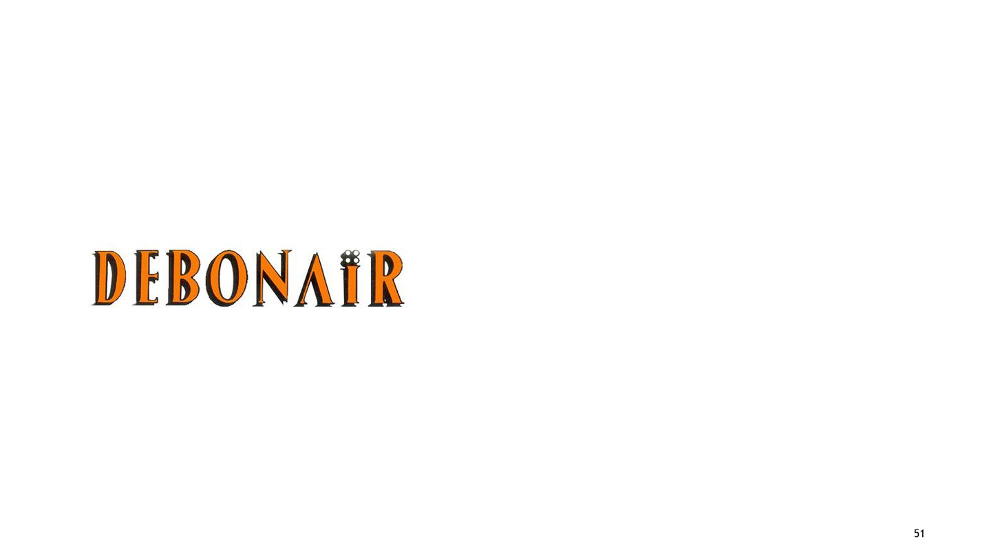
Title:
Debonair
Description:
Debonair magazine was started in India based on the design and concept of ‘The PlayBoy’ in US. This magazine for Indian men was given an image shift in 2005, when it was targeted more towards a younger audience. The customized type style used to depict the name ‘Debonair’ signifies a courteous, gracious gentleman with a sophisticated charm. The vertical stress given to the letters in the typography of Debonair exude sophisticated/elegant charm and poise. The four dots used above the letter ‘I’ looks chic and classy.
-
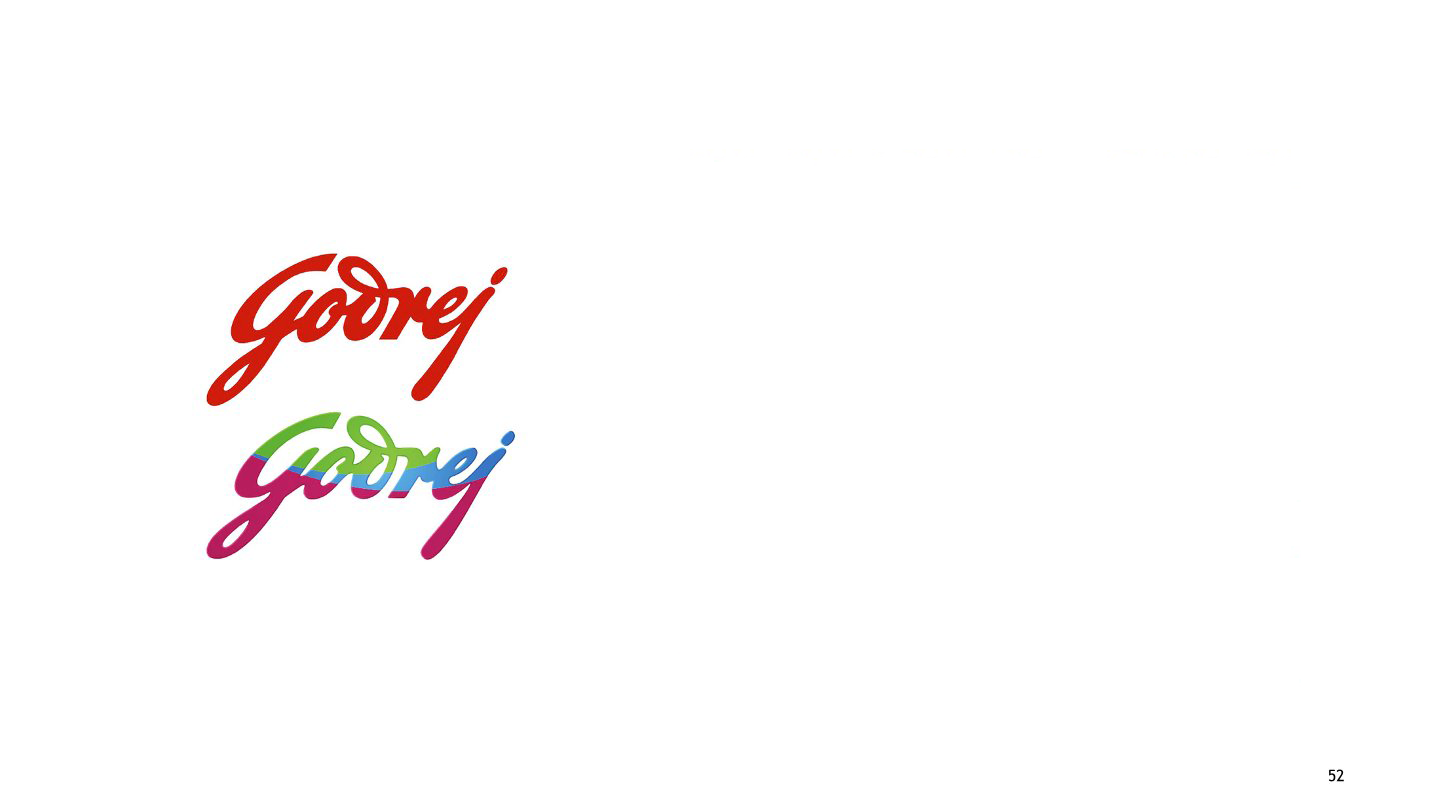
Title:
Godrej
Description:
Established in 1897 by Ardeshir Godrej, the logo has been there for 116 years. The logo has the signature of Mr. Ardeshir Godrej, Founder of Godrej. Initially, the colour for the logo was ‘blue,' but that changed to ‘red’. And in 2008, Interbrand, UK, suggested a three-colour pattern to fill the Godrej signature. The objective behind the colour use was to create a funky image in order to connect with the youth of India. However, looking from a design point of view, the calligraphic identity of Godrej reminds one of the trustworthy locks and cupboards of Godrej (the first product range of Godrej that helped establish the brand).
-

Title:
Incredible India
Description:
In 2004, the Ministry of Tourism in India initiated the glorious 'Incredible India' campaign with the main theme of 'Atithi Devo Bhava' (Guest is God); with an aim to create a sensitivity towards tourists visiting India and the stakeholders facilitating the development of tourism in India. The exclamation mark forms the 'I' of India. The exclamation used creatively across several visuals compliments the concept behind the word 'Incredible'.
-
Title:
Infosys
Description:
A Bengaluru-based Graphic Design studio The slogan "Driven by Values, powered by Intellect" refers to Infosys vision and identity. The logotype for Infosys uses the colour blue (Pantone 285 C). The characters of the customised identity indicate a visual alteration of the Lucid Sans typeface. Moreover, the joined letters provide the logo with a smooth, unified bonding of values that the company abides by and stands for (values of trust, quality, consistency in performance, and longevity that summarise their promise of "Building Tomorrow’s Enterprise").
-
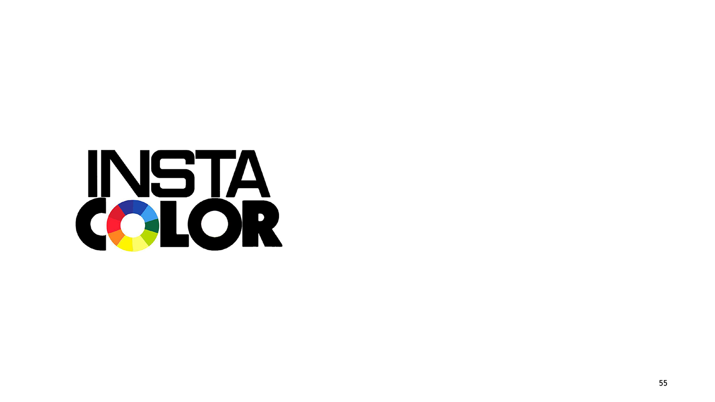
Title:
Insta Colour
Description:
The Insta Colour logo was designed in the mid-90s. The philosophy of Insta Colour involved the use of technology to customise painting solutions. The paints of Insta Colour played the role of persuading people to experience the individualistic pleasure of colour choice provided by a sound technical solution to adorn their houses and offices. This freedom to choose from the colour palette is symbolically signified in the colour wheel used to depict ‘O’ in the name INSTA COLOUR. The basic Vibgyor colour wheel marks the possibility of numerous colour mixing choices available for the customer. Equally, to signify the technical soundness and base of the paint products of the company, the choice of Eurostile typeface for the name.
-
Title:
JASRAS
Description:
The logo for India’s leading full digital service, pre-media, and printing firms, named JASRAS, was designed around 1974, with the launch of the company. The logo explores the geometric characteristics of letters in their simplicity, strong structural form, and rhythm. The dynamic rhythm is achieved by using stylized triangles to depict letters twice in the logo. The shape of A is a triangle based on Gestalt’s Law of Closure (the visual impetus given to the eyesight to complete forms by using open forms) created in a way that persuades visual closure in the mind’s eye.
-
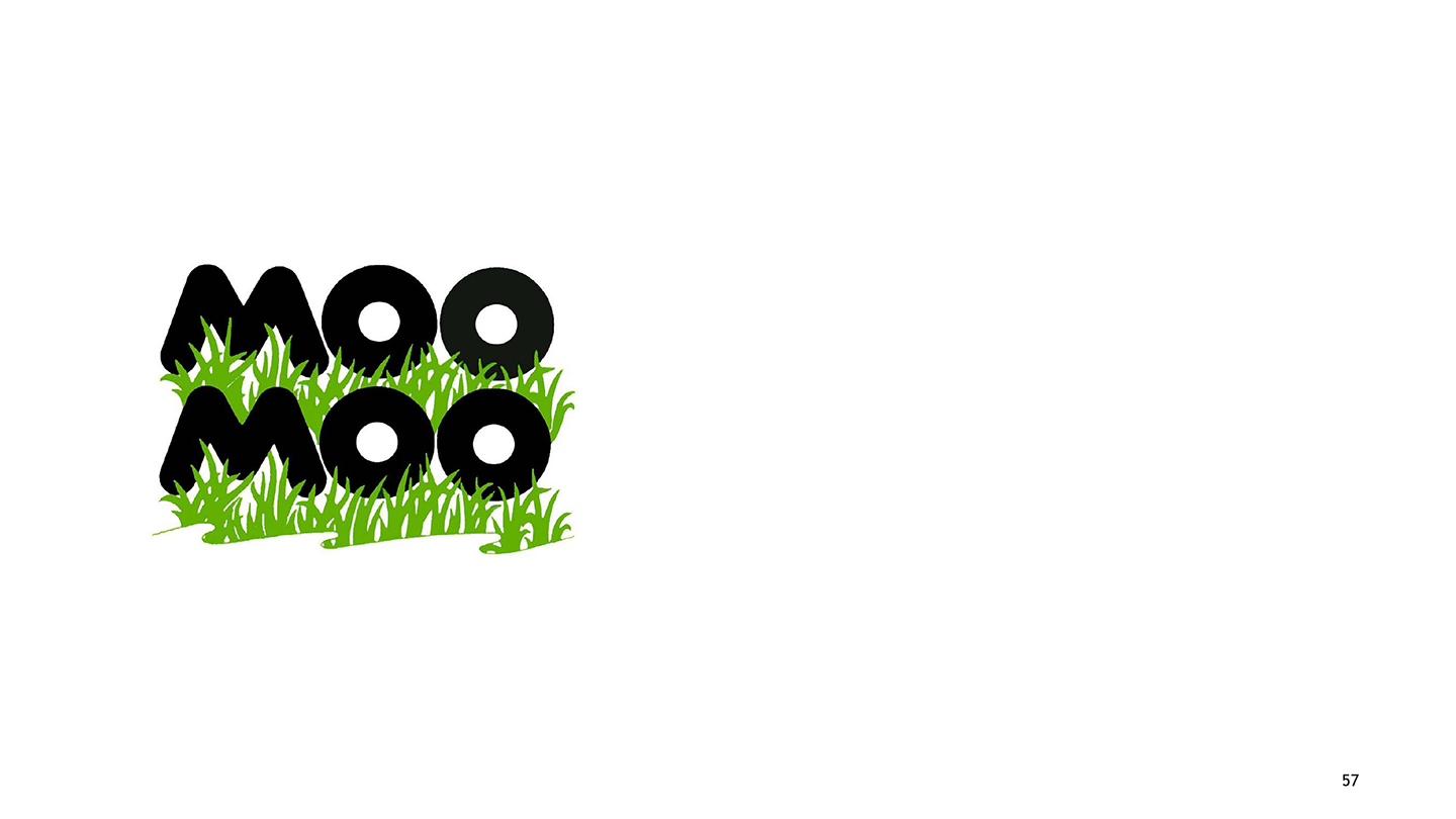
Title:
MOO MOO MILK PRODUCTS LIMITED
Description:
The use of bold uppercase letters for the name Moo Moo subtly hints at the cows with hefty build and big, bold, and black spots on their backs. The characters in black carry the same conspicuousness as a cow with black spots. The backdrop of lush green is the perfect base for the image of a cow in its natural surroundings. The connotations that perhaps emerge are that Moo Moo milk products have the purity of natural qualities, making them premium products under the Moo Moo milk brand.
-
Title:
Raymond
Description:
Raymond India Limited stands for trust, quality, and excellence in their products (apparel, furnishings, engineering of fabrics, and other personal care products). Established in 1925, the quality of Raymond elucidates different faces of The Complete Man, which could be expressively seen in the calligraphic yet stable visual forms of the letters. A Pseudo-blackletter appeal, the Raymond hand signature expresses the essence of "The Complete Man" beautifully.
-
Title:
CIRCLE
Description:
The ‘Complete Technology’ CIRCLE logo is a recent design by the PALASA design team in 2009. Circle, an IT and Computer peripheral brand, provides customers worldwide with the latest techno-savvy products. The simple, expressive orange circles in the two C’s of the word CIRCLE complete the meaningful identity of circle, i.e., providing complete solutions as an IT brand. The simple and modern font Futura in all Caps gives a clean, crisp, and modern appeal.
-
Title:
Jazz Yatra
Description:
The Americans discovered Jazz less than a century ago. The Jazz Yatra has been an event organised annually since the early 1970s to celebrate the spirit and new identity of Jazz in India. Jazz in India meant an interesting improvisation on the existing identity of Jazz. Not only was the aim to revive interest in Jazz, but to unify people to develop the identity of Jazz in India. Therefore, the logotype, using a simple type style with joined letters, very convincingly signifies the act of harmonious intervention for the celebration and preservation of the spirit of Jazz music in India.
-
Title:
Jio
Description:
The logo is an abstract representation of a banyan tree leading to the leaves of an open book. The banyan tree is symbolic to stability and knowledge. It was designed by the National Institute of Design.
-
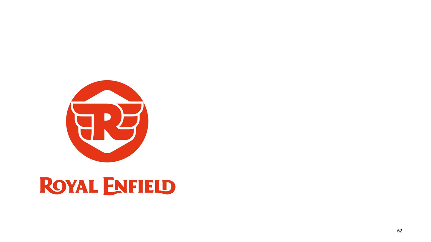
Title:
Royal Enfield
Description:
Royal Enfield, an Indian motorbike manufacturer, has British heritage. The wordmark, the crest, and the seal underwent a complete redesign in 2013–2014, which was the most recent development in the evolution of the Royal Enfield logo. The design of the new and ancient seals is based on a circle. The new design is more sophisticated than the previous one, which had a silvery "R" and "E" against a black background. The words "Royal Enfield since 1901" are ringed by a bubbly, winged "R", which serves as the pièce de résistance. These aren't simply wings, though; they stand in for a double "E". The wings have been used to symbolise "speed". The wing theme lacks a unique touch that could have made the Royal Enfield logo stand out among other "winged" emblems.
-
Title:
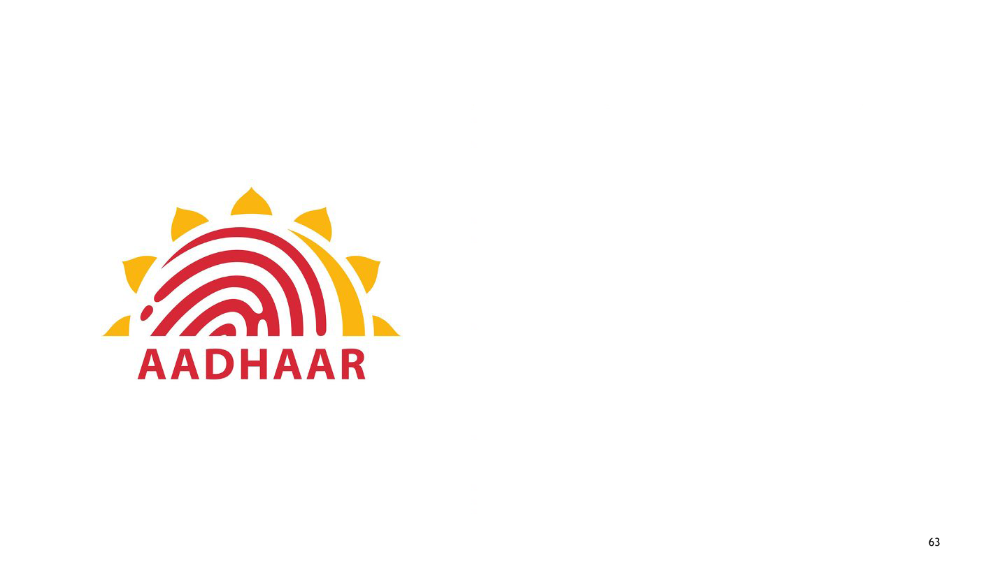
Aadhaar
Description:
The brand name for a unique identification number (UID) is Aadhaar. UID launched an all-India competition in 2010. The selected logo depicts a glorious sun image in red and yellow, with the sun’s nucleus depicted as a fingerprint in red. It symbolically depicts the dawn of a new identity for every individual, endowed with a unique number for each individual.
-
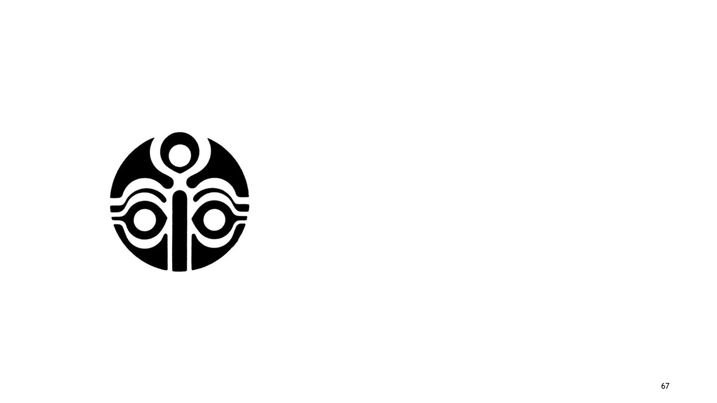
Title:
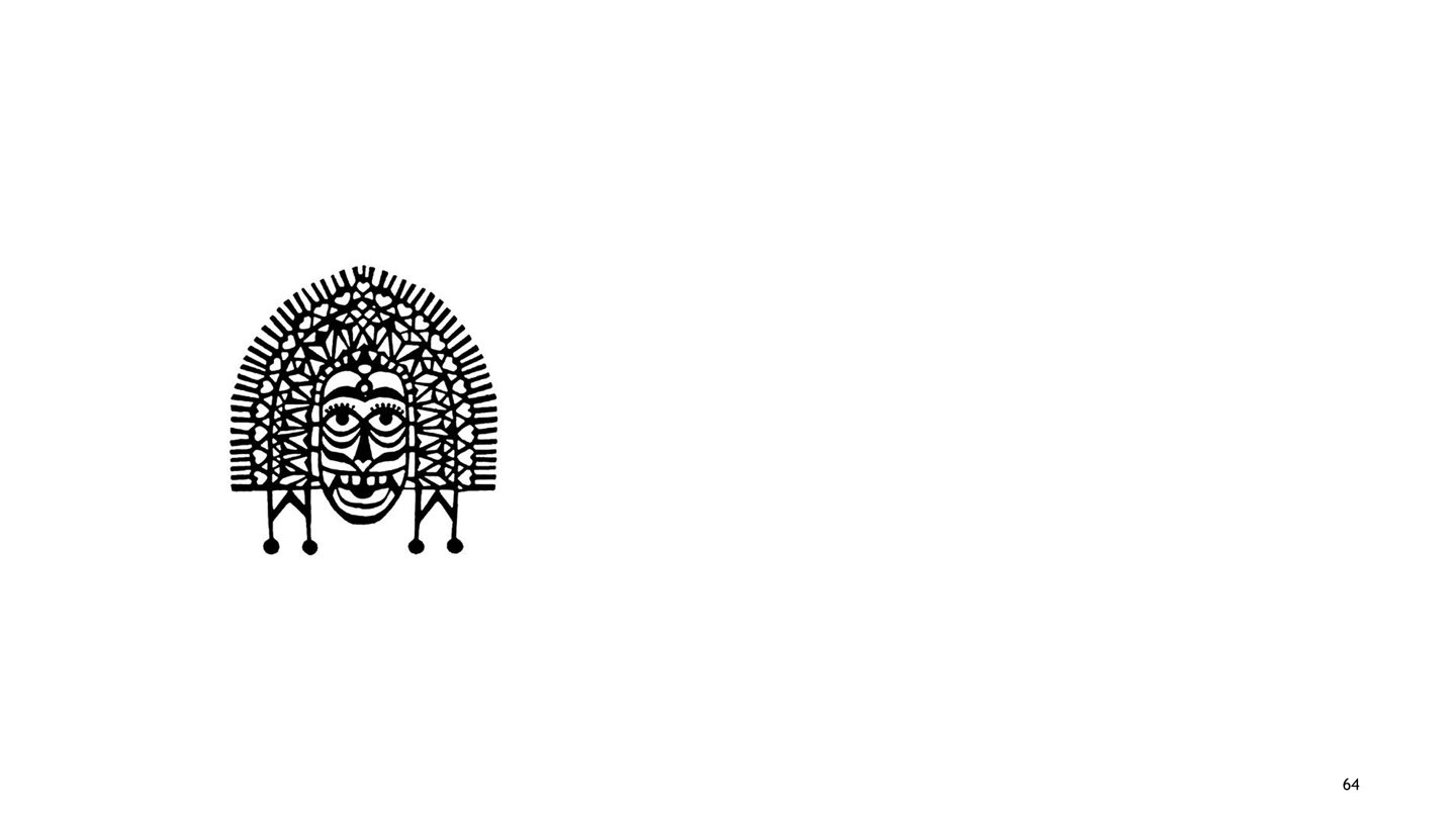
Adivasi week festival
Description:
Desilva Associates Popularly known as Adivasi Mela (Orissa State Level Annual Adivasi Exhibition), the event is an annual celebration of Tribal Art and Culture in Orissa. Started in the 1980s, the event went on for one week a year. The symbol for one such annual festival depicts Orissa’s Tribal mask. The depiction of big eyes with an evil smile, along with the intricately patterned Crown of the mask, is a direct signifier of Indian Tribal Art.
-
Title:
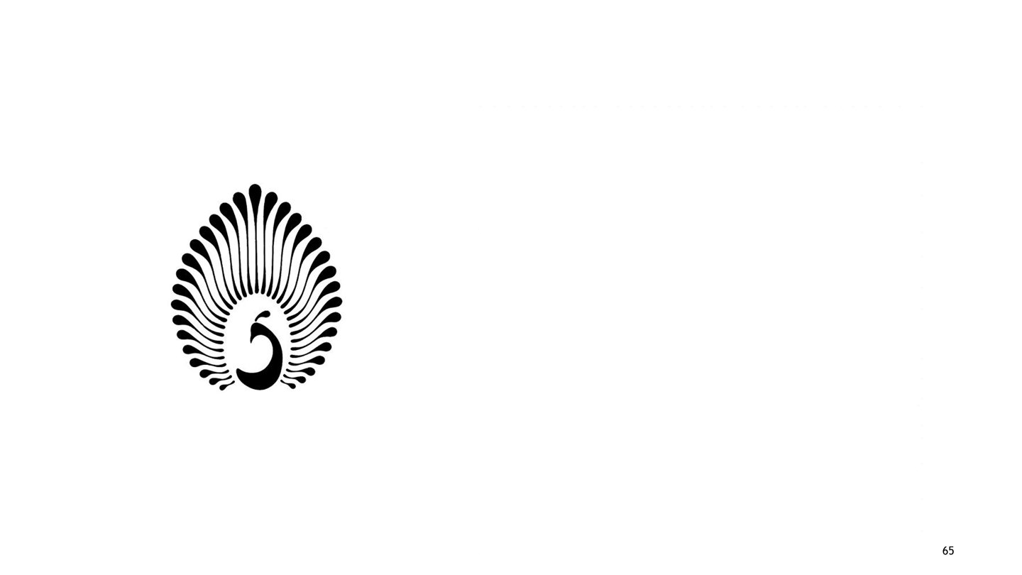
Festival of India Committee
Description:
The Festival of India Committee is a national body that aims to organise annual festive events in different cities in India. It also organises the annual ‘Festival of India’. The form of our national bird, the peacock, forms the central image of the logo. The graphic effect of fine, fluid lines for its wings depicts the vibrant, flourishing image of the Festival of India Committee. Utilising the symbol of India’s national animal, the core Indianness has been impersonated in the logo.
-
Title:
Film and Television Institute of India
Description:
FTII is the premier film and television institute, established in 1960. The logo for the institute presents a simple letterform in Devanagari. The angular stroke to the turn and the vertical stem of the letter connote the impression of a rolled film strip. The angular stroke is repeated on the top right end of the Shiro-Rekha to provide visual balance to the composed letterform.
-
Title:
IDC Conference
Description:
This logo was designed by Yeshwant Chaudhary for the Communication Design Conference held at the Industrial Design Centre, IIT Bombay. This logo depicts the third eye.
-
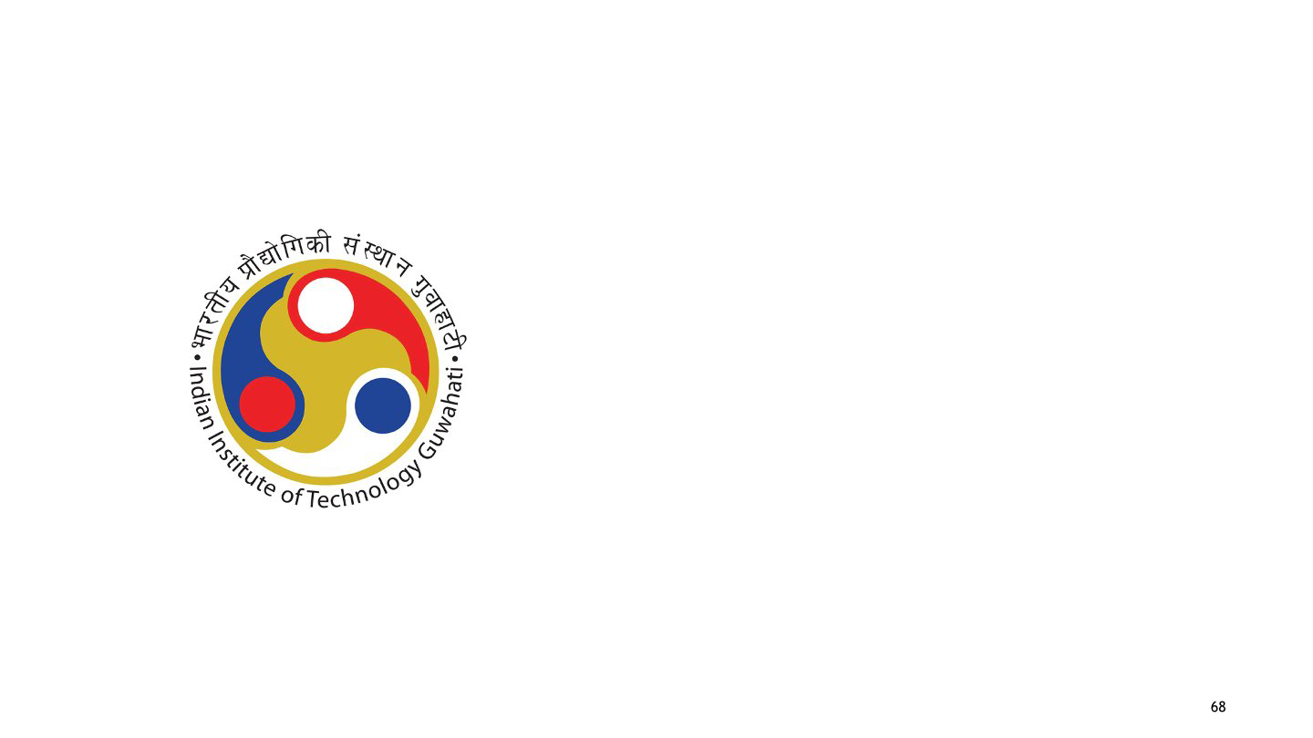
Title:
IIT Guwahati
Description:
The logo of IIT Guwahati is based on the concept of a sound connection between the mind, body, and soul. The concept underlines the deep philosophy of cosmic beliefs in the field of Yoga (a philosophy practised in India since Vedic times). The triad of sound training and education creates a unified assimilation of true Indian values in education. The colour palette used in this logo is red, blue, and yellow, which represent power, peace, and perseverance.
-
Title:
Indian Telephone Industry (ITI)
Description:
Though established in 1948, the logo for ITI was designed in 1971, with the first ever Indian Telephone Industries plant established in Naini (Uttar Pradesh) as a manufacturer of transmission equipment like telephonic instruments, related fibres, etc. The use of Devanagri letterform in a graphic treatment that creates the form of a telephone, along with equally bold letters ITI with deliberate angular endings, signify cutting-edge technology in making fibre and telephonic products as part of transmission equipment.
-
Title:
Mahavir Hospital
Description:
A public charitable trust now developed as an extension of the hospital, now called Shree Mahavir Health and Medical Relief Society, was established in South Gujarat in 1979. The metaphor of ‘fire’ has been inserted into the medical symbol of the plus sign. The red sign is symbolic of the medical profession. The flaming growth is shown emerging from the sign in order to communicate the development of quality healthcare services and facilities for patients.
-
Title:
Maurya Hotels
Description:
With the ITC group of Hotels diversifying through its several chains in the 1970s, one such chain, namely the Maurya group of ITC, gave Delhi a strong visual identity. The logo designed by the late R.K. Joshi depicts an arched form, signifying a warm, homely welcome and hospitality for the visitors. The colour ‘green’, a convincing choice of an earthly hue, marks the logo with vitality, comfort, peace, and closeness that we experience at our homes. The depiction of a circular suspended form in the centre part of the logo reminds the welcome symbols used at the doors of Indian homes.
-
Title:
National Integration Council (NIC)
Description:
The objectives of the National Integration Council (since 1961), a body under the Ministry of Home, aim to find path-breaking ways to tackle social issues and biases like regionalism, casteism, etc. The logo is iconic, depicting people joining hands to integrate and assimilate ideas. The efforts aim to propagate a secular, equal, and strong socio-economic and political fraternity in India. These values add more visual essence to the symbolic use of the national tri-colour palette of India’s flag.
-
Title:
Yoga Tirtha Academy
Description:
Yoga Tritha Academy is the oldest Yoga centre in India, established in the early 1970s. The logo depicts the philosophy of collective concentration (dhyan in Hindi) that unites mind, body, and soul. Based on deep Indian philosophy and the science of yoga, the logo stands for Indianness – its identity and values.
-
Title:
Young Presidents’ Organization
Description:
The Young Presidents’ Organisation is a premier network of new leaders in the global scene of business and entrepreneurship. This logo was created on the occasion of a world conference organised by the network in Goa in 1994. The logo signifies the concept as elaborated in the punch line "Doors of Perception" written below the logo. It depicts a banana tree, with the roots going down and firmly associating with the ground. The expression connotes affirmation, reliability, and values like sustained consistency in quality and growth.
-
Title:
Amul Milk
Description:
This logo was designed for Gujarat Cooperative Milk Marketing Federation Ltd. (GCMMF) in the late 1940s by Yeshwant Chaudhary. The philosophy behind the brand name 'Amul', meaning ‘Amoolya’ (‘pure’ in Sanskrit), has been directly represented in the graphic treatment of the word milk as an image reminding of cow’s udders for extracting milk in its purest form. The connection creates a mark of quality associated with 'Amul Milk'. The logo was used on the packaging and other collateral distributed and managed by GCMMF at the timze.
-
Title:
Bureau of International Transportations
Description:
The logo for the Bureau of International Transportations represents BTS’ identity as a global transportation network that helps churn knowledge-based decisions for the easy flow of goods. The pointing arrow formed by the rhombus used for the logo connotes this efficient flow of goods, etc., to trade and transportation professionals, government bodies, etc. The lines inside the strokes of the rhombus depict the continuous generation of data produced and transmitted by BTS.
-
Title:
Commonwealth Games 2010
Description:
The logo for the Commonwealth Games 2010 celebrates the spirit of participation, contribution, competition, and persuasion towards sports on the platform of The Commonwealth Games are a multi-sport international event involving the participation of athletes from Commonwealth Nations (the first Commonwealth Games date back to 1930). The metamorphosis of bright yellow and orange rays into joyous human figures, escalating high in the spirit of celebrating international sports spirit and development, creates an attractive rhythm, full of positivity, vigour, and a forward-looking determination to share the joy of participation and union of different vibrant cultures, as signified by the use of multi-colour metamorphosed progression in the logo.
-
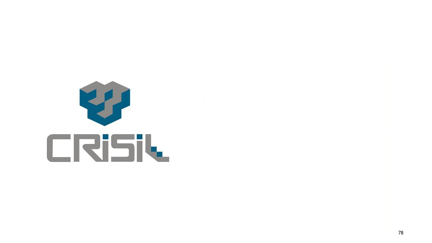
Title:
Crisil India Limited
Description:
Founded in 1987, Crisil India Limited is a research-based global analytical company providing risk and policy-free advisory services. The services help keep markets stable and more functional. The deep research about the investment scene in India, good investment ideas, etc. makes Crisil a credible and developing body that helps shape public policies in finance and investments. The shape of a step-by-step cubic structure signifies Crisil’s aims and role in the global market. The colours used to create an upward staircase illusion in the logo and name exude the mature image and consistent performance of the global company.
-
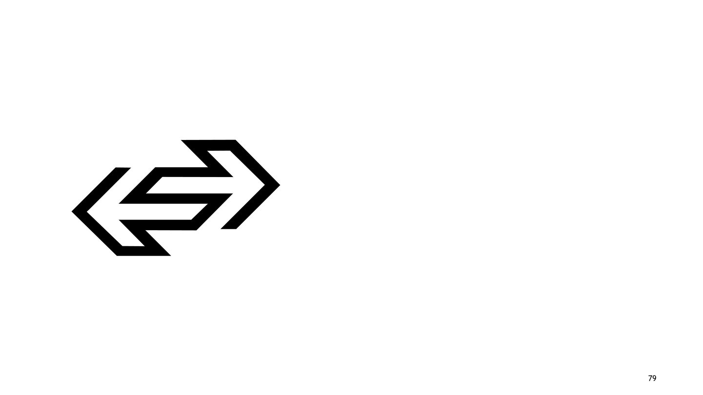
Title:
Delhi Transport Corporation (DTC)
Description:
Incorporated by the government in 1948, it is the local bus service that operates interstate services in six states: Punjab, Haryana, Rajasthan, Jammu & Kashmir, Uttar Pradesh, and Uttarakhand. The logo presenting the inter-connecting arrows facing each other signifies the inter-state local bus services. The overlap and use of mirror images create an interesting and unique form to show interconnected transport between states. The simple and open juxtaposition of arrows also connotes efficiency in terms of speed, quality service, continuous service, etc.
-
Title:
Expo Marketing Logo
Description:
This logo was designed by Prof. R.K. Joshi. This logo has been designed using many interconnected lines, which depict the connection between people and the brand. Graphic Design has the special quality of influencing the general public with distinct alterations to shapes and forms. This identity not only presents information through a company’s name but also creates a mood and emotive quality within the logo that leaves an eternal imprint of the image in the viewers’ minds.
-
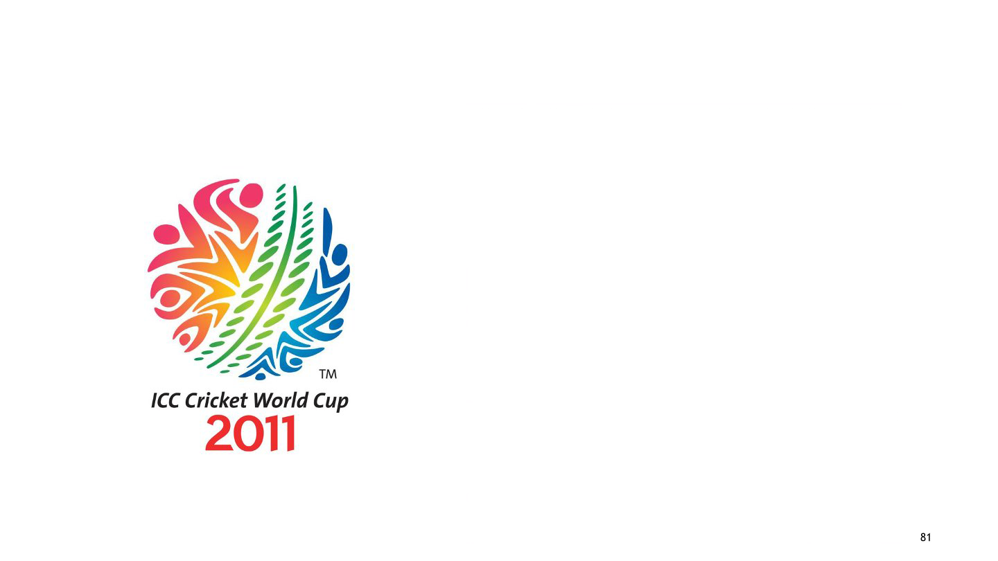
Title:
ICC World Cup 2011
Description:
The theme of the ICC World Cup 2011 was ‘Celebration with Cricket’. This was closely kept in mind while using the shapes of human figures, the colourful gradient, and other elements to create a feel of vibrancy in the celebration concept. This colourful ball with human figures in action cheering and shouting for their teams, forming the rich texture of the spherical shape of the ball, exudes the energy, fervour, and spirit of high involvement in cricket. The rhythmic colour and form of the ball's movement create an attractive festivity and mood for the players and fans alike.
-
Title:
Indian Rayon Industries Pvt Ltd.
Description:
Designed in the late 1950s, the logo of Indian Rayon (renamed Indian Rayon and Industries Limited in 1987) represents the processing of the viscose filament yarn unit symbolically. The parallel lines forming the triangular cycle represent the precision and engineering of Rayon fibres. The precision depicts the quality of Rayon produced and exported. The triad form also depicts a continuous process of producing Rayon and expanding its presence around the world.
-
Title:
Trikaya Grey Advertising
Description:
The logo represents the flexibility, structural strength, and quality of products available at Fusion Polymers Limited. Be it cables, Co-Axial cables, Networking cables, Thermocouple wire, control cables, and other accessories, etc., form the three-dimensional logo, which amplifies the high-quality engineering and precision of its products.
-
Title:
Bengaluru Airport
Description:
Bengaluru’s image as the world’s Silicon Valley experienced a temporary jolt around 2009. Taking inspiration from the scenario, the logo for the new Bengaluru Airport was designed in a new and fresh form. The form is visually inspired by the dazzling city avenues and the mesmerising flora of the city. This true spirit of the city has been alive since the 1920s. The idea is to entice the minds of the people with the multi-coloured form as they walk through the airport. The blooming form and the use of a colour palette inspired by primaries make the logo visually dynamic and distinct.
-
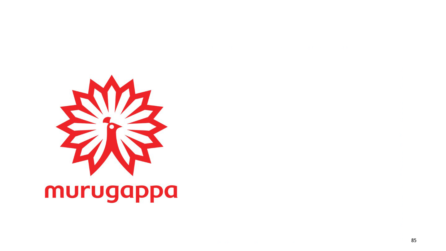
Title:
Murugappa Group
Description:
The group unveiled its new logo in 2010. A contemporary visual treatment has been given to the peacock form used as a symbol for the company. It signifies in red a continuing passion, vigour, power, drive, and energy. The lowercase style for the name goes with the trend of the time. Lowercase provides downward balance to the composition, with the symbol at the top having a more heavy and dense form. The idea is to represent the traditions of the group in modern times. Therefore, the soft curves in the lowercase letters have been inspired by the curves of Dravidian letterforms.
-
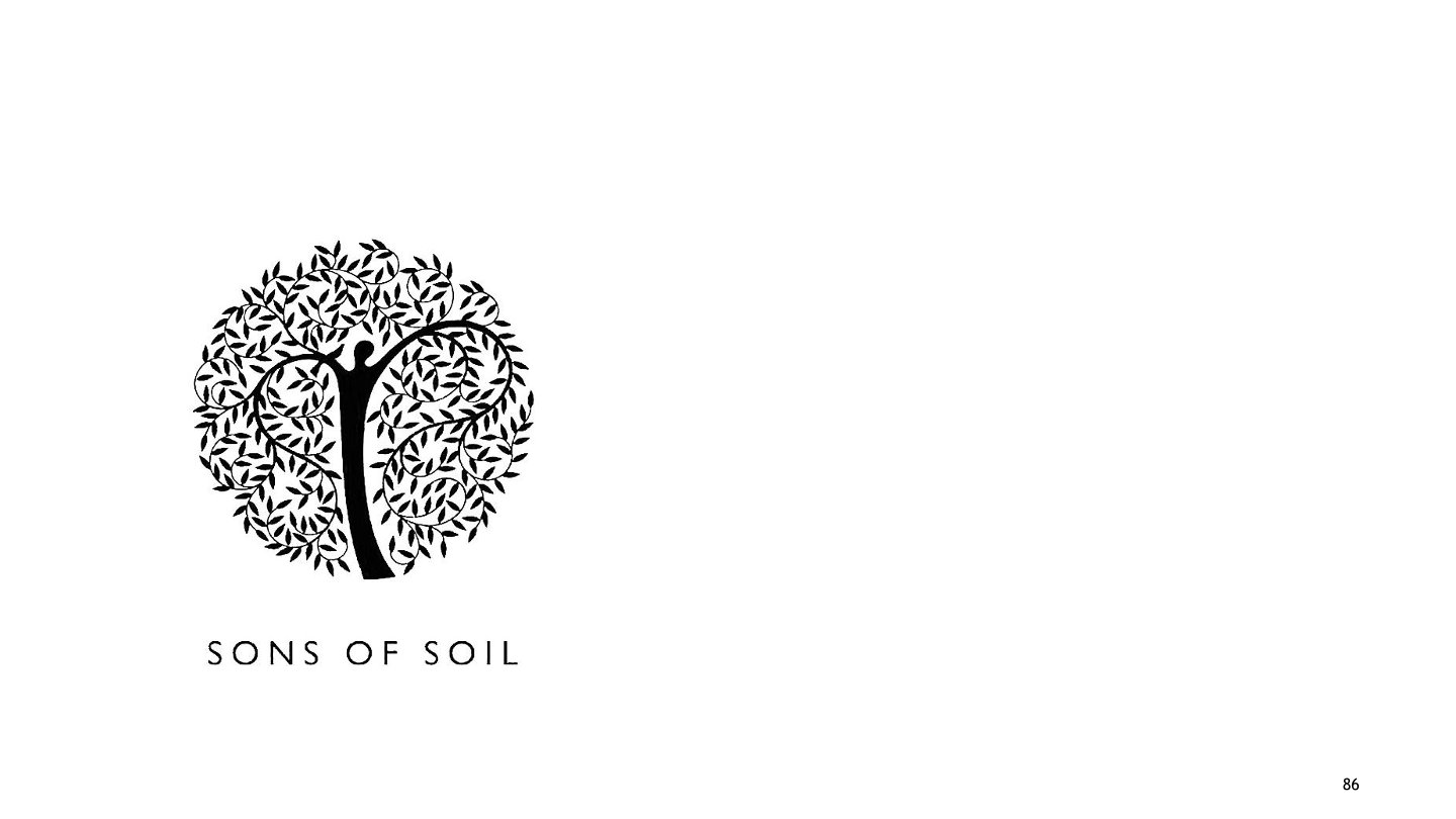
Title:
SONS of SOIL
Description:
SONS of SOIL is a group of people who are passionate about their work and offer exquisite landscaping solutions and nurseries. The efforts are to preserve and restore nature in its raw form. The logo is a mirror of what Sons of Soil stand for. The design cue is inspired by the universal "Tree of Life" concept. The tree trunk is a man holding nature in its true form: vital, evolving, and ever-green. His arms or the tree branches with their rhythmic swirls pay tribute to the beauty of nature and its resources. The logo envisages an Indianness and a Universal Appeal through its form.
-
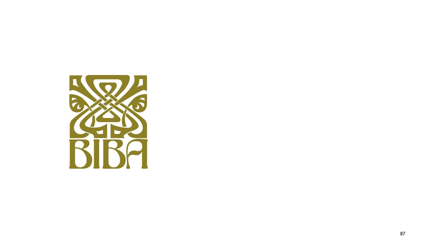
Title:
Biba
Description:
Biba is an Indian fashion retail company that was established in 1986. Its logo, composed of a wordmark and a delicate emblem, is executed in one colour, creating the sense of a single organism. The soft burgundy colour is the mainstay of the company’s palette. It adds luxury and sophistication to the logo and shows the fashion retailer as professional and trustworthy, evoking a sense of care and love. The Biba emblem is a stylized image of a flower composed of six equal curved lines resembling elongated petals. The flower represents the delicacy and finesse of ethnic fashion and shows the essence of oriental beauty. The wordmark in all capital letters is executed in a sleek, bold sans-serif typeface; the bottom part of both letters "B" is extended, which makes the inscription more balanced and complete.
-
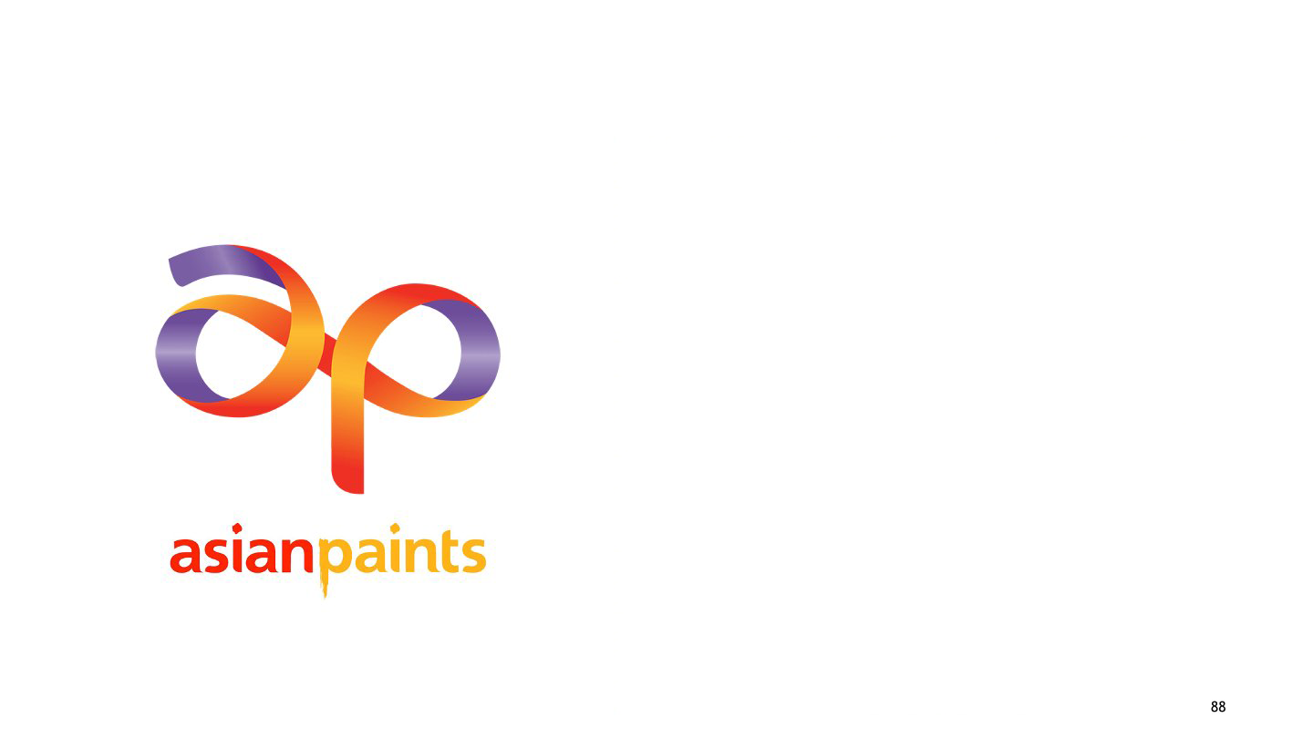
Title:
Asian Paints
Description:
Asian Paints Limited is an Indian multinational paint company headquartered in Mumbai, Maharashtra. The Company is engaged in the business of manufacturing, selling, and distributing paints, coatings, products related to home decor, bath fittings, and related services. "With research revealing that Indian consumers are surprisingly scared of colour when decorating their homes, we wanted to make people more colour confident", says design agency Fitch. The logo represents a more meaningful and personalised engagement with the increasing number of interior décor consumers in the home, retail, and commercial segments across India. The wordmark from the previous logo is kept intact, but it has been recolored and is accompanied by a gradient ribbon.
-
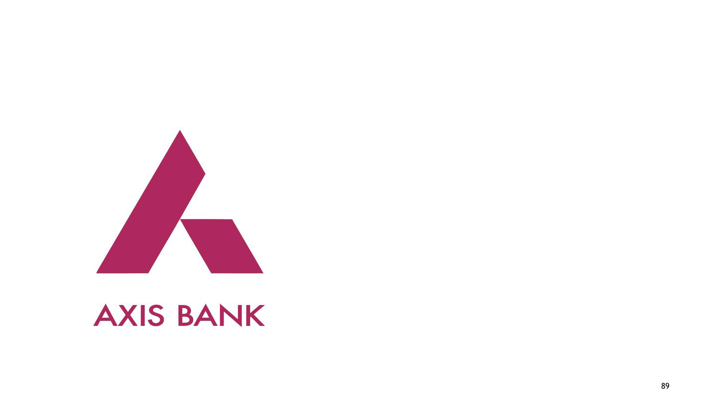
Title:
Axis Bank
Description:
Axis Bank Ltd (formerly UTI Bank) is the third largest of the private-sector banks in India offering a comprehensive suite of financial products. The logo design of Axis Bank is based on the letter ‘A’. It is a contemporary, universal and solid design that retains the burgundy colour of the original UTI logo as a link to its heritage. The new logo has two strokes, the first stroke depicts forward growth while the second stroke signifies a solid support system. The two thick strokes also connote solidity and security, and conveys a sense of authority and credibility.
-
Title:
Bajaj
Description:
Bajaj Group is an Indian conglomerate founded by Jamnalal Bajaj in Mumbai in 1926. Bajaj Group is one of the oldest and largest conglomerates based in Mumbai, Maharashtra. The new brand identity with only "BAJAJ" in an expanded, all-caps logotype reinforced the confidence of the brand and made it far more legible on a vehicle at speed. The new "flying B" symbol depicts a smooth ride, flying speed, and soaring excitement and carries forward the foundation, trust, and pioneering spirit of the Bajaj team. Without letting go of the familiarity, the selection of a younger blue continued to stand for precision engineering and excellence in technology. Identity usage was standardised across various applications, and the retail experience was consolidated to reflect positive change in the company.
-
Title:
Videocon
Description:
Videocon Industries Ltd. is involved in the manufacturing, assembly, and distribution of key sectors of Consumer electronics, including display and colour picture tubes. The company is also engaged in the CRT glass and oil and gas industries. The group has 17 manufacturing sites in India and plants in Mainland China, Poland, Italy, and Mexico. The Videocon logo is the heart of the new brand identity. The Fluid lava reflects the brand idea, ‘Experience change’. The colour palette has been chosen to reflect the philosophy of Videocon Group, i.e., the colour green is symbolic of the company’s eco-drive.
-
Title:
Hero Moto Corp
Description:
Hero Motocorp Ltd. is an Indian motorcycle and scooter manufacturer based in New Delhi, India. The company is the largest two-wheeler manufacturer in India. The new symbol is made up of three shapes that make up the letter H at an angle. The red and black colours are taken from the previous corporate identity of HeroMotoCorp. The font used by the Hero logotype is a variation of Harabara font. The new logo of Hero MotoCorp is enhancing the ‘can-do’ spirit in young Indians. The logo design resembles an ‘Indian Catapult’, conveying a message of inspiration that the company is deeply rooted in Indian values. The logo reflects the high energy and space of the company.
-
Title:
Havells
Description:
Havells India Ltd. is one of the largest electrical equipment companies in India. Lokusdesign initiated a radical rebranding project that improved the company’s brand value, brand positioning – and fortunes. A unified brand image led it to be more international, adaptable, and increasing brand value through better customer perception; aiding it to be a globally recognised, trendsetting corporation that delivers excellence through products. Through the creation of a new identity, we captured the company’s brand essences: Dynamic, leader, and Stability.
-
Title:
Airtel
Description:
Airtel is the world’s fifth-largest telecommunications company, spreading its services all around. It is the largest mobile service provider in India and redesigned its brand logo in 2010. The new logo is Airtel's single letter ‘a’ presented on a red background, followed by Airtel written underneath the letter ‘a’. The red colour of the logo represents their passion and dynamism, which contribute to their success worldwide. The unconnected letter ‘a’ represents the meaning of ‘no boundaries’ to explore the world. The new logo is a combination of its old logo and Zain Telecom.
-
Title:
Jet Airways
Description:
Jet Airways is an Indian airline based in Mumbai. It operates over 300 flights daily to 68 destinations worldwide from its main hub at Chhatrapati Shivaji International Airport. Jet Airways' original livery was navy blue with light grey and chrome yellow. The top and bottom of the aircraft were painted in light grey, with the flying sun logo on a navy blue background. The original logo was designed by K.V. Sridhar in 1992. In 2007, a new livery was created by Landor Associates that added yellow and gold ribbons; the design retained the dark blue and gold-accented colour scheme along with the airline's "flying sun" logo.
-
Title:
Electronics India
Description:
The logo is to express the energy that originates from a point and doesn’t have any limits. The origin is the letter ‘I’ which is just represented by a Dot. Then the typographical play on the letter ‘E’ which is aligned to the Fibonacci series, makes the perfect form, which is inspired by the flower ‘Lotus’ (the National Flower of India). The origin dot is inspired by the ‘bindhi, which normally Indian women use on their foreheads. It’s also a symbol of energy that is controlled at a particular point.
-
Title:
Reliance
Description:
Reliance Industries Limited (RIL) is an Indian conglomerate holding company headquartered in Mumbai, Maharashtra, India. Reliance owns businesses across India. Engaged in energy, petrochemicals, textiles, natural resources, retail, and telecommunications. Reliance is the third-most profitable company in India. The logo consists of an abstract, rounded shape and a circle with a stylized flame inside. The font used for this has thick to thin strokes and is a powerful serif typeface.
-
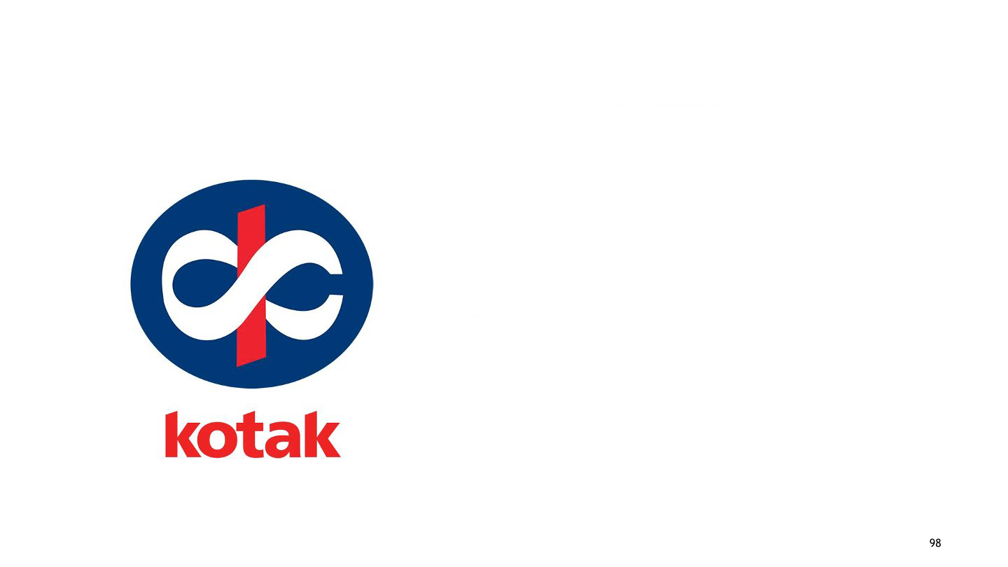
Title:
Kotak Mahindra
Description:
Kotak Mahindra Bank is an Indian private sector bank headquartered in Mumbai, Maharashtra, India. Bengaluru-based Graphic Design studio Ray and Keshavan designed the logo. The letter form for ‘k’ in the Devanagari (‘क’) script was crafted to include the symbol for infinity in its form. The symbol of ‘Ka’, makes it of distinctly Indian origin, while its curves form the universal ‘infinity’ sign, thus reflecting the group’s uniquely global Indian personality. The Devanagari ‘Ka’ (‘क’) – has the knot of ‘ka’ (‘क’) around the strong red stem. This unit within the strong dark blue circle projects superiority, victory, a strong foundation, and stability. The group has thought about the basic tenets of economics, which state that man’s needs are unlimited. The infinite ‘Ka’ (‘क’) symbolises that we have an infinite number of ways to meet those needs.
-
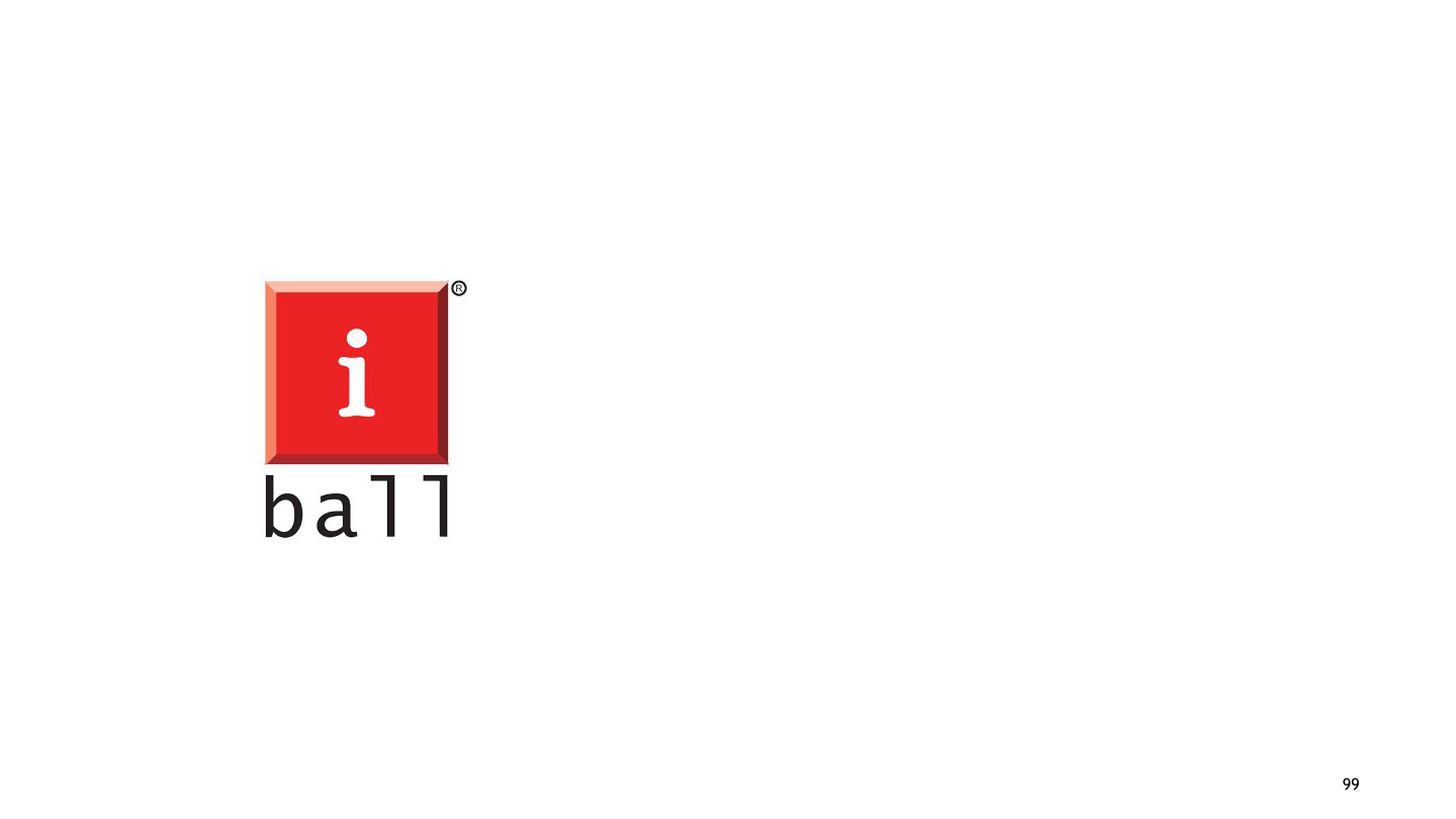
Title:
iBall
Description:
iBall is a privately held consumer electronics company headquartered in MIDC Andheri, Mumbai, Maharashtra, India. iBall is a computer peripheral brand. It came up with a computer mouse that had a small ball as a scroll as well as a cursor. Considering this speciality, Palasa named the brand iBall itself. Here the letter ‘i’ in red represents the field, i.e., information technology. Also giving an idea of the brand’s expertise in the same field.
-
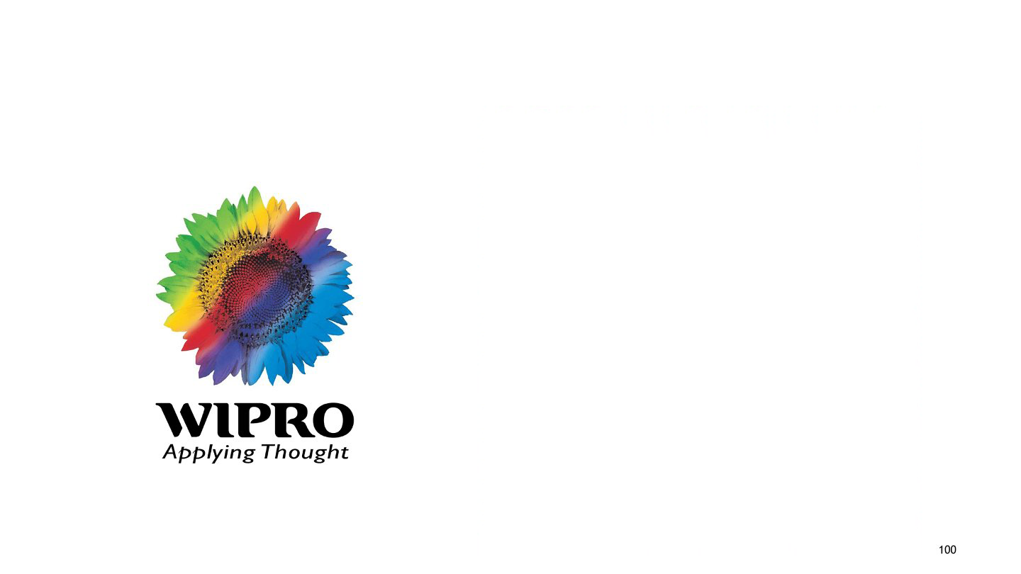
Title:
Wipro
Description:
Wipro, one of the top MNCs in India, started its journey in 1945 with a vegetable oil company. But today, the company has expanded itself into many fields like IT, electrical, and furniture. Initially, the logo symbol of Wipro was a sunflower designed in black and white. Later, the logo was redesigned by Shomit Sengupta into a dark, integrated, rainbow-coloured sunflower depicting the company’s integrity and values. Rainbow is the rare miracle of nature taken as inspiration for logo design, depicting its simplicity and rareness. These together will aid in success all the time. The logo also resembles a solution for innovative thoughts.
-

Title:
Star TV
Description:
Star India Private Limited is an Indian media and entertainment company owned by 21st Century Fox. It is headquartered in Mumbai, Maharashtra. STAR India's portfolio includes 58 channels in eight languages. The new star logo symbolises zeal to continuously innovate, create, and invent for 21st-century India. It is targeted at a younger audience that believes in change. The campaign ‘Nayi Soch’ literally translates to new thoughts or views. The logo reflects the vigour and vitality of a new India.
-
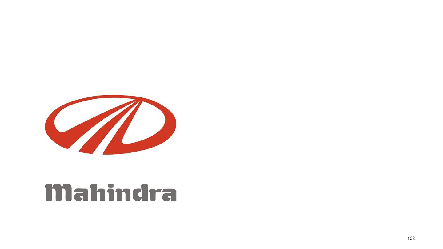
Title:
Mahindra
Description:
The Mahindra Group is an Indian multinational conglomerate holding company headquartered in Mumbai, India. It is considered to be one of the most reputable Indian industrial houses, with market leadership in utility vehicles as well as tractors in India. Mahindra’s new word mark retains its existing brand attributes, such as its reliability, solidity, warmth, trustworthiness, and caring nature, as well as its new brand attributes, namely global, technology savvy', 'modern' and 'progressive. Mahindra's previous wordmark was grey in colour, in line with the colour of vehicle badges that are typically steel grey. The new hand-drawn word mark sports a deep, bright red, which is, in fact, a shade deeper than the signature Mahindra red. The new colour red has auspicious connotations. In India, it also stands for vibrancy, positivity, energy, and excitement.
-
Title:
VISTARA
Description:
Tata SIA Airlines Limited, operating as Vistara, is an Indian domestic airline based in Gurgaon with its hub at Delhi-Indira Gandhi International Airport. Vistara is derived from vistaar means 'infinite expanse' in Sanskrit. It is the perfect cue for an airline that will push back the boundaries of air travel and create seamless experiences. It also conjures up the image most associated with a smooth flight– an endless, blue horizon.
-
Title:
INDIGO Airlines
Description:
IndiGo is headquartered in Gurgaon, Haryana, India. Indigo is the most efficient airline and has the largest fleet in India. It has its primary hub at Indira Gandhi International Airport, Delhi. Twenty dots arranged in the shape of an aircraft serve as the airline's logo. The airline uses a two-tone blue livery on a white background, with the belly of the aircraft in indigo and the logo in white.
-
Title:
Air India
Description:
Air India is the flag carrier airline of India and the third-largest airline in India in terms of passengers carried. It is owned by Air India Limited, a Government of India enterprise, and operates a fleet of Airbus and Boeing aircraft serving domestic and international destinations. The first logo of Air India was a centaur, a stylized version of Sagittarius, shooting an arrow in a circle, representing the wheel of Konark. The logo chosen by founder J. R. D. Tata was introduced in 1948 and represented the airline until 2007. On May 15, 2007, Air India refreshed its logo, making the Rajasthani arches along the windows slightly smaller, extending a stylized line from the tail of the aircraft to the nose, and painting the underbelly red. The new logo is featured on the tail and the engine covers, with red and orange lines running parallel to each other from the front door to the rear door.
-
Title:
Wipro
Description:
To "underscore its commitment to transformation and evolving client expectations", Wipro unveiled a new corporate concept. It is a symbolic representation of their actions and intentions towards their customers. Wipro claims that the new logo reflects how the company "connects the dots" for its customers by fusing advanced technology and domain knowledge with ideas from many sectors. The four circles of the brand mark stand in for Wipro's beliefs, workers, clients, partners, and communities, while the styling of the mark conveys fluidity, resourcefulness, optimism, and a connected world. The business has kept the rainbow colour scheme even though the new logo has undergone a complete design makeover.
-
Title:
MindTree
Description:
MindTree is an Indian information technology company with offices around Asia, Europe and the United States. This is the new brand identity and logo that Mindtree unveiled on September 28, 2012, as created by Siegel+Gale. Siegel+Gale is a US based company, which has designed brand logo's for companies like Microsoft. In essence, the new logo communicates that the company sees a possibility where others perceive a complete top. The harmonious centre created by several interlocking threads in Mindtree's new logo speaks of humanity while also representing the fusion of technology and thought. It also projects a forward-moving energy. "Welcome to possible" encapsulates the brand's mission, beliefs, and promise in a short but effective phrase.
-
Title:
Tata Motors
Description:
In 2003 the Tata Motors logo gets more laconic and minimalistic, with the graphical emblem removed from the composition. The current logo consists of two wordmarks that have been written in two distinct fonts but the same light blue colour. While the second portion, "Motors" has a lighter sans-serif for its capital letters, the first part, "Tata" is placed in the same typeface as in the previous edition. An elegant and contemporary sans-serif typeface is used to set the "Tata Motors" logotype from the rim art insignia of the Indian automaker, with the first portion bolded and modernised and the second written traditionally. The fonts Myriad or Rolphie Heavy are perhaps the ones that are most similar to the one used for this symbol. The light and calm shade of blue is the only color in the Tata Motors palette. It looks very tender and evokes a sense of reliability and security.
-
Title:
Ola
Description:
Ola Cabs is an Indian startup located in Bangalore and established in 2010. Their company's logotype is an 'o' character rendered in broad strokes to resemble a car tyre. We can see the brand name written on the right. The logotype doesn't have a background or any other unique components. The Ola brand logotype is coloured in black and yellow hues, with black used for the name and the outer portion of the letter 'o' and yellow for the interior of the letter. The letters in the Ola wordmark's font are semibold and lack serifs. Sharp edges and brief gaps distinguish the characters. The 'a' character now resembles an inverted 'v' because it no longer has a horizontal bar.
-
Title:
Swiggy
Description:
Swiggy is an Indian food delivery company established in 2014. The logo comprises of a wordmark and an emblem. The emblem is the most striking element of the design, in part because it is higher than the letters that make up the corporate name. Additionally, it makes the brand stand out and is more distinctive. The "S" links to the company's offer by representing the first letter of the company's name and serving as a location symbol. The Swiggy logo effectively advertises the brand thanks to the intelligent use of colours and symbols. Not only does it give a subliminal hint at the industry in which the company works, but it also helps to gain new orders. It’s an austere sans serif typeface with classic proportions and a uniform thickness of the lines.
-
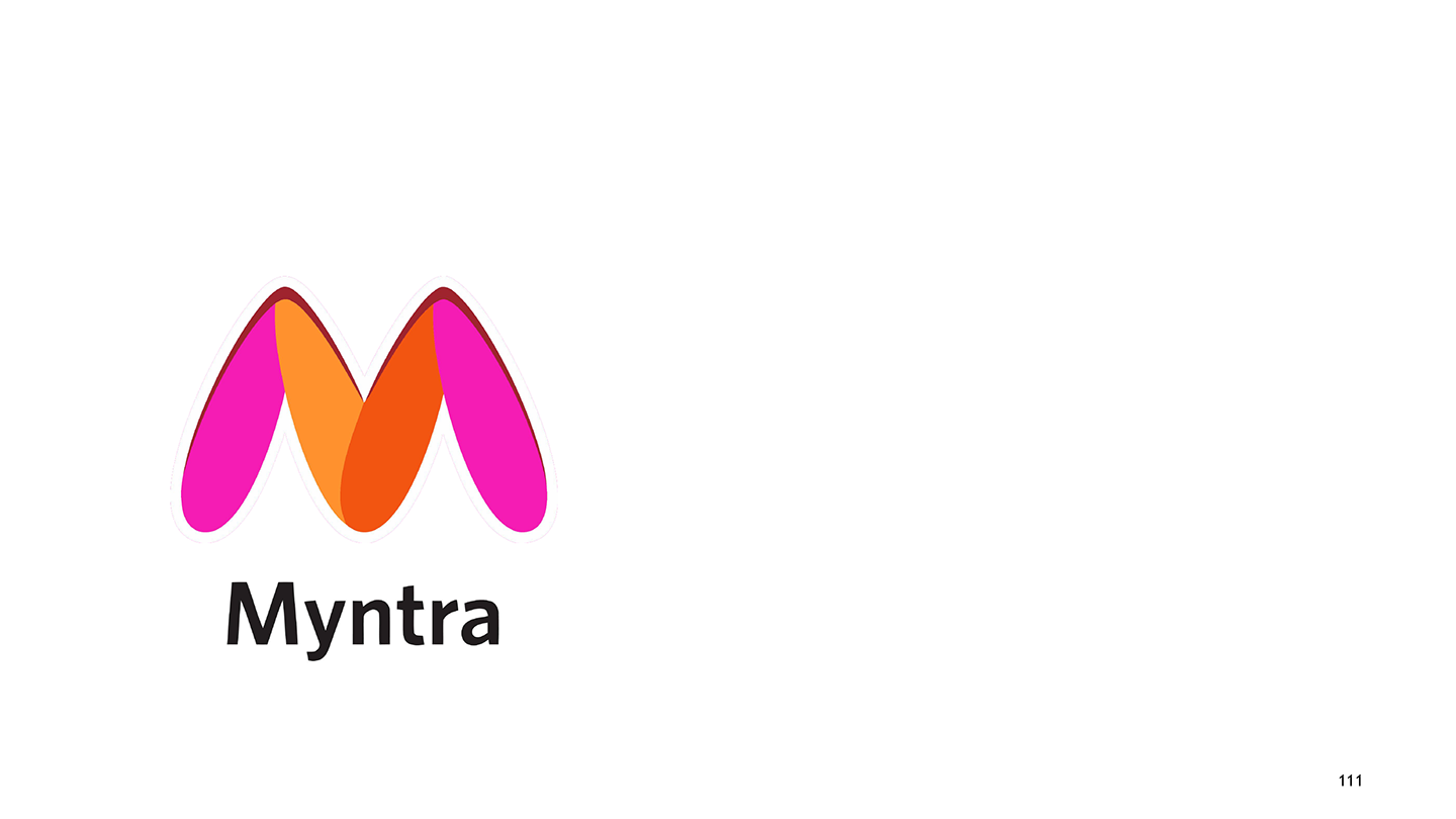
Title:
Myntra
Description:
Myntra is a large Indian online clothing and accessories store that has been operating since 2007. The Myntra badge has been strengthened and stabilised with the redesign of 2021. It keeps the concept of the previous logo but intensifies the colours, eliminates the overlaps, and places more emphasis on the top lines of the stylized "M" by adding some darker outlines to the peaks. The Myntra visual identity colour scheme consists of an orange and pink mix, with black added for the typography. The colour pattern of the logo conveys a feeling of vitality and affection, reflecting the company's philosophy and core principles. The black inscription enhances the business's professionalism and confidence.
-
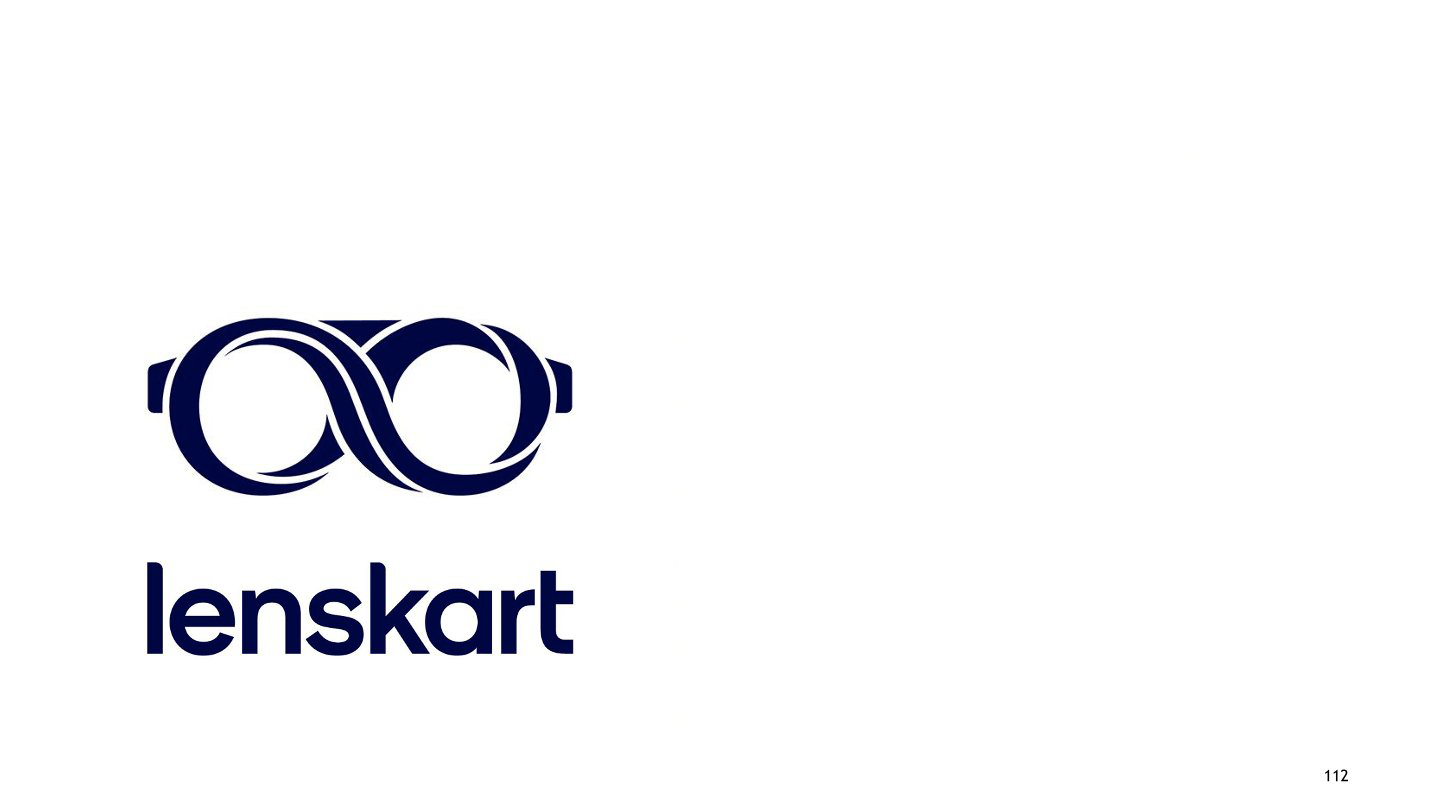
Title:
Lenskart
Description:
Lenskart is an Indian manufacturer of eyewear. The new redesign of Lenskart's corporate logotype depicts the familiar glasses. Their frame forms an infinity sign using some lines. To the right, the brand designers wrote the brand’s nameplate. The entire logotype now has a monochromatic colour scheme. Since 2010, the Lenskart logo's colour scheme has changed twice. The glasses were originally painted in bright hues of yellow, green, and blue. The second logotype was built on a straightforward deep blue and white colour scheme, where the blue represented the name and the glasses while the white lines represented the infinity symbol that was drawn on the frames of the spectacles.
-
Title:
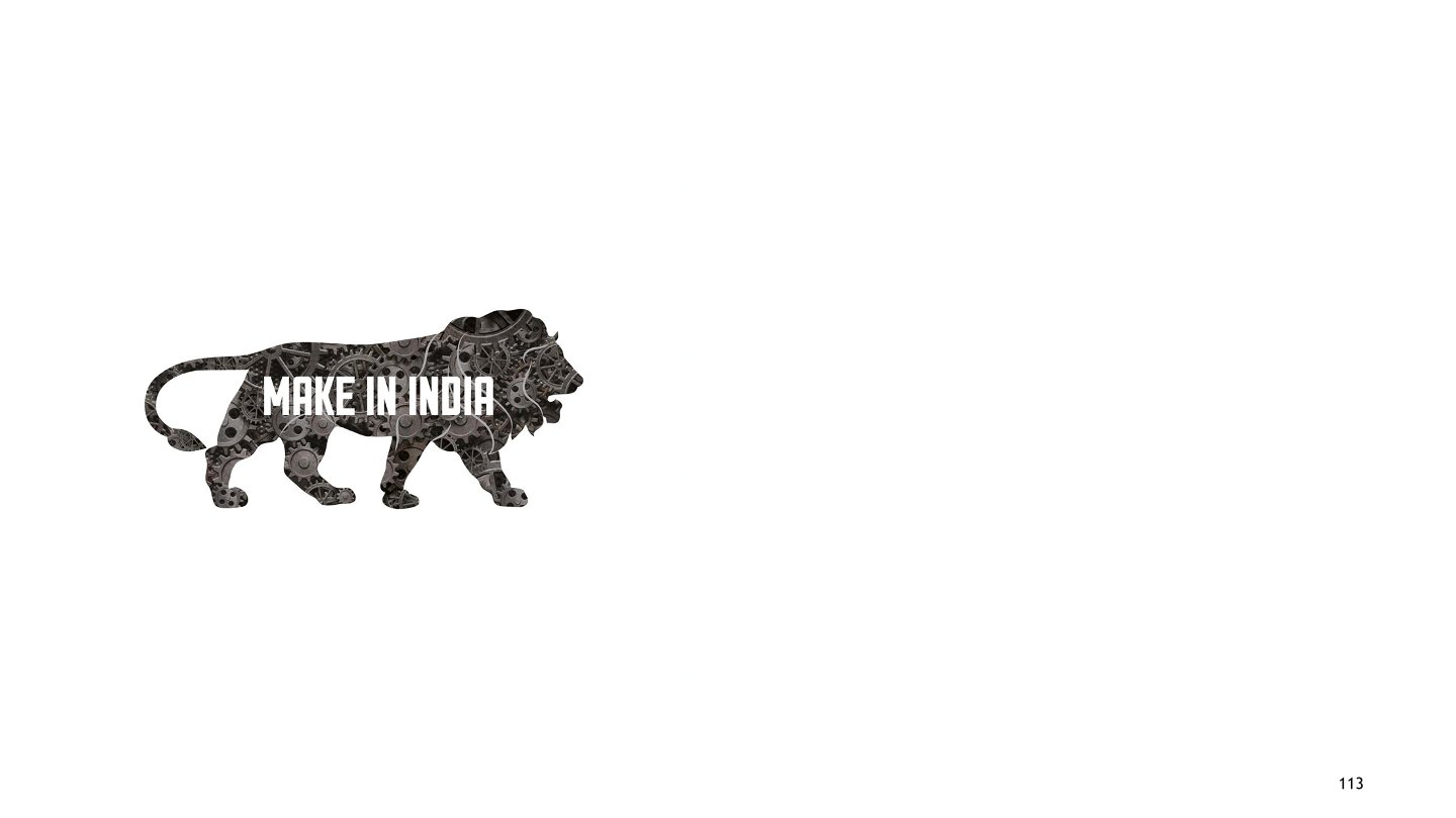
Make in India
Description:
Make in India is an enterprise-initiated campaign by the Government of India to provide a platform for international and national companies to set up their manufacturing units in India. The idea was to make India the most preferred destination for foreign investment. The main purpose of this initiative is to enhance job creation, skills, and technology in major sectors of the Indian economy. Make in India takes an overworked phrase and turns it into a powerful call to action reflective of modern India. Derived from India’s national emblem, the prowling lion stands for strength, courage, tenacity, and wisdom-values that are every bit as Indian today as they have ever been.
-
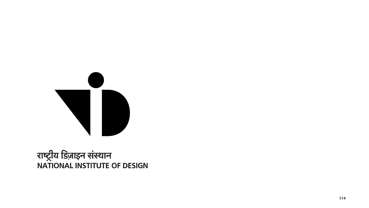
Title:
National Institute of Design
Description:
The National Institute of Design (NID) is a premiere design school in Ahmedabad, India. NID is recognised by the Department of Scientific and Industrial Research under the Ministry of Science and Technology, Government of India, as a scientific and industrial design research organisation. Adrian Frutiger designed a wordmark for the National Institute of Design in Ahmedabad, India. Originally, the institute was named the National Design Institute, however, the institute renamed itself to match Adrian Frutiger's stylized NID logotype alongside the name "National Institute of Design".
-
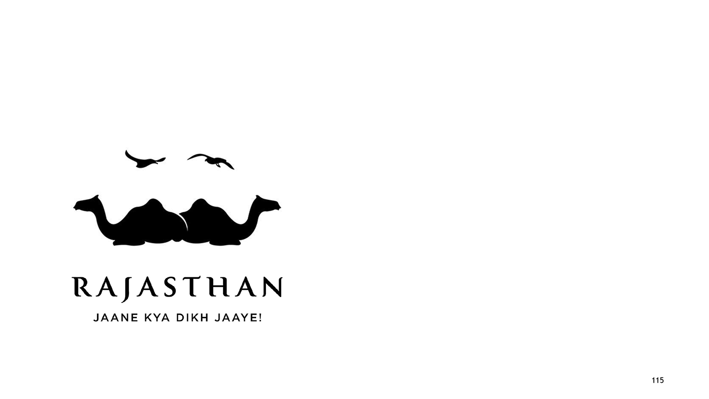
Title:
Rajasthan Tourism
Description:
Rajasthan Tourism is an initiative by the Indian government to improve tourism in India. Rajasthan has massive forts, stunning palaces, diverse cultures, delectable cuisines, and warm people amidst a rugged yet inviting landscape. The clever logo resembles the distinctive traditional curly moustaches sported by men from the state, but look closer, and it appears to be a pair of camels sitting across from each other with two birds flying above them, capturing the essence of Rajasthan.
-
Title:
Indian Institute of Crafts & Design
Description:
The Indian Institute of Crafts and Design (IICD Jaipur) is an academic institution located in Jaipur, India, and offers undergraduate and postgraduate programmes in areas of craft design.
-
Title:
India Design Mark
Description:
The India Design Mark is a design standard and a symbol that recognises good design. The India Design Mark symbolises excellence in form, function, quality, safety, sustainability, and innovation and communicates that the product is usable, durable, aesthetically appealing, and socially responsible. The India Design Mark symbol is a trustworthy indicator of excellence. The symbol can be used in a wide range of ways, such as in advertisements, catalogues, product packaging, and other promotional mediums.
-
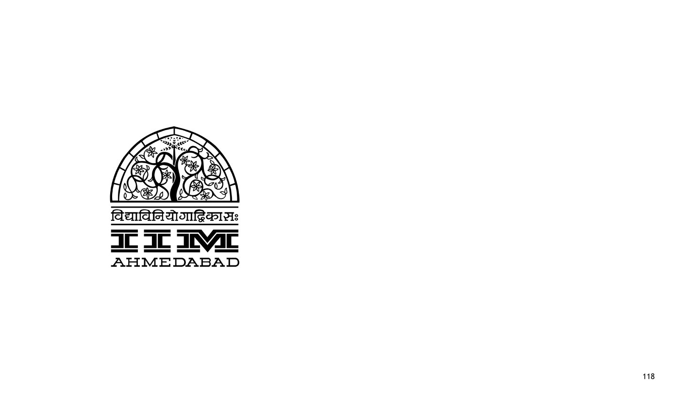
Title:
IIM Ahmedabad
Description:
Indian Institute of Management Ahmedabad (IIM Ahmedabad or IIMA) is a public business school located in Ahmedabad, Gujarat, India. It is the world’s toughest business school to get in considering the acceptance rate. The intricately carved lattice stone window, Sidi Saiyyed Jali, is the unofficial symbol of city of Ahmedabad and the inspiration for the design of the logo of the Indian Institute of Management Ahmedabad.
-
Title:
Indian Institute of Technology Gandhinagar
Description:
Indian Institute of Technology Gandhinagar is a public engineering institution located in Gandhinagar, Gujarat, India. It has been declared to be an Institute of National Importance by the Government of India.
-
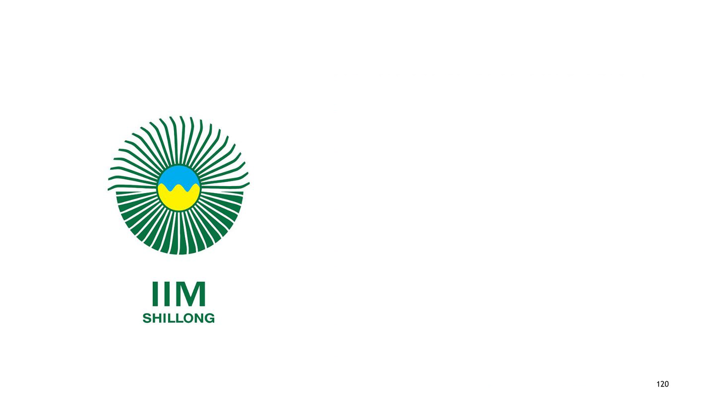
Title:
Indian Institute of Management, Shillong
Description:
The Indian Institute of Management, Shillong, is a public, fully autonomous management institute in the city of Shillong, Meghalaya. IIM Shillong’s logo was designed by Anil Sinha and Ankita Gajjar from the National Institute of Design, Ahmedabad. The focus of the institute is embodied in the logo, which uses colour and imagery from nature – the sun, the sky, and the mountains. The portrayal of the sun in the upper half circle, with its rays spreading across, indicates progress and light. The definite linear lines making up the lower half circle are compared to the skill of the participants and suggest that their energy can be channelled. Within this, the area coloured blue stands for the sky, and the yellow region represents the mountains, indicating the location of the institute.
-
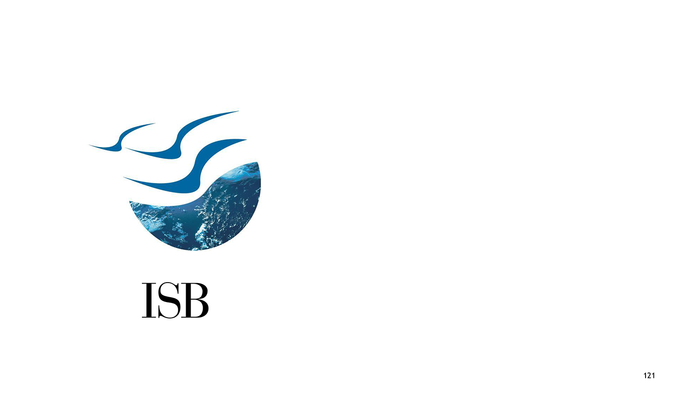
Title:
Indian School of Business (ISB)
Description:
The Indian School of Business (ISB) is one of the most prestigious business schools in India and is rated among the best in the world. The globe progressively transforms into birds in flight in the ISB logo. The earth represents the nurturing character that is essential to a learning environment. The birds stand for freedom of mind, the capacity for innovation, and the capacity to go beyond conventional limitations, while the structure symbolises a rock-solid basis for learning.