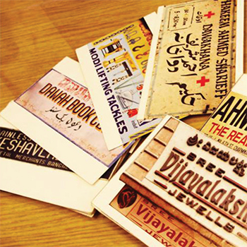
Shop signs are the quintessential urban markers of business and trade in a city. They unravel the fascinating dimensions of the visual culture of a city. There has been a paucity of published literature on analytical frameworks designed to study attributes in a shop sign. Therefore, this research aims to investigate the design and formulation of such a flexible visual framework. This framework aims to work as an analytical tool to describe the visual communication, the integration of the elements, and the emerging relationships in the attribute of colour as part of the visual design of shop signs in India.
In order to build a foundation for the visual analysis of shop signs, a background study was initiated with a journey of signs and shop signs from Prehistory to the Digital age. This historical journey has helped us develop an overview of shop signs in the context of our research. We initiated this research by conducting two pilot research projects. The first project documented through photography shop signs from pre-independence till present times from the historically rich Abdul Rehman street market of South Mumbai, India. A semiotic analysis of these signs gave insights about semantics, syntactics, pragmatics, and their design transitions. The second pilot research project involved the open card sorting of a group of Bengaluru city shop signs by designers and non-designers. The results indicated colour being the main visual attribute in the design of shop signs in the context of India from the viewers’ perspective. The data collection for the main research involved the documentation of a large number of shop signs through photography belonging to a range of marketplaces in 12 cities in India. During data collection, information about the shop signs, such as their design, changes, and business objectives, was gathered from the shop owners. The documented data of 3500 shop signs was reduced by the method of stratified sampling, which gave us a group of 450 shop signs from five cities in India. We could identify that in a shop sign, information operates at three levels: main text, or shop names; secondary text, or tag lines; and background sign panels. These layers constitute the morphology of a shop sign. As material objects of a visual culture, shop signs carry business identities with the aid of visual attributes. Of these, colour has been observed as the primary attribute that imbibes an art of persuasion in visual communication. This research could identify dimensions and characteristics of colour based on an existing colour analysis method. The researcher could identify four factors, renamed quadrants—patterns, trends, tendencies, and conventions—as part of a visualised framework. The identified quadrants were integrated by the methodology of Bricolage in the design of this framework. Finally, a visual analysis of colour was conducted for the selected five city shop signs with the aid of the formulated framework. This analysis of colour has revealed spatial relationships and contextual meanings in the three layers of information in shop signs.

