


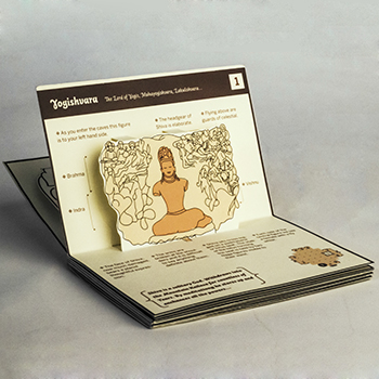

The needs of graphic design change over a period of time. Typefaces are designers tools to create strong visuals for flawless communication. There is a growing need for fonts in multiple weights that cater to the requirements of different platforms. Typefaces are generally classified according to their wide usage in text and display. One of the objectives of this project is to bridge the gap between text and display typefaces. So that the requirement can be met with only one font family.
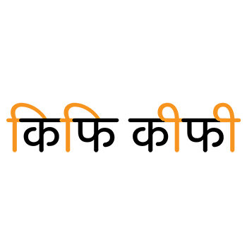
A brief study of devanagari letter structure helped in form exploration. Various calligraphic tools gave direction for creating potential designs. A set of styles for the letterforms was selected to set a guideline for the characteristics that would suit the needs of the project. One such exploration was of geometric rounded letterforms. It proved to be a distinct and interesting approach that could possibly meet the purpose of the project.
A working typeface in three weights, i.e., light, medium, and bold, was created. This typeface is legible in text at small point sizes and is attractive at display sizes. The name of this geometric devanagari typeface is ‘Acacia’.