


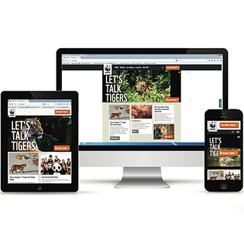
The main objective of the project was to analyze and understand the Responsive design strategies in web design. This project focuses on the need for responsive web design for a wide variety of users looking at the mobile usage in the current day scenario. With increasing trends in the use of smart phones and tablets of different screen size, it became difficult and complex to maintain the website that fits best on different screen sizes. Responsive Web Design (RWD) is found to be an effective way of solving the issue of site management for different end users. As the name suggests, RWD is a conceptual design of website with the properties of liquid, which occupies the shape of a container without losing its properties. RWD conceptualizes on three main fundamental blocks of website construction. Which are Media queries, Fluid grids and Flexible images.