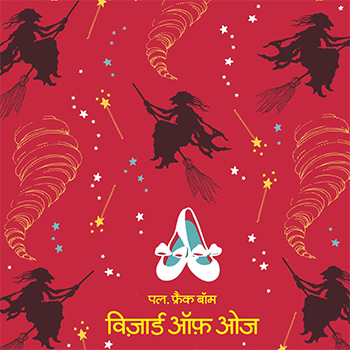
Films have been using typefaces the same way they have been using music, sound, colours, editing, and lighting to complement and construct the narrative as a whole. They evoke a certain feeling, they subtly suggest what is about to unfold and at times they put you in a mood to laugh, cry or be gripped with fear of something. Typefaces in films along with the other elements are invested with the responsibility of expressing and taking the narrative forward and hence the fonts used in films are an excellent place to delve in to while looking for expressive typefaces. Lettering used in films was specific to the films they were meant for and that way it was unique. Our goal in this project was to put to use the uniqueness and use this inspiration as a base for the project. We have focused primarily on the pre-digital era movie titles which were crafted by hand. Pre-digital era movie titles carry the aesthetics of a bygone era and represent the then prevalent culture. The lettering used in movies were never intended to be carried on to any large scale reproduction and printing. Painters/designers of movie titles could dip into their long years of training in traditional hand lettering and the craft has evolved and refined seamlessly through the ages. That in itself makes film titles an invaluable source for type design. It is difficult to reproduce the same style consistently if we are forced to recreating fonts manually. Our attempt was to transition the hand lettering in the titles by extracting their values and re interpreting them to make a font that contextualizes it for the current times.
