
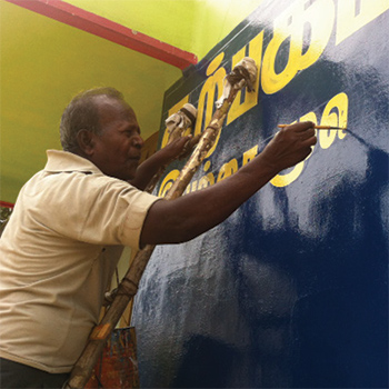


Amongst the various directional and shop signage, political graphics can be seen all over Tamil Nadu. Every election seems to paint the towns and cities afresh. Today however, there is a growing number of flex banners and printed paraphernalia. Rapidly advancing digitalization of visual space in India is replacing individual creative efforts. On the surface, due to the lack of a clear visual language, the sheer multitude of these signs create visual chaos more than they do order. Tamil characters are larger, rounder and wider than Latin letters, fitting the two together often compromises on legibility. However, on a functional level, do these signs still work? What do they add to the visual of their surroundings? Painting these signs is usually someone’s livelihood. Usually these hand skills are passed on from one generation to the other, along with their fresh and unique appeal and quirks. They are easily identifiable and are an important detail in the visual “brand” of any city—instantly recognizable anywhere. In the course of this project, I was fortunate enough to come across a sign painter and observe his skill. I was also able to identify certain styles or unique characteristics of the signages in and around my hometown, which I easily overlooked before, due to the chaos and visual clutter. This project proved to be a chance to document the sensitivity and fineness of indigenous typography. The locally originating character of marketplaces, hospitals, bus stands, etc.; from where these signs were collected brings forth the native nature of these hand-painted typographical expressions.