


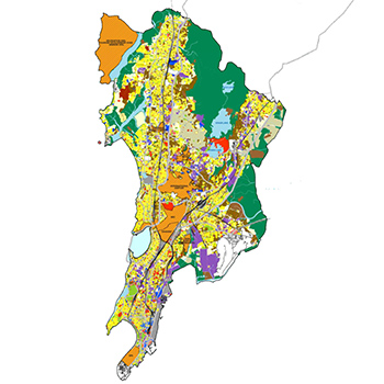

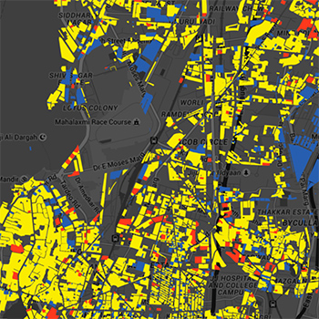

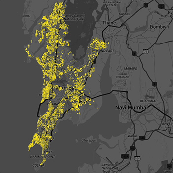
Our governments create and release vast quantities of data about us and our surroundings by means of the census, budgets, human development reports, LAN use studies, etc. This data is released in the public domain and is regularly accessed and used by policy and decision-makers in both the public and private domains. Data visualisation allows for data analysis, especially when large amounts of data are available. Data visualisations are frequently used by these decision- and policy-makers.The visualisation of data done by these individuals or groups is most often done with a purpose in mind. However, insights can come from anywhere, in seemingly disparate correlations between two or more datasets. Accessing these datasets is often difficult due to the scattered nature of our government bodies, and even after access is gained, the datasets come in different tangible and intangible file formats, making direct use of these datasets for visualisation a difficult and often laborious task. With the city of Mumbai as an example, this project aims to enable an easy way to visualise the city’s spatial data. This is done by means of a web-based application called the Mumbai Data Visualization Tool. The higher goal is to enable faster and better decision-making by means of data visualisation and set an example for all city governments in the country.