Home / Alumni / Profile / Detail

Sachit Shyam | Mdes VC 15-17


Related Images


Source: India,   IDC IIT Bombay

Date: 2015-2017 

Medium: Photograph

Credits: IDC


Detailed Description

Sachit Shyam is a graphic and type designer with specialties in strategy and branding, identity systems, art direction, and type design, with a focus on communication design. He received his M.Des in visual communication design from IDC (IIT Bombay) in 2017. Prior to that, he received his Bachelor of Design in Communication Design and Graphic Design from Symbiosis International University. Currently, he has been working as a senior designer at LOCAL (wedesignlocal.com) since 2022. His previous work experiences are: Visual Designer Intern at Scribbles (2013); Type Design Intern at Mota Italic (2016); Lead Designer at Samsung India (2017–2019); Visiting Faculty at the National Institute of Design Haryana (2021); Design Consultant at Glyphic (2021–2022); and Communication Designer at Sachit Shyam (2015).

Related Links:
https://sachitshyam.com/


Reference Links:
http://ddsidc.com/2017/portfolio/sachit/


Projects

Packaging Design and Visual Impairment

From the point of view of packaging design, there is very little we know from literature about how blind people relate to the packaging of everyday consumer products in India (Mumbai). As part of a design research project at IDC, we attempt to get answers and insights into how visually impaired people access various products (especially FMCG) on a daily basis. Are there any standards set up by the government or the food industry to aid people? If not, how are people currently accessing products? These are some of the key questions to which we tried to look for answers.

There are also issues like how visually impaired people currently identify, locate, and find information about the products and the shopping stores. In most cases, people are accompanied by a family member or a friend, but if a person lives alone and is independent for most of the daily chores, what are the problems faced by them (if any) and what are the workaround solutions they have devised to tackle these daily problems?


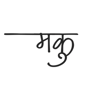
Maku: A friendly Devanagari typeface

Since my childhood, I have always been attracted to letter forms. From scribbling random words on the backside of the math book to designing booklets and reports for the design projects during the graduation period, it has been a tremendous journey. I consider this project my first step in professional type design. To be honest, I always had an inclination towards the Latin script and had never thought of designing for or with an Indic script. This project helped me overcome my fear of Indian scripts.

This project aims at learning the process and enabling designers to take design decisions for type-design projects. It specifically focuses on the handwritten Devanagari typeface and further explores the possibilities that can be achieved through the open type features.


Improving communication between mnd*patients and their caregivers

MND progressively affects the motor neuron sensors responsible for sending signals from the spinal cord to muscles. In a lot of cases, tasks as simple as talking and swallowing become impossible. At present, as there is no cure for this, the average life expectancy may be shortened. The symptoms may start in the arms, legs, respiratory, and swallowing muscles and then spread to other regions. Difficulty performing fine tasks like buttoning, writing, closing the jar lid, slipping of footwear, nasal speech chocking while eating and drinking, and frequent falls on uneven surfaces are some of the early symptoms. The medical treatment for MND and ALS is only palliative and symptomatic.

In July–August 2014, the ALS Ice Bucket Challenge, an activity involving dumping a bucket of ice and water on someone’s head to promote awareness of the disease (ALS, also known as motor neurone disease and in the US as Lou Gehrig’s Disease), and encourage donations to research, went viral. The challenge encourages nominated participants to be filmed having a bucket of ice water poured on their heads and then nominating others to do the same. A common stipulation is that nominated participants have 24 hours to comply or forfeit by way of a charitable donation.


Designing a Gurmukhi Typeface

There was a time before the machines in Punjab when each book cover, advertisement, poster, etc. had a character of its own. Each magazine headline and title was different, as the creator did each piece by hand and added to the pool of diversity. At present, it is hard to differentiate between a book on economics and a poetry book.

The desire and need to design a Gurmukhi typeface came from the lack of good Gurmukhi typefaces available today. My aim was to fill in the gap by adding to the Gurmukhi-type palette available. In the project, I explore the roots, golden era, and transition of the Gurmukhi script and design a semi-casual typeface that fits contemporary taste. This project has two essential domains, i.e., the ‘essence’ of the typeface and the quality and ‘fineness’ of the type design, which I juggled constantly, switching between the two as the project progressed.