Design Gallery
Magic Mascots of India
by
Mascots could be seen as storytellers bringing forth the stories of brands to the masses. Historically, the use of ‘mascot’ as a concept emerged when an opera series named La Mascotte (1880); written by French philosopher Edmond Audron was screened in England and America. The tale was about a farm girl who brought luck to anyone who employed her. Hence, mascots acquired their identity as a person, thing or an animal bringing luck thereafter. Rephrasing the significance of mascots in modern commercial context, they add value to the brand identity of a product or service. The present archive celebrates the glory, legacy and visual power of some of the most lively mascots of top brands in India. Some of these storytellers do not exist for their brands, but their popular image has left an unflinching legacy in the commercial world.
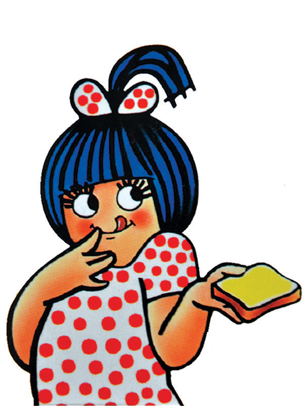
Amul Girl Creator: Eustace Fernandes, 1967 The omnipresent girl wearing a white frock with red polka dots was the wonder creation of Eustace Fernandes in 1967. He drew the “Utterly, Butterly Girl!” with his black marker pen. She could be considered as one of the most popular brand ambassadors, narrating Amul’s story through India’s victories in Sports, playing her part as a social participant in the political scenes of India, using automobile brands of India etc. Her most memorable appearance was the one where she holds the butterly toast in one hand with her licking the taste of Amul butter. The character design compliments “Utterly, Butterly – Delicious Amul” punchline used for Amul butter.

Appu The dancing elephant with the 1979 Asian Games symbol placed on its forehead was the cute little mascot we all know as ‘Appu’. The source of inspiration was a six-year old elephant named Kuttinarayanan alias Appu. It has been regarded as a symbol of transformation of old India into new, modern visionary India. The mascot design was extended into an amusement park named ‘Appu Ghar’ in 1984. Located in Pragati Maidan in Delhi, it was inaugurated to commemorate the 1982 Asian Games by Shri Rajiv Gandhi, the Prime Minister of India in those days. ‘Ghar’ meaning home in English – Appu Ghar became a dream destination for children of India. Such was our Appu’s popularity that it became a powerful symbol of India’s vision on matchbox label graphics. (Source: Light of India: A Conflagration of Indian Matchbox Art).
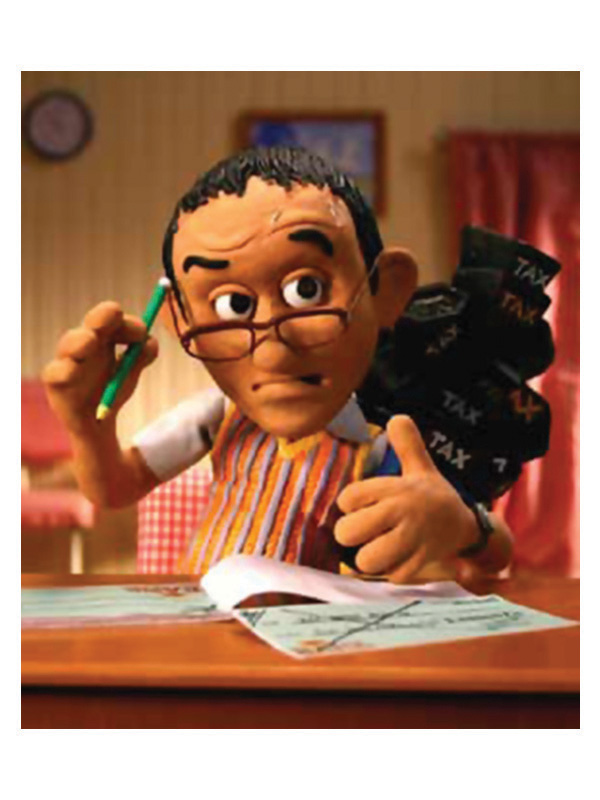
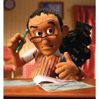
Chintamani The Icon for the insurance services for ICICI Prudential Bank in 2005. It was the year when the bank witnessed a brand recall of 92 percent according to AC Nielson’s Survey. The idea of having a claymation animated character worked wonderfully in the competitive insurance market. Chintamani, a middle-class, middle aged man was portrayed as a worried soul, engrossed in the search for beneficial money investments. His worries connected with the anxieties of middle-class section of India. Initially formulated for only radio spots, the popularity of Chintamani took him to face confront the Indian audience through television commercials too.

Common Man Creator: RK Laxman, 1954 The Common Man is an omnipresent witness to India’s social, political and economic themes brought to light by Laxman as cartoon strip, printed on regular basis on the front page of the national daily, The Times of India. The Common Man has been the enduring messenger, passing on Laxman’s perspectives on many socio-political issues and events for more than fifty years now. The hope, courage and patience of the common man connects with the masses in bold strokes of black ink. As a mute spectator, the Common Man witnesses all kinds of views, issues and scenarios expressing silent humor.
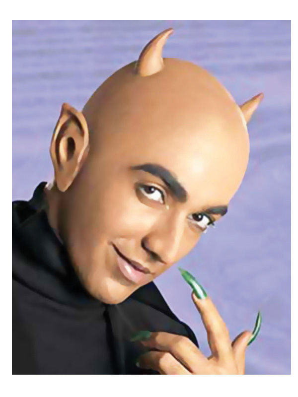
Devil Elucidating the theme ‘Neighbour’s Envy – Owner’s Pride’, the devil became a symbol of ownership. For eight long years the Devil captivated the Indian masses with its green, envious deamanor. Onida suffered from bad sales after discontinuing The Devil from its commercials. Finally, it was re-introduced in 1994. Since then, the Devil’s image became more friendly, impish, interactive as could be seen in the commercials where the Devil talks openly to the consumers. The new brand message for Onida – When the devil beckons, ‘nothing but the truth’ prevails.

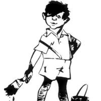
Gattu Creator: R.K. Laxman, 1954 Gutsy Gattu was conceived by renowned cartoonist R.K. Laxman in 1954, when Asian Oil and Paint Company had a massive turnover of Rs. 3.5 lakhs. The impish figure of a street boy holding a paint brush in hand reminds of the corporate role of Asian Paints. Gattu opened the world of colours for the masses of India. The image endows the magic of the paint-brush that adorns the walls of numerous homes and structures in India. Gattu vanished in 2006 when the company decided to capture more mass appeal especially in rural India.
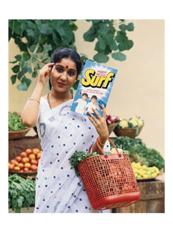
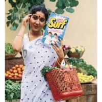
Lalitaji Concept: Alyque Padamse The idea of an unsmiling but extremely iconic housewife named “Lalitaji” for selling Surf was the concept made possible by Alyque Padamsee in early ‘80s. Lalitaji was a personified idea of his mother, that worked magically with Indian housewives. Clad in a white saree with printed blue border and dots, the charming, middle-class demeanor of Lalitaji with the equally convincing name signified practicality and wisdom a housewife should acquire while buying a washing powder. That time Surf as a brand required a marketing lift that was successfully accomplished through Lalitaji. How could we forget the wonderful advise, ‘Surf ki khareedari mein hi samajhdari hai!!!’

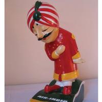
Maharajah Concept: Booby Kooka (Erstwhile Director, Air India) Execution: Umesh Rao, J. Walter Thompson, 1946 Composed in a typical red gown and white Chudidaars with wavy yellow borders, the first glance of this Maharajah would symbolize royalty. Though, for its creators the form symbolizes an epitome of luxurious living, graciousness, hospitality. His first entry was on an Air India memo pad expressing Air India’s promotional messages to travelers in India. The global appeal has taken him to acquire different personalities in different countries. A pavement artist, a monk, a lover boy in Paris, a sumo wrestler in Tokyo, our Maharajah has played different roles successfully to become an international brand ambassador for Air India. The charm and the wit displayed by Maharajah with his oversized and arched up moustache gives a distinctive look.

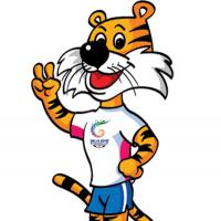
Shera Shera, the name derived from hindi word sher (meaning ‘tiger’) was the global face to commemorate the Common Wealth games of 2010. According to the creators, it represents majesty, courage, power and grace. Created for all age-groups, Shera’s role is to invite all to active participations in games. This is effectively communicated with the tagline ‘Come out and Play’. The smiling, energetic look of standing Shera, sometimes with his hand making a victory sign or mostly with his hands joined depicting Indian symbol of welcome (the ‘namaste’) creates an interesting fusion of local and global collaborative Sports event.

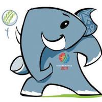
Stumpy The baby elephant named ‘Stumpy’ is the official mascot of ICC World Cup 2010. Elephants are peaceful and powerful animals. Hence, despite of being a baby elephant, Stumpy exudes the same spirit and energy. According to the creators, Stumpy signifies and eternal, restless spirit. The name characterizes the game ‘cricket’ (stumps being a main element of the game). The name was selected through an online competition for name suggestions for the mascot, conducted by ICC in 2010. The name was required to express qualities of a young elephant full of enthusiasm and a powerful sportman spirit. The name Stumpy harmonizes the young spirit with the spirit of the game in 21st century.

Sunfeast Concept and Design: FCB Ulka ITC came into existence in 1910 and encompasses a wide range of brands of hotels, information technology, cigarettes, tobacco, packaging, lifestyle products retailing etc. It entered the business of biscuits with The Sunfeast biscuits in Glucose, Marie and Cream range. There came the requirement of a visual brand ambassador. Sunny, known for his “Spread the Smile” concept, connotes happiness, pleasure and satisfaction that the tasty biscuits promise. It amplifies the emotional connection with the activity of acquiring energy and delight while having the glucose biscuits. With such a strong impressionistic mascot, the company has prospered in terms of branding, outsourcing due to a universal appeal and distribution.
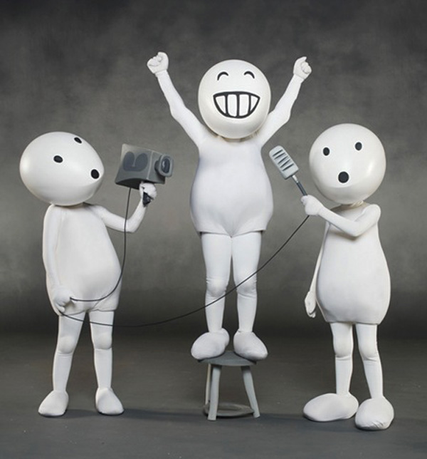
ZooZoo Design Team: Prakash Verma and team, Ogilvy and Mather The white, ghost like but curiously funny creatures became the promotional icons for Vodafone’s value-addition services. These eggeheads are not animated characters, but humans wearing body suits. The white egg shaped heads became thick and smooth as a result of “Perspex” (very hard material shell), which in turn was stuffed with lot of foam in order to support ventilation. The bulbous head with the lanky, thin body gives an impression of ZooZoo being very small in size than a human being. However, it is a life-size character cinematically shown smaller in size by using high-speed format through shooting. Also the background was turned grey with uniform, neutral lighting conditions in order to maintain focus only on the ZooZoos and their actions.


