What does the word mean?
What is the word or the phrase that has to be expressed. What does it mean. Do you want it to mean something else. Can you create a visual pun that will make it more memorable? The word has to become a visual cue.
Edward Ruscha's 'Made in California' poster is a great paradigm where California's quintessential qualities - Sea, Sunshine and Oranges, have been personified by - a type that appears to be water - on the orange colored poster.

Julian Rojas has preserved the essence of the word 'handmade', by creating it with numerous nails hammered into wood - it effectively creates a memory trigger for DIY work.
As a simple exercise let us take for instance the word 'Love', it means different things to different people. It is a common word, and we all feel it in different ways in our daily life. Love can be beautiful. Love can be in excess, it can be possessive and claustrophobic. It can be temporary. It can be a geeky love for machinery. Or a love for drinking! A food lover’s love is different from a book lover's love.
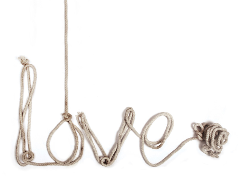

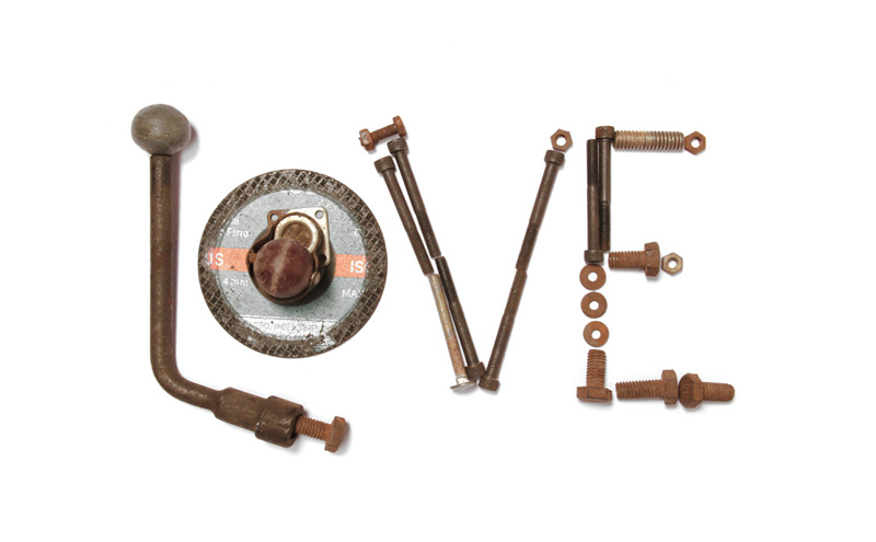
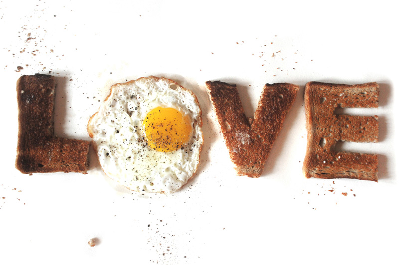
The images above express 'Love' in different materials and varied objects.
Observe what happens to the word and the play on its meaning, owing to the unique nature of each medium. The same word imparts diverse feelings when it is recreated with different materials.
The objects in question can be repeated endlessly to reinforce the word/meaning, lending itself to a pattern-based type. Or they could be used to create a visual contradiction - imagine the word 'Fire' written with ice-cubes and water, and what if the word 'Water' was made in paper, and "Paper' written with fabric. What if 'Love' was created with false, plastic roses? Different images are being created here, which in turn are imparting different ideas. Qualities and meanings can be constantly substituted or contradicted.
Using the Space:
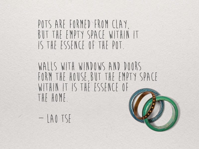
The negative and positive space when balanced carefully can create a beautiful type, as we have seen earlier. But, sometimes the space where the type has been created, also contributes greatly to its form and meaning.
Depending on the size and nature of the material, and the word or phrase that has to be created, one can get a sense of the proportions and space required. If the word is made from small paper pins, a table top snap is sufficient to capture it. But if the artworks have to be created in a bigger space, maybe outdoors the requirements and angles that it would be shot from are quite different.
When outdoors, 'where' you stage and create the typography can also be vitally important as the surroundings can also be of significance. Three factors which are: The 'word', means something, the medium it is created from - can carry a meaning & finally where it is created, the type of space used, can also be aptly chosen. The union of all three can produce interesting results. One such example can be seen in the works of contemporary graphic designer Stefan Sagmeister's bold artworks which are an excellent reference to this point.

'Always' - means forever and continuously. Ironically it has been written on a contradictory surface - beautiful flowers, that wither and die. The meaning of the word becomes a contradiction in itself.

Pieces of cloth have been wound across different trees, at different distances to create this word. This particular bit of typography is visible and readable only when captured from a certain angle, which makes it very interesting.
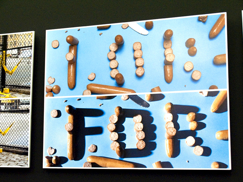
These pieces of bread that look incomplete in the frame above, actually get a meaning when a source of light is placed on the side, forcing them to cast a shadow that goes on to complete the incomplete letters. Who had ever thought, that sliced baguettes and shadows together could create a word.
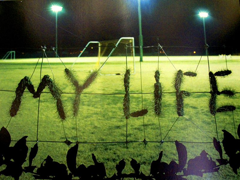
A football field behind, and typography created with a cacti on the fence around it seem to signify the passion and love amidst a difficult life!
