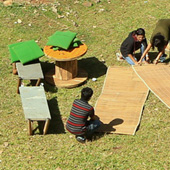
Taking into consideration the different contexts of the word 'Park' this is what the students came up with:
• 'No Parking' - The word 'No' has a negative connotation here. This signage is used for not parking cars in particular spaces, that are meant to be left available and open.
• Therefore, 'Park here' meant that the car was supposed to be parked there. But in case of our assignment anything could be parked in a particular space. So what exactly could be parked? And where could it be parked? to create the typeface.
• Park -It also means a green, open space for the public to enjoy, relax in, play games and have interactions.
• Park here - could be a signage in the literal sense pointing to a real 'Park' nearby.
• What do people do in the Park? Apart from playing and walking, they literally 'park'
themselves onto the grass.
• Where else can we park ourselves? At an urban home we park ourselves onto couches, sofas, beanbags, floor mats, rugs etc. In the office we park ourselves onto chairs.

This search for apt building blocks for the typeface resulted in - park benches, stools, tables and chairs, bean bags, mats etc. which were to be used for creating the letterforms.
The idea is that neither materials nor the efforts are to be spared whilst giving the words a dimension in the real space - the real space for it to be created on, was a lawn outside an academic building which was hardly used. It was selected owing to the grassy patch that had the shadow of a tree and building, making it a well shaded place. This place had a good potential to become a space for informal interactions and relaxing during short breaks taken in the course of day.

