Presented below are applications of the different styles of Bengali Typeface used on the streets of Kolkata supported by the scenario in which they were seen.
On Signboards:

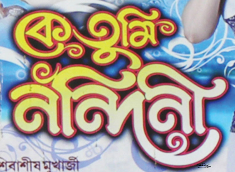
KE TUMI NANDINI
This is a banner from the theater 'KE TUMI NANDINI', which means ‘Who are you, Nandini’ released in Kolkata in the year 2010. The typeface is designed taking inspiration from “ALPANA”- a technique of creating ornamented design motifs of Bengal by crop dust and water. Usually, Alpana is used for all kinds of festivals in Bengal.

BASTRALAYA
This is a signboard from a traditional fabric shop of Kolkata written ‘BASTRALAYA’, an authentic cloth shop of Bengal, 10 feet by 10 feet square area and 12 feet in height, with a man sitting on a bench (‘Benchi’ in Bengali) at the entrance of the shop, selling all kinds of fabric and garment products. Usually, every outlet is related to some family descendant-ship and hence some name is accompanied with this word. ‘Bastralaya’ is a typical stereotype of most traditional cloth shops. In terms of typeface, it draws influence from ‘Kalka’ name of one type of Bengal motif, and also from ‘Tant’ (a Textile product/ Sari), which are integrated in a rhythmic way giving consistency and togetherness reflecting the culture of this region.

PURATON SONA O RUPA KHARID KORA HOI
‘PURATON SONA O RUPA KHARID KORA HOI’ – this sign says ‘We buy old gold and silver’- a commonly found signboard in jewellery shops in Bengal. It basically serves the purpose of indicating both selling and buying if you put this kind of board in front of a shop. Although it has consistency, its typeface is not proper nor are its curved strokes. Color red and yellow is the authentic color associated with Bengal. Its high contrast is to catch your eye and inform. The word ‘Kharid’ is also not a Bengali word. It is taken from the Hindi language means ‘to buy’ and literally gets adapted into the Bengali script.

KAMALA STORES
Multiplexes and shopping malls are a recent phenomenon in the modern day shopping experience in India. But are not as yet a replacement for the popular ‘Kirana’(Grocers) shop that dot every town and village in India. Bengal is no exception. The Kirana shop has a strange kind of traditional and personal feel to them. Here the sigh ‘KAMALA STORES’ is also reflecting that stereotype. First, this image is a special case. The shop is located in a place called Chandannagar city. If we study the history of Chandannagar, we see that it was part of a French colony between 1673 to 1794. French men used this city as a business port. Later when the British came, they also used Chandannagar city as a business port to export goods from here. They used big authentic ‘jute bags’ commonly named Bengali as ‘Pat-er Bosta’. Imagine a huge number of jute bags loaded in a container and the unique pattern this sight creates. This sign seems inspired and influenced in using the pattern and texture while creating this typeface. The image looks full of jute bags according to curves and strokes. For an outside visitor's understanding, these considerations seem improbable, but a field visit to the locality may help to understand this vernacular cultural influence.

RANGMAHAL HALL
Another image 'RANGMAHAL HALL' is one of the oldest signboards of a shop in Kolkata that sells only colors. In this shop, all different kinds of color are sold - from watercolors to wall paint or metal paint. The interesting part of the signboard is that it is monotone with the background forming the ground against the white letterforms resting on it. Another aspect is the interesting use of linear stroke as the shadow for the letter stroke. They very cleverly put the same color in letters and also in shadow, giving it depth.

BHAR DECORATORS
One of the examples of the previous discussion is 'BHAR DECORATORS'. Here designer used depth and it is notable that depth has light and shade according to their position. The dark part is black and the light part is brown. The perspective creates the feeling of three-dimensionality. Another thing is that it is not a three-point perspective. If we monitor these signboards then we see it is actually multiple perspectives from Indian Miniature paintings.

MUKTAMANJURI
Jewellery shops in Bengal follow their own kind of designs for the signboard that is unique and authentic. Typeface forms an integral part of that. Together they give the essence of Bengal’s jewellery shop. Here ‘MUKTAMANJURI’ means jewelled with diamonds. This jewellery shop follows the same tradition. The typeface reflects the jewellery of the region. Also here ‘Ukar’ and ‘Dirgha Ekar’ are extended and all the letters are ornamented with a small triangle.

SILK KUTHI
‘SILK KUTHI’ is one of the other authentic ‘Sari’ shops from Bengal, Kolkata. Silk is a textile material and ‘Kuthi’ means hut. ‘Silk Kuthi’ means a hut or house where silk is produced. Here they sell all kinds of Indian sari. The signboard uses ornamented typeface. The ‘Hrasu Ekar’ and ‘Dirgha Ekar’ reflect a feeling of a hut. These two dependent vowels signs create the impact of wholeness in this typography.

PURATON SONA O RUPA KHARID KORA HOI
Another image of ‘PURATON SONA O RUPA KHARID KORA HOI’ which reads ‘We buy old gold and silver’, but here they add the initials ‘BARABAZARER DORE’ means ‘Rate same as Barabazar’. Barabazar is a market in Kolkata where the price of gold and silver is comparatively low than in other places of Bengal. Here also one can see visual order emphasizing words using ‘golden yellow’ color. These colors like crimson red, chrome yellow, white and black also form authentic colors of Bengal. People use these colors in lots of places. Two types of the typeface are used. Both are low contrast typefaces but they are semi-bold faces. Developments of the Bengali typeface reflect small cultural aspects. Every locality evolves subtle variations distinct to its locality. These cultural differences in language and typeface vary from place to place. This could be because till the 80s or 90s communications occurred only within the immediate community or locality. Every community was different from another community. That made difference in display typefaces. What we see reflected as one traverse different locations are similar words with different typefaces displayed in different areas.
Historically we know the presence of British rule in India. Their capital was Calcutta (now Kolkata). The influence of their presence is seen in the architectural monuments, buildings, houses built in Kolkata and other locations in Bengal. Their influence on the local people was significant. A cross-cultural influence is also reflected in typographical styles put to use in the everyday. What is seen on the signboard today is continuity in cross-culture references which happened in Kolkata and its suburbs. Not only the British but the French and Portuguese model is also seen used as an aspect of this typographic culture. This cross-culture model is one of the finest percepts in Bengali script.

PAUL JEWELERS
This is another signboard from a jewellery shop ‘PAUL JEWELERS’. Again here the inspiration from the architectural form of ‘Pillar’ is juxtaposed with jewel form. Two types of the typeface are used. Both are low contrast typefaces but are semi-bold.

YATRA UTSAV
This is a poster from the Bengal Theater festival ‘YATRA UTSAV’. Theater culture was one of the most popular cultures in Bengal. It has however nowadays lost its luminosity.

KANDE BISHNUPRIYA
This is a banner from a theater called ‘KANDE BISHNUPRIYA’ means ‘Bishnupriya is crying’. In the field of theatre, typography becomes more expressive. All posters, banners, signboards, are seen to be not only expressive but also more emphasized. Here the word ‘Kande’ is emphasized, irrespective of its meaning.

HOREK MAAL 12 TAKA
Other types of two signboards - ‘HOREK MAAL 12 TAKA’ and ‘AITO RANG BE RANG’. These signboards read - ‘The price of all goods is Rs. 12’ and the second one -‘Here, colors are sold’. Both signboards use authentic colors. The left side one uses two typefaces. The second information of left one is ‘Bikrito Maal Pherot Hoi Na’ means ‘Goods once sold will not be exchanged’. The left one uses different typefaces for every letter and is handwritten. The right one is more perfect than the left one. It maintains consistency in terms of typeface design.

BARNOPARICHAI
‘BARNOPARICHAI’ means ‘Come to know about letters’, a signboard from one of the old bookshops in Kolkata with the smell of books. The typeface gives an essence of an old handwritten script in ink. Besides they use their authentic trademark in a consistence way.

YUGALS
‘YUGALS’ means ‘Pairs’. It is one of the contemporary shops from Bengal where they have used a three-dimensional display for their shop name. It is a multi-cuisine shop, where Chinese, Tibetan, Continental, South Indian and Indian food is available. In terms of typeface, they use authentic traditional Bengali typeface.

MONALISA
‘MONALISA’ is a textile shop that customizes the design of saris. They use the typeface in such a way that the movement and flow that forms the essence of a sari is reflected. It is a high contrast font. The word is written by a curved ‘matra’, Bleed junctions, oval negative space and a big round glyph to create consistency within letters.

BANGALI PATHAR MANGSER DOKAN
‘BANGALI PATHAR MANGSER DOKAN’ This signboard is from a meat shop. Here they wanted to mean ‘Mutton shop of Bengal’, but it’s become ‘Bengali Mutton Shop’. Here also they maintain the visual order, multilevel perspective and vignette colors. The composition is overfull using Bengal's authentic design motives.

YATRAMANDIR
This Bengal Theater banner written ‘YATRAMANDIR’ means ‘Temple of Theater’. Here the notable thing is the use of ‘Harsu Ekar’, and an italic typeface. The designer tries to incorporate the authentic common shape of temple architecture of Bengal into the ‘Harsu Ekar’.

SWEETS MRITUNJOY
'SWEETS MRITUNJOY', is the name of the sweet shop from Bengal. Bengal is famous for its sweets or ‘Sandesh.’ People relish eating sweets on all occasions. ‘Mritunjoy’ is the name of the owner of the shop but in Bengali, it also means ‘who won against death.’ It is some implies a kind of ‘Nectar of the Goddess.’ In the typeface, there is consistency between the letters, joineries and characteristics.

