The final prototype consists of the web article that contains static, animated and interactive visuals for explaining the subtopics. It can be accessed here-
https://jribh.github.io/Spacetime-Jribh/ (best viewed on Chrome for Laptop/Desktop). Some salient features of the prototype are listed below:
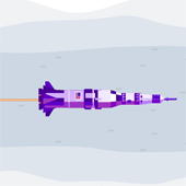
1. A banner on top features an interactive visualisation from the article, and would serve to grab interest of the viewer, as seen in Figure 56. The type of visualisation chosen here was that of a rocket ship experiencing length foreshortening as it flies faster and faster through space. In this particular visualisation, it is easy to see the effects of what is actually happening, while showcasing easily comprehensible visuals like a rocket ship flying through space.
2. Small chunks of text explain each subtopic in a concise manner. Sans-serif font ’Roboto’ has been chosen for the paragraphs for a modern look and easy readability.
3. Fixed scroll visualisations accompany the subtopics. The position of the visual would be fixed until the reader reaches the next subtopic. This would ensure that large chunks of text don’t dominate the page.
4. Interactive visualisations incorporate sliders to show the changes in real time, as seen in Figure 58. All the interactions are made using JavaScript, using majorly two libraries: three.js for the 3D visualisations, and D3.js for the 2D visualisations.
5. Some visualisations incorporate 3D models, that help in visualising curved spacetime with more ease, as seen in Figure 57. This particular visual allows the user to change the mass and radius of a celestial body, and see in real time the effects on its spacetime embedding diagram. The 3D models embedded here, just like all the other 3D models on the page, can be freely rotated around by the audience, which increases immersion and lets the audience view the model from different directions.
6. Not all visualisations are interactive, as that would increase cognitive load on the viewer, as well as increase the loading time of the page. Static visualisations, as seen in Figure 59 explain relatively simpler subtopics. In the image shown here, two static visuals show two different reference frames.
7. The overall layout of the page features text chunks and visualisation boxes with alternating alignments: some subtopics are right aligned while some are left aligned. These are separated by striking text and visuals that serve to categorise the major subtopics, while also making the long web-page less monotonous in terms of layout design.
Case Study Download:
• Visually Understanding Theory of Relativity......


