The students have to develop an eye to notice things within nature and pick out the right shapes and objects corresponding to letterforms. After spending a few hours outside, with the intention of finding shapes, and fonts amidst objects, we begin to notice things around us that have always existed, except that we did not perceive them with any freshness.
You may notice the form of an alphabet because of the way an object is arranged, or the shape of a leaf that naturally looks like the letter 'C', the shadow of a nail on a white wall making it the perfect letter 'L' at 7am in the morning, or the formation of a tree trunk forming a natural 'Y'. Just observing without any restrictions and looking in the most unlikely places may have interesting results.
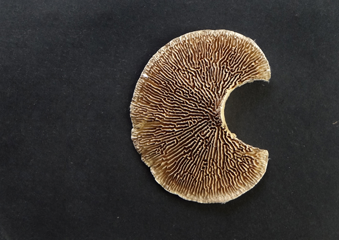
This is a perfect crescent moon 'C'. It was picked by a student when she was out for a walk, it is a beautiful bracket fungi that grows on trees in the monsoons. Not only does it take up the form of the letter C, but it also has a strong character of its own owing to the ribbed line texture, making it looking like a decorative font.

Can you spot the letter here?
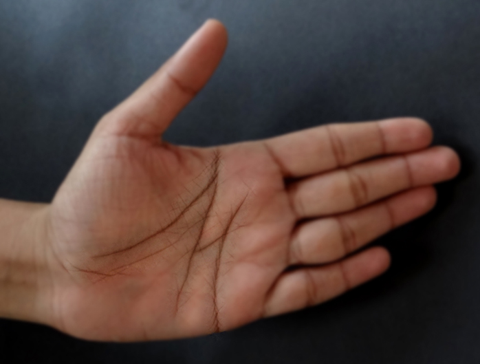
The perfect 'M' on the palm of a hand. As the students went on exploring they were surprised to find most of the letters in some form or the other, on different people's hands.
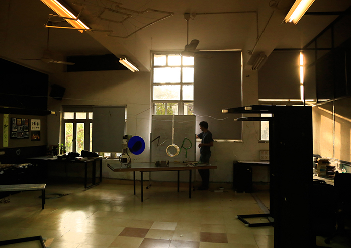
Understanding space. What if the font created is not top view but front view. Simply put it is not arranged on a table top but arranged within a 3 dimensional space. The purpose of this activity was to understand perspective, proportions and distance in space apart from finding objects that closely resembled the letters required.
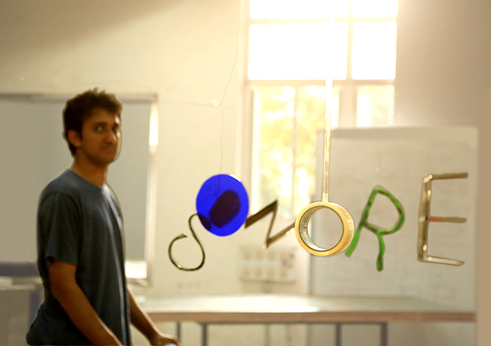
As you can see different objects like a tape and maybe even a person can be used as a part of the font. Once they are arranged at the right distances in such a way, that when all come together they form a readable word - Ignore.
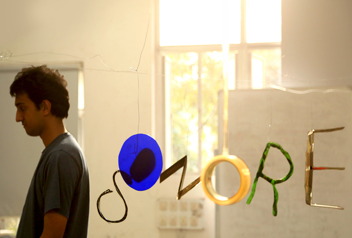
The idea behind this one was 'I' Ignore. I am ignorant, or 'I am better being ignorant to some things' Or 'I ignore the world' etc. The student in this picture with his back turned the other way; represents not only the letter ‘I’ but also ‘I’ as in the identity of a person, the fact that his back is turned becomes a visual cue for the word ‘Ignore’.
This is some work done - by Laura Manning as you can see the word itself demands a certain liveliness.

Be versatile - written in the most versatile way possible, in a way it is obvious and surprising at the same time, owing to the time and effort required to create it.
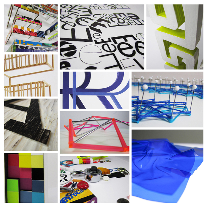
The making of 'Be versatile' close-up images revealing how the designer has worked in her studio to create the typeface.
The directness of the depiction may surprise you. But she has not limited her ideas and effort, through the usage of various materials and techniques to express 'Be versatile'. Works like these are undoubtedly a challenge to advocators of a sensible and functional use of typography.
Some examples of designers around the world exploring handmade type are below:
http://www.studiokallemattsson.com/#backbreaker
http://www.typeworkshop.com/index.php?id1=Eindhoven_10_2007&id2=daily&id3=
final_results&id4=&id5=&idpic=23#pictloader

