Colour is not just a visual sensation but it is immediately followed by perception. It is the perception that decides and identifies what has been sensed. This can be understood through:
1. The Experience of Colours
2. The Psychology of Colours
3. The Meaning of Colours
The Science of Colour Perception:
Vision is not only a result of the light entering into our eyes but also includes biological functions. The sensation of light is received in two areas of the brain.
1. The cerebral cortex, which is the centre of cognitive activity. Its job is to receive information and process it by recognizing and structuring a response to each stimulus.
2. The hypothalamus or midbrain, which acts as a biological stimulus to the nervous system. The light and colour stimulations trigger the midbrain which in turn releases hormones. Hence, colour stimulus can have a very strong psychological and hence physiological influence on human affecting their needs and emotions.

Source: Feisner E. A., (2006) Colour Studies, Fairchild Publication, Inc. NY.
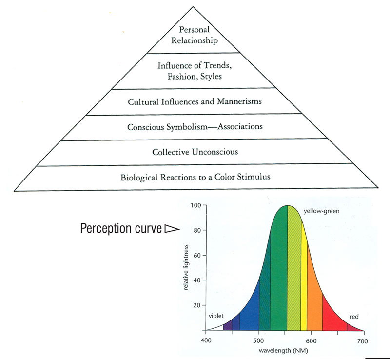
Human eye in combination with the brain’s reaction distinguish type of colours, its relative purity and lightness. Humans do not sense the colour spectrum as separate colours but as unbroken band of colours each blending into the next just like in case of a rainbow. ‘Threshold’ of vision is the point at which one cannot detect difference between two similar colours. The ‘interval’ is the step of change between sensations and helps characterize differences between colour samples. The ultraviolet and infrared colours lie beyond two ends of visible spectrum beyond the range of human vision. However, certain animals and insects can sense these colours. In addition certain colours are perceived more easily than others. The attached figure shows the perception curve of the visual spectrum. It indicates that yellow and green are seen before other hues while red and violet are difficult to perceive.
Memory, experiences, intelligence and cultural background all affect the way colours impact humans and these impacts vary from person to person. This does not say that the colour will be perceived differently but the perceptions will mean different things to different people [1].
According to Miller [2], it is possible to do a theoretical distinction of three backgrounds for meanings attached to colour:
• An Innate,
• A Personal, and
• A Cultural background.
The first one hypothesizes from anthropological and behavioural research, for several subhuman species colours are very important signals in order to survive and adapt. Humans are also bound to these biological reactions and it is possible that in their evolution the ability to see colour developed because it was essential for their survival too [3].
The second background comes from each of our personal experiences and choices. People are comfortable when colours remind them of similar things. For example, a soft shade of blue triggers associations with the sky and a psychological sense of calm.
The third background implicates culture. We are born and bred in cultures that are full of meaning. Coded meanings of colours are shared connotations of feelings, sensations, atmosphere, thoughts, and moods [4].
It could happen that meanings could vary through historical timeline and different cultures. The vast majority of people are not aware about the effects that colours have on them; neither how this symbolism is used in everyday life and in communication. Some basic colours have had, and still have, symbolic significance in religions. Flags are important examples of abstract colour symbolism.
The Experience of Colours:
To perceive colour is to ‘experience’ it consciously or un-consciously. Mahnke (1996) has systematised the experience of colour through a Colour Experience Pyramid. The different levels of colour experience starting from the base of the pyramid are:
1. Biological Reactions to a Colour Stimulus:
Colour is a gift of evolution and an inherent characteristic of survival.
Eg. Green plants are green because they depend on the pigment chlorophyll for photosynthesis.
2. Collective Unconsciousness:
They are archetypes or original patterns, predispositions for responding to or experiencing our world in the same manner our ancestors did.
3. Conscious Symbolism or Associations:
The impressions and associations made at conscious level- they are learned responses.
Eg. Green with nature, blue with sky or water.
4. Cultural Influences and Mannerisms:
Colour associations that are characteristic of specific cultures and groups or regions and religions.
Eg. Red represents purity in Eastern context while it is associated with aggression and anger in the global West.
5. Influence of Trends, Fashions, Styles:
Colour changes associated with sales and market, to guard against consumer boredom and to celebrate the spirit of a particular time. Though temporary, the colour trends are also overall way in which we experience colour.
6. Personal Relationship:
An individual responses with respect to likes and dislikes towards a particular colour(s). Personal relationship to colour and its significance can only be truly investigated through psychodiagnostic colour tests.

The Psychology of Colours:
Light and colours are also involved in psychological theories. Valuable information about emotional content of colours is available from a series of psychological experiments and tests. Rorschach developed a psychological test in which colours are an important issue, commonly known as inkblots test. He stated colours remit to emotions, and a more responsive behaviour towards colours indicates a greater affectivity. Jung suggested chromatic experience as different ways of perception and expression, and stated an equivalency between colours and feelings. Psychological effects of colours or colour psychology is a vast and complex field beyond the scope of this section.
Our reactions to colours can also be used as diagnostic tools for some theriapies. Experiments have shown that people placed within a red environment are energized and seem mentally alert and creative. A pink environment has a calming effect but still allows creativity to be highlighted. Yellow and orange will activate and increase energy levels. It has been shown that blood pressure is elevated by experiencing red, orange or yellow environments. Blood pressure decreases when people are in green, blue or black environment.
Some psychologists believe that analyzing an individual’s use of and responses to colour can reveal information about his/her physiological and psychological condition. It is even been suggested that specific colours can have a therapeutic effect on physical and mental disabilities. Dyslexic children have been helped in their reading by placing a coloured transparent sheet over the stark black and white page. Phototherapy is a therapy used for depression diagnosis; the patient is exposed to a potent source of light in order to make him/her feel better. It has been proved regions with long non-light periods have higher records of emotional disorders and suicides. Moreover, IQ testing also provides us with some interesting colour effects. Testing results are higher when the subject is placed in yellow, yellor-green, orange or light valued blue room. Lower IQ results were recorded when subjects were in white, brown or black surroundings. Medical field known as chromotheraphy is use of healing with colour, be it coloured light, environment or mental exercised that involve concentrating on particular colours. However, the role of colour in medicine has been controversial over ages [5].
Colours may evoke associations with odour and taste, appear heavy or light, appear near or distant, be associated with sound, volume and temperatures. These associations play an important role in the design of the built environment, advertising, product colour and display – in short anything where colour is used to inform and communicate.
Mahnke (1996) again gives the following association with colours with perception of volume, weight, size, temperature, noise, sound, odour, taste and tactile associations.
Perception of Volume:
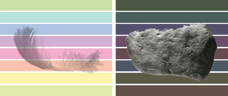
Lightness or darkness of colour in interior spaces plays a very important role in the perception its overall volume. Light or pale colours recede or increase room size while dark or saturated hues seem to decrease the apparent size of the same room. Similarly, a highly illuminated room will have an enlarged appearance of volume while a dim or low illumination seems to diminish it.
Perception of Weight and Size:
Darker colour appears heavier while lighter colours seem less dense.
Eg. A piece of heavy machinery painted dark green will seem shaky if it rests on yellow feet.
Cool colours make objects appear shorter and smaller while warm colours make them longer and larger.
Eg. Heavy objects designed o be moved or carried by human may be made to appear less heavy by painting it with ligher, cooler colours. In interior spaces, low ceiling may be painted lighter to make them appear higher.

Perception of Temperature:
Colours that are considered warm are red, orange, yellow while cool colours are shades of blue and green. There are a number of accepted medical theories proving the perception of temperature with respect to colours.
Eg. Because red is the nearest hue to infrared heat (it is the longest wavelength) it imparts a physical sensation of warmth.
Colours absorb and retain heat in various degrees. In hot climate the terrace floorings are whitewashed or use white china mosaic to reflect heat and keep temperatures inside the room lower.

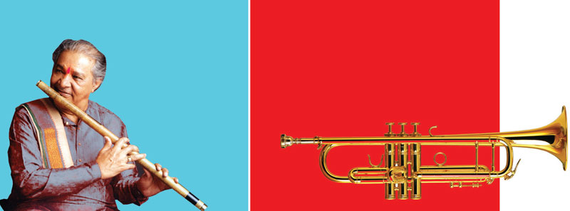
Perception of Noise and Sound:
Brightness and loudness are associated with effects of warm colours and vice versa.
Eg. Loud red or soothing blue.
Heinrich Frieling, director of Institute of colour Psychology, based on his research assigns the following sound associations to various colours. A few examples are as follows:
• Red: Loud, trumpet
• Pink: Soft, delicate
• Yellow: Shrill, major key
• Green: Muffled (when dull), shrill (when saturated)
• Blue: Distant, flute to violin.

Associations of Odour and Taste:
Colours that hold pleasant associations with smell are pink, lavender, pale yellow and green. Tints of coral, peach, soft yellow, light green have pleasant associations with taste.
“Colour and the appeal of various foods is also closely related. Just the sight of food fires neurons in the hypothalamus. Subjects presented food to eat in the dark reported a critically missing element for enjoying any cuisine: the appearance of food. For the sighted, the eyes are the first place that must be convinced before a food is even tried. This means that some food products fail in the marketplace not because of bad taste, texture, or smell but because the consumer never got that far”. (Gary Blumenthal International Food Strategies)
The Institute of Colour Psychology under Frieling has also complied a listing of odour and taste associations:
• Red: Sweet, strong
• Pink: Sweetish, mild
• Yellow: Sour
• Green: Sour, juicy
• Blue: Odourless
Tactile Associations:
Colours can also give an impression of texture or sense of touch.
For Eg. Red appears firm and solid, yellow appears smooth and light while violet has a velvety appearance.
Colour Psycholgy:
The colour of the food plays a cur tail role in appetite. The lighting in the restaurants as well as the food colour and presentation contributes to its success. Sight is the first to be convinced before the food is even tried!


The Meaning of Colours:
Colour Association:
• RED
• ORANGE
• BLUE
• GREEN
• RED:
Arousing, exiting, stimulating and is associated with strength, passion, activity. Its negative impressions include aggressiveness, fierceness and blood. Red signifies life and living. Red is an auspicious colour for marriage. Brides in India and Nepal wear red saris; in Japan, a red kimono symbolizes happiness and good luck.
It is also a colour of love. It is perhaps the most dominant and dynamic of all colours. The effect of fierce effect of red is drastically changed to gentle when it turns to pink. Red when is used with bright orange loses its meaning.

• ORANGE:
Orange is jovial, vibrant, exiting, extrovert and fruity – but it can be rough, insensitive and can lack identity unlike red. It is a symbol of autumn. Orange (saffron) is a sacred and auspicious colour for Indians while it is the colour of prison uniforms in the U.S. Research has shown that orange in supermarkets represents ‘cheap’ value for money. Bright ‘safety orange' is also used to attract attention like red. Different oranges have different effects and associations. Brown is a darkened orange which is linked with comfort and security, bright orange can be spicy, and terracotta is earthy while lighter oranges are soothing and healthy.

• BLUE:
Blue is rarely disliked by people and gives a relaxing and calming impression. Its positive associations are calmness, comfort, peace, cleanliness, spirituality, coolness and infinity while its negative associations are frightening, depressing and cold. Blue convey different meanings in different cultures – in English to ‘feel blue’ is to feel low while that in German is to be drunk and in Russian means to be homosexual. Blue is associated with baby girl in Belgium as opposed to rest of the world.

• YELLOW:
Yellow is reflective and luminous and happiest (cheerful and high-spirited) among all colours. It’s the colour that captures our attention more than any other colour. In almost all cultures it symbolizes bright future, optimism and hope. The human eye processes yellow first and hence it is used for cautionary signs and emergency vehicles.

• GREEN
Green is a global symbol of ecology and environment; it is holy in Muslim culture and lucky colour in Ireland. It is universally associated with nature and traffic lights are green all over the world. Negative association of green is decay and sickness. Most people associate poison with green. Neutral green is calming but when it moves towards yellow in the colour spectrum it becomes stimulating while towards blue is turns cooler.

Colour Symbolism:
Yellow is a cheerful and bright colour. In its purest form, it has associations with nature, childhood, the sun and happiness. However, add red to it and you start to move towards autumnal feelings. Add green to it and it gets associated with disease and illness. When coupled with black, yellow is the highest contrast colour, which is why you see it on so many warning signs, airport signage, and so many other signage systems. We are, of course, just copying nature here, bees and wasps use these colours to great effect.

A colour that isn’t really a colour. Black is the absence of colour. In the West, it’s associated with death and mourning, but also has an authoritative, official feel. It can sometimes be used in branding to give a sense of style; a classy touch. In this sense, black can suggest wealth and opulence.

Flags are the most obvious examples of abstract colour symbolism.

The symbolic meaning of colour varies with TIME and CULTURE.
It is now clear from the chapter ‘the Science of Colours’ that in the physical world, there are no colours. Colours are light waves of different wavelengths that are reflected from objects and the human eyes have the ability to sense and perceive such bands of wavelengths as different colours. Seeing colours is therefore, is ones one perception and experience which can be affected by various factors such as individual personality, mood, emotions, personal experiences, age, gender, social and cultural backgrounds. This is why different colours mean and feel differently to different people. Moreover, the meaning of colours is not same across different cultures and period of time. The meanings of colours and their symbolism in a particular society is formed by the myth, value, belief, religion, customs and taboos as well as regional and historic background of that particular society. For eg. The Christian bride wears white for the wedding symbolising purity while a Hindu widow wears white as it symbolises mourning.
The meanings associated with colours may be universal and timeless but not always. For example, the fact that green is the colour of vegetation and that blue is the colour of the sky and water has been a reality that is common to all people. However, colour symbolism that arises from cultural and contemporary contexts are not universal and may be unrelated to its natural associations. These may also change through time. Colour changes are said to reflect the ideas, philosophy, moods and trends prevalent in that particular era as well as the economic and social change. For example in the 1960s, psychedelic colours were popular since it echoed the optimistic spirit of that era. Furthermore, a colour may have both positive and negative symbolism. For example black’s positive connotations include sophistication, luxury, and power while its negative connotations are death, depression, bad luck. On one hand, red is a colour of fire, energy and aggression (in the global west) while in direct contrast, red is used for “STOP” signs throughout the world today.
Although there are no absolutes, there are logical sources for the range of complex and sometimes contradictory psychological/cultural meanings of colours. These may arise from any of the following [6]:
1. Cultural associations: the colour of currency, traditions, celebrations, geography, etc.
2. Political and historical associations: the colour of flags, political parties, royalty, etc.
3. Religious and mythical associations: the colours associated with spiritual or magical beliefs
4. Linguistic associations: colour terminology within individual languages
5. Contemporary usage and fads: current colour applications to objects, sports, and associations generated by modern conventions and trends.
Colour psychology analyses the effect of colour on human behaviour and emotions. It can also influence the subjective appreciation of the quality of goods or the perception of an advertising message. Hence designers and marketers can use colour psychology to add value to the products and services and to increase sales. There are numerous examples that colour psychology can be applied to interior, product, fashion and textiles design in numbers of ways that achieve favourable result [7].
The understanding and application of colour psychology is made complicated by the different symbolic meanings of colours in different culture.
[1] Feisner E. A., (2006) Colour Studies, Fairchild Publication, Inc. NY.
[2] Miller, H. Experience of Colour, http://www.hermanmiller.com/
[3] Mahnke, F.H., (1996) Colour, environment and Human Response. An Interdisciplinary Understanding of Colour and its Use as a Beneficial Element in the Design of the Architectural Environment, Van Nostrand Reinhold, NY.
[4] Zammitto V.L., The expressions of Colours, summit.sfu.ca
[5] Feisner, A. (2006), Colour: how to use colour in art and design, Laurence King Publishing.
[6] Morton, J. http://www.colormatters.com
[7] Wong, B., Colour Psychology in Design, www.shine-21.com

