Colour is an important aspect of the design of interior spaces. We know that a well planned space can be enhanced by using ‘appropriate’ colours. An appropriate colour for a space is relative and cannot be prescribed.
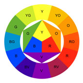
The use of colours in interior spaces as the translation of abstract colour schemes, theories and meanings into real materials, surfaces, experience and use in a space is a complex matter requiring creativity, judgment and often comes with experience. However, organized methodology and advance planning of colours can lead to successful use of colours. Pile, J. (1997) argues that just as one would not start construction of a building without construction drawings and plans, one should not start working on colours in interior spaces without careful planning. An understanding of the colour theories and effects also supports confidence in use of colour in practice. Various devised colour schemes may not be directly applicable to actual colour schemes in practice but it helps in understanding the way in which colour appears to the viewers, its different effects and provides a sound background for appropriate use of colours. An understanding of colour psychology and symbolism play an important role while choosing colours for interior spaces in different settings for different functions.
There are three key questions to be asked while working with colours in interior spaces:
• WHAT ?
• WHO ?
• WHERE ?
WHAT is the function/purpose/use of the space you are choosing colour for?
- Colours used for residential interiors can be highly personalised depending on the taste and choice of the owners. Hospital interiors are generally white and blue to indicate cleanliness and being calm. In contrast many experiments can be done with trendy, bright colours while choosing colours for fast-food joints and restaurants targeting young crowd. The function of the space corresponds to colours based on the preferences of the clients, users, intended ambience, atmosphere as well as desired mood and emotions.
WHO is the end user of the space you are choosing colour for?
- Before you derive a colour scheme for an interior space it is very important to inquire the use of the space and their needs and attitudes- what is the age group, whether children, youth or elderly? Are there people with special needs requiring special design considerations? Young children are attracted more by colour than shapes and infants prefer red and blues. For elderly people all colours will be dimmer and visual resolution will be lower. Hence while designing for elderly people, designers should use bright colours and make sure that brightness and contrast is especially high.
WHERE is the location of the space you are choosing colour for?
- Colour schemes may vary for spaces in hot and bright climate to cold and dull weather, in specific cultural and social settings, in different physical and geographical locations.
Colour Methodology in Interior Design:
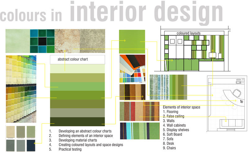

There are a few steps to follow that might be useful for developing appropriate colour schemes for successful interior spaces.
1. Developing an abstract colour charts
2. Defining elements of an interior space
3. Developing material charts
4. Creating coloured layouts and space designs
5. Practical testing
Developing an Abstract Colour Charts:
Developing colour charts is very useful in developing satisfactory colour schemes for interior spaces. The colours for abstract charts should be chosen based on the answers to the previously mentioned 3W’s but should be independent of actual layout and general design of a particular space. Abstract colour charts can be merely bands of desired colours and can be created using coloured papers or paints like watercolour which gives more flexibility in producing different colours of different shades and tints by adding and mixing of pigments. Choosing the first colour and adding colours in sequence with a constant attempt to achieving satisfying relations is the aim of this exercise. Several alternatives may be laid out for a particular key colour and final selection can be delayed until total scheme is complete.
Defining Elements of an Interior Space:
The next step is to define the elements of the interior space that a designer is to conceive. Several elements of an interior space may share same colour hence it is important to make a list of elements in the interior space eg. floors, walls, ceiling, architectural features, doors, upholstery, furniture, artwork, etc.
Developing Material Charts:
After a satisfactory colour chart is derived assign real material colours to match the chart colours. Samples of paint colours, wood finishes, tapestry, veneers, laminates etc available from various suppliers can be used to create material charts and schemes.
Creating Coloured Layouts and Space Designs:
After the abstract colour and material charts are derived and the elements of interior space are determined, the next step is to transfer the material chart to a space layout or model. It is best to start with areas that occupy large spaces such as floor, ceiling, walls or to start focus objects or key element of the design which will act as a key colour in your colour scheme. The samples from the material chart are indented to stand for the way in which each colour will look in the final placement. After the assignment and placement of colours in the plan and elevation drawings, developing a physical model or a 3d computer model can be very useful to create realistic images of the space with desired lighting effects.
Practical Testing:
The actual materials when applied in real sometimes may appear very different from their samples, hence some practical testing on smaller areas on the site is useful. Also, viewing the entire piece of upholstery or laminate sheets may give a better idea of the final effect and there are less chances of getting wrong. This becomes more clear with experience and knowledge about materials available in the market.
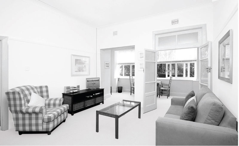
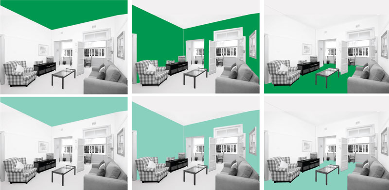
The location and total area covered by a colour within an interior space can make a great deal of difference in influencing a space’s character. The effect of a hue on the floors is different from the effect of the same hue on the ceiling. Mahnke (1996) views on the effect of a colour when applied at different locations such as ceiling, walls or floor in a is described here.
However, this may vary extensively depending on the tints, tones and shades of the hue. Personal preferences and cultural parameters also pay a key role in defining the character of the space based on the colour usage. Also, the amount of colour used in a space may vary affecting its character and appearance. eg. red can be used to highlight or gain focus on cer tan areas or walls whereas too much application of red in living areas may be difficult to live with. The same read can work well on large surfaces and areas if there is a lot of natural light. It can also be used extensively in trendy food outlets, pubs, etc.
Colour, material and lighting choices for interior spaces may be different for residential use, retail outlets, restaurants, hotels, showrooms, offices, religious buildings, transport interchanges etc depending on its location, climate, culture, activity and preferences.
• RED:
- Ceiling: Intruding, disturbing, heavy
- Walls: Aggressive, advancing
- Floor: Conscious, alert, pompous
Red can also give energizing effect and is used in case of trendy fast-food joints, pubs etc. However, over use of red can add complexity to space and hence should be carefully used.
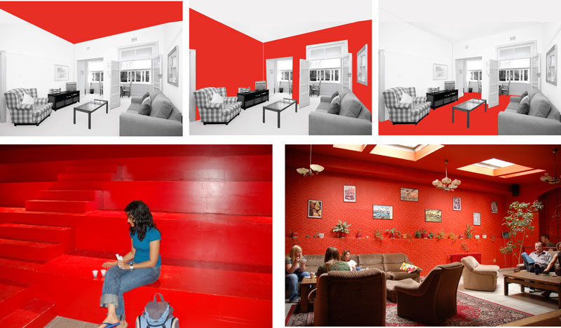
Temporary Space designed for Venice Architectural Biennale 2006 - Youth Hostel, Prgaue
• YELLOW:
- Ceiling: Luminous
- Walls: Exiting to irritating
- Floor: Elevating, diverting
Because of high visibility, yellow is used for safety indcators. It can give fresh feeling when used appropriately. A good colour for kitchen or part of children's room.

Yellow when used in home interiors can create a cheerful atmosphere, give a sleek look and can improve ones mood. Application of yellow as the dominant or key colour can often unify and strengthen the over all interior space but if went wrong can seem redundant and hot.
a. Deep yellow with a combination of red when applied to large areas feels hot and loud.
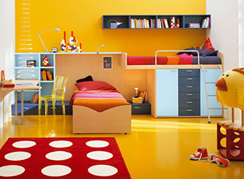
b. Yellow used in furniture creates interest and feels cheerful.

c, d. Dull yellow in combination with white looks fresh.

e, f. Bright yellow in combination with white looks bright and clean.

(Image source)
• YELLOW:
“Urban Station is a combination interior design of office space and coffee shops located in Palermo Soho area of Buenos Aires. Decorating the bright yellow interior space, giving a double room functions of the perfect working environment and a cozy coffee-shop. Cool vintage furniture chair beside the table art and business magazines, projectors, LCD screens, printers and fax machines, coffee, breakfast and WiFi complete the interior space facilities.
Merging the functions of office space and the coffee-shop designed to provide increased comfort and interaction opportunities for mobile workers. This is an interesting design inspiration for a better quality of life”.
The Designer: Total Tool Design Studio
Source: Copyright © 2010 - 2011 yellowpelow.com

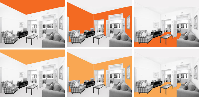
• ORANGE:
- Ceiling: Stimulating, attention-seeking.
- Walls: Warm luminous.
- Floor: Activating, motion-oriented.
Orange can be harsh if it is too bright. Appropriate use of bright orange can create lively and cheerful moods and can be used to highlight surfaces. Calmer tones of orange are easier to live with.
• BLUE:
- Ceiling: Celestial, cool if light; heavy, opressive if dark.
- Walls: Cool, distant if light; encouraging, deepening if dark.
- Floor: Feeling of effortless movement if light; substantial if dark.
Blue can be cold and bleak if applied to large areas.

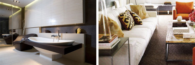
• BROWN:
- Ceiling: Oppressive and heavy if dark.
- Walls: Assuring if wood is used.
- Floor: Steady, stable.
Brown works well as natural colour for wood, mud etc. Brown paint is not as comfortable.

Brown can be timeless and classy as well as modern at the same time. Brown is used in many ways throughout interiors and fashion world. Brown lighter to darker tones, brown can be versatile and blend well with other hues.
SOURCE: Edyta & co. Interior Design & http://millenniumdesignsinc.com/
• PINK:
- Ceiling: Delicate.
- Walls: Intimate, sweet, feminine.
- Floor: Too delicate, unfamiliar for the location.
Pink is usually used for childrens room and a correct tone can also bring soothing effect.

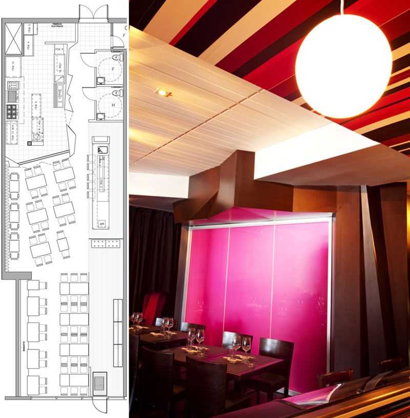
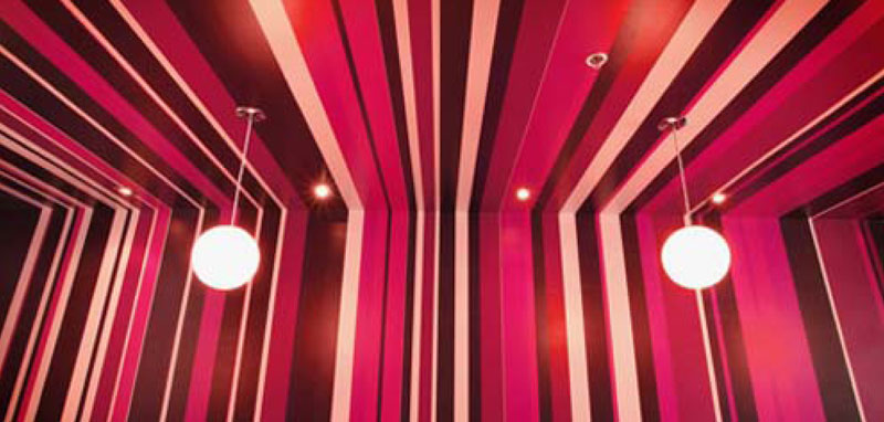
Kazumi Sushi Lounge, in Montreal, Canada designed by Jean de Lessard is inspired by the ancient oriental art of paper folding revisited in a thoroughly modern and glamorous. Strips and use of glossy pink gives the space as unique character and atmosphere.
SOURCE: trendhousedesign.com; http://www.joindes.com
LINK: http://delessard.com

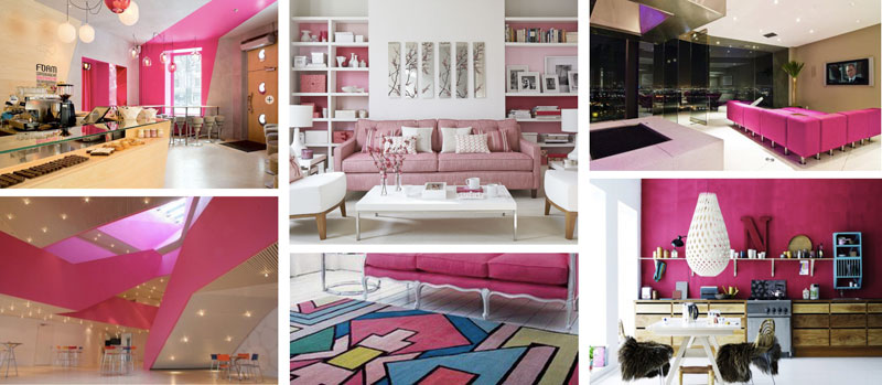
Pink can be fresh and soothing and can be used to create stylish interior spaces. It is a great accent colour as well as a highlighter if used as dark and bright Though creative use of pink can really liven up a space, it can also overwhelm just as easily.
Source. Google papemstitchblog com; myhomeandgardencom; wwl¥. #lcreaseroom.com; http/ /dreamsinpink.blogspotin
• GREEN:
- Ceiling: Protective, disturbing if too bright or dark.
- Walls: Cool and calm if mild, can be irritating if dark.
- Floor: Soft, relaxing if softer tones are used.
Green works well as natural colour for leaf etc. Green paint is not as comfort, if dark.
• BLACK:
- Ceiling: Hollow to opressive.
- Walls: Ominous, dungeonlike.
- Floor: Odd, abstract.
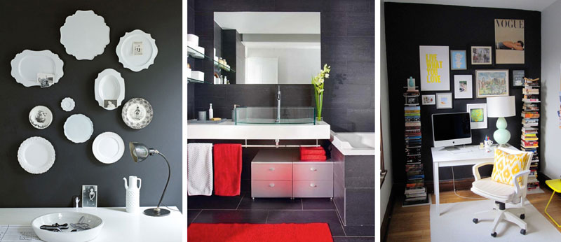
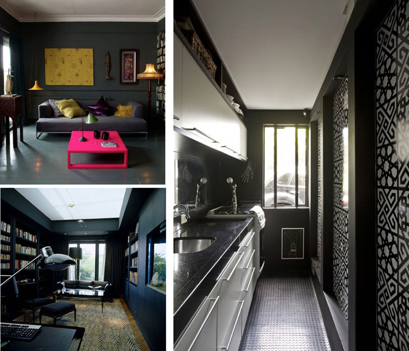
The use of black on walls requires two things courage and well-designed spaces. Black painted walls or even some black accents can change the appearance of space interiors. High ceilings or a lot of natural light are prerequisites for the use of black on walls, but even smaller spaces can look modern and elegant if all the other elements are chosen to contrast and enhance the effect of dark walls. A smaller space can painted in light hues (eg white) to feel more spacious or it can be painted dark (eg black) to accentuate its character.
(Image source)
• WHITE:
- Ceiling: Empty
- Walls: Neutral to empty, sterile, without energy
- Floor: Feeling of not to be walked upon.
However, white marble is extensively used for flooring. White is used for temples to symbolise purity. White on walls gives neutral effect and allows use of brighter and various colour accessories and tapestries.
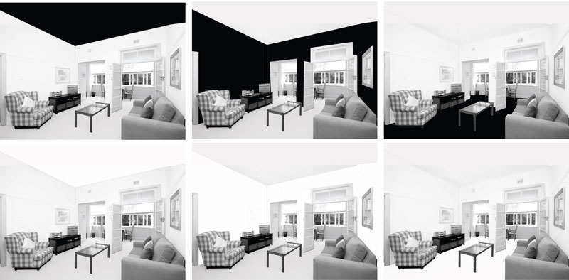
Pile, J. (1997) Color in Interior Design. McGraw-Hill companies Inc.
Mahnke, F.H., (1996) Colour, environment and Human Response. An Interdisciplinary Understanding of Colour and its Use as a Beneficial Element in the Design of the Architectural Environment, Van Nostrand Reinhold, NY.
Assignment 1: Colour Schemes for Kitchen Interior:
Based on your knowledge develop your own colour schemes for this kitchen interior.
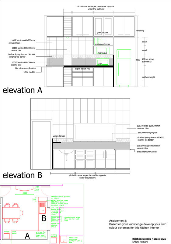
Assignment 2: Colour Scheme for toilet Interior:
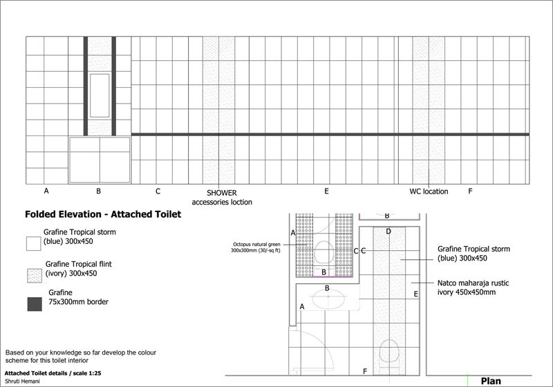
Based on your knowledge so far develop th ecolour scheme for this toilet interior.
