Design Course
Visual Design Primer - The Grid
Explore. Experience. Understand
by
Sample Solution and Process
Slide 1:
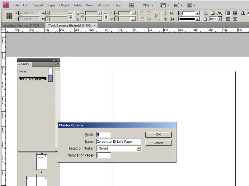
Master pages:
It is an A4 sized page, thus our space is already defined. We will define our type area, by setting margins. These margins will be set on master pages in the pages panel of Indesign. We will create two master pages, one for the left side page and one for the right side page. Open the pages panel and create a new master. I have named it prefix: L Name:Corporate ID Left Page. Similarly the master page for right is called R Corporate ID Right Page.
Slide 2:
Slide 3:
Slide 2 and 3:
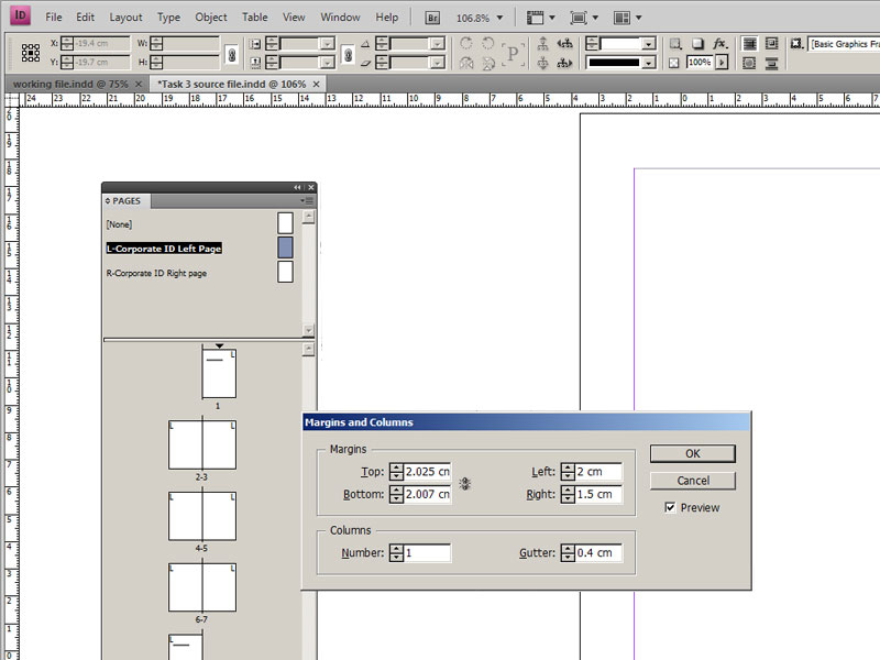
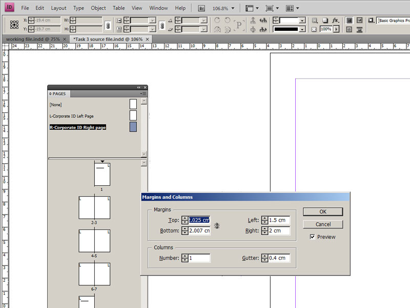
Margins and Type Area:
We have seen good practices about setting up margins earlier, now we will use the same principle to set margins for this book. Since this is the left page master, I want to have least space in the right and most space at the bottom. My margin increases from right, to top, to left, to bottom in an anti-clockwise fashion. These measurements are just an example and margins will vary from book to book, depending upon the content.
Margins are left such that while holding the book, thumbs can rest in the margin area without obstructing the process of reading.
Slide 4:
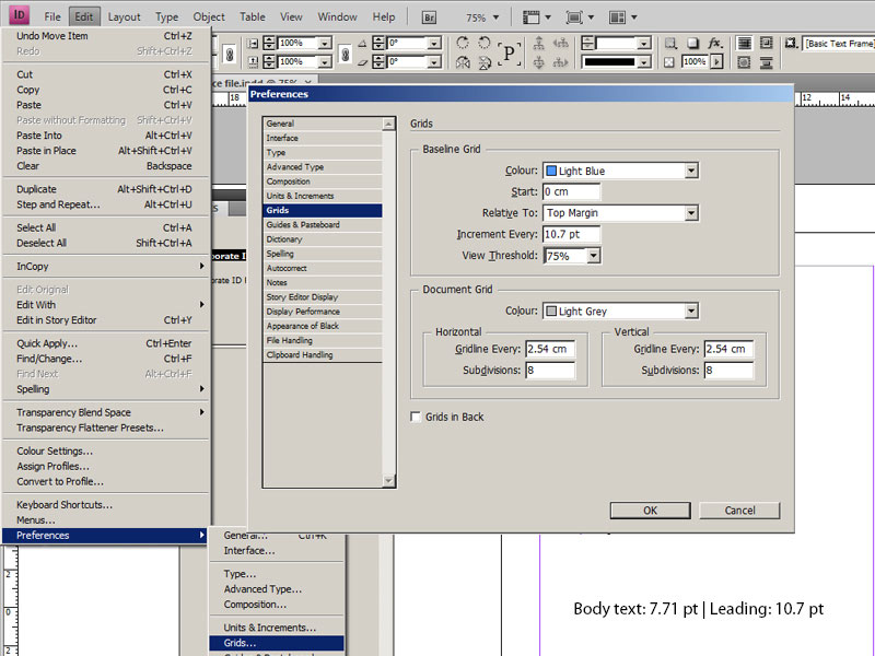
Set the Baseline Grid:
The baseline grid in Adobe InDesign, is tucked under EDIT>PREFERENCES>GRIDS or simply Ctrl+K on PC and InDesign>Preferences>Grids or simply CMD + K on Mac to throw open preferences panel and look for baseline grid under Grids tab. Here, we will use body text size of 7.71 and a leading of 10.7 pt, which we derived in the previous section. Hence in the baseline grid under increment we will enter 10.7 pt, so that the spacing between two lines that is our leading is 10.7 pt. I want the grid to begin from the top margin and I will choose the ‘top margin’ option in ‘relative to’ tab.
Slide 5:
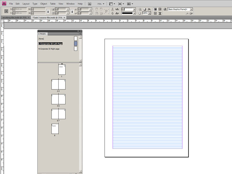
The baseline grid is set. This is what it looks like
Slide 6:
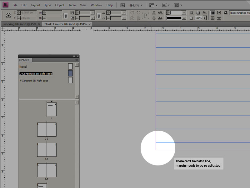
However, we are getting an incomplete line at the end. We cannot have half a line, so we will tweak the margin to either include or exclude the last line. I re-worked the margin and now the type area has 70 lines
Slide 7:
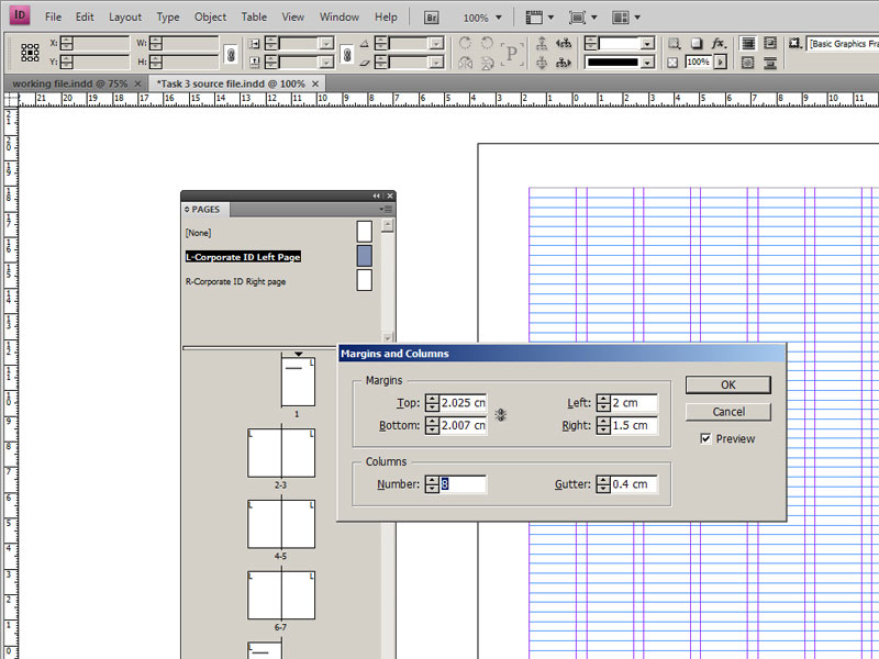
I decided to make 8 columns (found under EDIT>MARGINS AND COLUMNS).
Slide 8:
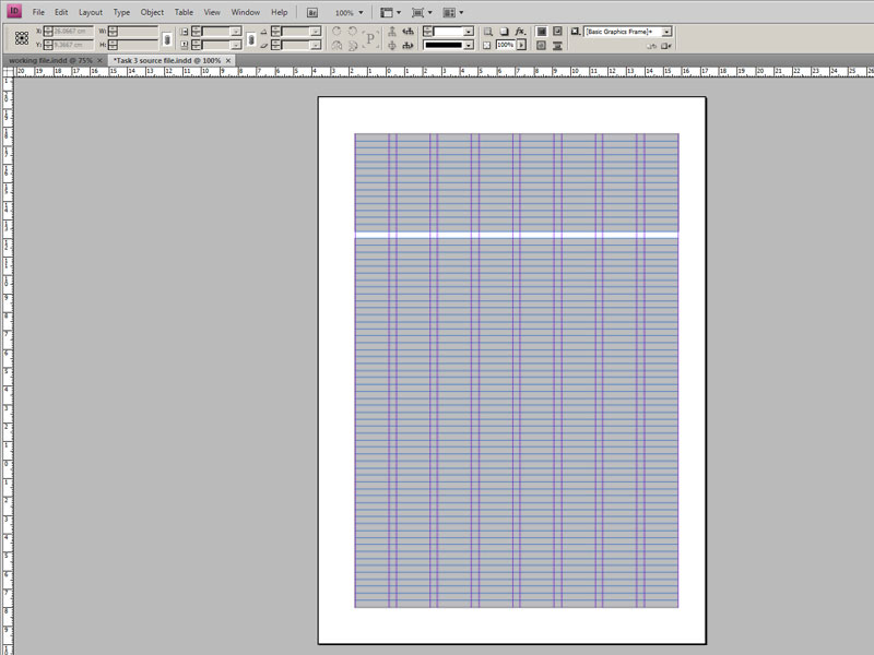
I made the following divisions of space, within 8 columns. I decided to have all the instructions, course details in the rectangle at the top. I wish to use rest of the area for the assignment and images if any. But these allotments of space are not random.
Slide 9:
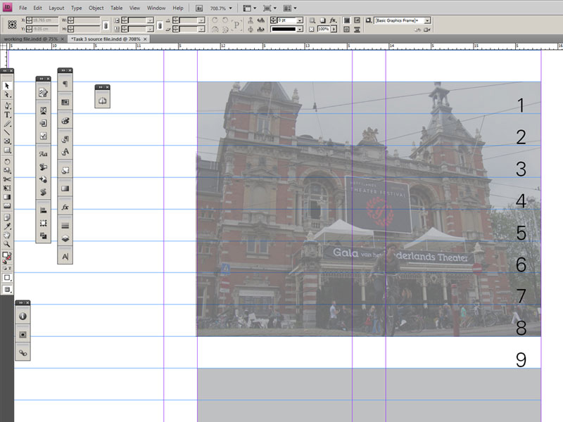
Each grid field, or the basic unit of the grid is 8 lines in height and one column wide. After each grid field a line is left blank for caption. But the caption is literally sticking to the picture area of the grid field, how do we separate the two?
Slide 10:
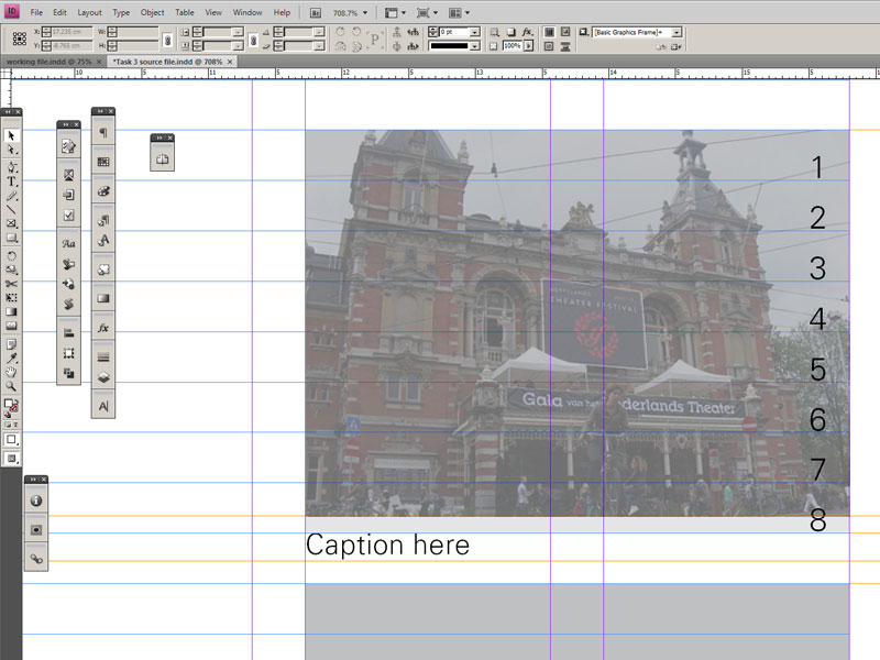
We will reduce the height of the grid field to accommodate captions.
Slide 11:
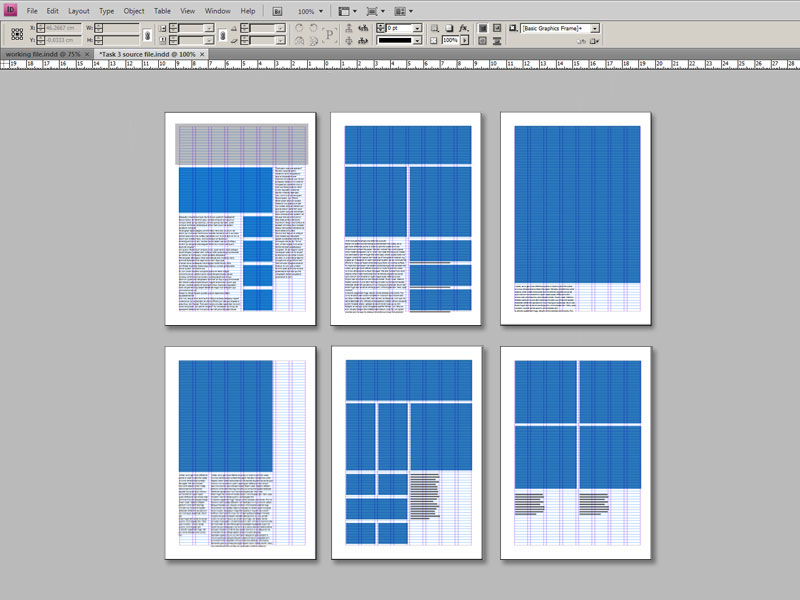
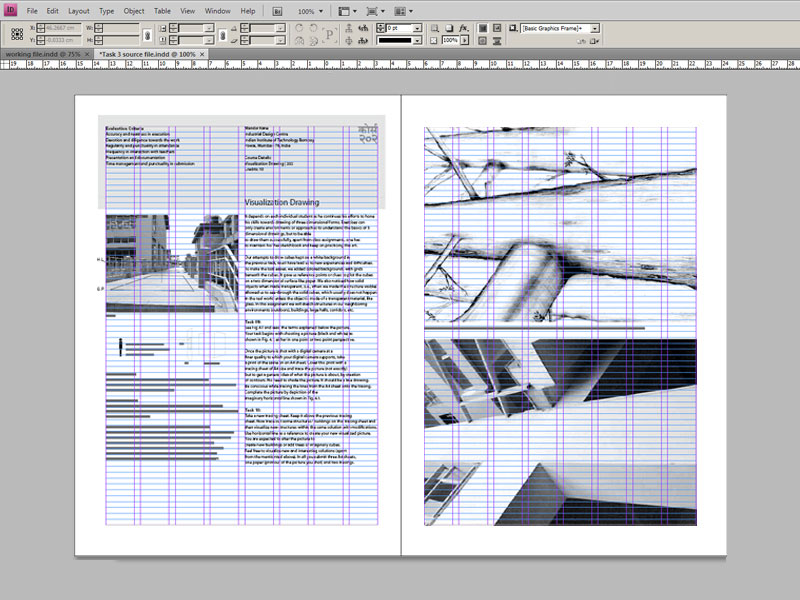
The good part about a grid is it allows for multiple layouts. Let us see this page as a series of grid fields; we have several options of picture and text areas. Here picture areas are shown in blue, along with placeholder text. The options are endless. Let us see how this grid was used to create the book.
Slide 12:
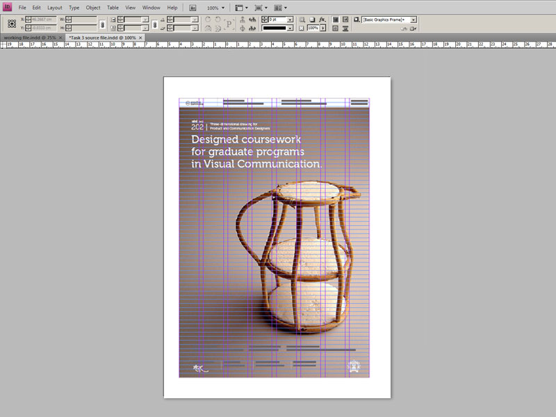
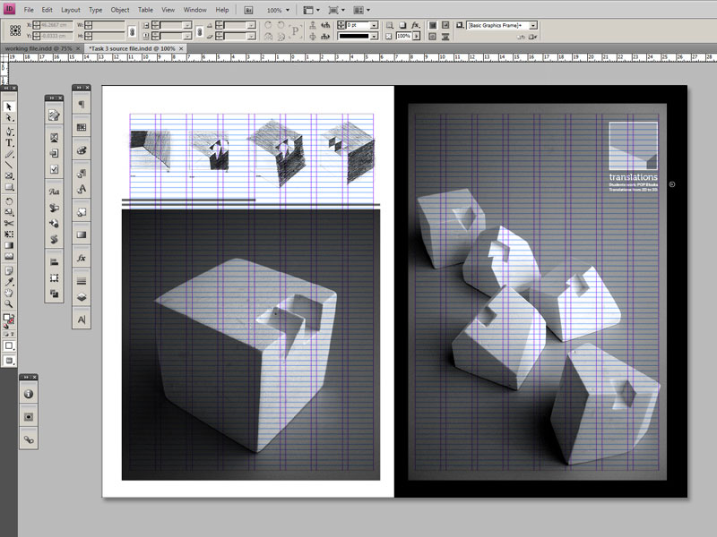
Here’s the cover of the book from the same grid.
Slide 13a:
Slide 13b:
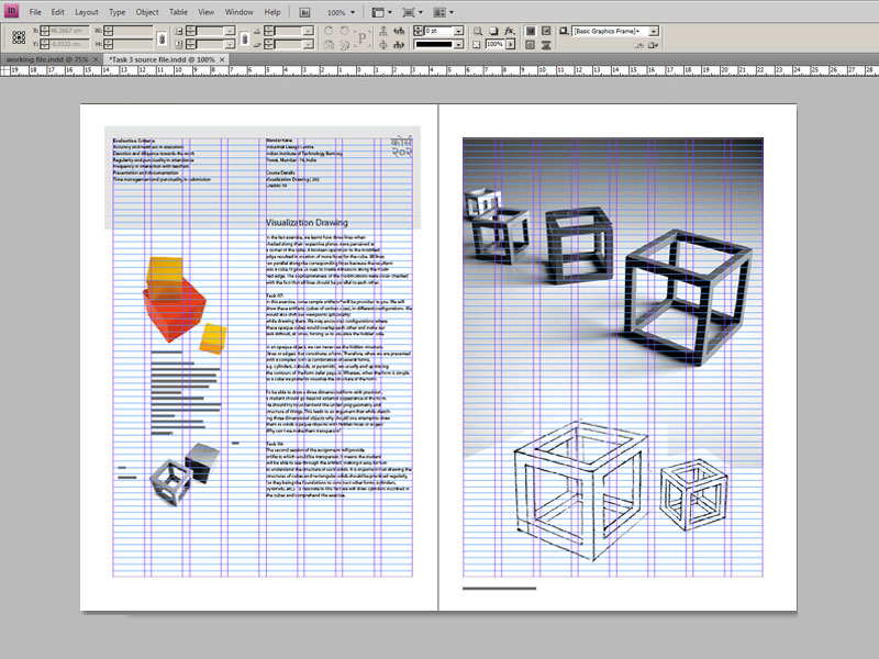
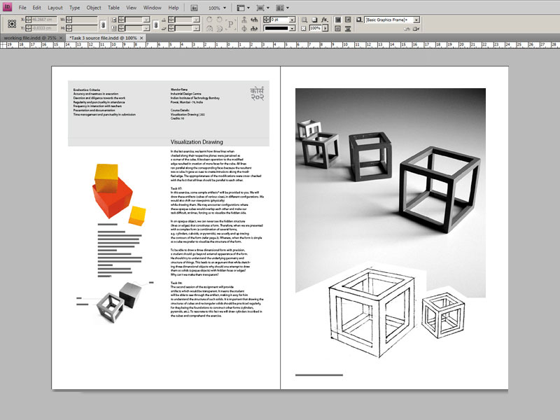
The inside spread
Slide 14a:
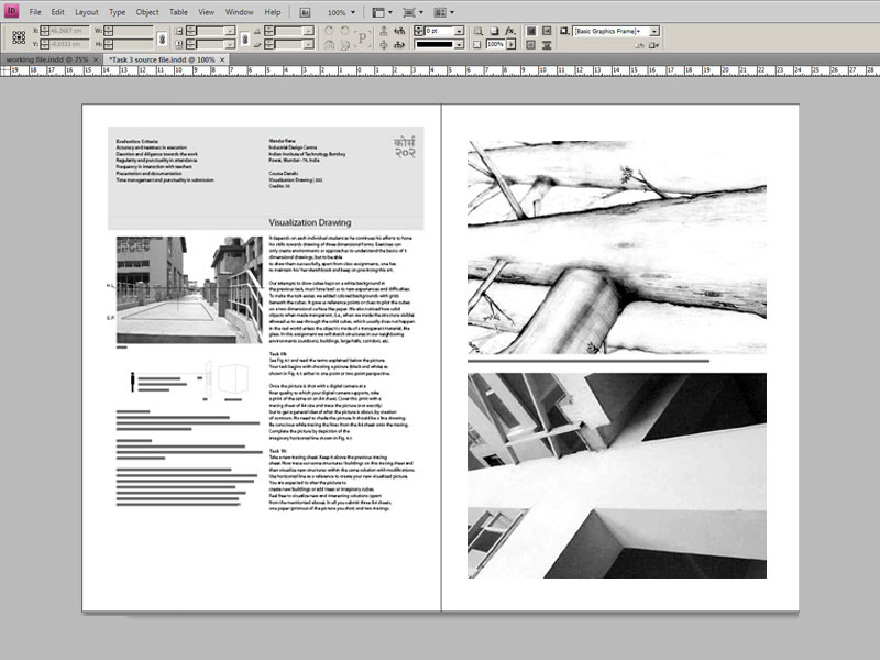
Slide 14b:
Assignments
Slide 15:

Slide 15b:
Slide 16:
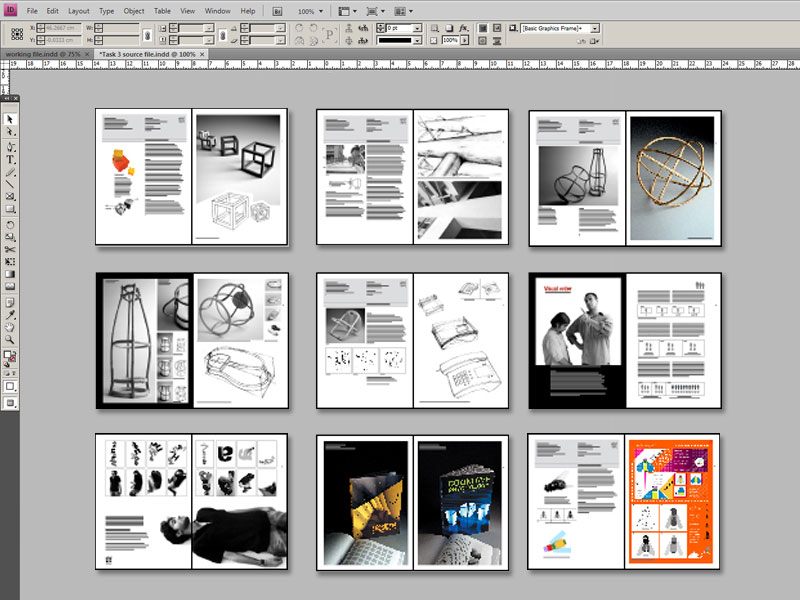
Diversity of layouts from a single grid.