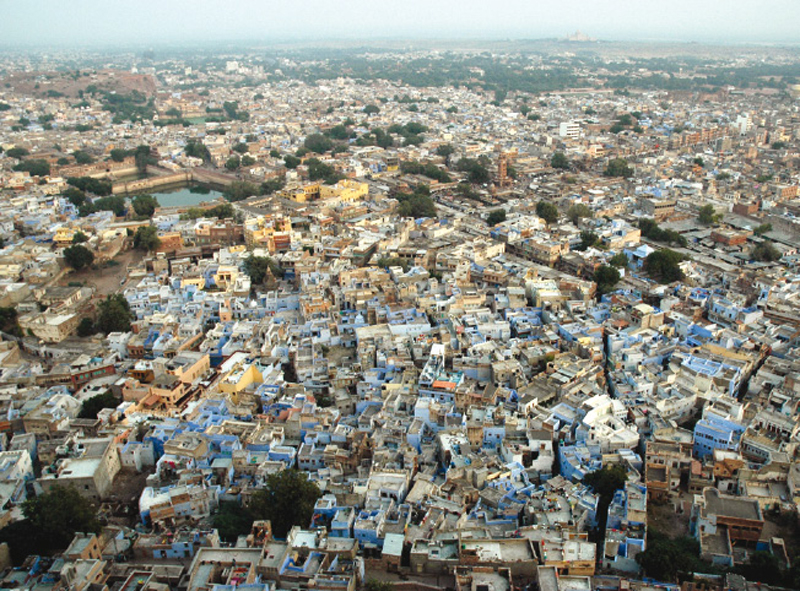
Elements come together in a space, interact with the space to create an arrangement. All arrangements create forms.
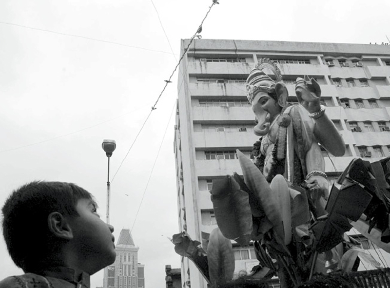
The picture of the elephant god Ganesha’s procession has elements arranged along a linear path. It directs the attention of the viewer- person viewing the picture, along an invisible guideline captured by the photographer. The child looks at the idol of Lord Ganesh and the line of sight travels up, pointing to the people on the top of the terrace building, watching the procession.
It’s the ability of the photographer to see this composition/arrangement and freeze the moment to create a memorable picture; an arrangement captured through the lens of the camera by the intelligent eye of the photographer. Here, he is able to see a ‘visual order’.

Tool versus The Task!
Analog versus Digital:
With new tools for execution, maximum effort is spent on understanding/ struggling with the tool rather than involving oneself in the depths of the task. The task as a result, only goes as far as the novice’s knowledge about the tool. Therefore, one can say that the objective of the task is dictated by the tool, resulting in limited exploration and distorted learning.
Having understood the problem in all these aspects, the challenge was to come up with a teaching method that not only allows freedom to explore, but also helps validate this freedom with objectivity and rationality.

About the Method:
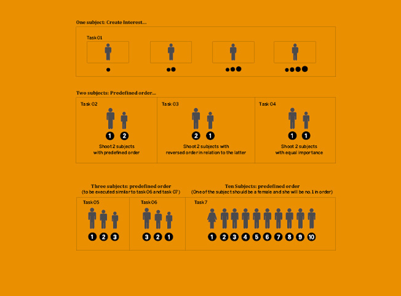
In this course Visual Order, students attempt visual solutions to a given set of task based questionnaire (Task sheet). The visual solutions created by the students form analogies to explain design decisions which dictate arrangement of elements in visual design. This slide displays the assignment format that describes each task the students have to perform, step by step.
The picture is one of the task (visual solution) performed by the students. As we proceed we will discuss the assignment in detail.

Choice of Subjects:
For the experiment, we choose three students from the class. This slide displays the group of chosen students who will participate as subjects to execute the given tasks (questionnaire). These students should form an obvious visual hierarchy, i.e., the height of the subjects should increase or decrease gradually, when they stand together. That is one obviously taller than the next. Physically the difference amongst the subjects should be obvious, but not too stark. Choice of subjects with stark differences should be avoided as one particular subject might become unique. This has to be strictly adhered to, while choosing the subjects.
For the tasks which we conducted we chose two groups with three students in each group. On this slide is the first group and on the next slide is the second group of students who participated in the experiment.
First Group - Rahul, Kshitij & Navendu (left - right)

Presented here is the second group of students with an obvious visual hierarchy.
Second Group: Abhishek, Manshu, Dinesh (left to right)
Task Sheet - Visual Questionnaire:
Once the subjects were decided, rest of the class is given a task sheet as shown on the right hand page. The class will shoot black and white pictures of the chosen subjects as per the task defined in the task sheet. These pictures have to be shot against an empty background (this is compulsory). To shoot the pictures a digital camera should be used and the preview on the screen should be set to black and white.
Each task will be Explained as We Proceed Further:
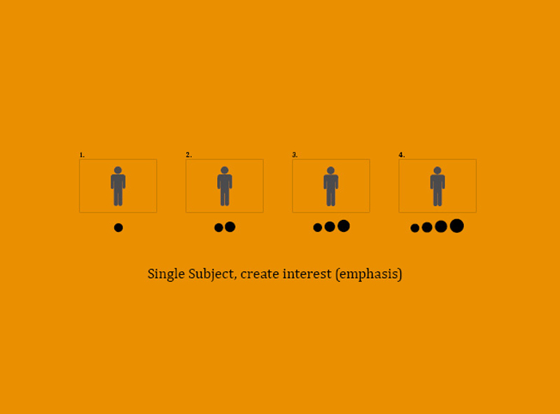
For this task, Task 01, you can choose any one subject out of the three from group one.
Task 01:
In this task we shoot four black and white pictures of a single subject in a pre-defined format (landscape) against an empty background. Shoot these four photographs with incremental interest. It means that when all four pictures of the chosen subject are shot and displayed together- each picture should be more interesting than the previous one. That is the fourth picture should be more interesting than the third one, the third picture more interesting than the second one and the second picture more interesting than the first one when validated against the opinion of a viewer or an audience.
Points to Remember:
• The background of the subject while shooting the picture should be empty or white.
• Clothing should be neutral and non-trendy.
• Clothing should not overpower the subject or distract attention.
• Ideally, Black or Grey coloured T-shirts could be used.
• There should be no printed text/imagery on the clothes.
• The subjects can be either male or female and not a mix of both.
• No props are allowed.
Further pages will display a series of images with increasing emphasis.
Single Subject, create interest (emphasis)

This is the first picture where the subject stands still in the center of the picture frame. As per the criteria mentioned in the task sheet, the next picture should be more interesting than the current. What does the next picture in an increasing order of interest look like? You shall find out on the next slide.

The second picture displays a gesture by the subject carefully listening to something. The change in posture adds a little interest.
What about the third picture?

The third picture adds more dynamism as the subject tries to attempt a dancing posture to achieve the criteria of increasing interest.

In the fourth and the last picture the subject is brought closer to the camera to display astonishment and excitement.

These four pictures were rationalized by comparing the subject to a written word. Typographic solutions were worked out for each frame by the instructor to explain how pictures are translated into typographic expressions for easy comprehension.
In the first picture, as the subject has a personality, character and an identity; a font also behaves in a similar fashion with individuality, a character of its own, displaying its unique identity from a family of typeface.
The second picture is compared to changing of the text to italic to add a little gesture and dynamism.
In the third picture the element of fun and expression from the subject is translated into the font.
In the fourth and the last picture the subject is compared with increase in font size, trying to attract more attention by scale/increase in size.

This teaching method of Visual Order was experimented across various design institutes in the country. Presented here are a few examples of the results of students work at these institutes.
Task:
The act was similar as Task01; to shoot pictures of a single subject in an increasing order of interest and design typographic translations for the same. In this case the number of pictures was reduced to three instead of four.
In the task, what do we mean by a typographic translation?
A typographic translation is to create an equivalent of the subject’s picture with the help of type as a medium for expression. That is creating an arrangement of type in a given space comparable to the subject picture that was shot. We translate the contents of the picture frame into a typography.
What needs to be translated?
There are primarily three things that we are required to translate.
1. Content (subject) = What is written. (In this case, the name of the subject, choice of font)
2. Space and content interaction = Resulting in proportion. (Scale, emphasis)
3. Expression of the Content (subject) = Expressing emotion through type
This slide displays the first picture in the series of three (again in incremental interest), followed its typographic translation on the next slide.

Typographic variables are explored to create picture equivalent, typographic translation of the picture on the previous slide.

Second picture in the series. Appropriateness of the picture validated against the criteria of incremental interest.

Typographic translation for the second picture.

Third picture in the series.

Typographic translation for the third picture.

An overview of all three pictures and their typographic translations. Typographic expression corresponding to the pictures is attempted and rightly achieved.
Students explore the typographic variables, scale and value in a given space objectively. Picture becomes a reference to review the typographic attempt. There are numerous ways to execute the picture-equivalent typographic translation. Each and every approach is considered valid and encouraged in this method. So, the resultant is never a single right answer to this task, this makes the task exploratory. This exploration is objective since it is validated against the three points mentioned in the criteria.
1. Content
2. Content + space interaction
3. Content + expression
On the next slide we will see one more example, where the same task is executed with another subject.

A similar task was executed by another student by shooting a series of pictures and creating corresponding typographic translations, equivalent to the subject pictures.
This slide shows the first picture of the subject, in the series. Task is the same as earlier; to shoot three consecutive pictures with increasing levels of interest.
Typographic translation for the same will follow on the next page.

The subject uses a short form of his first name, “Siddharth”, as “Sid” to create the appropriate typographic translation.

Here’s the second picture in the series.

Typographic translation for the second picture.

Third picture in the series.

Typographic translation for the third picture.

The typographic translation done by the student is quite different from the earlier. Here he does not attempt to trace the exact outline to create a silhouette of the figure. The student plays with the letter-forms as a mass of object to imitate the qualities of the picture.
This slide displays all the three pictures and their typographic translations with reference to the pictures shot. At the end of these tasks students understood the act of expressing the required gesture through font as a medium for the message. The message here is typographic translations keeping in mind three factors- firstly the content, secondly the interaction between the empty space and the content and thirdly the expression of the subject. Students were able to comprehend the relationship of all three and validate the same against the picture to rationalize the typographic decisions.
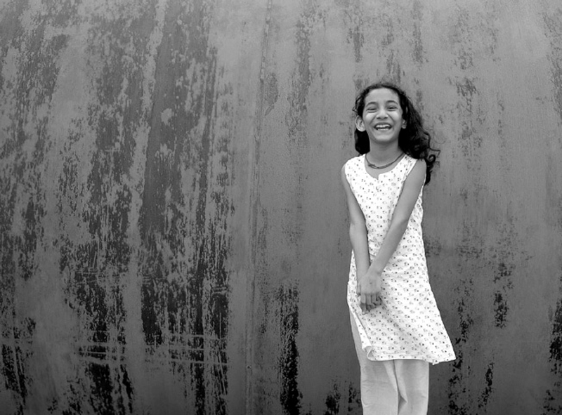
What do we conclude from these tasks?
It is easy for the viewer to focus on a single element in a given space since there is nothing else to look at.
But, this does not mean we create a flat or a bland solution. A single element in a given space can also be treated interestingly. Next slide shows an interesting composition of the same subject.

Interesting composition with a single element in a given space.


