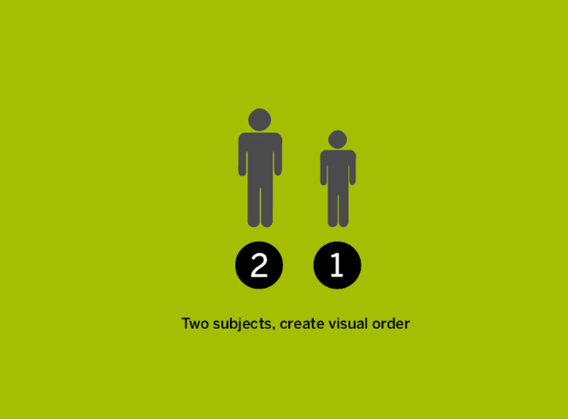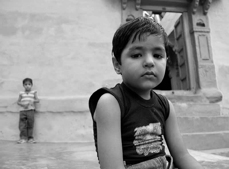
From this section we begin the second task, now the number of elements (subjects) in a given space has increased. This slide has two subjects with numbers below them, 1 and 2 indicating the order of visual preference, in which their photographs should be shot as well as be perceived by the viewer after the shoot.

The subjects we chose for this task are from amongst the first group of students. We have two subjects, Rahul and Navendu whose pictures need to be shot for this exercise.
By this we mean that when a picture of these two subjects is taken with a digital camera against a white background, for a viewer looking at the photograph Rahul should stand out first followed by Navendu.

Students fulfilled the criteria. The only problem in the solution was that, it is an obvious solution. If you hide the face of the second subject naturally the first subject would gain more importance. This does not mean that the solution is wrong, but better options can be attempted. A creative solution would be one where a picture is created without hiding the face of the second subject. In these pictures face is the identity (attention grabbing area), in comparison to the rest of the body. This identity and the arrangement of the subjects dictates the sequence of the visual order.
It requires a mention that the subjects in the picture should be unknown to the viewer, prior to his judgment that is validation regarding the appropriateness of the created/ required visual order.

Shoot a picture in such a manner that the taller guy is perceived prior to the shorter guy when the picture is presented to the viewer. Let’s see how the second group fares with the Task 02.

Interesting solution! The subject who was supposed to be No.1 in visual order is brought forward and the second subject is sent behind. This is an act of conscious arrangement to attain a predefined objective.
On second thoughts, there seems to be a little ambiguity in this solution and the preference may tend towards the second subject to be perceived first, due to the smile on his face.

Typographic translation for the same solution. It fulfills the criteria of the first subject (Abhishek) to be seen first and the second subject (Dinesh) later in visual order.

Due to slight ambiguity in the earlier picture, the solution was redone. Still it fails because the tilt in the head of the second subject creates interest or attracts ‘attention’. Let’s see the typographic translation for the picture on the next slide.

Interesting treatment of typography to create different weights. The tilt of the head is translated with change in orientation of the letter forms (for the second subject, i.e. Dinesh).
It fulfills the criteria that Abhishek should be seen first and Dinesh later. The result seems quite good as it met the required criteria.

The third picture in the series is our perfect solution to the given visual problem. Subject No.1 is brought forward, nearer to the lens of the camera to increase his importance and the second subject is pushed behind with nil expression/gesture to make him appear secondary in the visual order.

This is a clever typographic translation. It attracts attention by highlighting the initial letters of the names respective subjects. The larger letterforms with different values are used to balance the visual weight of the subjects with reference to the picture.

All three pictures with their typographic translations. If we compare all the three solutions we can conclude that the idea is not to find just one solution, sufficient to fulfill the criteria of the given problem, but to develop a habit of generating multiple alternatives for the same problem.
In other words, the search is not for the right answer, but for a better answer.

In this section we begin with the third task. The visual order in this case is reversed, exactly opposite of what we were supposed to do in the earlier task.

The pictures of the subject with the numerals below them define the visual order. Shoot a picture such that the weaker subject (shorter) has to be No.1 and the stronger subject (taller) has to be No.2 in the visual order perceived by the viewer.

The picture shot by the students seems to meet the required criteria. The weaker subject (right) due to his strong gesture dominates the scene and elevates himself to the number one position in the visual order by attracting attention. When the picture was validated with viewers, the weaker subject was the most preferred, and a few viewers who felt sorry for the other subject chose him for his sorry state.
This resulted in a situation where the solution was ambiguous. A consciously designed arrangement could not be left to ambiguity. Could we alter the solution in such a manner that all the viewers would vote for their visual preference of the weaker subject in accordance with the given criteria for the task?

A change in the background dictates what is to be seen first. Using a principle of design ‘radiation’ we could define the Visual Order and reduce ambiguity. Now all the viewers voted for the subject with the angry gesture, followed by the preference for the second subject.

Information can be informative or persuasive. It depends upon the context in which the message has to be communicated. A little modification in the radiating lines can add a little persuasion (attraction/interest).

We have a tremendous control when we design, even to the extent of reversing the Visual Order. Therefore, the act of design is planned, conscious and objective.

Let’s see how the other group performs the same task.

Dinesh (left) gets preference because of the strong expressive facial gesture of being choked up. Apart from creating the required Visual Order the group has also added a story into the picture. The story binds the two subjects together.

Type expresses an emotion. Dinesh is prioritized in Visual Order due to value, scale orientation and position.An example of expressive typography; expresses the choking of name, ‘Dinesh’ with reference to the shot picture.

One more picture performing the same task, weaker subject to be No.1 in visual order

Three students render different typographic translations for the same picture. If we compare all three typographical translations, the first typographic solution fulfills the criteria of the word Dinesh to be seen first, but lacks the aggression in the font as seen in the picture.
Whereas the last typographic translation, adjacent to the third picture reflects expression and aggression of the subject through the font.
Imagine the difficulty an instructor would face to explain aggression in a font without the reference of the pictures.

A picture expressing visual order with two subjects. We can dictate the order by prioritizing which subject is to be highlighted or should draw attention.

Create visual order for two subjects with equal visual preference.

Task 04:
was to create equal importance. Equal importance means, none of the two subjects shown aside should have prominence over each other. In other words, a viewer should perceive both the subjects as a group or as a whole entity.
The viewer should either vote his visual preference for both the subjects or for none of them. The preference should be biased to either of them or else the required criteria of creating equal importance for both would fail. In this task we purposely chose a weak and a strong subject to make the task challenging.

This was their solution, they tried to achieve uniformity with similar gestures but failed to meet the criteria of equal importance for both the subjects. The viewers either preferred the left or the right subject. The task failed.

Two subjects standing apart from each other, created distinct spatial differences and the arrangement encouraged creation of separate identities. Students were told that if they had brought the subjects closer then it could have dissolved their individual identities.

Same task with the other group.

A good solution! But still the subjects do not form a group or a whole. They appear as separate entities.

Let’s bring the subjects closer to each other and overlap them. Distance (Proximity) is a very sensitive and crucial variable to make or break groups.
Read more about this by referring to Gestalt laws.

We revise the difference in height to create similarity and dissolve prominence to create equal importance.

Earlier, both subjects were identified as two separate entities. Overlapping the two subjects created a single contour for them to form a group.

Typographic translation for the pictures shot by the students. Subjects were substituted by names of the students. The criteria was the same, neither of the names should have preference over each other. Both the names can be neutral in preference. In the current solution the word ‘Abhishek’ on the left is read first. This does not meet our criteria of equal importance.

One more solution but still it fails. Reading direction and position will always affect the order of preference for the written word.
Even if we had place the words aligned left to begin from the same position, either of the word will be placed at the top or the bottom. The word at the top would get preference because of our habit of reading from top to bottom and left to right. Students were stuck! How does one create equal importance? At first glance the design solution seems impossible, until it gets resolved.

One more attempt fails, because similarity creates groups. When groups are created there will obviously be preference.
Either, or.

Finally the solution works because it creates ambiguity for the viewer regarding which word should get preference, resulting in a perception of the whole or a mass. Students comprehend the idea of dissolving identities with a conscious attempt to achieve, lack of similarity.

All three attempts together reflect the process of trying to achieve the most appropriate solution. This clearly reflects objectivity and exploration can go hand in hand.

The background of the adjacent picture acts similar to that of the words, Abhishek and Dinesh in the previous typographic solution. Neither of them shouts (demands attention). The same idea is explained through a photograph. Since the background is overexposed (out of focus) keeping the subject in focus. Attention is directed towards the subjects rather than the background.
“The background stands out”. Such are the words used by design instructors attempting to explain the visual design principles to the students. On the face of it, such comments appear irrational, but underneath lies a strong rational, which Visual Order (as a method of teaching) attempts to explain through this photograph.
Look at the third part to view the creation of visual order as the number of subjects increases to more than two.

