Home / People / Faculty / Detail

Prof. G. V. Sreekumar


Related Images


Source: India,  

Tenure: 2000 to Present

Date: 2000

Medium: Photograph

Credits: IDC


Detailed Description

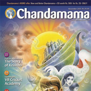
Professor G. V. Sreekumar is a distinguished faculty member at the Industrial Design Centre (IDC) of IIT Bombay. He holds the position of Professor and Institute Chair Professor, specialising in Visual Design, Typography, Publication Design, Magazine Design, and Information Graphics. Prof. Sreekumar completed his M.Des in Visual Communication from IDC, IIT Bombay, and a BFA in Applied Arts from M.S. University, Vadodara. His extensive work experience includes roles such as group art director at Jasubhai Digital Media, art director at The Indian Express, and graphic designer for the Times of India group. He has also worked as a freelance cartoonist and illustrator for various publications in Kerala. At IDC, Prof. Sreekumar teaches courses like Typography Fundamentals, Exploratory Printing, and Studies in Typography. He has been involved in numerous consultancy projects, including magazine design for publications like Chandamama and Digit, as well as corporate training programmes for companies such as CapGemini and Malayala Manorama. Additionally, he has served as a visiting faculty member and jury member at various prestigious institutions and conferences. Prof. Sreekumar is also the founder of the Typography Society of India and has organised the Typography Day International Conference.


Projects

Chandamama Magazine Redesign

The Chandamama Magazine Redesign by Prof. G. V. Sreekumar from IDC, IIT Bombay, is an important project that focusses on refreshing the look and feel of one of India’s most iconic children’s magazines, Chandamama. Chandamama, known for its rich storytelling and illustrations, holds a nostalgic place in Indian literature, especially in the realm of folk tales, mythology, and moral stories. The redesign aimed to retain the traditional charm and essence of Chandamama while giving it a modern, contemporary appeal. The goal was to connect with a new generation of readers without alienating older audiences who grew up with the magazine. Prof. Sreekumar, known for his expertise in typography and graphic design, introduced fresh, readable, and visually appealing typefaces that balanced the magazine’s classic storytelling tradition with modern readability standards. The typography ensured that the text was both inviting for young readers and stayed true to the cultural context of the stories. A refreshed colour palette was introduced, keeping in mind the younger audience. The redesigned version of Chandamama aimed to breathe new life into the magazine during a time when print media was facing challenges from digital platforms. Prof. Sreekumar’s redesign received appreciation for respecting the legacy of the magazine while making it relevant for a 21st-century audience.


Posters for 18th Cheongju Jikji World Calligraphy Exhibition, Korea & South Asia Design Educators Alliance(SADED), Exhibition, USA

Prof. G. V. Sreekumar designed posters for two notable exhibitions: the 18th Cheongju Jikji World Calligraphy Exhibition, Korea, and the South Asia Design Educators Alliance (SADEA) Exhibition, USA. 18th Cheongju Jikji World Calligraphy Exhibition, Korea: The design for this exhibition poster likely embraced the aesthetics of calligraphy, combining traditional elements with modern design principles. South Asia Design Educators Alliance (SADEA) Exhibition, USA: The poster for this exhibition would have reflected design education and collaboration between South Asia and global design communities.


Calligraphy for Kala Ghoda Festival, Mumbai

The Calligraphy for the Kala Ghoda Festival, Mumbai, by Prof. G. V. Sreekumar, was likely a creative endeavour where he brought his expertise in typography and calligraphy to this iconic cultural festival. The Kala Ghoda Arts Festival is known for its celebration of arts, crafts, and culture, and Prof. Sreekumar's work would have added a rich visual element to the event. Prof. Sreekumar likely combined traditional Indian scripts with contemporary design aesthetics, creating visually compelling calligraphy pieces that resonated with the festival's diverse audience.