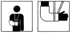
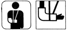
Hospital Symbols: A case study
Communications in India is constrained by factors arising from the very diverse cultural, traditional, lingual and social backgrounds of its people - resulting in potential as well as real situations of communication impasse. A drawback of no mean proportion, it is related to the simple linguistic and cultural fact that in India, there are as many as 14 major languages and about 1,600 dialects. Secondly, many of its adults are perhaps functionally literate but are literally illiterate. Thirdly, people do not communicate easily because of boundaries determined by the cultural-traditional-social denominators of gender-divide that limits the free mixing between the sexes, or among different castes or religious communities.
Need:
At the very outset it was discovered that there was no existent data pertaining to the problem of message communications in the domain of health-care services. One reason for this being that at the time of our study, Indian hospitals by and large did not employ any system of symbols. Five major hospitals run either by the government or the municipality within the city limits of Bombay was therefore chosen for a study of the potentials of symbol development. The results of the study revealed that there were several problems deriving from the absence of a sign system: There was a great degree of confusion that resulted from using a number/numerical system for identifying the departments, counters, etc. It was found for instance, that 35-40% of the first -time users coming to a hospital to utilize health services, invariably ended up standing in the wrong queues. This not only caused loss of time for the user but also undetermined efficiency as a consequence of the considerable confusion and delay caused on both sides- on the part of the patient, as well as on that of the hospital staff. Since the queues were lengthy on account of high patient turnouts, the patient often wasted over half an hour to simply realize this error. It was felt that visual symbols, appropriately used could go a long way in ameliorating these avoidable conditions.
Methodology:
Broadly, the approach was the creation/generation of a large set of possible solutions, which were to be narrowed down, and graphically refined until the final set emerged. The design solution also involved a dialectical movement between the user and the designer, and each stage of the process was modulated by responses from the users.
Message Areas:
As a first step, all the major facilities where a symbol was necessary, were identified and classified according to their potential for representing in the iconic, indexical and the arbitrary categories.
This involved visits to various hospitals, photographic documentation of all the facilities along with the users, observing and following the users navigating through the hospital spaces, taking down notes and making sketches, keeping track of the different interactions the users have with the hospital environment and talking to the users about their difficulties and asking them to narrate their experiences.
Variations:
In order to generate possible solutions pertaining to each message area, three methods were employed.
From users:
First, the users (patients, visitors and hospital staff) themselves were requested to propose solutions. Their perceptions were quite helpful in conceptualizing especially the indexical category of representations. They were interviewed and asked to narrate their experiences with the aim of finding out what association they had regarding a particular message area. Key words associated to the message areas described by the users were documented. These were then visualized into possible visual representations by the designer.

From Designers:
Secondly, brainstorming creativity sessions were held involving designers and visual artists in order to generate solutions mainly for the iconic and arbitrary category of representation.

From Existing Solutions:
Thirdly, existing international solutions were documented. This procedure resulted in the accumulation of a large number of alternatives for each message area.
Thirdly, existing international solutions were documented. This procedure resulted in the accumulation of a large number of alternatives for each message area.

Evaluation by the people:
The next stage consisted in going back to the users for an evaluation. Without volunteering any information, the users were shown the complete set of possible solutions for each message area and asked to mention what these represented and to identify the ones which gave them sufficient clues towards identification. When the results were tabulated, it was discovered that out of the whole set of possible solutions a few were semantically considered more appropriate than the rest. These few were then passed on to the next phase of the process.
The next stage consisted in going back to the users for an evaluation. Without volunteering any information, the users were shown the complete set of possible solutions for each message area and asked to mention what these represented and to identify the ones which gave them sufficient clues towards identification. When the results were tabulated, it was discovered that out of the whole set of possible solutions a few were semantically considered more appropriate than the rest. These few were then passed on to the next phase of the process.

Ergonomic and System Attributes:
Following this was the pragmatic phase where ergonomic studies were done on aspects like visual distances, amount of relative blackness perceived, minimum thickness of lines, and the required enlargements. Decisions at a macro level in the semantic and syntactic domain were formulated across message areas so that it became a convention to be used in all symbols for a given environment (e.g.; the patient in black and the hospital staff in white, the roundness of form, the character of border, etc.)
Following this was the pragmatic phase where ergonomic studies were done on aspects like visual distances, amount of relative blackness perceived, minimum thickness of lines, and the required enlargements. Decisions at a macro level in the semantic and syntactic domain were formulated across message areas so that it became a convention to be used in all symbols for a given environment (e.g.; the patient in black and the hospital staff in white, the roundness of form, the character of border, etc.)

Redrawing of Symbols:
In the light of all these studies and evaluations, the symbols were redrawn incorporating ergonomic features and established standards, and then made to syntactically match with each other. The designer's task was to work them over and refine them so that they were graphically more compatible with each other.

Re-evaluation by Designer:
Next the designer evaluated the symbols for ease of recognition and for syntactic compatibility.

Redrawing of the Symbols:
The symbols were corrected and redrawn.

Operation Test on Site:
The final stage involved operational tests on site for checking out the effectiveness of the designed symbols.
The final stage involved operational tests on site for checking out the effectiveness of the designed symbols.

Example of Signage Application:


