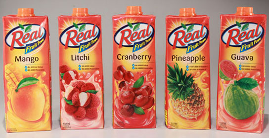
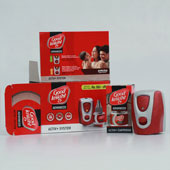
In packaging basic design principles are customized to meet the objectives of each design assignment. These guidelines help to define how color, typography, structure and imagery are applied within a design layout to create the right sense of balance, tension, proportion, and appeal. This is what makes the design elements form the communicative attributes of the packaging design.
These principles provide a framework for typographic decision making for packaging design. These are:
• Principle 1: Define the typographic personality
• Principle 2: Limit Typefaces
• Principle 3: Create Typographic Hierarchy
• Principle 4: Define the typographic positioning
• Principle 5: Define font alignment
• Principle 6: Vary typographic scale
• Principle 7: Choose to contrast
• Principle 8: Experiment with type
• Principle 9: Stack characters carefully
• Principle 10: Make it ownable
• Principle 11: Be consistent
• Principle 12: Refinement for typographic excellence
Principle 1: Define the typographic personality
The visual personality is what communicates how consumers perceive a design. Research, experimentation, proper type selection, and clear visual communication strategy provide the foundation.
Principle 2: Limit Typefaces
Three typefaces are general limit for any primary display panel in packaging design. Sometimes it is difficult to limit the number of typefaces because of the quantity of the copy required. In this case it is best to employ typefaces that offer a variety of styles within the same family; this provides a clear, consistent appearance and a unified message.
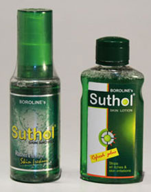
Principle 3: Create Typographic Hierarchy
Typographic hierarchy, the organisation of the visual information, can be created by grouping related items together and spacing related items together and spacing unlimited items farther apart.
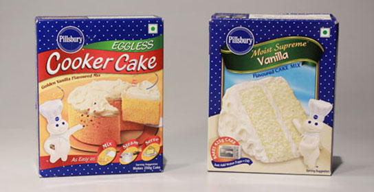
Principle 4: Define the typographic positioning
Typographic positioning is the physical placement of the typography within the primary display area: the individual location of the letters, words, and bodies of text in relation to other design elements.
Principle 5: Define font alignment
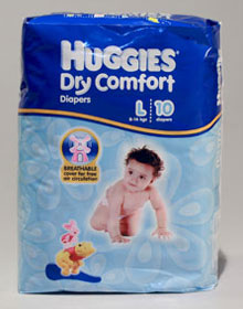
Alignment defines the overall architecture of the layout. Basic typographic alignment can be :
- Centred: With each word or line copy centred within the primary display panel or specific area.
- Flush left: With each word or line of copy aligned on the left, used most often in western cultures, where reading is from left to right.
- Flush right - With each word or line of copy aligned on the right, can be an awkward choice when there is a significant amount of copy for consumers to read.
- Justified - With words or lines of copy stretched to the same width, but here letter and word spacing can be challenging.
Principle 6: Vary typographic scale
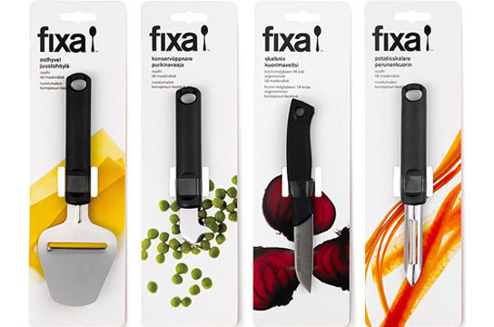
The visual personality is what communicates how consumers perceive a design. Research, experimentation, proper type selection, and clear visual communication strategy provide the foundation.
Principle 7: Choose to contrast
Typographic contrast – light vs. bold, italic vs. roman, serif vs. san serif – allows the designer to organize information for the consumer and add interest to the layout.

Principle 8: Experiment with type
Experimenting with type styles, characters, letters forms, ligatures, kerning, and layout is an important part of the design process. Experimentation is the part of the creative exercise that allows ideas to be visualized and take shape.
Principle 9: Stack characters carefully
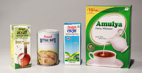
The general rule in packaging design is not to stack type. Stacking characters on a packaging design can make shelf stocking confusing since the proper vertical or horizontal orientation for the product is unclear.

Principle 10: Make it Ownable
The brand name or product name are what the consumer connects to both the mentally and emotionally, so the typography used should be unique to the brand as well as ownable.
Principle 11: Be consistent
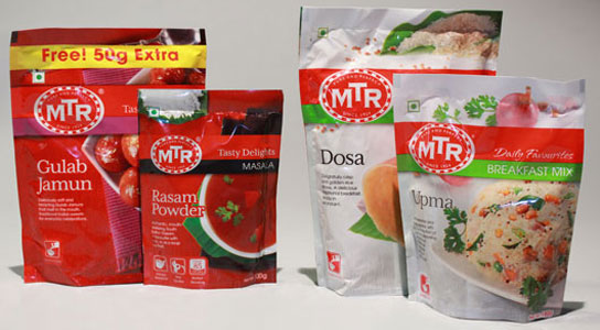
Consistent use of type in personality, style, positioning, and hierarchy creates a unified look across a brand family or line of product, creating a strong shelf presence.
Principle 12: Refinement for typographic excellence
Typographic refinement is essential to the quality of the end result. Ultimately typographic excellence is achieved when the type has clear expressive power that impacts the packaging design in a way that makes an immediate impression on the consumer and sparks a transaction.
