Design Work:
1. Gerany + India 2011-12 Website
2. Building a strong brand for Hercules
3. Murugappa Group gets a new identity
4. BSA Motors drives change with a new look
Gerany + India 2011-12 Website:
• Strategy + Interface + Technical Development + Social Integration.
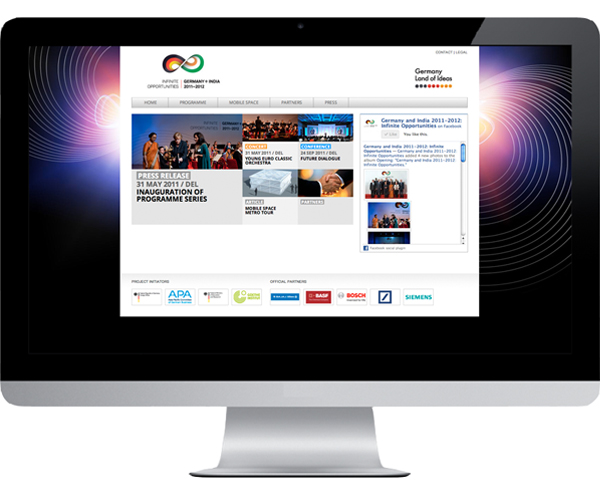
Lopez Design is the online strategy partner for the venture, working on the website design and development via a custom CMS, and the social media strategy.
Visit - www.germany-and-india.com for details.
Building a strong brand for Hercules:
• Strategy + Identity + Retail + Product Graphics + Packaging.
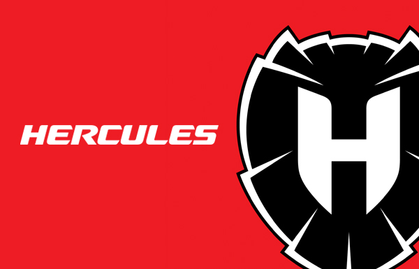
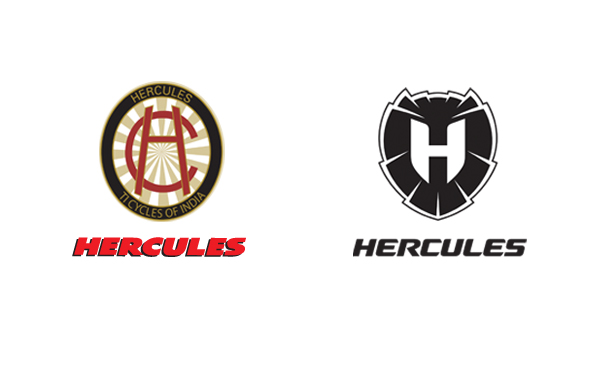
The new identity takes a bolder and more aggressive stance.
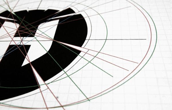
The symbol and typeface convey strength and agility, drawing inspiration from a lion’s mane and a shield.
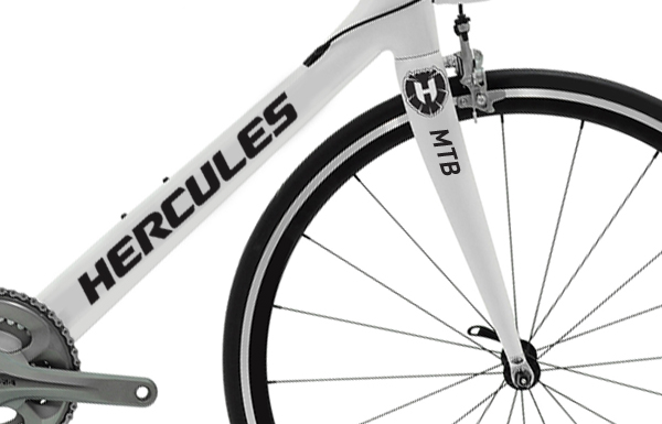
The symbol has been designed for use as a crest on the bicycles.

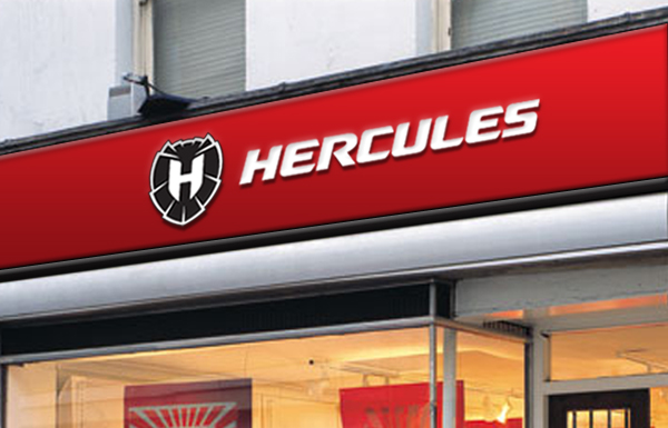
The symbol can be applied to a variety of collaterals.
Murugappa Group gets a New Identity:
• Brand Audit + Corporate Identity + Print Communication.
More than 100 years of lineage. More than 29 limited companies. A turnover exceeding USD 3 billion. Redesigning the Murugappa Group identity was all about striking a delicate balance between tradition and modernism.
Press Coverage:
- Anthony Lopez spoke to Vinay Kamath from The Hindu Business Line:
The challenge was how to get high recall for the entire group all over the country and project the intellectual wealth of the group.
- A. Vellayan, Executive Chairman, Murugappa Group expressed his views:
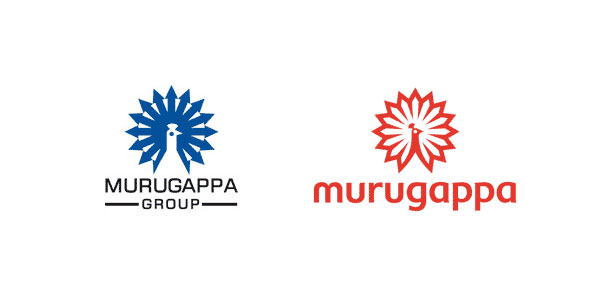
We wanted to reflect a new vibrancy, new daring, new energy. We didn’t want to give up the peacock as that reflects our heritage and our values and beliefs don’t change but we wanted to contemporise it at the same time. The group’s peacock that has changed from blue to red now is to reflect group’s ambition of becoming a little more daring and adventurous.
- Quoted in 'The Hindu Business Line' and 'The Financial Chronicle'.
- Articles covering the launch from The Economic Times, Management Next, Campaign India, Exchange4media.com, Yahoo Finance, and Commodity Online.
“The new branding exercise comes after a pan-India study commissioned by the group after drawing its near term growth plans. It was found that while the group was recognised for business ethics, the diverse businesses of the group were not known. The group felt the need to deepen the understanding with core customers and also to connect with future generation.” - View the article in The Financial Chronicle
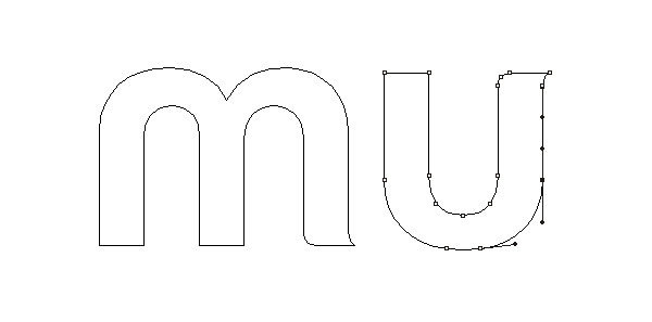
The soft curves in the typography were inspired by the rounded curves of the Dravidian scripts.
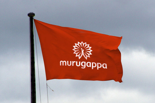
Unveiling the brand, A. Vellayan, Executive Chairman, Murugappa Group said, “This contemporary rendition of the Murugappa Peacock is a sign of the Group’s global outlook and the dynamic targets we have set out to reach. Red as a colour embodies vigour, power, passion, drive, energy and is renowned for its excellent visibility. The clean lines and the unique lower case style in which ‘murugappa’ is written help connect with audiences through simplicity and elegance.”
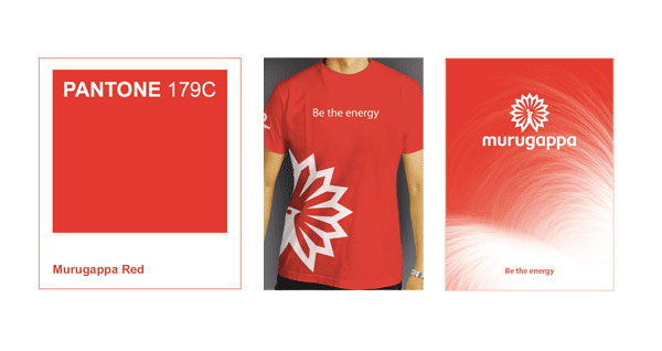
The 'Murugappa Red' is a personification of the brand’s energy and optimism. The new brand logo is the first step in the group’s brand campaign reflecting its ambitious growth plans with the theme Energy Unbound.
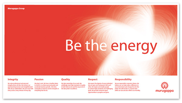
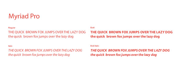
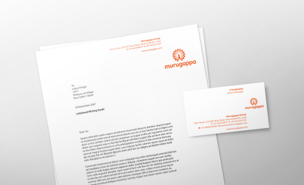
The Corporate Identity Programme covers various details of the applications, including font family, letterheads (above) and employee access cards (below).
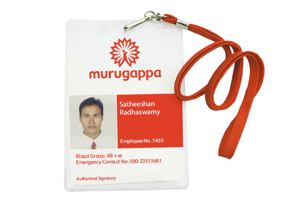
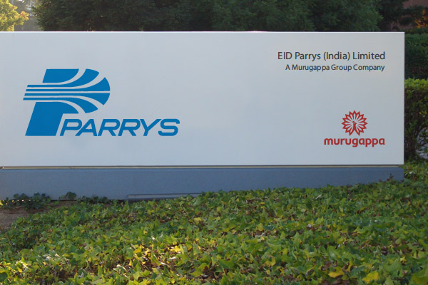
The Brand Manual clearly defines the visual relationship of the umbrella brand with the with group company identities.
BSA Motors Drives Change with a New Look:
• Identity + Nomenclature + Product Graphics.
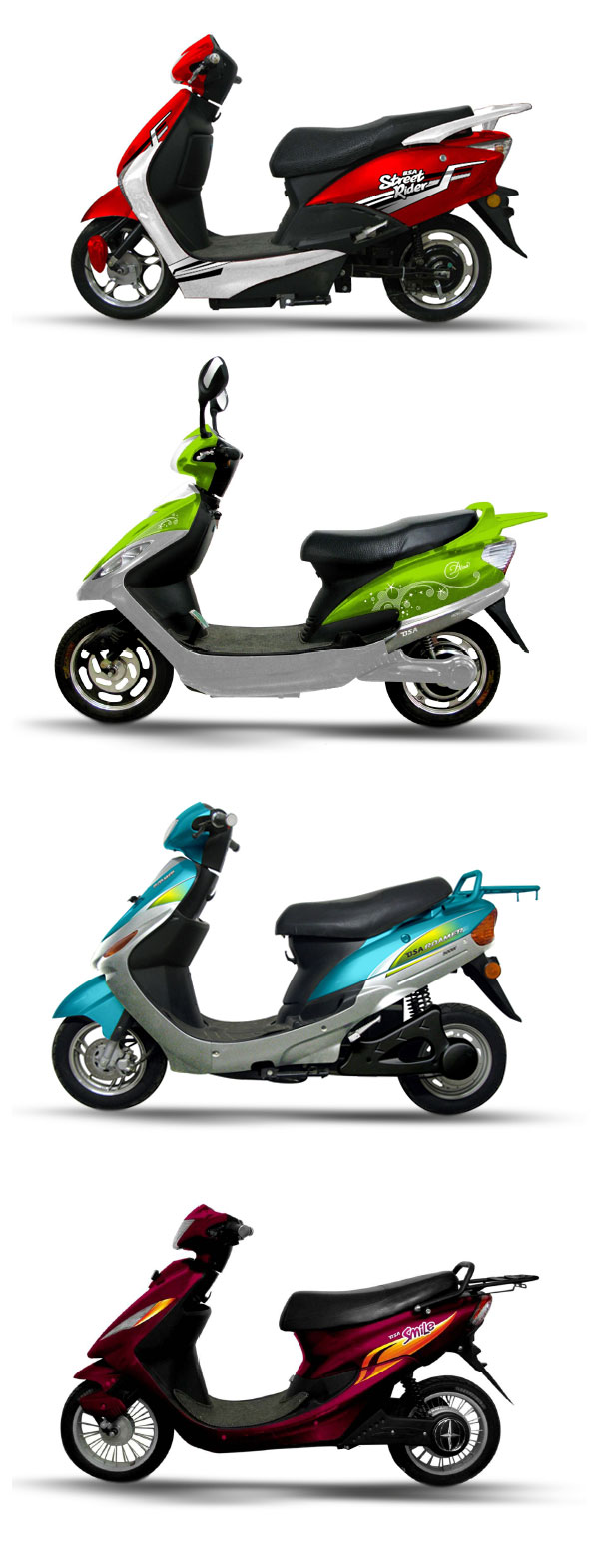
BSA Motors is an SBU of TI Cycles, part of the USD 3 billion Murugappa Group. They have launched five models of electric 2-wheelers in India. As strategic advisors to the Brand, we have revitalized the identity and developed nomenclature, sub-brand identities, and product graphics for them.
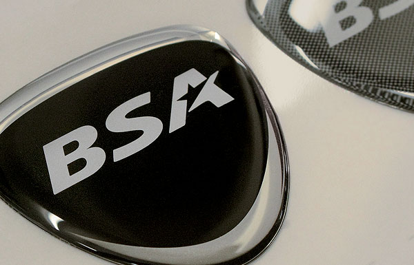
The new BSA identity as applied on a 2-wheeler crest.
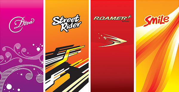
Nomenclature, brand identities and visual vocabularies for the sub-brands.
