Designed in early 1990s, the logo for Airport Authority of India has a symbolic graphic depiction. The use of triangular form and the wings of an airplane together as a form instantly makes connections with airports. The upward accent of the triangle depicts the vision of AAI. The vision being to upgrade, develop, maintain, manage civil aviation in India.
Computer Maintenance Corporation (CMC), Designer: Arun Kolatkar, Moulis : The logo for the information technology, services and software company (now known as CMC Limited) was designed in 1975. The logo depicts the concept of integrated systems engineering as a unit. The geometric shapes forming letters C, M and C express the image of information technology, integrated services and modern engineering in a simple and effective way. The upward arrows creating the visibility of letter ‘M’ compliments the word ‘maintenance’. The geometric square used to create joined letterforms makes the logo a balanced, harmonious unit concept. The form is minimalistic, but at the same time follows the principle of ‘less is more’.
Doordarshan, Designer: Devashis Bhattacharya, student of Visual Communication, NID (as part of classroom exercise) :Born on September 15, 1959, the logo celebrated the first launch of program broadcasting in India. It is believed that around 180 TV sets were sold in 1959 (the year when television came to India). The design emerged from the hands of a visual communication student at NID, as part of a classroom exercise to create logos. Doordarshan was considered one of the largest broadcasting organizations in the world in terms of studios and transmission development. The classic form elucidates the identity that stands firmly till date.
HDFC, Designer: Yeshwant Chaudhary, Communica : The characteristic logo for Housing Development Finance Corporation Limited came into being in 1977, with the company’s aim to provide long-term financial loans for home ownership. The geometric design of the logo in simple colours of black, white and red make it strong as a symbol. The letters H.D.F.C. also following the same geometric style, placed below the logo unifies the concept of housing loans. Security, preservation and trust are the words that come to mind while viewing the logo. It also encaptures the objective of HDFC as a professional service that aids support to people of India with integrity.

Hindustan Petroleum, Designer: Sudarshan Dheer, Graphic Communication Concepts : Designed in 1974, the logo for Hindustan Petroleum Corporation Limited (HPCL) celebrates the “Club HP” concept i.e. High-quality personalized “Vehicle and Consumer Care”. The slogan Future full of energy complements the design of curved lines joining together like a stream of energy fuel being poured into the vehicle. The visual forms connect with the concept instantly. Additionally, colours of Red used the bold initials HP with blue circle and lines provide clear combination, reasonable contrast between letters and shape giving the logo a marked elegance. The symmetry makes the form balanced and simple.

Logo - Welcome Group, ITC Hotels, Designer: R.K. Joshi, Ulka Advertising : The design was a mark of extension of ITC to hotels in 70s. Surrounding the theme of ‘truly Indian’, ITC gave the name of ‘Welcome group’ to its chain of hotels. The letter W beautifully envisages the ethos of Namaste (the Indian traditional gesture of expressing ‘Welcome’). Conceptually, the form elucidates a universal form to accommodate India that unifies different cultures and religions as one whole.

Operation Flood Symbol for National Dairy Development Board (NDDB), Designer: Vikas Satwalekar, NID : Designed by Vikas Satwalekar in 1970-71, the drop logo symbolizes the Operation Flood movement started by Verghese Kurien for National Dairy Development Board (NDDB). The White Revolution changed the face of dairy functioning in India, giving livelihood to thousands of milkmen in Anand. The timeless simplicity of the drop signifies the value of milk, its sustenance by and for people of India, making India the largest producer of milk in the world.

Punjab National Bank (PNB), Designer: R.K. Joshi, Ulka Advertising : Designed in 1984 , the design with letter captures the ethos of the letter in Gurmukhi to conceptually complement Punjab National Bank (PNB). The orange colour also compliments the Indian ethos and traditional image. The Gurmukhi letterform enclosing a circle compliments the identity of PNB as a nationalized bank (system of the bank under the control of government).

SBI भारतीय स्टेट बैंक , Designer: Shekhar Kammat, NID : The logo for State Bank of India, India’s largest commercial bank was designed on 01 October 1971. As an initial response to the circle form with an open hole, it looks like a key-hole. But, the real concept behind the design being that the circle encloses a common man inside at its centre. The common man represents the centre of the bank’s business. The circle signifies the service of trust, security and perfection for the common man. Moreover, the slogans With you all the way and The banker to every Indian support the idea of serving the common man as the epicenter of its activities. This logo is a unique example of how to create a quality of a concept with most basic geometric form of design i.e. the circle.
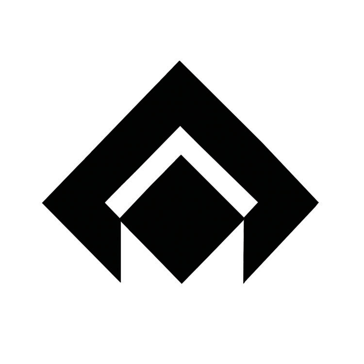
Steel Authority of India Limited (SAIL), Designer: R.K. Joshi, Ulka Advertising : The logo for the largest integrated Steel and Iron producer, SAIL was designed in 1973. SAIL has laid a sound infrastructure for the industrial development of the country with its integrated steel plants. The symbol using the triangular form with an upward direction indicates growth and development of steel industry. The solid rhombus used enclosed within the triangle seems to agree with the fact that SAIL stands to infuse high level technical and managerial expertise.
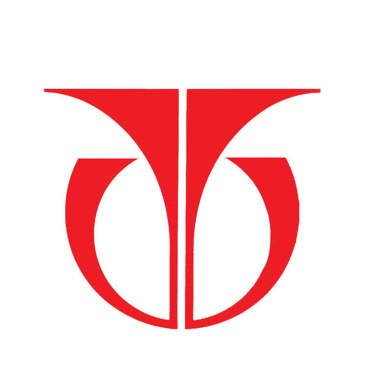
TITAN, Designer: Sudarshan Dheer, Graphic Communication Concepts : The logo was designed in 1987 with the joint venture of Tata Group and Tamil Nadu Industrial Development Corporation (TIDCO) to form TITAN Industries. TITAN exports watches, accessories and jewellery in both modern and traditional style designs. The most attractive aspect of the logo is the play with letter ‘T’ creating a circular hallow around it. The form reminds of a watch dial and the internal parts of its machinery. Simple and elegant in form, the logo beautifully elucidates the traditional ethos and modern identity of Titan products.
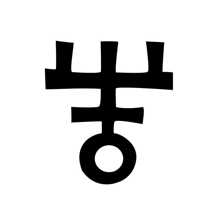
Trade Fair Authority of India (now called ITPO – India Trade Promotion Organisation), Designer: Benoy Sarkar, NID : The logo was designed in 1974, when government of India initiated in the area of external trade. The logo has an interesting depiction of letters T and F. Thetone is a fusion of preservation of traditions of Trade and investments along with modern identity of ITPO. The logo has a universal form. It signifies an authority of India exercising trade through fairs and exhibitions in India and abroad.


