Asian Paints
Designer: WPP's Singapore-based design agency Fitch.
Asian Paints Limited is an Indian multinational paint company headquartered in Mumbai, Maharashtra. The Company is engaged in the business of manufacturing, selling and distribution of paints, coatings, products related to home decor, bath fittings and providing of related services.
“With research revealing that Indian consumers are surprisingly scared of colour when decorating their homes, we wanted to make people more colour confident”, says design agency Fitch. The logo represents a more meaningful and personalized engagement with the increasing number of interior décor consumers in the home, retail and commercial segments across India. The wordmark from the previous logo is kept intact, but has been re-coloured and is accompanied by a gradienty ribbon.
Source:
- http://brandingsource.blogspot.in/2012/10/new-logo-asian-paints.html
- http://www.fitch.com/work/asian-paints
Axis Bank
Designer : Ogilvy & Mather
Axis Bank Ltd (formerly UTI Bank) is the third largest of the private-sector banks in India offering a comprehensive suite of financial products.
The logo design of Axis Bank is based on the letter ‘A’. It is a contemporary, universal and solid design that retains the burgundy colour of the original UTI logo as a link to its heritage. The new logo has two strokes, the first stroke depicts forward growth while the second stroke signifies a solid support system. The two thick strokes also connote solidity and security, and conveys a sense of authority and credibility.
Source:
- http://www.exchange4media.com/advertising/uti-bank-to-axis-bankwhat%E2%80%99s-in-a-name-everything!_27116.html
- http://finmanac.blogspot.in/2007/10/re-branding-uti-bank-as-axis-bank.html
Bajaj
Designer: Elephant Designs
Bajaj Group is an Indian conglomerate founded by Jamnalal Bajaj in Mumbai in 1926. Bajaj Group is one of the oldest and largest conglomerates based in Mumbai, Maharashtra.
The new brand identity with only “BAJAJ” in an expanded, all caps logotype reinforced the confidence of the brand and made it far more legible on a vehicle at speed. The new “flying B’ symbol depicts smooth ride, flying speed and soaring excitement and carries forward the foundation, trust & pioneering spirit of the Bajaj team. Without letting go of the familiarity, the selection of a younger blue that continued to stand for precision engineering & excellence in technology. The identity usage was standardized across various applications and the retail experience was consolidated, to reflect positive change in the company.
Source: http://www.elephantdesign.com/case-study/Corporate-Identity/Bajaj-Auto/17.aspx
Videocon
Designer: Interbrand Singapore.
Videocon Industries Ltd. is involved in manufacturing, assembling and distribution of key sectors of Consumer electronics, Display & Color Picture Tube. The company is also engaged in CRT Glass, Oil & Gas industries. The group has 17 manufacturing sites in India and plants in Mainland China, Poland, Italy and Mexico.
The Videocon logo is the heart of the new brand identity. The Fluid lava reflects the brand idea, ‘Experience change’. The color palette has been chosen to reflect the philosophy of Videocon Group i.e. the color green is symbolic to the company’s ecology drive.
Source:

Hero Moto Corp
Logo Designer: Wolff Olins
Hero Motocorp Ltd., is an Indian motorcycle and scooter manufacturer based in New Delhi, India. The company is the largest two-wheeler manufacturer in India.
The new symbol is made up of three shapes that make up the letter H at an angle. The red and black colours are taken from the previous corporate identity of HeroMotoCorp. The font used by Hero logotype is a variation of Harabara font. The new logo of Hero MotoCorp is enhancing the ‘can do’ spirit in young Indians. The logo design resembles an ‘Indian Catapult’, conveying a message of inspiration that the company which is deeply rooted with Indian values. The logo interprets the high energy and space of the company.
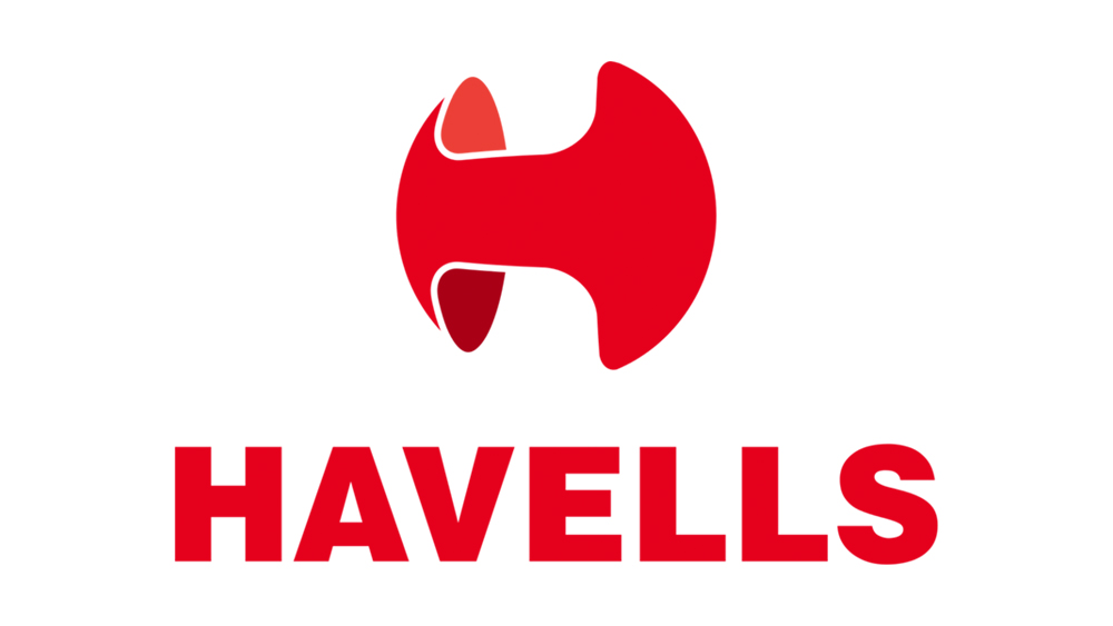
Havells
Designer: Locus design
Havells India Ltd is one of the largest electrical equipment companies in India.
Lokusdesign initiated a radical rebranding project which improved the company’s brand value, brand positioning – and fortunes. Unified brand image led it to be more international, adaptable, while increasing brand value through better customer perception; aiding it to be a globally recognized, trendsetting corporation that delivers excellence through products. Through creation of a new identity, we captured the company’s brand essence; Dynamic, Leader & Stability.
Source: http://www.lokusdesign.com/portfolio/havells/
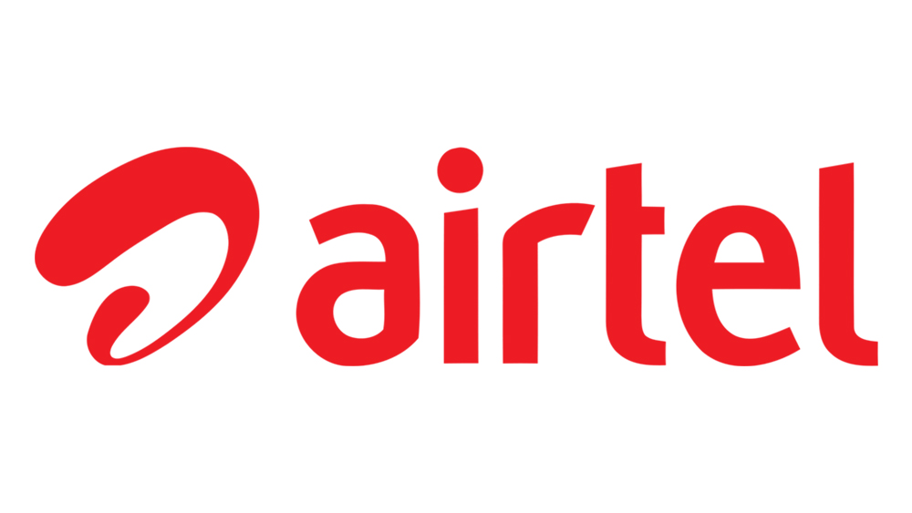
AIRTEL
Designer: Ray Keshavan
Airtel is the world’s fifth largest telecommunication company spreading its services all around. It is the largest mobile service provider in India which re-designed its brand logo in 2010. The new logo is Airtel single letter ‘a’ presented on a red background followed by Airtel written underneath the letter ‘a’. The red color of the logo represents their passion and dynamism aiding towards their success worldwide. The unconnected letter ‘a’ represents the meaning of ‘no boundaries’ to explore the world. The new logo designed is a combination of its old logo and Zain Telecom.
Source: http://www.creanara.com/expressions/article/the-top-10-indian-logos--brands-ever-designed

JET AIRWAYS
Designer: Landor associates
Jet Airways is an Indian airline based in Mumbai. It operates over 300 flights daily to 68 destinations worldwide from its main hub at Chhatrapati Shivaji International Airport.
Jet Airways' original livery was navy blue with light grey and chrome yellow. The top and bottom of the aircraft were painted in light grey with the flying sun logo in the navy blue background. The original logo was design by K.V. Sridhar in 1992.
In 2007, a new livery was created by Landor Associates which added yellow and gold ribbons; the design retained the dark blue and gold-accented colour scheme along with the airline's "flying sun" logo.

Electronics India
Designer: Satheesh S
The logo is to express the energy that is originated from a point and it doesn’t have any limits. The origin is letter ‘I’ which is just represented by a Dot. Then the typographical play on the letter ‘E’ which is aligned to the Fibonacci series to make the perfect form which is inspired from the flower ‘Lotus’ (National Flower of India). The origin dot is inspired from the ‘bindhi’ which normally Indian women use on their forehead. It’s also a symbol of energy which is controlled at a particular point.
Source: https://www.behance.net/gallery/9499325/Logo-Design-for-Electronics-India-(ESDM)
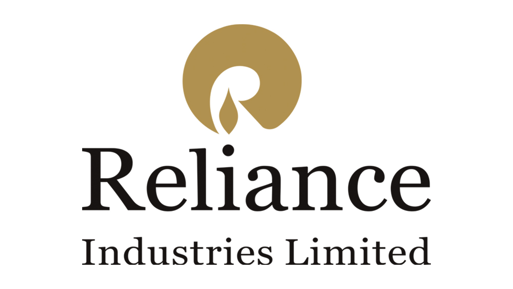
Reliance
Designer: Landor Associates
Reliance Industries Limited (RIL) is an Indian conglomerate holding company headquartered in Mumbai, Maharashtra, India. Reliance owns businesses across India engaged in energy, petrochemicals, textiles, natural resources, retail, and telecommunications. Reliance is the third most profitable company in India.
Source: Wikipedia
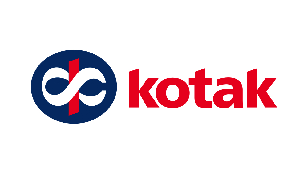
KOTAK MAHINDRA
Designer: Ray and Keshavan
Kotak Mahindra Bank is an Indian private sector bank headquartered in Mumbai, Maharashtra, India.
Bengaluru-based Graphic Design studio Ray and Kesavan designed the logo. The letter form for ‘k’ in the Devanagari (‘क’) script was crafted to include the symbol for infinity in its form. The symbol of ‘Ka’, made it of distinctly Indian origin; while its curves form the universal ‘infinity’ sign, thus reflecting group’s uniquely global Indian personality. The Devanagari ‘Ka’ (‘क’) – has the knot of ‘ka’ (‘क’) around the strong red stem. This unit within the strong dark blue circle projects superiority, victory, strong foundation and stability. The group has thought on the basic tenets of economists that, man’s needs are unlimited. The infinite ‘Ka’ (‘क’) symbolises that we have the infinite number of ways to meet those needs.
Source: https://zerocreativity0.wordpress.com/category/logo-design-2/

iBall
Designer: Sameer Bombale, Palasa designs
iBall is a privately held consumer electronics company headquartered in MIDC Andheri Mumbai, Maharashtra, India. iBall is IT an computer peripherial brand. It came up with a computer mouse which had a small ball as a scroll as well as a cursor. Considering this speciality, Palasa named the brand as iBall itself. Here the letter ‘i’ in red represents the field ie. Information technology. Also giving the idea of the brand’s expertise in the same field.
Source: http://www.palasa.in/

Wipro
Designer: Shomit Sengupta
Wipro is one of the top MNCs of India started its journey in 1945 with a vegetable oil company. But today the company has expanded itself to many fields like IT, electrical and furniture.
Initially, the logo symbol of Wipro was a sunflower designed in black and white colors. Later the logo re-designed by Shomit Sengupta to a dark integrated rainbow colored sunflower depicting the company’s integrity and values. Rainbow is the rare miracle of nature taken as inspiration for logo design depicting the simplicity and rareness. These together will aid for success all the time. The logo also resembles a solution for innovative thoughts.
Source: http://www.creanara.com/expressions/article/the-top-10-indian-logos--brands-ever-designed
Star TV
Designer: Venture three
Star India Private Limited, is an Indian media and entertainment company, owned by 21st Century Fox. It is headquartered in Mumbai, Maharashtra. STAR India's portfolio includes 58 channels in eight languages.
The new star logo symbolises zeal to continuously innovate, create and invent for the 21st century India. It is targeted to a newer audience who believe in change. The campaign ‘Nayi Soch’ literally translates to new thoughts or views. The logo reflects the vigour and vitality of a new India.
Source: http://www.afaqs.com/news/story/30279_STAR-India-unveils-new-corporate-logo
Mahindra
Designer: Landor Associates
The Mahindra Group is an Indian multinational conglomerate holding company headquartered in Mumbai, India. It is considered to be one of the most reputable Indian industrial houseswith market leadership in utility vehicles as well as tractors in India.
Mahindra’s new word mark retains its existing brand attributes such as its reliability, solidity, warmth, trustworthiness and caring nature, as well as its new brand attributes, namely, 'global', 'technology savvy', 'modern' and 'progressive. Mahindra's previous word mark was grey in colour, in line with the colour of vehicle badges that are typically steel grey. The new hand-drawn word mark sports a deep, bright red, which is, in fact, a shade deeper than the signature Mahindra red. The new colour red, has auspicious connotations in India, also stands for vibrancy, positivity, energy and excitement.
Source: http://www.afaqs.com/news/story/36531_Mahindra-unveils-new-visual-identity-brand-architecture
VISTARA
Designer: Ray Keshavan
Tata SIA Airlines Limited, operating as Vistara, is an Indian domestic airline based in Gurgaon with its hub at Delhi-Indira Gandhi International Airport. Vistara is derived from vistaar means 'infinite expanse' in Sanskrit. It is the perfect cue for an airline that will push back the boundaries of air travel and create seamless experiences. It also conjures up the image most associated with a smooth flight– an endless, blue horizon.

INDIGO Airlines
Designer: Wieden kennedy
IndiGo is headquartered at Gurgaon, Haryana, India. Indigo is the most efficient airline and has become the largest fleet in India. It has its primary hub at Indira Gandhi International Airport, Delhi.
Twenty dots arranged in the shape of an aircraft serves as the logo of the airline. The airline uses a two tone blue livery on a white background with the belly of the aircraft painted in Indigo with the logo in white.
AIRINDIA
Designer:
Air India is the flag carrier airline of India and the third-largest airline in India in terms of passengers carried. It is owned by Air India Limited, a Government of India enterprise, and operates a fleet of Airbus and Boeing aircraft serving domestic and international destinations.
The first logo of Air India was a centaur, a stylised version of Sagittarius shooting an arrow in a circle representing the wheel of Konark. The logo chosen by founder J. R. D. Tata was introduced in 1948 and represented the airline until 2007.
On 22 May 2007, Air India and Indian Airlines unveiled their new livery consisting of a Flying Swan with the wheel of Konark placed inside it. The flying swan was morphed from the centaur logo and the chakra was derived from Indian's erstwhile logo. On 15 May 2007, Air India refreshed its livery, making the Rajasthani arches along the windows slightly smaller, extending a stylised line from the tail of the aircraft to the nose and painting the underbelly red. The new logo features on the tail and the engine covers with red and orange lines running parallel to each other from the front door to the rear door.


