Logo Design involves use of Typography in addition to forms and shapes. Sometimes, the word meaning achieves a meaningful uplift by use of expressive letterforms, use of a certain typestyle (inherent with a tone of voice), the balance of letterforms with respect to colours, use of white space etc. Robert Bringhurst observed that, “Typography is language made visible”. Similarly, for a graphic designer the word’s visual identity becomes visible in the form of logos. Different fonts, customized letter styles and other formal graphic treatments have been applied to create distinct visual identities of Type in these logos. The current archive is a sequel 12 by 12 gamut to the previous one – Typographic Logos of India – GROUP A
Dialogue Design Firm: PALASA, Mumbai A Communication and Personality Development Outfit, ‘Dialogue’ as the name suggests ‘Talk Better’ (that is also the main tagline of the logotype). The speech blurb (‘O’ in the name identity) opens up a conversation channel for effective and easy interaction. The yellow of the speech blurb brings in a kind of ‘youthful freshness’ as well as an urgency to establish dialogue between the service providers and the clients
ESSAR Group of Companies Designer & Design Firm: Sudarshan Dheer, Graphic Communication Concepts Designed way back in 1960s, the Essar Group’s logo type and mark tosthere firmly establish the Group’s philosophy of growing with innovative approach in the areas of service businesses, annuity and commodity investments. The Uppercase used to depict ESSAR logotype gives a strength and impact to its image as a global entrepreneur – a diversified business corporation with a balanced portfolio of assets in the manufacturing and services sectors of Steel, Oil and Gas, Power, Communications, Shipping ports and logistics, and Construction. The Gripu is active in seizing opportunities to expand their reach. Hence, the joined horizontal bars in intense red elaborates the reach and efficieny factor of the griup

Himalaya Design Firm: Ray+Keshavan, a Bengaluru based Graphic Design studio Established in 1934, the Himalays Drug company is well known for a wide range of herbal therapeutic and personal care products. The makeover logo design revolved around the three-tier concept of tying all brand touch-points from packaging to marketing, collaterals, retail and web presence. The orange cross-bar leaf form of the capital ‘H’ of the name identity presents the trustworthy, pure and Indian inception of the herbal and personal products. The orange and green bring fervour, healing power nature’s resources attached with it various brand touc-points. The simple and clean typeface unifies with the said inception and produces a very legible, convincing and positive logotype (with an amost universal appeal visually)
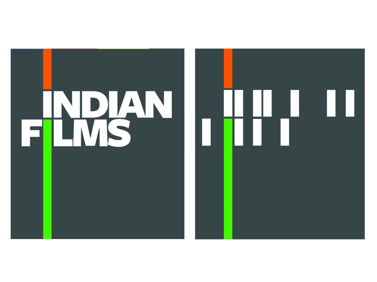
Indian Films Design Firm: Ray+Keshavan, a Bengaluru based Graphic Design studio Indian Films are the first traded film company, with the main objective of investing in Indian films made primarily for the Indian audience. The expression given to ‘I’ in the name symbolically represents the tricolour – mark of India (its heritage and philosophy). The vertical ascending and descending extensions in the saffron and green hues of the tricolour with the white sitting comfortably between the two bands – creates a subtle feel of ‘moving reel’. There’s a moving symphony, movement, dynamism and framed stories that define the Indian Cinemascope. The other letterforms in white alone are lending themselves to the movement of the Cinemascope (though are visually individual entities in being away from the tricolour string). The fluid identity is almost a tailor-made solution to signify Indian films

Indian Institute of Forrest Management Designer: Neeta Verma, NID Ahmedabad The institute is a sectoral management institute, that endeavors to evolve knowledge useful for the managers in the area of Forest, Environment and Natural Resources Management and allied sectors. Symbolically the green leaves emerging from the letterform ‘f’ of the name identity presents natural resources, their preservation, environment related activities etc. The logotype is simple, balanced and harmonious in terms of almost uniform letterspaces. This projects image of a strong management system that is highly integrated and has flourishing aims to facilitate effective forest and natural resources management

J.K. Tyres Designer & Design Firm: Viru Hiremath, Vartul Communications A pioneer in the radials for cars in India, JK Tyres logo was designed way back in early 70s. It is now an established No. 1 Tyre brand of India. It provides radials of supreme quality for Trucks & Buses, LCVs, Cars and Farm. This function is depicted in the symbolic shape of a small unit of the tyre texture (generally seen as cut zig-zag divisions inside a tyre) representing the part-whole image of ‘Radials’. The speedy, swift and smoothly flowing uppercase letterforms in an extra black weight, further reaffirms the durability, longeivity, quality performance and loyalty of the radials for its buyers/users/customers.The use of black and red provides the connotative “ruggedness” and “masculine power” – that are very much associated with automobile parts; especially tyres
Kotak Mahindra Finance Limited Design Firm: Ray+Keshavan, a Bengaluru based Graphic Design studio Kotak Mahindra Finance Limited, established in 1984, is india’s most renowned financial banks. Their state of the art service for individual and group deals, mutual funds, investments, Life Insurance etc. In its revamp around 2010, Kotak concentrated on making itself as among the emerging breed of global Indians. The affluence yet the traditional values and trust that the new logomonogram envisages for the urban audience projects, made the brand strong, comprehensive and widely acceptable. The Devanagari ‘Ka’ – has the knot of ‘ka’ around the strong red stem. This unit within the strong dark blue circle projects superiority, victory, strong foundation and stability
Photoquip India Limited Designer & Design Firm: Sudarshan Dheer, Graphic Communication Concepts Established around 1976, Photoquip established itself as a premier photography studio – that manually processed and printed photographs. Later in 1984, it collaborated with leading group Elinchrom - the world's leading studio flash system manufacturer - with a view to export studio flash systems to Switzerland. A decade after its formation, Photoquip felt the need to grow at a quicker pace, and the company went public with Photoquip India Ltd. The logo uses an extra light, uppercase style providing the brand image the required contemporary and universal look. The suggestive use of red coloured tail of ‘Q’ – making a white (reversed) shape inside the solid circular body – connotes the sound of shutter clicking, the sight of sliding of photo prints out of the printing machine, and other equipments and their applications etc. The illusion within the letterform is symbolic of cutting edge products and photographic solutions for the respective fraternity

Tata Group of Industries Design Firm: Wolff Olins Founded by Jamsetji Tata in 1868, Tata’s early years were inspired by the spirit of nationalism. It has shined in several industries of national significance in India, from steel to power to hospitality and to airlines. Launched in 1999, the Tata Group logomonogram and the logotype together represent the new expanding face of Tata Group of Industries, a fountain of knowledge or may be a tree of utmost trust subsumed in the reversed out capital ‘T’ against a modern and energetic blue colour of the ellipse. From the service-quality point of view, the logo image has advanced further in the 21st century and The Tata marque has become a symbol of quality, reliability, and real value, not just in India but in other parts of the world too
Tanishq Design Firm: Wolff Olins Launched in 1994, Tanishq is now a leading jewellery brand of India. It has India’s first and largest jewellery store, with 138 exclusive boutiques in 80 cities. ‘Tanishq’ word is a combination of Tata/Tamil Nadu and Nishq (meaning a necklace of gold coins). Also, from ‘tan’ meaning ‘body’ and ‘Ishq’ that means ‘love’. The mark of ‘T’ and the ravishing, luxurious, high-class and silky smooth and shiny curvaceous letterforms depict the meaningful association with wealth (embedded in ‘nishq’ meaning gold coins)

Technova Associates Designer & Design Firm: Yeshwant Chaudhary, Communica/Corporate Communications Since 1971, Technova has been a leader in the provision of total imaging solutions for the graphic communications industry. The use of the digitized letterforms and the pointed geometric structure and form of the main mark ‘T’ is symbolic of provision of integrated solutions of high quality and efficiency. These integrated solutions are for print, packaging, textile, engineering, signage and photo industries. All incorporated in a bold letterform in red and a futuristic identity, urgency and technically sound characters of the logotype presents the effectve use of typeface, letter expressions, balance with variation in weights, proportion and contrasting letter-widths (separate for the mark and the letterforms in the logotype)
Vadilal’s Designer and Design Firm: Mannu Gajjar (NID Ahmedabad) Designed in 1970s time, the logotype presents one of the most popular and top ice-cream brands. The expression given to letterform ‘D’ in the name identity – that of a ice-cream bar directly represents the brand’s identity. The slab serifs are expressive of the rounded, solid and delicate wooden spoons that are generally given with ice-cream cups. The visual language of the tilted bar - connotes not only the product features and the tastes of various brands; but what most comes to the mind is the fragrant ambience in which one relishes a Vadilal’s ice-cream to the best for invigorating taste buds with delicious iced creams of milk in different flavours


