Assignment: Image Distance

The act of arranging words in a given white space is not random. The words (content) and the space (format) provided are correlated, interacting with each other in order to extract a hidden or visible visual hierarchy, usually pre-defined by the graphic designer through his design. As graphic designers, we tend to create order of importance, i.e., try to create 'emphasis' in the elements of the page. Hierarchy defines the visual flow, priority of the elements, from larger to smaller, defining a path for the user’s convenience, while extracting the presented information. We will try to experience these visual hierarchies through a series of assignments and find out how elements and principles of design affect these hierarchies.
Task 01:
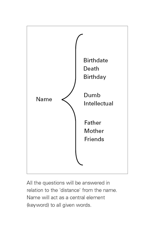
A list of words is provided and you have to arrange these words, either close or far away from each other (in distance) within a given format. Try to exploit the subtle spatial distance, which would exist between those two words in reaction to the question asked for each word:
1. Your name* (Write you name in the predefined format.)
2. Birth date (How far are you from the date when you were born?)
3. Death (How far would you aspire to live from the present state?)
4. Birthday (How far or near are you from your next birthday?)
5. Dumb (How far are you from being dumb?)
6. Intellectual (How close are you from being intellectual?)
7. Father (How close are you to your father?)
8. Mother (How close are you to your mother with respect to your father?)
9. Friends (How close are you to your friends than to your parents?)
This is an endeavor to use typographic variables, to design visual answers for a user. One may develop a sensitivity towards white space or negative space through these efforts.
Note:
Use Font: Franklin Gothic Medium Condensed/ Regular,
Font size: 20 pts
*Do not write your surname (Write your first name).
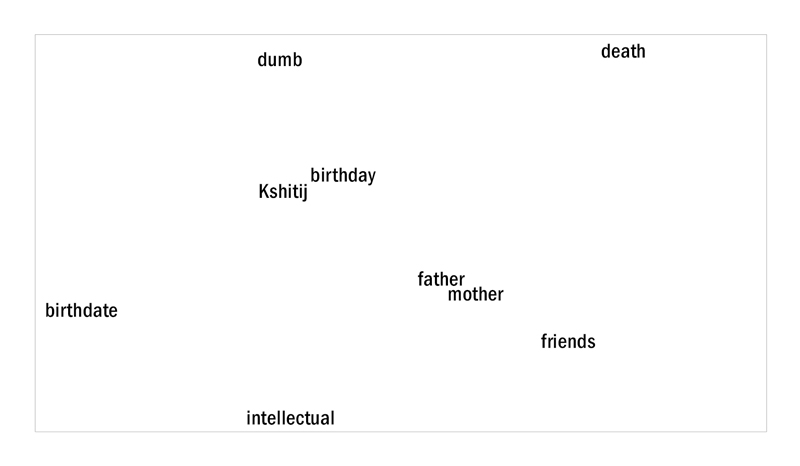
• Solution Image Distance:

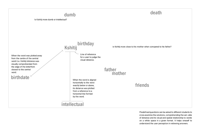
• Feedback Image:

Predefined questions can be asked to different students to cross-examine solutions, comprehending the variable of distance, its visual and spatial relationship to words on a white space in a given format. It helps one to understand the user’s perception in retrieving answers.
• Queries & Observations - Distance:
Queries:
Why such questions were chosen in the questions asked? Why these tasks and what is the aim?
Two dimensional graphic design involves teaching of an experience: taught at subtle as well as gross levels. The words in the assignment depict human relationships; these are words with which one can relate. It allows students to experience space. The tasks mentioned in the assignment give a reason to shift /position a word in subtle and gross distances in order to make a relationship or break it. Personal involvement in the exercise encourages the student to participate and persuade him to begin the task with a rationale in his mind. Experience while altering distances with reference to the questions asked imprints in the student’s mind, the importance of distance for visual judgments.
Why do some questions seem confusing? For example: How far are you from being dumb? They are made a bit confusing with the purpose of reducing the notion of monotony in repeatedly asking the same question. These questions should create and maintain interest levels of a participant. Thus, each question appears to be different, but follows the same underlying principle of how far or close it is from the central word.
Another question pertains to constraints. One may question the rationale behind these constraints. Why are participants not allowed to change the font face or font size? Why does this assignment have many constraints?
The reason behind this is not allowing the students to tackle all variables at a time. Constraints force one to struggle with a single variable, making him add more thought into it while working. Value and scale are two important variables of typography and therefore were not introduced in the beginning with the variable of distance. Each variable teaches an underlying principle of typography.
• Observations:
While executing and reviewing the first solution, students were not aware of the next assignment.
We can cross check the appropriateness of solutions in group discussions with the students, asking questions and answers based on visual judgments when presented to a user ( as in comprehension of user’s perception about the students’ solution. Students judge each other’s solutions and evaluate on the basis of given criteria (i.e. the questions asked).
• Distance, Position and Axis:
An interesting dimension of this discourse lies in the analysis of distance, position and axis. When a set of students were asked to visually plot the distance based on positions of the words with reference to the keyword, the outcome was interesting. Distance was plotted on x and y axis primarily due to the constraints such as not allowing alterations in font face or font size.
• How was the distance defined in this assignment?
Distance was defined as the space plotted between two words in relation to the reference point and the position of the respective word in that format:
Here distance is referred to:
a. passage of time
b. Sharing a relationship
c. Evaluating behaviors
It also hints towards finding analogies in graphic design towards leading, kerning and tracking, as well as formation of visual groups based on proximity and closure.
Arrangements of dots in gestalt theory are the most well known laws of perception and have had a clear impact on rationalizing design decisions. Examples in theory, although well comprehended by novice graphic design students are difficult to translate into practical applications, such as design of a layout. The main reason for this is the contextual nature of design solutions. Design solutions simultaneously employ a large number of variables, not to forget the variable of sensitivity*, making one feel its strong presence by its sheer absence.
This assignment encourages students to put down actual words in a white space. There is a relationship attached to each word. Altering the spatial distance within a context of the relationship shared with a person time or behavior. This sharing develops a visual sensitivity in arrangement of these words depending on how close or how far they are from the central word. Due to the relationships shared by the word it does not result in a random activity, but augments ones contemplation before and while executing the given task.
During the course of this exercise, different axis on the two dimensional plane was explored by rotating the groups and changing their positions and orientations to generate new solutions. Many queries can be posted to the students to encourage them to think and experience the interaction with the empty space. For example, do you find invisible structures formed beneath the word, like scaffolding, sometimes linear like a timeline or sometimes radial like a spider’s web (with name acting like a spider (centrally located) and the words interacting with the name in spatial distances. Do these invisible structures help us to retrieve information easily and quickly, provide us a point of reference to start with, to plot things, or give us a hint with some clues, regarding the hierarchy of information presented within a group? Can these invisible structures acting behind the white space be defined as grid? So what is a grid?
• References and Foot-Notes:
*Sensitivity to micro and macro distances, spaces which govern formation of groups and chunks within content.

