Assignment: Image

When we compare a piece of art and the work of the graphic designer from a viewer's (user) perspective, it would be necessary for us to understand the difference between both kinds of visual enquiries. An artist creates art for self expression and the viewer has the freedom to interpret meaning out of the artist's expression.
A graphic designer has rarely any room for self expression. Moreover, they can never be physically present to explain their designed solutions to the user. In their absence they have to visually communicate clarity of the message to the user (viewer), making it least ambiguous as well as achieve their sole goal of effective communication. You have to understand this difference before designing solutions, thus prioritizing the user’s perception and perspective.
Task 05:
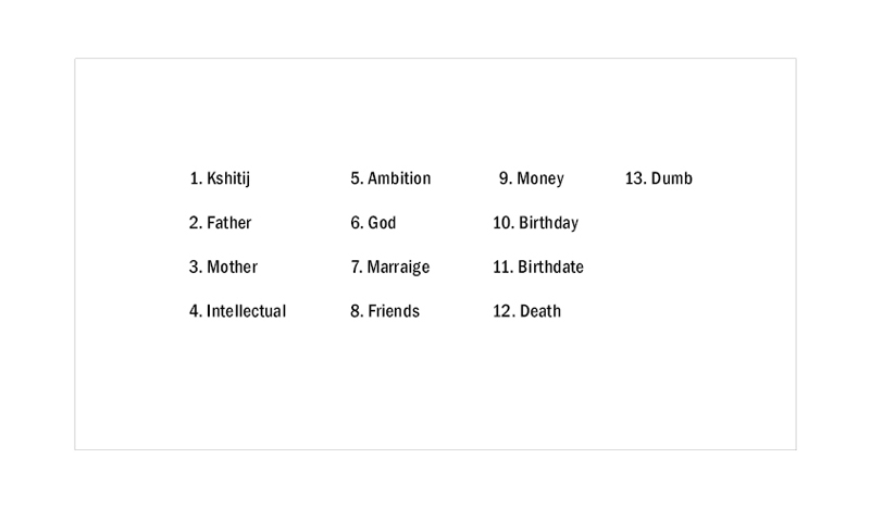
Here one has to predefine the numerical order (1 to 13) of the words of the previous exercise and the additional words shown in the figure 5.1 as per one’s own preference. This numerical order should be independent of the relationships they share with the keyword (name) and has no relation to the questions that were asked earlier. Your task is to define your own numerical order to the given set of words. Your solutions will be judged on the basis of your predefined numerical order.
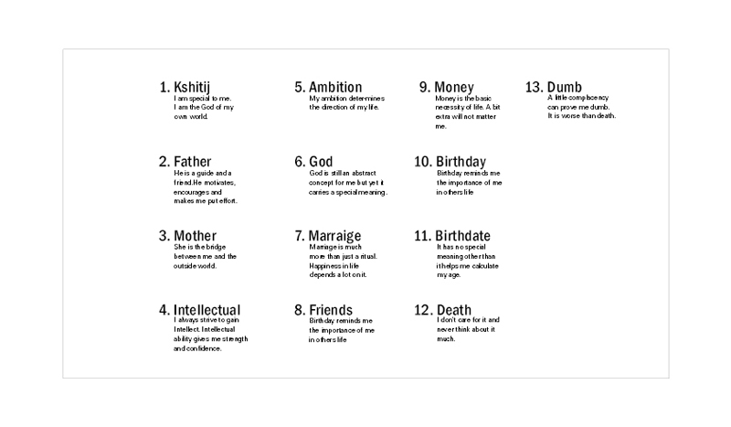
So, first, you begin with assigning a number to each word, including your name. You will present your numerical order in the format that would be provided. Once the numerical orders are frozen write a description for each word consisting of 15 words. (Please revise your description to maintain a minimum of 13 words or maximum of 17 words). All descriptions have to be presented according to the predefined format. Create your solutions in the given format. Even though the user will be unaware of the numerical order while judging your solutions, ensure that your solution should make them perceive the same numerical order which you had set.
You are expected to come up with two solutions:
a. Define the order of 13 words without descriptions, use same font, and consider all three variables.
b. Define the order of 13 words with descriptions for each word. You have full freedom of using any font with additional elements of design to support.
• Visual Order of Words:
• Visual Order Words Description:
• 5a Student Solution - 1:
• Feedback - 1:
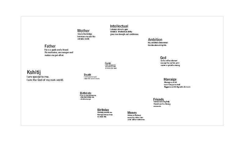
Considering the freedom to use all the principles and elements of design, a careful visual investigation would conclude that here the emphasis is quite weak in relation to the reference point.
• 5a Student Solution - 2:
• Feedback - 2:
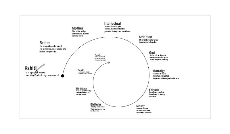
In the solution illustrated below the stroke cutting through the first element can confuse the user, who might try to discern the purpose/logic behind it. Why is it cutting through the information? Why is it directional in nature? Such questions may arise in the mind of the user. Could there be a better solution for emphasis? Is the stroke required at all? Can it be excluded and the desired result still achieved? These are some of the questions which need to be addressed.
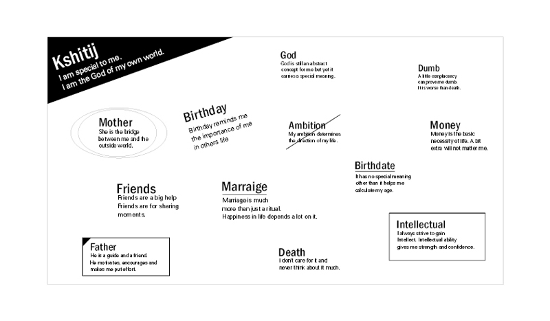
• 5b Student Solution:
• Feedback:
In this solution the flow simply refers to the visual and verbal paths of movement in which the reader’s eye tracks through a page or pages. A page with a good flow will visually lead the reader from one element to another in the layout carefully presenting information to the reader. Planning flow in the documents allows better control of the order in which the reader reads the points in the message (Lisa, 2002).
A good layout is one which tries to create a balance between order and chaos. Too much of order will lead to loss of interest and too much of chaos will accentuate emphasis, killing the flow.
Lisa Graham, 2002, Basics of design: layout and typography for beginners, Delmer, ISBN: 0-7668-1362-2
• Observations:
Task 5 dramatically increased the amount of information that the student has to deal within the solutions. Also by removing most of the constraints i.e. providing the freedom to use all three variables to depict a visual hierarchy within this information, this task suggested possibilities to transcend mere functional flow and impart an overall semantic expression to the layout.
Task 5a consisted of guiding the user through the 13 elements in exactly the same order as defined earlier by the student. After dealing with various variables to accentuate/ diminish the emphasis in all the previous tasks, this was the first introduction to visual order. All the text has to be presented in the same font. This objective was successfully achieved by gradual diminishing of all three variables to create a visual flow. But not much attention has been given to break the monotony of the resulting solutions.
Task 5b provided students the additional freedom to use various fonts and external graphic elements to guide the user through the same visual order as presented on task 5a. With so much freedom and increased information as compared to the previous tasks, visual clutter emerged as a real problem to be dealt with. On the other hand this freedom also provided an opportunity to impart an overall semantic expression to the layouts and increase persuasion for any user delving into this information. This latter aspect was not explored in this task. In fact, the semantic aspect of the layout is an important consideration. Comparison of various solutions for task 5b reveals that the solutions with a definite semantic connotation instinctively persuaded the user to scan the information and augmented interest even before the user entered this information.

