The square grid of the screen presents a new kind of challenge to font designers. Type designers have had to design letters which fit into the pixel grid presented by various electronic devices. Screen fonts are fonts which are specially designed considering the limitations of a pixel grid. Their intended use is for display on digital devices. In some low end devices such as mobiles, bitmap fonts are used instead of vector fonts.
Common examples given for fonts that are designed for the screen are:
• Verdana and
• Georgia

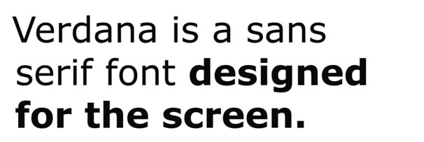
Figure 1: Verdana is a sans serif font designed by Matthew Carter.

Figure 2: Gill Sans is a font which was designed by Eric Gill before the use of DTP computers.

Figure 3: Compare x-heights of the fonts, both the fonts are at the same point size.

Figure 4: Compare x-heights of the fonts, both the fonts are at the same point size.
In the above figures we have shown fonts which are largely used for print and fonts which are specially designed for the screen. Compare the visual features of these two typefaces, and try and deduce what design features differentiate the two kinds of fonts. As a hint we could begin by comparing the horizontal and vertical proportions (such as x-heights) of the two kinds of fonts.

Figure 5: Note differences in characters such as lowercase l and upper case I and the numeral 1.
If we study Verdana, we realize that its legibility at small point sizes can be attributed to many factors. Its basic shape is derived from a square grid. Along with this it is more loosely spaced which helps legibility at small sizes. The bold version of the font is also darker than print based fonts. Letters such as j I l, I and 1 have been designed so that they can be easily differentiated.
Besides the visual features, screen fonts are hinted. Font hinting is the process in type design where set of instructions are embedded in a font so that the computer can adjust the drawing outlines on a small raster grid. Hinting is especially used to make fonts more legible on low screen resolutions. One important factor for the clear legibility of screen fonts is the quality of hinting that they have.
Assignment 4:
• In the given assignment, please try and answer the following questions.
• Use the available books in your library, online sources or talk to experienced graphic/ type designers.
• After noting down the answers, please discuss your answers with your colleagues and faculty members.
There is a possibility that you might not reach a single unambiguous answer. The goal of the assignment is to stimulate a discussion rather than to come up with a definite answer. Some of the questions are purposefully challenging, complex and ambiguous in nature; they are meant for the more experienced students and faculty, but undergraduates should nonetheless attempt to answer them.
Q9. List out the visual design features in screen fonts such as Verdana and Georgia that make them more legible on the screen as compared to print fonts.
Q10. Verdana and Georgia were fonts designed for the screen in the 90’s. Find out and list down fonts designed for the screen in recent years.
Q11. Explain the phenomena of hinting. What is its purpose? How is hinting actually done?
Digital Typography Downloads:
• Presentation - Slideshow - pdf

