Search
- yohoho
- unblocked games 77
- unblocked games 8
- unblocked games 2
- unblocked games for school
- unblocked games world
- retro bowl
- unblocked games
- unblocked games premium retro bowl college best unblocked games unblocked games
In the earlier section we saw how we can be certain about the output of our designs in traditional print mediums. The same cannot be said about web based designs, as the device on which the design will be viewed is not known. Along with this there are certain basic differences in the approaches to designing for print and for the web. One of the first differences that we come across is that of light sources.
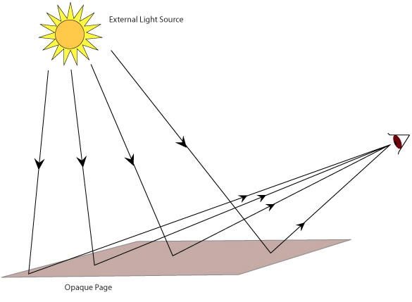
Design elements on a printed page, be it text or graphics are seen in reflected light. Their visibility is dependent on an external source of light. The rays of light are emitted from an external light source such as the sun; they then are reflected back opaque page and are then seen by the viewer. (See figure 1)

Figure 1: A printed page is viewed in reflected light.
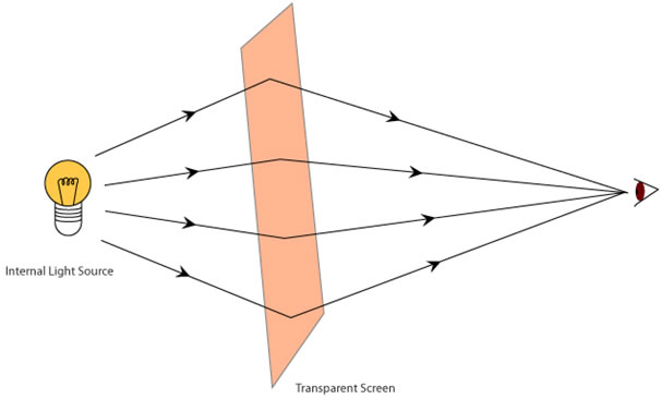
Web (software) based designs use a completely different principle to display text and graphics. When a design is seen on a computer monitor or a mobile device, the graphic elements in the design are illuminated by an internal light source which is present in the device itself. Graphical elements on a monitor are illuminated and displayed directly.

Figure 2: Any text on a monitor is read with an internal light source.
This difference in the light sources has many consequences on how graphical elements and text are perceived by the viewer. So a graphic designer must be aware of how a design would look on screen and how it would look on paper. Designers must be aware of the advantages and disadvantages of each of the mediums, and be careful while translating their designs from paper to screen and vice versa.
For Example:
Colour is perceived differently on paper and on screen due to the differences in light sources. Most colours usually look brighter on the screen; this can be an advantage as more vibrant colours can then be used on screen. But designers must be careful while using light colours, especially in setting text. Light colours on screen have lower contrast. So a line of yellow coloured text on a white background might be very difficult to read on screen. Along the same lines colours such as gold, silver, as well as a range of fluorescent colours are available exclusively for print and cannot be created on screen.
Assignment 2:
• In the given assignment, please try and answer the following questions.
• Use the available books in your library, online sources or talk to experienced graphic/ type designers.
• After noting down the answers, please discuss your answers with your colleagues and faculty members.
There is a possibility that you might not reach a single unambiguous answer. The goal of the assignment is to stimulate a discussion rather than to come up with a definite answer. Some of the questions are purposefully challenging, complex and ambiguous in nature; they are meant for the more experienced students and faculty, but undergraduates should nonetheless attempt to answer them.
Q3. Describe in your own words how the source of light affects the text that is read. Determine what effect does light have on the basic elements of design, such as colour, typography, layout etc.
Q4. Read up and search “e-ink technologies” and e-book readers. Discover the source of light that they use, and hence determine its advantages and disadvantages.
Q5. Compare print based design with screen based designs and e-ink technology. Highlight their pros and cons.
Digital Typography Downloads:
• Presentation - Slideshow - pdf