"When a black spot is located on a white ground, this is already perceived as a three-dimensional situation. This is clearly reflected in language. The spot is said to be on the white ground, i.e., the spot is in the foreground and the white is its background. The eye separates the parts of a two-dimensional picture into figure and ground, i.e., it interprets two-dimensional form in a three-dimensional manner. Frequently, linear forms are also perceived as three-dimensional. The criteria for the separation of figure and ground lie in the relative size of the forms and in the shape of their outlines". (Moritz Zwimper, 2001, Chapter 07)6
Knowledge of figures and ground with typography is indispensable for any graphic designer to design effective logos and symbols. In this assignment, we will try to experience the figure & ground relationship in letterforms. The aim of the exercise is to explore possibilities; as to what is the least amount of ground required to identify a letterform when it is reversed and to become sensitive to the subtle changes which matter in recognizing the letterforms through a user study.
Task 01:
Type the first letter of your name in Devanagari Script.
Font face - Manjusha Bold.
Your Name:
First Letterform:
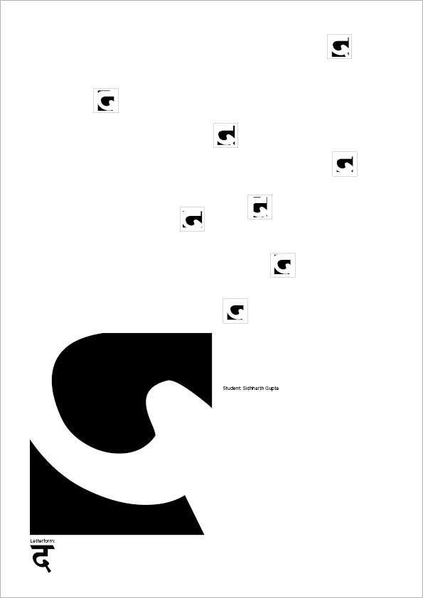
Add black background to your letterform, so that the letterform appears white and the (ground) is black. Keep on trimming (deleting) the black portion (i.e., the ground) around your letterform (i.e., the figure) to the maximum possible extent without losing the identity of the letterform, meaning you should be able to identify the letterform (figure) with least possible (ground) black area. Generate various alternatives by juxtaposing the letterform over the black background to study vital curves/ counters, necessary, to make or break the identity of the letterform. Create five variations to investigate the identity of the letterform within an area of 5 x 5 cm.
Create the identity task with any one Roman letterform.
Create five variations of identity investigations for your chosen Roman letterform.

The purpose of the exercise was to extract basic most curves of the alphabet that made recognition possible for the human eye. As the positive space (the black area) was reduced, more and more frivolous curves were discarded, the eye moved towards the most essential part of the alphabet. The smaller triangles were omitted for the sake of harmony.

