Task 03:
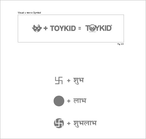
Till now, we have understood negative and positive space and creation of depth in the last exercise. While creating symbols one often has to deal with combination of visual metaphors as well as written text (either the name of the company or initials) and fuse them together to form a unit as a whole. Communication designers face these challenges while creating symbols. The example shown above is picture of a kid and the shop name “toy kid” which has been cleverly transformed to form a single group. The designer has changed the font to (smooth, rounded edges), conscious to the fact that it is a Kid’s store, and substituting the letter “O” with the kid’s face in a circle.
You are challenged with a similar task and are expected to come up with alternatives. The aim here is of an exploratory nature where you should create options to generate harmonious combinations of the pictorial element and text to complete the symbol. (It is an exploratory task devoid of context).
You are free to alter the font according to the requirements of the symbol. If you don’t find font that suit's your purpose, you may try calligraphic strokes instead of true type fonts.


