Figure 5.3.a
Source: Amit Patjoshi
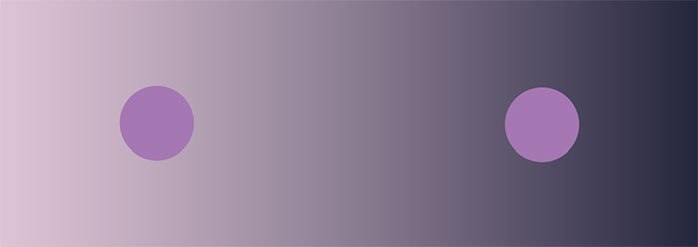
Do you see a difference in the colors of the two circles above? If you are like most people, you would say that the circle on the left is lighter than the circle on the right. Would you believe me if I said the circles are identical? Both the circles seen on top are identical. However, due to the background, one looks lighter than the other. This is called the simultaneous contrast effect.
Simultaneous contrast is a phenomenon that occurs when two adjacent colors interact and alter our perception, making them more or less saturated or more or less bright than one another. It can be seen in a variety of hues and luminosities. When two patches of equal luminance appear on contrasting backgrounds, the phenomenon of simultaneous brightness contrast occurs. The patch against the lighter backdrop appears darker, whereas the patch against the darker background appears lighter. Also, and this is critical, this is a phenomenon that can only be assessed by comparison. This is true for all types of perception phenomena. We have no way of knowing or defining how cold an item is or how saturated a color is. We can only state that something is cooler or more saturated than something else.
Michel Eugene Chevreul, a French chemist, first developed the phrase "simultaneous contrast effect" in 1839. Chevreul made his discovery after receiving complaints about color inconsistencies in tapestry fibres. He was surprised to discover that the color discrepancies were not due to dye faults but were due to the placement of colors on different backgrounds. Chevreul found that when two samples of identical fibres were placed on different backdrops, they looked to be different colors. He discovered that a patch of non-hue grey appeared lighter when set on a black background, as opposed to when placed on a white background, it appeared darker. He labelled this phenomenon the simultaneous contrast effect.
When two circles of the same color, A777B7 with brightness level 70, are put on a continuous gradient with brightness levels ranging from 86 to 23 from left to right, the circle on the right appears brighter, and the circle on the left seems darker. The phenomenon occurs because the circles are influenced by their respective lighter or darker background, making us perceive them differently.

Figure 5.3.b
Source: Amit Patjoshi
The concept of belongingness regulates our perception of brightness. The theory asserts that the appearance of a region is determined by the portion of the environment to which it belongs. According to this theory, as the circle (left) looks to be resting on a lighter background, the background will influence our perception of it. Similarly, because the circle on the right appears to be resting on a darker background, the background will influence our impression of the circle. Moreover, the lighter region makes the left circle appear darker, while the dark background makes the right circle appear lighter.
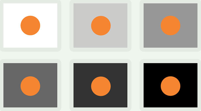
The image below depicts six different rectangles, each with a brightness ranging from 100% to 0%. Circles of the same colour and brightness (FFBA44, with a brightness of 80) are inscribed within rectangles. As the brightness of the rectangles decreases, the circle appears lighter.

Figure 5.3.c
Source: Amit Patjoshi
Initially, explorations only witnessed the illusion while using shades of black and white (white illusion, Mach band etc.). However, the idea that different colours also interact, causing our perceptions to alter and produce the simultaneous contrast effect, was soon explored. As we rarely see colours in isolation, our perception of the colour is influenced by simultaneous contrast present in the environment. Its effect is based on the complementary colour law, which states that any pure colour physiologically necessitates its counterpart hue or complement colour. Therefore, if the complementary colour is not present, the eye is prone to perceive it simultaneously. For instance, the greens and magentas used in the image below are of the same brightness, but they seem different because of the backgrounds they are put on.

Figure 5.3.d
Source: Amit Patjoshi
Moreover, when Chevreul placed a patch of non-hue grey on a green background, it appeared to be somewhat red, and when positioned on a red background, it appeared to be slightly green. This type of contrast can be seen in the exploration below, where when a green rectangle is placed in a red background, it is much brighter and vice versa. The simultaneous contrast causes visual strain at the intersection of the hues, as shown in the diagram below. This causes the figure to vibrate where the two colours meet.

Figure 5.3.e
Source: Amit Patjoshi
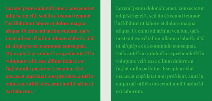
If simultaneous contrast is not considered when designing presentations, it can hurt letter legibility. For example, the figure below created a sample text on the same background with identical attributes. However, one sample text used contrasting red as the font colour while the other used a tinted version of the green. As it can be seen, the contrasting text colour on the left reduces legibility and makes it exceedingly difficult to read, but the text is easier to see when tinted.

Figure 5.3.f
Source: Amit Patjoshi
The legibility is increased when a shade of red that is not as contrasting is placed over the green background. The tint of red reduces the impact to some extent, but the effect persists. However, when a similar colour or shade of green is used, the effect is further diminished and, at times, becomes almost non-existent.

Figure 5.3.g
Source: Amit Patjoshi
Does the effect exist with Odia's script?
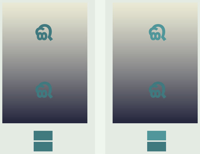
The Odia letters, like other forms, can be affected by the simultaneous contrast effect. For instance, a set of Odia letters were placed on a background of alternating purple and orange stripes. The same set of letters was then relocated to the strip on the right in the bottom row. The letters appear differently in each stripe which can be attributed to the simultaneous contrast effect.

Figure 5.3.h
Source: Amit Patjoshi
Several open and closed spaces in the Odia script could potentially contribute to the simultaneous contrast effect. If the internal colours of closed letters, such as the letter 'Pa,' are modified, the effectiveness of the colour of the letter can either diminish or enhance.

Figure 5.3.i
Source: Amit Patjoshi
This is also true when the backdrop is kept the same, but the internal colours in the characters are changed.

Figure 5.3.j
Source: Amit Patjoshi
The effect is also apparent when the background is pixelated with similar colours. The difference in grey becomes more apparent in the pixelated background compared to the solid background. When the colour-generating pixels are of optimum size, it can also indicate that the effect will have a greater impact on the text in the event of smaller font sizes on the screen. This can be seen in the exploration below with the second-row vs the third-row.

Figure 5.3.k
Source: Amit Patjoshi
When the screen is glossy and viewed in a bright area, screen glare can also distort the perceived colour of the letter, similar to pixelation.

Figure 5.3.l
Source: Amit Patjoshi
The impact is also apparent when the letters are utilized in gigantic proportions. We may not be able to perceive the letters as a whole when they are viewed at massive sizes. We may see them in pieces, and when we do, the fill colour of these letters will vary depending on the viewing location.
The Odia letters' Ma' and 'Kha' are represented as parts in the figure below. The red appears slightly different in entirely enclosed spaces than in partially enclosed spaces and open spaces.

Figure 5.3.m
Source: Amit Patjoshi

