Design Course
Visual Perception for Communication Designers
Human Factors and Sociotechnical Systems Studios
by
5.4 Colour Assimilation
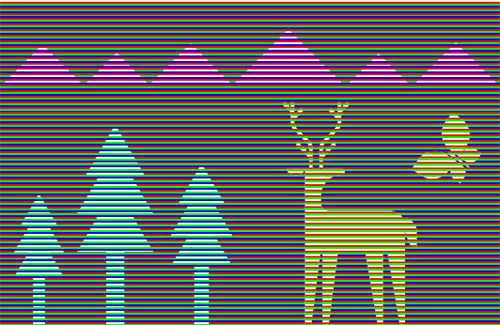
Figure 5.4.a
Source: Sumedh Narnaware
In the picture above, what would you say is the color of the butterfly, mountains, deer, and trees? Well, if you are like most people, the trees would look to be in cyan, the butterfly and deer would look to be in yellow, and the mountains would look to be in magenta. However, what if I told you they were all light yellow in color? That it is an optical illusion known as color assimilation or the Bezold effect.
The "assimilation effect," also known as the Bezold Effect, is an optical illusion in which the color or colors around it influence the hue or value of a color. Wilhelm von Bezold, a German professor of meteorology, is credited with discovering the Bezold effect. He found that color might seem different depending on its position to neighbouring hues. Bezold learnt that, in some cases, a colored region would take on the same color as its surroundings. This theory contradicts the widely accepted conclusion of "simultaneous color contrast," in which color takes on the complimentary hue and contrasting brightness of its surroundings.
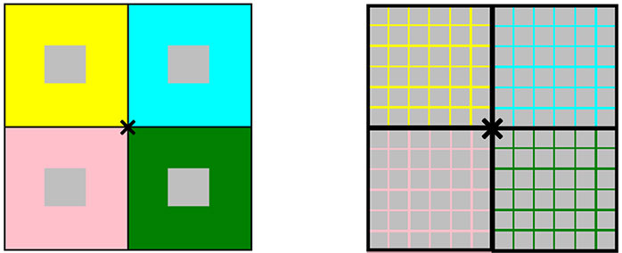
Figure 5.4.b
Source: Sruthi Sridhar. Recreated from Shapiro and Todorović, 2017
The representation above reveals the difference in simultaneous contrast and color assimilation. The one on the left shows how simultaneous contrast works. The four grey squares seem to be tinted with desaturated hues that complement the colors around them (clockwise from the top left: yellow, cyan, pink, and green). The image on the right displays color assimilation. The overlay grid colors seem to have colored the grey backgrounds. Focusing on the centre cross may enhance the results.
Color assimilation states that depending on the colors around it, a particular hue may appear to shift when observed closely. For instance, a yellow box surrounded by blue will appear darker than one surrounded by red.
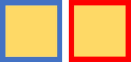
Figure 5.4.c
Source: Sruthi Sridhar
The color surrounded by another hue frequently looks to take on a tint of that color; for example, red boxes bordered by blue will appear bluer than those surrounded by white.

Figure 5.4.d
Source: Sruthi Sridhar
The best example is when thin borders of black and white separate two patches of the same color. Compared to the one surrounded by white, the one encircled by black appears darker. The colored areas absorb the color of their border, which is the opposite of the contrast effect that is frequently seen with hue and brightness.
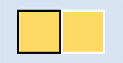
Figure 5.4.e
Source: Sruthi Sridhar
Why does this take place? How does this illusion work? One way to explain the Bezold effect is using White's illusion. White's illusion is often considered the achromatic illustration of color assimilation; the video below illustrates one form of White's illusion.
The video above shows that a set of horizontal black and white bars make up White's illusion. Looking at the image, it is clear that the grey bars with white stripes around them are lighter than the grey bars with black stripes. The grey bars bordered by white not only seem lighter but also seem brighter.
An explanation attributed to this is the gestalt law of grouping. The grey patch appears darker on black than when they are present on a white background because it has been "grouped with" that color and vice versa.
Additionally, researchers assert that the T- junction, which they suggest signals depth through occlusion, is the critical grouping component in this situation. Others, on the other hand, support a "scission" explanation of the White effect, in which the T- junction in these displays cause the patches to be divided into several layers. This explanation of the White effect states that the test patch concurrent with the black stripe appears lighter because some of the "blackness" has been attributed to the black bar beneath it and vice versa.
Moreover, the theory of layer decomposition or scission proposes that our visual system breaks down a picture into three layers: reflectance, illumination, and transparency. The T-junctions, created by the intersections of the ends of the objects with the two grating phases, enable a perceptual scission process that treats the object stripes as if they were a thin, translucent veil covering the grating bars.
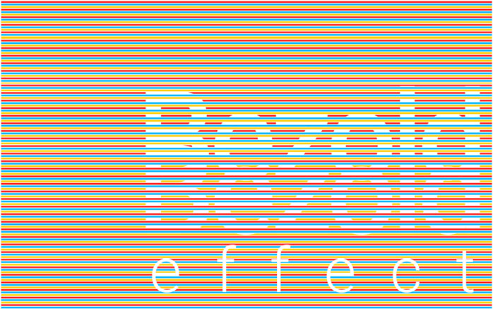
Figure 5.4.f
Source: Madhuri Suresh
For example, in the picture above, we see two rows of the word "bezold." The actual color of the font is white, however, the one on the top is perceived to be yellow, and the bottom one is considered red. According to the decomposition theory, the yellow color of the "bezold" is "split" into two elements blue+yellow and red. The red becomes the stripes that run continuously underneath the letters, and the blue+yellow becomes the veil that covers the word.
Similarly, the second "bezold" word appears red due to yellow stripes running continuously underneath and the red+blue strips forming the veil which covers the entire word. The words appear yellow and red, respectively, because they are defined by the veil created by the process of scission.
Here is another exploration of the Bezold effect. The figure below shows a simplistic version of a landscape. The sun is grey, and the mountains are green in color.
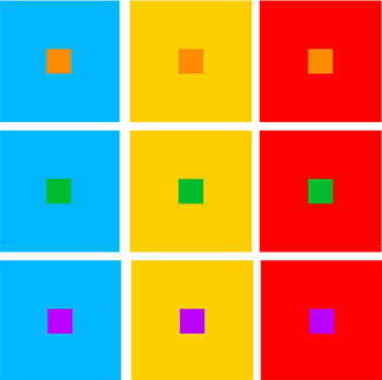
Figure 5.4.g
Source: Madhuri Suresh
However, the perceived color changes when a set of primary color stripes are introduced over the picture. Bezold effect is of great interest to graphic designers to study the assimilation of colors in their everyday work.
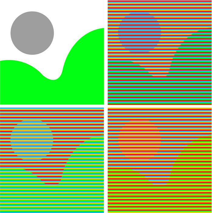
Figure 5.4.h
Source: Madhuri Suresh
Here are more explorations of the Bezold effect:
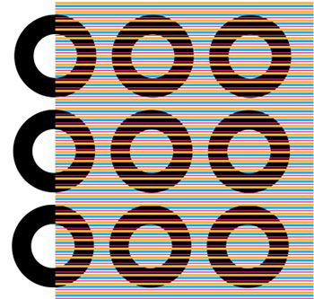
Figure 5.4.i
Source: Madhuri Suresh
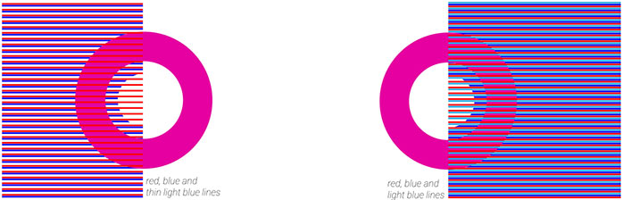
Figure 5.4.j
Source: Madhuri Suresh
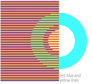
Figure 5.4.k
Source: Madhuri Suresh
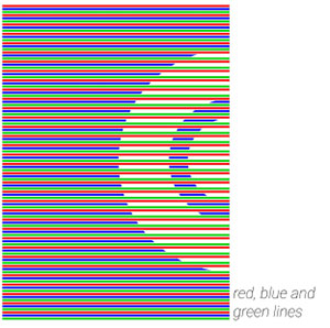
Figure 5.4.l
Source: Madhuri Suresh
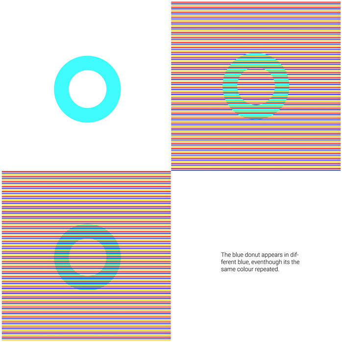
Figure 5.4.m
Source: Madhuri Suresh
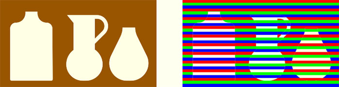
Figure 5.4.n
Source: Sumedh Narnaware