What colour are these stars?
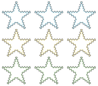
Figure 5.5.a
Source: Shraddha Prabhu
The first, second, and third rows of stars appear to be filled with blue, yellow, and green colours, respectively. But what if I told you that they are entirely white inside? That they only appear to be filled in with colour? This is known as the watercolour illusion. When a pale bright colour is placed on either side of a dark contour, the brighter colour expands into the surrounding white region, creating a watercolour effect.
Baingio Pinna first described this illusion in 1987. The watercolour illusion displays two main phenomena. The first is a distinct coloration effect, or a long-range assimilative spread of colour, which originates from a thin coloured outline that is juxtaposed to a darker coloured outline. Second, a potent figural effect, or figure-ground segregations, over a substantial area.
How does this illusion work?
Our mind considers the darker hue to be separating the figure from the background. The darker colour (black) is regarded as the border, and the lighter colour is perceived as the filling colour. Since the inner border is lighter in colour here, the colour appears to be spreading inwards. The lighter-coloured (blue, yellow, or green) line that surrounds the darker border and the actual colour of the figure (white) are both recognized as the filling.

Figure 5.5.b
Source: Shraddha Prabhu
The entire area inside the stars (stars on the right) appears to have a faint tint of the respective hues when the light-coloured lines are flanked by the black outlines of the stars (stars on the left). The stars appear to be covered in light colours as a result of the white background and coloured outline combination.
What enhances or diminishes the illusion?

Figure 5.5.c
Source: Shraddha Prabhu
The watercolour look is diminished when the black outline is thicker. We are unable to see the yellow line accurately due to increased contrast. Increasing the yellow line's thickness also lessens the watercolour effect since our brain now perceives the yellow line as a distinct, thicker line within the border.
What if one reversed the order and the black line was inside the shape and not outside?

Figure 5.5.d
Source: Shraddha Prabhu
The watercolour effect is reversed when the black and yellow lines are switched. The yellow colour seems to be expanding at this point. However, this is not very effective.

Figure 5.5.e
Source: Shraddha Prabhu
The watercolour effect is enhanced by enclosing the same star in a black square with a yellow border surrounded inside, which also yields a "keyhole" effect. The hole appears to be three-dimensional, and the boundary defines a region. Now, the perception of figure and ground is flipped. The figure at the front is seen as a square with a star-shaped hole, while the background is considered as the area inside the star. A stronger keyhole can be seen as the yellow lines' brightness increases.

Figure 5.5.f
Source: Shraddha Prabhu
The watercolour effect persists even when there are several objects present. The area where the colour spreads is perceived as the figure. The pale-yellow square with several star-shaped holes is now considered the figure, with a white background.

Figure 5.5.g
Source: Shraddha Prabhu
A stronger keyhole may be seen by thickening the yellow line in the second row, while a weaker one can be seen by thickening the black line in the third row.

Figure 5.5.h
Source: Shraddha Prabhu
The watercolour and the keyhole appearance are eliminated when the black outline is removed.

Figure 5.5.i
Source: Shraddha Prabhu
Even with dashed or dotted outlines, the watercolour effect still exists, though it is not as noticeable.
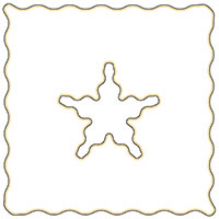
Figure 5.5.j
Source: Shraddha Prabhu
Wavy lines seem to increase the effect compared to straight lines.
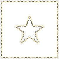
Figure 5.5.k
Source: Shraddha Prabhu
The watercolour effect gets more robust as the "waviness" increases. It appears that the spreading is nearly uniform.
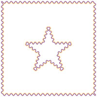
Figure 5.5.l
Source: Shraddha Prabhu
The colour spreading occurs in any combination of dark and light-coloured outlines.
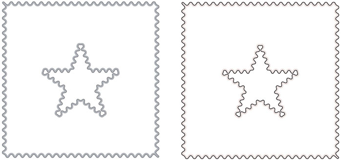
Figure 5.5.m
Source: Shraddha Prabhu
But one might diminish the watercolour effect by using various shades of the same colour, which results in our brain trying to combine them into a single outline. The higher the contrast between two colours, the stronger the watercolour illusion.
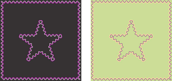
Figure 5.5.n
Source: Shraddha Prabhu
The effect also appears on backdrops with various colours. Compared to the background, the line with higher contrast is seen as the border, whereas the line with lower contrast seems to spread in. However, the colour filling, in this case, is minimal. Therefore, it is best to have a white background.
What if there are two colours bordering a black outline?

Figure 5.5.o
Source: Shraddha Prabhu
Here, the watercolour effect is faint due to the two contrasting colours surrounding the same black outline.
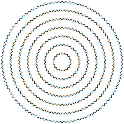
Figure 5.5.p
Source: Shraddha Prabhu
The watercolour effect is improved by pairing two contrasting colours with a single black outline. They now resemble alternating blue and orange concentric rings.
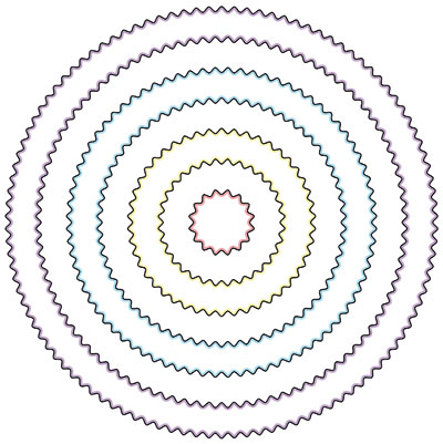
Figure 5.5.q
Source: Shraddha Prabhu
However, the best result is when only one colour is flanked against the black outline.
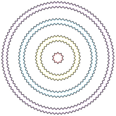
Figure 5.5.r
Source: Shraddha Prabhu
The watercolour effect is more pronounced when the lines of similar colours are placed in proximity. It is congruent with Gestalt's law of proximity.
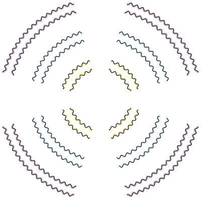
Figure 5.5.s
Source: Shraddha Prabhu
Albeit minimally, even if the outline is not a closed loop, the watercolour effect still persists. This is congruent with the Gestalt law of closure.
Can the effect take place with letterforms?
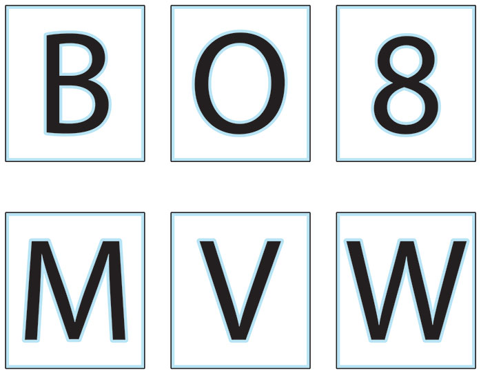
Figure 5.5.t
Source: Shraddha Prabhu
Whether or not they have closed counters, the letterforms inside the black borders with the blue lines flanking them also exhibit the watercolour effect.
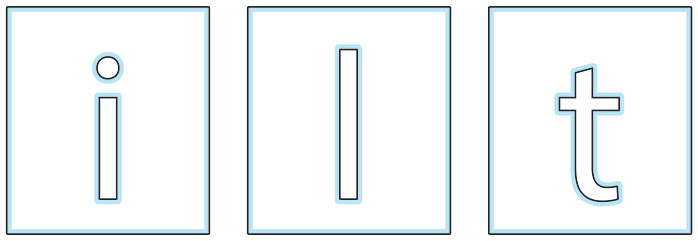
Figure 5.5.u
Source: Shraddha Prabhu
The letterforms' outlines alone can produce a keyhole impression. In this instance, the figures are seen as rectangles with letter-shaped cuts in the front.
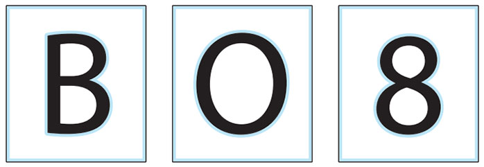
Figure 5.5.v
Source: Shraddha Prabhu
When the inner skirting of the blue line is removed from letterforms with closed counters, the keyhole effect results, however, in this case, letterforms and rectangles are considered figures and are seen as being in the front.
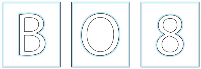
Figure 5.5.w
Source: Shraddha Prabhu
The letterforms' outlines alone can also produce a keyhole appearance. However, it's not entirely evident in this instance whether the letterforms are a part of the ground or figure.

Figure 5.5.x
Source: Shraddha Prabhu
The watercolour effect is also achieved by removing the blue line's outside flanks along with the rectangle, giving the letters the appearance of being completely covered in a light blue tint.
How can designers use the insights from the watercolour illusion?
Designers can use it in maps to make discretely coloured areas separating distinct locations. Posters and other print media can use them to create the illusion of an entirely colourful space with a minimal number of colours. It can also help be time efficient in digital rendering. By using fewer colours, it may be possible to reduce rendering time.
Here is the pdf exploring this phenomenon:
• Watercolour Illusion......

