Communication Design
Batch 2012-2014
(30 items)
Communication DesignBatch 2012-2014
(30 items)
(30 items)
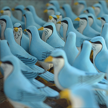
Nirmal Toys
by Ashoka Chary M
by Ashoka Chary M
India has a great tradition of making toys with wood. And this toy making is a skillful craft. Especially for the children, these toys help a lot to children with playing different play objects and they completely live in a different world with different traditional toys. Toys are used as decorative elements in Indian houses. Most of the houses will have the showcase with various toys in Andhra Pradesh. In Andhra Pradesh apart from Nirmal there are other places also do these toys such as Etikoppaka and Kondapally. I went to know the toy making in Nirmal, which are traditional wooden toys and beautifully carved by craftsmen. During this project I have learned how the craftsmen make the toys from wood to final shape.
Details >>
Summer Internship Under PG VINDA Director and Cinematographer
by Ashoka Chary M
by Ashoka Chary M
"I wanted to work with PG Vinda, Director and Cinematographer who is the great skilled and dedicated cinematographer from Hyderabad. Vinda’s work for Grahanam received major attention and a National Award nomination for Cinematography. Vinda earned a distinction of master of digital format in Telugu cinema. Many critics appreciated his works. Now PG Vanda engaged with three to four Telugu films. PG Vinda made a film “Lotus Pond” as a writer, director and Cinematographer. I got an opportunity to work with PG Vinda for couple of Telugu films. “Aa Aiduguru” and “Anthaku Mundu Aa Tharvatha” . I got an apportunity to explore and observe and learnt so many things in cinematography in all aspects like easthetics, creating lighting and the process of film making."
Details >>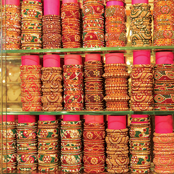
Beyond the Bangle
by Ashoka Chary M
by Ashoka Chary M
This project is about women’s traditional wear, "the bangle," and its making process in the Laad bazaar in Hyderabad. In this documentary project, I attempted to investigate various aspects of Bangles, such as how they are made, where they are made, what their circumstances and working conditions are, the bangle market, people in that market, various communities involved in making and purchasing bangles, and the Bangle-making tradition in Hyderabad. The aim of this documentary is to communicate the working conditions, the skill of the bangle-making craftsmen, the process of that bangle-making, and the ambience of Laad Bazaar, which is the place the bangles are made. I have tried to communicate the bangle-making process to people in the Laad bazaar. How they bargain with the sellers and how the bangle market looks like In order to communicate all these elements, I have used the required camera techniques and other equipment to capture the visuals and the sound. I had explored the techniques and aesthetics of visual grammar, like exposures and points of interest, by pulling focus, using the required depth of field, and maintaining continuity in the actions. In some places, I wanted to emphasise the visuals, whereas the craftsmen embellishing the stones on the bangle and selecting the stones I used the reversal lens technique to achieve the macro lens effect; additionally, for sound recording, I used a Zoom H1 recorder, which is an external recorder for recording Foley sounds from the locations. In order to communicate the visuals about the bangle making, the Laad bazaar, and the people, in this film there are 5 chunks, which are the Hyderabad introduction by establishing wide shots of the Charminar and Golkonda fort, and the Laad bazaar ambience through the market and the people visuals, Since I have seen three different bangle making processes in the Laad bazaar, I have shot and presented those three processes separately in the film. Then the second chunk of visuals is process number 1, which is the heating of the lacquer and the process of making lacquer ready for the bangles, as well as bangle making. Then there's the third chunk, which is a completely different process than the first. Then the fourth chunk is also another process, which is the old process of using pot. Then the fifth chunk is the Laad Bazaar, with people and the ambience of the night. Because lacquer bangles are well-known for bridal bangles, I attempted to connect the film with a bangle being made in stages and a bride being decorated with suggestive shots.
Details >>
Balaram
by Ashoka Chary M
by Ashoka Chary M
"Balram, Short Film" is a project about treasure hunters and their beliefs about treasures. In this narrative fiction project, I attempted to investigate various aspects of visual storytelling and filmmaking, such as preproduction, production, and postproduction. I have made this short film based on news from various places in India and experiences from my village. In this story, Balram is the main character who believes in the treasures and wants to earn money through shortcuts. Though I have drawn inspiration from the real events in my village, I have also added fictional characters to this film. How the Balram fell into the treasure-hunting trap—in the process of rescuing his friend—and finally, he drags his son into the treasure hunt. The aim of this short film is to communicate Balram's character and the journey towards the treasure.
Details >>
Writing with (Available) Light: Amol Gole Cinematography
by Chinmay Bhave
by Chinmay Bhave
With an academic background in mass communication and professional experience in the news and consumer research domains, I was keen that I acquire a new skill during the internship; more importantly, a skill that would add up to my professional objectives. Though I have wandered along different paths, one thing has always remained common. It was my interest in observation of social behaviour and using visual methods to capture that to be able to tell the story vividly. A medium like TV news demands the storytelling to be pithy and lucid, and the production time available is very limited. Though this is a very effective way of communicating information in packages, it leaves little scope for reading between the lines and expressing complex ideas like human emotions. This is where I felt the need to break free. I wanted to understand the cinematic style of storytelling and fuse it with the non-fiction work that I am interested in to make it engaging. I believe that storytelling becomes effective when it is experiential and one makes the most of the medium of communication. Filmmaking has the potential to transport the viewer into the world of images and sounds and create a real experience.
Details >>
Seoul Curry
by Chinmay Bhave
by Chinmay Bhave
This project was inspired by the travel accounts of ancient travellers like Marco Polo, Xuan Zhang, and Ibn Battuta, etc., who travelled to new lands and wrote vivid accounts of their experiences. These travelogues became bodies of knowledge pertaining to the regions explored and were important exploratory ventures for the countries these travellers represented. Burton Holmes, who is credited with coining the term "travelogue," monetized his skills by conducting travel lectures. These travellers satiated the curiosity of their countrymen about the new cultures they visited. Today, these documents are landmark reference points for exploring the cultural history of the regions these travellers explored. I intend to create a visual travelogue that presents a point-of-view account of my experiences in the land of the morning calm. The travel writings of noted Marathi writer P. L. Deshpande are known for his deep cultural and behavioural observations. Whether he travelled within India or abroad, his writings described the cultural landscape as well as interesting personalities within these contexts. I wanted to "see things differently," and P. L. Deshpande was an important reference point for me. Any comprehensive ethnographic project requires much longer fieldwork as well as familiarity with the language. These two qualities are critical to gaining ethnographic authority. My project is an exploratory first step that borrows from concepts of visual anthropology in order to break the mould of structured journalistic methodology and see beyond what travel guides tell you. This would require focusing on visual culture, interactions, and going off the beaten track. As a designer, I would like to create a tool that can use cameras as a research tool to unravel cultural insights. I want to present my travel experiences and stories with dual temporality. While the book sums up the experience of travelling across South Korea and living there as a student, the blog would be a collection of images where each experience in South Korea has its own unique perspective. The book is a picture story that gives a holistic description of what South Korea was like for me. On the other hand, the blog viewer can enjoy each image separately as a work of art or design. It allows the photographer in me to present stories of journeys within a journey. I have explored the duality in the photo-word relationship as well. In book form, my notes supplement my images, allowing me to say exactly what I want to say and elaborate with precision. In the blog, words are kept to a minimum, and I expect the viewer to interpret and react.
Details >>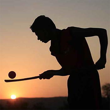
Stick to Dreams- A cinema verite film from the world of Indian hockey
by Chinmay Bhave
by Chinmay Bhave
It is a film about dreamers! It is about the lives of people who are not afraid of
going against the flow, norms and chase their dreams. Though the inspiration for
my film came from my passion for hockey; this film is not about the game. It is
about the mad zeal with which hockey aficionados like Andrea Thumshirn work
relentlessly to realize their dreams in foreign land full of challenges. Hockey is
merely the turf on which the story unfolds. The film aims to peek into lives of
people at the hockey village who have come together, woven their dreams together
and trying to work towards a common goal in spite of socio-cultural differences.
Their dreams, aspirations are completely different but what brings them together
is the hunger to make things happen against the tide. Stick to Dreams seeks to use
cinema verite approach to peek into the lives of these dreamers with an aim to
understand them in an engaging yet empathetic manner. While the mainstream
media regularly produces feel good stories about such dreamers; it seldom has
the patience and wherewithal to go beyond the headlines. My curiosity about
the process of social change juxtaposed with individual motivation to see things
differently motivated me to make this film.
Details >>
Happy Hands Foundation
by Divya Bharadwaj
by Divya Bharadwaj
The stated purpose of a summer internship at IDC was to expose oneself to different design firms in rural and urban sections of society and to understand how design can intervene to bring about constructive changes as per the socioeconomic and cultural context. As a Visual Communication student, I wanted to work with an organisation that is motivated to work for society and uses design intervention to change lives and make a positive social impact rather than just for commercial gain. Working as a designer in the past, I have often been exposed to several Indian crafts and folk arts and have had the privilege of working with them, even on small projects. Ever since, I have been really keen on learning more about them. I wanted to use this internship as a chance to explore this possibility as well. Happy Hands Foundation and The People's Project brilliantly combined these two interests and requirements, while also meeting IDC's criteria.
Details >>
Sight of Sound - an expression of emotions
by Divya Bharadwaj
by Divya Bharadwaj
Abstract art, which people would perhaps consider the most emotionally subjective form of art, is actually completely objective. The emotional objectivity of abstract art lies in the characteristics of the colours and their interactions with one another. To know what kind of colour palette can express the chosen emotions and to substantiate the reason for using movement in colours, as well as to understand which elements of art or visuals play a vital role in evoking emotions in the viewers, I created a survey. The inferences were made from 50 complete responses and around 76 partial surveys, where 16 of the surveys had data for 6 or more than 6 questions and thus were considered in the inferences.
Details >>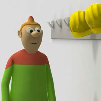
Animation for Industrial Safety
by Kailash Gharat
by Kailash Gharat
India is a country that was known for agriculture, but after industrial development, maximum employment depends on industries, and industries depend on manpower. But the manpower that is required for the jobs also requires proper education. Accidents are more likely if proper safety education and training are not provided. Government industrial organisations and public-sector companies are making lots of effort to minimise occupational accidents. But existing awareness materials such as safety posters, stickers, banners, and informative messages are not as effective. Technology has brought enough advancement into the life of the common man. One of the major benefits of information technology is computer graphic animation. The industrial environment is dangerous, and safety is a major concern. Animation generated information can explain scenarios before and after accidents and prevent employees from experiencing similar incidents in the future. Animation can help to understand safe procedures for handling hazards operation Education and training are the keys to maintaining a healthy atmosphere at any hazardous workplace. There are many ways to educate workers in the workplace, such as the display of safety posters, safety messages at factory entrances, canteens, work floors, and worker gathering areas. It’s important that workers fully understand the potential health effects that may occur after a long period of time. Maintaining safety awareness among workers is the key to controlling accidents at the workplace. Safety awareness is critical in many hazardous work environments.
Details >>
Constructive Approach of Devanagari Calligraphy
by Kailash Gharat
by Kailash Gharat
The report presents the understanding constructive approach
of Devanagari Calligraphy, basic fundas of the script, proportion
and character of the alphabets, such tasks completed during
summer internship. Devanagari Calligraphy is highly appreciated
in the history of writing. Imitating historical handwriting is a
wide, well-lit highway to calligraphic success. Learning historical
hands is a method of training the hand and eye, rather than a final
destination in calligraphy.
I tried to understand of the writing sequence of Devanagari
calligraphy, analysis of Devanagari letter design. The graphic
scrutiny of the Devanagari letters will bring out important aspects
of the letter design.
Details >>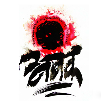
Introducing Devanagari Calligraphy to Undergraduate Design Students
by Kailash Gharat
by Kailash Gharat
The report presents the importance of
Devanagari Calligraphy, basic writing
sequence of the script, proportion and
character of the alphabets. Devanagari
Calligraphy is highly appreciated in the
history of writing. Learning historical
hands is a method of training the hand
and eye, rather than a final destination
in calligraphy. This study is especially
made for the undergraduate students of
art and design field.
I tried to explain the writing sequence
of Devanagari calligraphy, analysis of
Devanagari letter design. The graphic scrutiny of the Devanagari letters will
bring out important aspects of the
letter design.
The content of the report provides the
perfect start for your journey into the
field of calligraphy, with everything
from the history of this art form to
in-depth instructions on creating each
letter of each featured alphabet makes
the process of learning Devanagari
calligraphy easy simple and enjoyable
for aspiring artist, designers and other
all interested students in the field art
and design.
Details >>
Workplace Safety Education : The backbone for promoting safety awareness at workplace
by Kailash Gharat
by Kailash Gharat
Accidents are a major cause
of death for people working
in construction sites. It is an
urgent need to address these
issues for the betterment
of safety workplace. Poor
education, lack of proper
training and knowledge about
workplace safety issues are
some of the main causes for
construction accidents. This
project aims to create safety
awareness among workers using
animation videos. These videos
can be effectively used by the
Safety Manager to provide an
appetiser to safety through the
engaging characters, amusing
story line, and a humorous
approach.
These videos are designed for
less literates and are free of
language and culture barriers,
keeping in mind the wide
and diverse audience. Visual safety awareness material
can be used, but due to low
education levels of the workers
it is difficult to communicate at
diverse languages. Therefore
wordless animated videos have
the potential to make safety
education more attractive
and enjoyable can solve this
problem. Issues like ladder
safety, working at height, object
falling from height, material
handling, and their prevention
have been communicated
through this project. Safe
workplaces are vital to the
well-being of workers and
the strength of economy of an
industry or a nation.
Thus, to promote safety
education, I have decided to
contribute as a designer, to
improve safety on the job by
preventing workplace injuries
and illnesses of the worker.
Details >>
Corporate Identity Design
by Reshal Shah
by Reshal Shah
With an academic background in mass communication and professional experience in the news and consumer research domains, I was keen that I acquire a new skill during the internship; more importantly, a skill that would add up to my professional objectives. Though I have wandered along different paths, one thing has always remained common. It was my interest in observation of social behaviour and using visual methods to capture that to be able to tell the story vividly. A medium like TV news demands the storytelling to be pithy and lucid, and the production time available is very limited. Though this is a very effective way of communicating information in packages, it leaves little scope for reading between the lines and expressing complex ideas like human emotions. This is where I felt the need to break free. I wanted to understand the cinematic style of storytelling and fuse it with the non-fiction work that I am interested in to make it engaging. I believe that storytelling becomes effective when it is experiential and one makes the most of the medium of communication. Filmmaking has the potential to transport the viewer into the world of images and sounds and create a real experience. Company is a creative house founded by KB Vinod and Bhupal Ramnathkar in February, 2012. It is a design and advertising agency based in Lower Parel, Mumbai. Comapny believes in honesty, transparency, simplicity and originality. They are a team passionate and obsessive about quality and creativity. Some of their clients include Fashion Big Bazaar, Caprese, Holii and Malabar Gold.
Details >>
The Speaking Image
by Reshal Shah
by Reshal Shah
DIVING INTO IMAGES ~ SETTING AN OBJECTIVE Where all do we encounter images and how do we make sense of them? Images have made a journey from the age-old Lascaux’s paintings to the contemporary media images. But there arises a question to reflect upon: what are images and what are the contemporary changes? These questions often hover my mind and I am compelled to ask: What is my role as a visual communicator? How do I express? In my view, the most challenging task for a visual communicator is being able to communicate visually. Good images have the power to stay silent, yet convey so much. "The design is an expression of the purpose. It may (if it is good enough) later be judged as art"- Charles Eames. My objective thus becomes, to bring in images of art and make a study of images relevant to our current times. There is a need to realise the thought of what the purpose of an image is. THE FUTURE OF THE IMAGE The title is borrowed from the book, The Future Of The Image by Jaques Ranciere. The study of visual imagery in our times needs to take into account the diverse nature of images encountered today. We come across imagery in various forms like mobile imagery, Internet content (YouTube, TED, etc.), television, film, animation, advertisements (print, television, internet); illustration, painting, printmaking and sculpture. In these times where media throws a tsunami of images, there arises a question as to what relationship do we have with a still image? For example, people watch television till late in the night where images change at the rate of 24fps. What is the future of a still image in this tsunami of images?
Details >>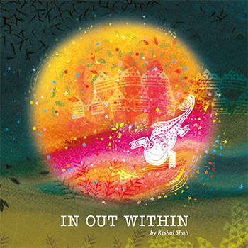
Young India - Then & Now
by Reshal Shah
by Reshal Shah
People often talk in generalities about the youth, having positive hopes in some sense as well as a few complaints against them. But what are the young people of India doing in reality? Why are they doing what they are doing, and what keeps them at it? These questions made me think that it would be interesting to talk to the young faces of my time and learn about their journeys. Looking at what others did in the past, in their youth, would allow me to reflect and understand in some way how we are all connected and how we have conversations, between "then" and "now," with a thread that binds us all together. The title of the project, "Young India: Then and Now," has somehow emerged from Gandhi’s "Young India." This Young India was a journal that had thoughts and opinions that inspired many people. It was focused on addressing various problems of those times, during the pre-independence era, and contained highly motivating views and messages from people who believed in their mission and worked actively towards it. Thus, my journey with this project began with what was happening "then" amongst the Indian youth. The questions about the youth "now" that were yet to be answered had their roots in the past, and thus, the journey of this project in itself became "Young India: Then and Now." Through this project, I wish to bring out the essence of these experiences through storytelling. The goal is to bring in my own image and text in an interesting way to give out the message in a richer form while maintaining the traditional strengths.
Details >>
2D Space Understanding for Blind - By applying 3D concepts
by Shweta Kable
by Shweta Kable
The world around visually impaired person is
drastically different from the experience of a person
with normal vision. Very few skilled and explored
people can achieved the environment around them
to some extent. Every time when we go to any new
place we create mental map of that place with the
help of various visual clues and if someone asked
you about that place then you prefer to give him/
her illustrated hand drawn map. Blind people lack
this visual information and they face great difficulties
in generating efficient mental maps of spaces and
therefore find difficult to navigating efficiently in
these spaces.
Here we describe how blind people perform with
haptic devices and understand the task given to them
with minimum support. The project went through
multiple experiments with blinds and we found out
interacting with them is the best possible way to
understand them better.
Details >>
Intranet Portal Design for CMS UX Portfolio
by Shweta Kable
by Shweta Kable
The key challenge for today’s marketers is to provide the right message at the right time through the right channel. Maintaining brand consistency, coordinating with multiple internal and external service providers, developing actionable insights that reflect a complete and accurate understanding of the customers, and speed-to-market are clear challenges. My project was to create a digital identity for Tata Consultancy Services’ (TCS’) Connected Marketing Solutions (CMS) group to showcase their portfolio. By attempting this intranet portal, we are trying to bridge the gap between customers and CMS Group, which will provide design solutions and strategy. Here, we are achieving it by following current design trends to make it a user-centred design. The project's aim was to showcase their portfolio in a creative way, which would feature their strengths, capabilities, team, and work. We achieved it by following current design trends and making a user-centred design. Our approach was to solve the problem through interactive infographics. I was working with a team of two visual designers and one usability analyst for a period of 47 days. The initial task was to create visuals based on the existing wireframes provided by TCS’ CMS group, which were simple and didn’t have anything that showed the creative process, services, or portfolio of the company. After we had a review of the provided wireframe, we suggested some changes and applied them. We then created two different visuals for that wireframe. The team had a discussion and debate on the wireframe and visual design, through which we came to the conclusion that we should change the overall approach of the portal. Because it was difficult to comprehend complex data or analyse a large amount of information using words or texts, the new approach was to solve the problem using interactive infographics. Infographics make it easy to understand and navigate the complex world of facts, figures, and directions to finish a task, solve a problem, or meet a need. The objective was to create a design that had different layers of information, and each layer could have multiple hierarchies. This was a completely new concept. We started working on this new concept with a comparative analysis of various company portfolio websites, many interactive websites, and infographic websites. We received various inputs and inspirations, as well as insight into the latest design trends and their various effects, and how we could use them smartly in our portal to communicate better with customers, through comparative analysis. The problem definition was to create a wireframe that had a proper content flow, was interactive, guided the user to navigate through the entire portal easily, and also created and developed two different visual design concepts. After creating two different visual designs for the basic four pages, the team had a discussion, and with the concoction of the two visual designs, we created one single final design that served all the purposes. Later, the design was sent to the user interface developers for further processing. Working in a company like TCS, which has an excellent group of people who all have deep knowledge in digital media, was a great experience, also equally challenging and exciting to work with a completely new medium and learn from the basics. As a visual designer from IDC at IIT Bombay, their expectations from us were really high. They immensely appreciated our work, our work process, and our design style. Not only are most of the things new to us, but there were also many new things that they got to know from us. All in all, it was a good exchange of knowledge and experience.
Details >>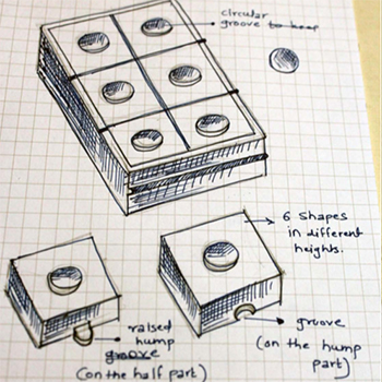
Creating Sensory Experience For Visually Impaired Children
by Shweta Kable
by Shweta Kable
This project aims to create a sensory experience for children who are visually impaired. Over time, children with visual impairments slowly become more acute in their other sensesver time, children with visual impairments slowly become more acute in their other senses. The lack of one sense increases the importance of the remaining ones. They become more sensitive to touch, smell, sound, etc. They use their fingers to understand a text written in Braille, remember people or places through fragrances, and understand the space around them through sound. The world around visually impaired children is drastically different from the experience of a person with normal vision. When a person with vision experiences the world, it is primarily through "what they see," but for the visually impaired, "what they touch, smell, and hear is what they experience." This project is concerned with visually impaired children of the pre-Braille class (5 to 10 years old) who stay in residential blind schools. There are a considerable number of students who remain in the same class for years due to hampered growth. Also, children are in a completely different environment when they go home during the weekends. This problem is widely known, yet very little attention is paid to it. My project aims to engage students in physical and mental activity when they are at home. At the same time, this activity will help them to improve their sensory coordination because knowledge of Braille demands sensitive hands, fingers, and coordination between sounds (ear) and touch (hands). The research led to prototypes aimed at engaging visually impaired children in active play. The goal of the designs is to create an aid that empowers children to build cognitive, social, and physical skills. The project will identify these abilities, teach them how to use them effectively, and assist them in learning about Braille. The idea is to make them physically and mentally strong, which will help them with pre-Braille development and at the same time make their sensory experience richer.
Details >>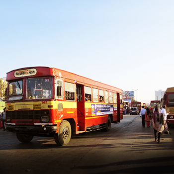
Pune Bus Transit Route Map
by Shweta Kable
by Shweta Kable
Pune was the cycle city of India, but now it is the motor cycle city of India. Pune has the highest percentage of two-wheelers in the state. Other than autos, bus transit is one of the major public transports Puneites use. Pune’s bus routes and services are very chaotic. There is literally no connection between buses and schedules. One of the common scenarios you will notice at any Pune city bus stand is that people are running here and there and asking everyone which bus goes where. or a particular bus number or route? Any new traveller who wants to travel from destination A to destination B needs to find the correct bus that goes to his destination. Also, there are various buses that go to the same destination but take a different route. The project aims to design a bus transit map that will explain routes and focus on 20 major stations in Pune city. To avoid confusion, this map will show you the shortest as well as all possible bus routes. This will provide the best possible service to the greatest number of people within the governing economic constraints. The route structure will be clear, requiring the user to spend the least amount of time understanding it. Because bus transit is such an important part of public transportation, bus lines should complement rather than compete with other modes of transportation, allowing each mode to be used to its full potential. People should interact with the route map in terms of comprehension and use, which will make their life easy in terms of bus travel.
Details >>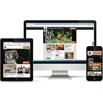
Responsive Design Strategies
by Srinivas Godala
by Srinivas Godala
The main objective of the project was to
analyze and understand the Responsive
design strategies in web design. This project
focuses on the need for responsive web
design for a wide variety of users looking
at the mobile usage in the current day
scenario. With increasing trends in the use
of smart phones and tablets of different
screen size, it became difficult and complex
to maintain the website that fits best on
different screen sizes. Responsive Web
Design (RWD) is found to be an effective
way of solving the issue of site management
for different end users.
As the name suggests, RWD is a conceptual
design of website with the properties
of liquid, which occupies the shape of a
container without losing its properties.
RWD conceptualizes on three main
fundamental blocks of website construction.
Which are Media queries, Fluid grids and
Flexible images.
Details >>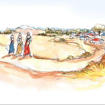
Strategic Pilot on Adaptation to Climate Change (SPACC)
by Srinivas Godala
by Srinivas Godala
I worked at Bharathi Rural Development Society (BIRDS) for a summer internship Allagadda, BIRDS is an NGO working in and around four states: Andhra Pradesh, Karnataka, Tamilnadu, and Kerala. BIRDS vision is "a world where all its inhabitants live in complete harmony with each other to maintain and benefit from balanced eco-systems." BIRDS mission is to create a platform for people from all walks of life so that they are able to take necessary action for ensuring ecological stability, safeguarding human rights, eradicating poverty, ensuring a minimum standard of living, and bringing in social justice (on account of differences based on gender, disability, social and economic marginalization, and displacement). BIRDS will work only for the furtherance of its vision, mission, and objectives. BIRDS recognise that they are only a part of a bigger movement to ensure environmental stability and in the fight against poverty. Therefore, it tries to establish linkages at the organisation and community levels with different strategic developmental players (governmental and non-governmental).
Details >>
Developing the learning method for Hearing Impaired Children in Andhra Pradesh
by Srinivas Godala
by Srinivas Godala
This project is aimed at improving the
learning and communication of hearing
impaired children aged 4-7 years. Hearing
impairment is a major setback as the child
loses the chance to learn language and
speech at this precious age. Added to this,
the parents do not know how to teach new
things to the child for basic communication.
These children require a special learning
method after proper treatment through
hearing aid with Cochlear implants.
Specially trained teachers of Auditory
Verbal Therapy (AVT) are very instrumental
in improving their auditory, speech and
language skills as regular teachers don’t
spend enough time teaching these children
or parents remove the cochlear implants.
I have designed an interactive learning
method designed for solving auditory &
language problems which can used at home
with help of parents as well.
Details >>
Kakatiya Dyansty Art and Architecture
by Srinivas Godala
by Srinivas Godala
This project aims at paying a visual tribute
to the art, culture and architecture of the
Kakatiya Dynasty in Andhra Pradesh - such
as the Warangal Fort, the Thousand Pillar
Temple and the Ramappa Temple.
The finely sculpted dancers, beautiful
flowers, aesthetically carved Prakaras or
Gopuras says a lot about our ancient art
and culture. This project takes the shape
of a pictorial book that communicates the
essence of Kakatiya art and architecture.
Through this project I have tried to
improve my understanding of photography,
communication design and visual design.
Details >>
Branding of Flower selling company
by Tarun Kumar
by Tarun Kumar
Branding and identity are very powerful tools of communication that make a first impression, whether in business or in personal life. It represents the company's profile and existence. It helps people to recall some brands with just a little glimpse. I have never done branding before in my design education or career. I am always fascinated by simple, minimalistic symbolic identities that attract millions of people at a single glance. So I decided to explore the most basic and serious subjects of design. I start working on a hypothetical brand, which lets me think about all the processes of establishing a brand and identity. I start working on the most important element of identity, which is the logo, to make other collaterals on the basis of that. I came up with many ideas and processes between the idea and the final output. This time I worked only on the basics of branding, which can later be added to other things required for promotion and establishment. I decided to do the branding of a flower delivery and purchase company that would be international. I explored some initial options, which I later elaborated on in my own style of illustration, as I am also interested in illustration.
Details >>
Exploration in Image Making
by Tarun Kumar
by Tarun Kumar
Images are an important source of our lives. From
morning till night we see thousands of images
on our smart phone; on television; on computer
screen; magazines ; news paper and road side
hoardings. Images keep coming at us many
mediums and have become an very important
source of our knowledge, entertainment and
information. As a designer I creating images in
many forms like illustration, photography, logosymbols and posters etc.
This project has been an attempt to understand
the process of image making, more critically.
My previous approaches in image creation
have been intuitive. While such an an approach
continues to be important. In this project I have
tried to understand the sources and the content
and the formal aspects of visual language more
carefully.
As I explored different ideas many images comes
to my mind before. A concrete image appears as
a final thing.
One important myth that I questioned during
this project was my belief that image should
always be pretty. There are many things around
us that are not always pretty.
I understood that sometimes images that depict
our environment as its can be like mirror that
reflect our world accurately. So in my project “Exploration In Image Making”
I will create images of things that are often
unnoticed by people.
Details >>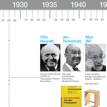
History of Design Timeline
by Vishnupriya Kaulgud
by Vishnupriya Kaulgud
A timeline is a display of events in an order that exhibits
prominent trends and helps understand the reason for such
occurrences. There have been several timelines available
for art movements and design. However, most of these are
meant to document the history that art and design charted
in the West. There wasn’t a cohesive timeline to display the
evolution of design in India.
The aim of the project was to create a design
timeline emphasizing on the evolution of design in India.
However, it still tries to fulfill the key moments from the
History of Design in the West in order to serve as a holistic
reference for any design student in India. It focuses on
typography and graphic design while covering the scientific,
socio-economic, political, and art influences.
Details >>
UX Portfolio Intranet Portal: Visual Design
by Vishnupriya Kaulgud
by Vishnupriya Kaulgud
I took this project as a challenge to myself. I had never worked
in a Corporate IT Company. So, to learn their work culture,
methodology in how they apply things and come to
a conclusion were all into my learnings.
My project was for total 45 days in which we had created
digital identity for TATA Consultancy Services’ (TCS’) Connected
Marketing Solutions (CMS) group. They will be showing their
portfolio work through this website. Here, we have achieved
this by following current design trends to make it user
centred design.
I found out, working in specific time constrains, with limited
sources, how to come out with a completely new solution.
By designing this website we were trying to bridge a gap
between customers and CMS group which would provide
design solutions and strategy.
Visual designs for old wire-frame was dome initially. Then new
concept with new wire-frame was designed. Visual design for
new concept was done and after that one final concept was
completed with combination of two designs.
Details >>
Designing a Touch Based Application Game to Recognise Gujarati Script for Children
by Vishnupriya Kaulgud
by Vishnupriya Kaulgud
India is a country rich with 22 official spoken languages, 13 official and 10 major scripts. In a multilingual environment like India, people travel from one state to another in a couple of hours. When one travels to a different state, there is a new language spoken and a new script used for reading and writing. But one is unable to identify these scripts. Apart from the languages and scripts taught in school, there is no exposure to a new language or script. Many times, people speak the language, but the associated script is not recognised. It would be beneficial if one could recognise at least one new script apart from what is taught academically (in schools and colleges). Previous researchers have shown that the best age for learning new things is early childhood. A new script will be taught based on the Devanagari script as the users' native script. This project aims to provide a solution for easy learning through a touch-based game for the recognition of Gujarati script. Users will be between the ages of 7-9 years old and will be familiar with the Devanagari script. My current goal is to concentrate on the recognition of vowels, consonants, and numbers in the Gujarati script rather than conjuncts or script writing.
Details >>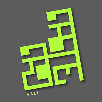
Game Design to form Conjuncts & Word Construction in Devanagari Script (Hindi) for Children
by Vishnupriya Kaulgud
by Vishnupriya Kaulgud
India is a country rich with 22 official spoken languages, 13 official and 10 major scripts. In a multilingual environment like India, people travel from one state to another in a couple of hours. When one travels to a different state, there is a new language spoken and a new script used for reading and writing. But one is unable to identify these scripts. Apart from the languages and scripts taught in school, there is no exposure to a new language or script. Many times, people speak the language, but the associated script is not recognised. It would be beneficial if one could recognise at least one new script apart from what is taught academically (in schools and colleges). Previous researchers have shown that the best age for learning new things is early childhood. A new script will be taught based on the Devanagari script as the users' native script. This project aims to provide a solution for easy learning through a touch-based game for the recognition of Gujarati script. Users will be between the ages of 7-9 years old and will be familiar with the Devanagari script. My current goal is to concentrate on the recognition of vowels, consonants, and numbers in the Gujarati script rather than conjuncts or script writing.
Details >>