Figure 4.1.a
Source: Shraddha Prabhu
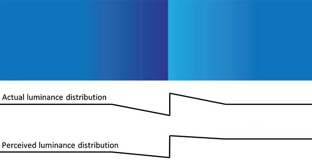
If we carefully observe the picture above, the squares seem to start with a lighter shaded blue and transition to a darker shaded blue. If one asked, "which of the two squares seems darker to you?" you would probably say the square on the left-hand side appears darker than the square on the right-hand side this is the Cornsweet illusion.
The Cornsweet illusion, also known as the Craik-O'Brien-Cornsweet illusion or the Craik-Cornsweet illusion, is an optical illusion in which a gradient within a central line or segment gives the impression that one side of a picture is darker than the other when both areas are identical. It was detailed in the late 1960s by Tom Cornsweet.
Two squares of varying contrast appear to be divided by a thin gradient band in the classic Cornsweet illusion. In actuality, the contrast between the two squares is exactly the same. In some instances, the illusion is so compelling that the only way to accept it is to conceal everything except the two identical colours, confirming that they are actually the same shades of a colour. For example, it becomes clear that they are the same shade of blue when you look at the picture below when the gradient is removed.

Figure 4.1.b
Source: Shraddha Prabhu
The Cornsweet illusion occurs due to the luminance difference (contrast) at the edges of the surface. Surfaces with bright edges are viewed as significantly lighter than those with dark edges. This backs up the theory that the surface traits that define the edges are interpolated to reconstitute the surface's perception (in this case, brightness). The Cornsweet illusion is an example of how the brain uses the edges of shapes to transfer information to the surrounding areas regarding other characteristics.

Figure 4.1.c
Source: Shraddha Prabhu + Sruthi Sridhar
The illusion is caused by previous experiences with luminance sources and gradients from shading in our 3D environment. Even though the two sections on each side of the brightness gradient are similar, the area on the right looks brighter because it is shaded as if illuminated from the left, triggering compensation of illumination by discounting the very light. The retina uses luminance profiles to evaluate what it sees. The left square is almost used as a fixpoint for the perception of the rest of the picture. The Cornsweet image is interpreted with nearly identical signals, which are subsequently integrated by the cortex to provide the same perceptual outcome.
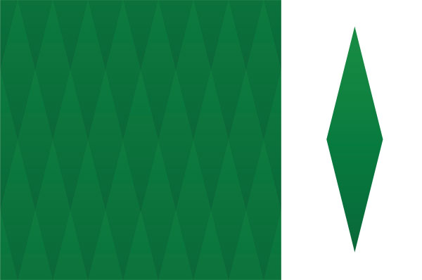
Graphic designers use the insights from the Cornsweet illusion all the time to develop patterns and other contrast effects, using the difference in luminance gradients in their work. Let us see one process of exploration of these patterns. In the image below, if you were asked which row of diamonds looks the darkest in the picture below, what would your answer be?

Figure 4.1.d
Source: Shraddha Prabhu
You probably would be tempted to say that the top row of diamonds looks the darkest. However, each one of these diamonds is exactly the same. They look different due to the cumulative Cornsweet effect.
Each diamond has a subtle gradient where it becomes darker towards the bottom. The diamonds are arranged in a pattern such that a lighter shade always surrounds the darker bottom of the diamond. Diamonds adjacent to the darker section of the gradient appear lighter, whereas diamonds near the lighter portion appear darker. Therefore, we get a cumulative Cornsweet effect where the topmost row of the diamond appears darker than the bottom row, which translates into the overall perception of the top row of diamonds as the darkest and the bottom row to be the lightest. As a result, our brain believes that the diamonds become darker as they progress to the top.
How to design a convincing Cornsweet illusion?
1. The gradient of the shape must be subtle enough. The illusion diminishes if the gradient is either too pronounced or too muted. If it is too pronounced, the brain easily perceives the similarity of the gradient. However, if it is too muted, the brain might not pick on the Cornsweet effect.
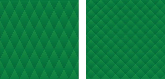
2. The shapes must be adjacent to one another to ensure the illusion works.

Figure 4.1.e
Source: Shraddha Prabhu
3. The gradient must be spread out over an appropriate area. For example, reducing the height of the diamond diminished the illusion.

Reducing the height of the diamonds decreases the Cornsweet effect substantially since one can easily perceive the gradient here.
Figure 4.1.f
Source: Shraddha Prabhu
4. The gradient must be in one shade or monotonous. Multiple shades are perceived easily by the brain. Therefore, perception would not depend on the shade's brightness; instead, it would depend on the hue or the colour itself.

Cornsweet effect cannot be observed in multiple colour gradients. Keeping it monochromatic is the key.
Figure 4.1.g
Source: Shraddha Prabhu
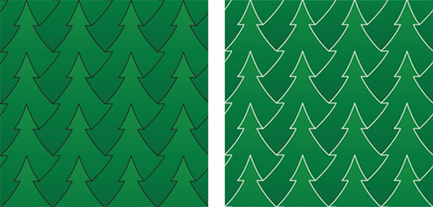
5. Make sure there is no border around the shape, as it will significantly diminish the illusion.

Borders around the shapes decrease the effectiveness of the Cornsweet illusion by enhancing the gradient within individual objects.
Figure 4.1.h
Source: Shraddha Prabhu
Here is the pdf exploring this phenomenon:
• Cornsweet Illusion ......

