Between the 'A' and 'B' line segments seen below, which one would you say is longer than the other?

Figure 4.4.a
Source: Amit Patjoshi
Most people would be quick to say that A is the longer segment and B is the shorter segment. Would you believe me if I said these line segments are equally spaced? These line segments are of the same length, and it is due to the Muller Lyre illusion that one looks longer than the other. What is the Muller Lyer illusion? And how does this illusion influence the way we perceive different objects?

Figure 4.4.b
Source: Amit Patjoshi
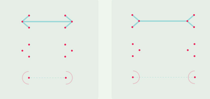
The Müller-Lyer illusion is an optical illusion that illustrates the change in perceived sizes of objects when they interact with other elements. The Müller-Lyer illusion is commonly recognized as two parallel lines, one of which terminates with inward-pointing arrows and the other with outward-pointing arrows. The one with the inward-pointing arrows appears to be substantially longer than the other. The Müller-Lyer illusion (1889) is named after Franz Carl Müller-Lyer, a German psychiatrist and sociologist.
How does the Muller Lyer illusion work?
There is no obvious explanation for why the Müller-Lyer illusion occurs, yet a few theories have tried to explain the phenomenon over time.
The first theory is called the centroid theory. The theory states that the perceived length of an object is determined by the position of the object's centroid.
As seen in the picture below, the points of the arrowheads are changed into arcs. The centroids of these arcs are then indicated using points. As seen on the left, the outward-facing arrowheads will have their centroids closer together than the inward-facing arrowheads on the right. Therefore, the line between the outward-facing arrowheads will be considered shorter as the distance between their centroids is also shorter.

Figure 4.4.c
Source: Amit Patjoshi
Another prominent theory is the "eye movement theory," which claims that humans see one line as longer than another because viewing a line with inside pointing arrows requires more eye movements than viewing a line with outward-pointing arrows. This theory is usually ignored as the illusion occurs without eye movement.
Another popular explanation is the "assimilation theory," which claims that we see one line as longer because our visual system cannot split the figure into parts. The line with inward-pointing arrows is, in fact, longer as a whole figure. However, this notion is often dismissed.
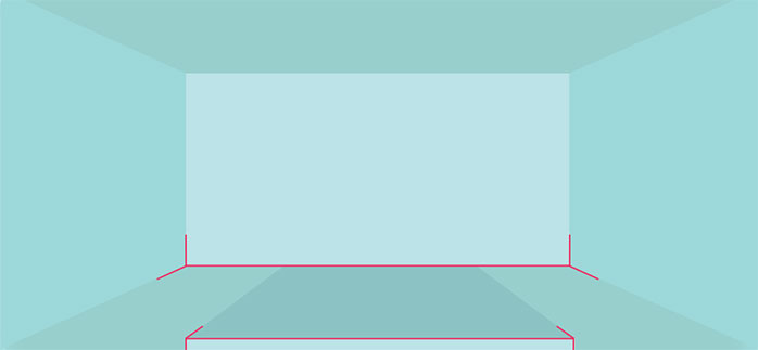
The perspective explanation is one of the most popular. We often use angles to evaluate depth and distance in the three-dimensional world. We've grown accustomed to seeing corners everywhere since we live in a "carpentered world." The brain is habituated to seeing such angles, interpreting them as distant and near corners, and making size judgments based on this information. When the brain sees the Müller-Lyer arrows, it interprets them as far and near corners, overriding retinal input that both lines are the same length.

Figure 4.4.d
Source: Amit Patjoshi
A perspective view of a room could be an excellent way to explain this. The "angles out" configuration correlates to a faraway item, such as the concave corner of a room, whereas the "angles in" configuration refer to a closer object.
The angles formed by the lines in the Müller-Lyer illusion are frequently processed as depth cues, as we do in perspective, resulting in a change in perceived size.
The illusion persists even when the arrows are swapped with circles, which have nothing to do with perspective or corners and appear to refute the perspective hypothesis.
Which leads to the next question, how does this illusion work with other shapes? And how does this influence our perception of the size of different shapes?
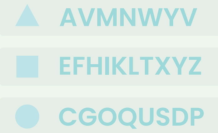
Basic two-dimensional objects such as squares, triangles and circles can also be misinterpreted when viewed together due to the Muller-Lyer illusion. For example, in the image below, even though the three shapes' height and diameter are identical, there is a difference in our perception of their sizes. When viewed together, the circle looks smaller than the triangle, which looks smaller than the square.

Figure 4.4.e
Source: Amit Patjoshi
The circle and triangle have been slightly enlarged to compensate for the illusion, resulting in an optically corrected image that makes the triangle, square, and circle appear to be of identical size.

Figure 4.4.f
Source: Amit Patjoshi
How does this difference impact our perception of fonts?
Typefaces, particularly those in the Latin alphabet, are generally derivatives of the basic shapes. Therefore, they can be associated/categorized using them. As shown below, the letters, like the shapes, are susceptible to illusion. The cap height at the top and the baseline at the bottom bind the uppercase of the typefaces. Even if the letters were made identical using mathematics and were contained between the baseline and the cap height, some letters will still appear smaller than others. Just like the shapes above, some letters are intentionally made larger to make us perceive them as the same size.

Figure 4.4.g
Source: Amit Patjoshi
Overshoots are the parts of the letters that extend above or below the cap height or baseline. These overshoots exist because they are parts of the letters with characteristics similar to those of triangles or circles at the end.
Some letters are considered smaller due to their interaction with horizontal lines when forming a word. When letters are curved at the top and bottom, such as the letters' O' or 'C,' there is very little interaction of the surface at the top and bottom, but flat letters, such as the letters' H' or 'F,' have a lot of interaction with the horizontal line.

Figure 4.4.h
Source: Amit Patjoshi
Does this occur with other scripts?
The illusion can occur in any script based on how these letters are created as it's inherent to the shapes. The image below, for example, depicts some of the letters in Odia font. The optical corrections performed to counter the illusion are indicated in red. Because most Odia letters are curved, the total size difference in Odia scripts is minimal compared to Latin scripts.

Figure 4.4.i
Source: Amit Patjoshi
As depicted in the following figure, the Devanagari scripts have a horizontal line called "Shirorekha" on top of them to 'complete' the word. Therefore, only the part of the letter on the baseline has to be adjusted to counter the illusion.

Figure 4.4.j
Source: Amit Patjoshi
Does changing the width axis impact the perception of the sizes of these letters?
Uppercase letters' C' and 'O' were written in Acumin font using the same font size but varying widths. The image below shows that the degree of overshoot reduces as the font width decreases. This is because the letters' relative widths are smaller than their lengths, giving them a shape similar to a rectangle. Therefore, they interact more with the horizontal lines at the top and bottom of the letter than their wider counterparts do.

Figure 4.4.k
Source: Amit Patjoshi

Figure 4.4.l
Source: Amit Patjoshi
Although there appears to be a difference in the cap height of the broader letters, this impact is best seen in the form of a word.

Figure 4.4.m
Source: Amit Patjoshi
Does the weight of the font also have a similar influence on our perception?
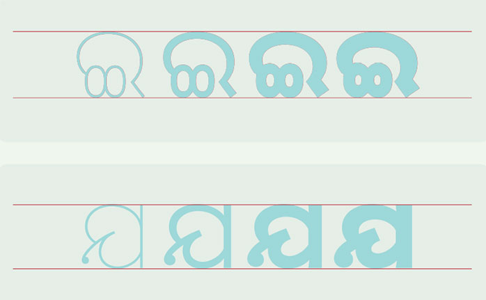
Unlike the width axis, the overshoot does not vary when the letter weight is adjusted while the width remains constant.

Figure 4.4.n
Source: Amit Patjoshi
This is true even for the Odia letters, two of which are shown in the sample below with weight variations.

Figure 4.4.o
Source: Amit Patjoshi
Their terminals would likewise determine the letters' height. For example, 'Futura' has pointed to 'A' and 'V' terminals, whereas Acumin has a flat terminal. The pointed terminals are positioned beyond the baseline/cap height to make the letters look as if they have a similar height.

Figure 4.4.p
Source: Amit Patjoshi

