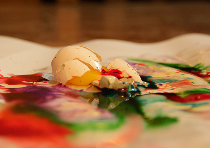
This project require a studio space, with lighting and a camera set up on the tripod. After bringing in the required materials you are all set to begin. Ensure that the space is clean and neat before and during the execution of the assignment.
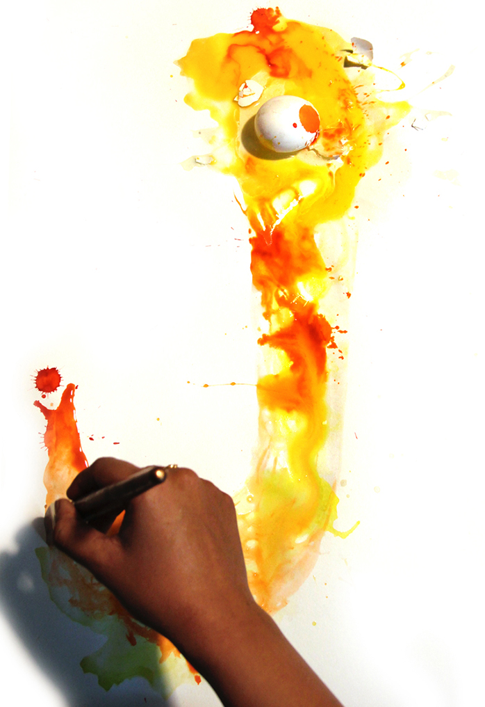
So for making an Oops! font we need to understand the qualities of the things that fall, spill or break. But the nature of the word implies chance. So there has to be a way of combining chance and imposed choice to create this font. Beginning with an broken egg, the designer then moves a brush full of water creating a perfectly transparent skeleton of the letter 'J'. Thus allowing a mixture of the egg yolk and inks to roam freely within the constraints of a liquid base resulting in a imperfect, but interesting letter ‘J’.
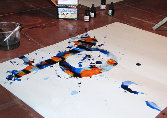
Large sheets of paper are suppsed to be spread across the floor. The ink and eggs (keeping in mind the element of probability) are to be dropped from a height to get the required spatter and splash. They can then be captured with a camera from above.
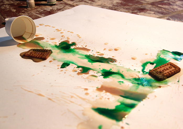
A split tea cup and soggy biscuits with a dash of green, make the perfect 'T'.
This brings to mind how many times people have spilt their tea, or even worse dipped biscuits into it, only to see it become so soggy that it falls back into the teacup with an embarrassing splash!
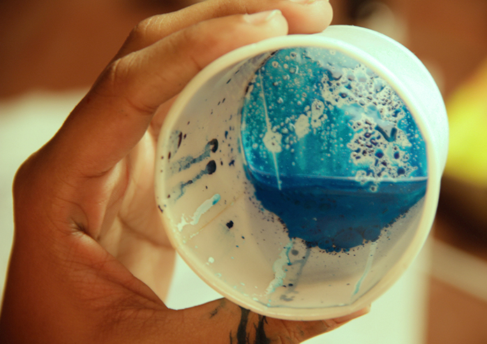
Sometimes mixing different colours and mediums in little cups is helpful to understand the their qualities and how they blend or react with each other, each experiment resulting in different visual effects.
